Image source: artvee.com
Introduction
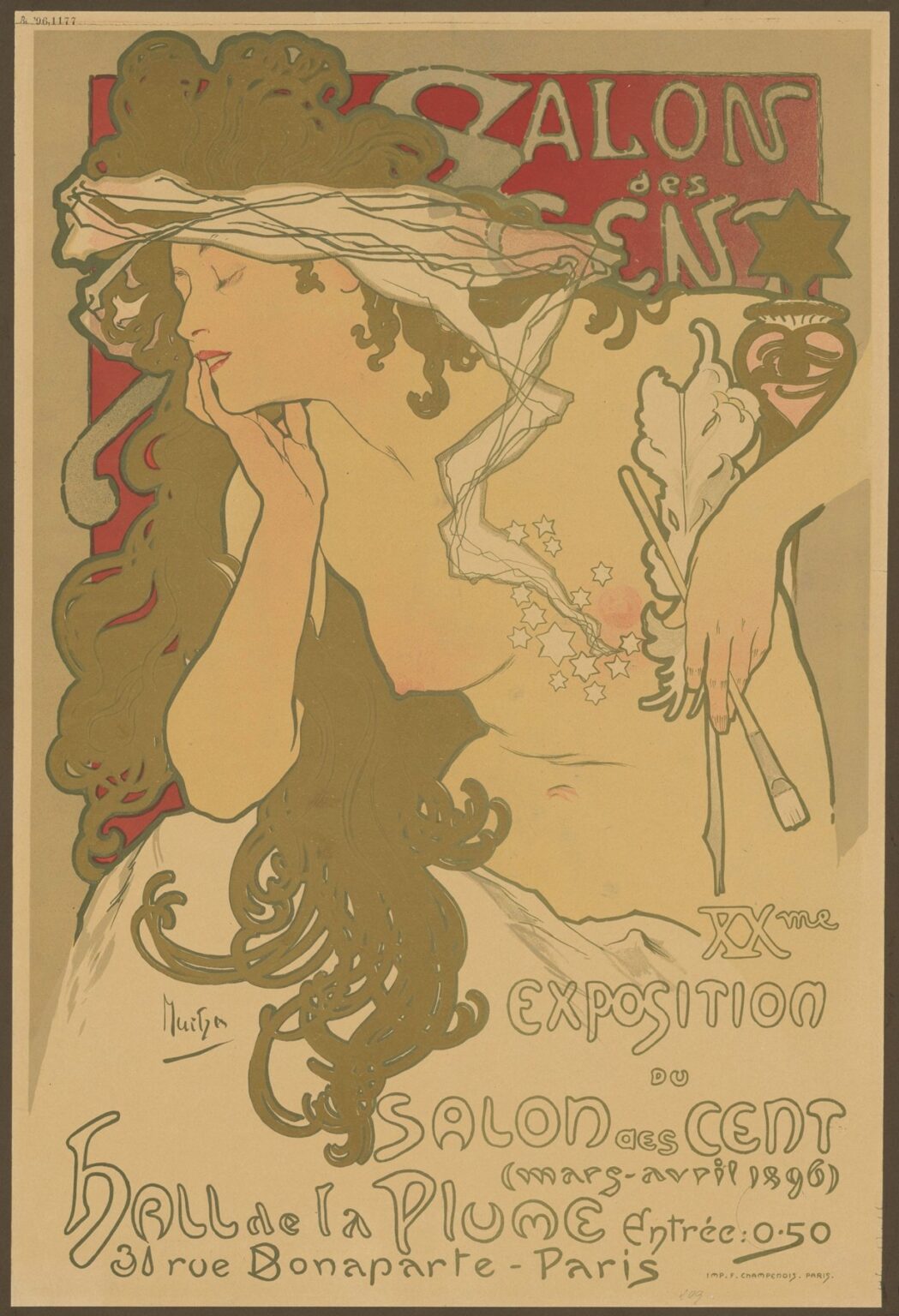
Alphonse Mucha’s 1896 poster “Salon des Cent, 20. Ausstellung” captures the exact moment when Art Nouveau crystallized into a public language—sinuous line, flattened color, and a woman who is less a model than an embodiment of creative rapture. Commissioned to promote the twentieth exhibition of the Salon des Cent in Paris, the sheet shows a dreaming figure whose cloudlike hair fills the frame, a transparent veil drifting across her brow as constellations of stars spiral from her heart toward a painter’s brush. With almost nothing—no perspective tricks, no heavy modeling—Mucha turns a rectangle of paper into a theater of inspiration.
The Poster’s Place in the 1890s Parisian Art Scene
The Salon des Cent was a commercial exhibition series organized by the literary and artistic review La Plume. Its purpose was simple and modern: give contemporary printmakers and illustrators a dedicated venue to sell affordable art directly to the public. Posters were not merely advertisements; they were the products themselves, pinned in cafés, bought by collectors, and stored in portfolios. By 1896, Mucha had already rocketed to fame with his posters for Sarah Bernhardt. His involvement with the Salon des Cent lent the series superstar wattage, while the series offered him a laboratory to refine a graphic language that could be simultaneously practical, poetic, and unmistakably his.
Commission, Audience, and Message
Unlike a theater advertisement packed with performance details, this sheet speaks to an audience already attuned to art. The poster had to do several things at once: announce the twentieth exhibition, identify the venue at Hall de la Plume, and make the very idea of attending feel like participation in something elevated. Mucha answers with an image that treats art-making as a sensuous trance. The copy supplies the logistics—dates, location, price—while the picture sells the mood that the Salon promised: immersion in living art.
Composition: A Stage for Reverie
Mucha organizes the poster around a diagonal that runs from the woman’s veiled forehead down through her tilted cheek to the fingertips resting lightly along her jaw. This diagonal is countered by the vertical weight of her cascading hair, which expands into an ornamental mass that occupies nearly half the sheet. Background rectangles of lacquered red and olive-beige lock the figure into place without disrupting the sense of buoyant drift. There is almost no illusionistic depth. The entire drama plays out on the surface, a hallmark of Art Nouveau and a choice that made the image read cleanly at distance on a Paris street.
The Figure and the Gaze
The woman’s eyes are closed, her lips tinged with rose, her expression one of inward absorption. Mucha resists the easy strategy of addressing the viewer directly. By turning the gaze inward, he invites onlookers to project themselves into the scene rather than simply consume it. This small shift from display to identification is crucial. The poster doesn’t say, “Look at this,” but rather, “This is how making and receiving art feels.” That is precisely the promise a Salon des Cent poster needed to make.
Hair as Architecture
Nothing in the composition is more assertive than the hair. It billows in carved, interlocking coils, a sculptural matrix that both frames the face and becomes a decorative field in its own right. The locks contain small tunnels of red, peeking through like warm shadows; the edges are crisply defined by a printed keyline that keeps the form legible at any scale. In Mucha’s hands hair is never background; it is the architectural armature of the sheet, the organic counterpart to the sinuous letterforms below.
Veil, Breath, and the Current of Inspiration
A gauzy veil wraps the head and trails into space as if moved by a barely felt breeze. From the figure’s breast a tiny rosy glow pulses outward, dissolving into a trail of tiny stars caught up in the same current that lifts the veil. The drift passes across the right side where the woman’s hand holds a brush and an oak-like leaf that reads as a stylized palette or emblem. In one unbroken gesture Mucha connects feeling (the flush at the heart), imagination (the stars), and craft (the brush). The movement is so gentle it can be missed, but once seen it becomes the poster’s invisible engine.
Color: Warm Quiet with a Single Shout
The palette is restrained—earthy olive-greens, cream, and warm beige—so that one element can speak loudly: the vermilion ground at the upper left, where the title sits. That square of red, framed by the figure’s hair, acts as a visual exclamation that anchors the otherwise dreamy atmosphere. Flesh tones are built from soft apricot and pale rose. The veil is rendered as pale gray, mere wisps of tone caught by the keyline. Because the poster relies on flat color fields, the viewer isn’t distracted by painterly effects; the mind stays with line, silhouette, and the gentle pulse of the scene.
Lithographic Intelligence
Mucha drew for chromolithography with an engineer’s foresight. Flat shapes are locked by a confident outline that permits perfect registration even when a printer is working fast. The veil’s translucency is an effect achieved with minimal means—thin lines and a light tint over the flesh tone—yet it convinces. Areas of unprinted paper become luminous skin and air, saving ink while preserving brightness. The poster demonstrates how economy can look luxurious when form and print process are in harmony.
Typography as Ornament and Voice
The hand-drawn lettering is a performance to match the figure. The words “Salon des Cent” are woven into the red cartouche at the top, their rounded, asymmetrical letters echoing the hair’s curls. Lower on the sheet, Mucha writes “XXme Exposition du Salon des Cent” and the address as if with a flexible quill, allowing strokes to thicken and thin in a living rhythm. The letters never behave like external signage; they are part of the same breath that moves the veil. This integration of type and image—so natural in Mucha’s work—became a template for twentieth-century display lettering.
Emblems at the Right: The Leaf, the Urn, the Star
To the right of the figure Mucha places compact symbols: a stylized urn or amphora, an oak-like leaf, and a star-shaped badge. The urn nods toward classical tradition; the leaf suggests the natural world that Art Nouveau constantly reinterpreted; the star doubles the constellation drifting from the heart. The brush held loosely beneath these emblems grounds the allegory in the material act of painting and drawing. Decorative though they are, these details function as a condensed manifesto: art springs from nature, engages tradition, and becomes personal light.
The Body as Landscape
The woman’s torso is described with remarkable economy—two long lines along the arm and ribcage, a hint of clavicle, the slightest shadow at the breast. Because modeling is minimal, the flesh reads as a smooth, sun-warmed plane against which hair, veil, and letters can flow. The body becomes terrain, and the strap of white fabric across the hip acts like a shoreline where lighter tones break against the darker ground. It is sensual without being specific, an allegorical body that belongs to the idea of art rather than to any individual.
Negative Space and the Art of Restraint
One of the poster’s secrets is how much it leaves blank. The beige ground surrounds the figure like silence around music. Empty space is not a lack but a frame that intensifies every line. This restraint keeps the composition modern. It also means the practical text—dates, price, address—can sit legibly without competing with the image, an important consideration for a street poster that must be read at a glance.
Advertising Without Shouting
The poster is persuasive precisely because it refuses to hustle. There is no cascade of endorsements or crowded copy. Instead there is a feeling: the pleasure of losing oneself in making or looking. In a city awash with noisy banners, Mucha offered quiet seduction. The Salon des Cent, he suggests, will not pester you; it will charm you into lingering, and—once you enter—into collecting.
Dialogues with Mucha’s Other Posters
Compared with the jeweled intricacy of “La Plume” or the haloed theater portraits for Sarah Bernhardt, this sheet is pared down. The halo becomes a rectangle of red; the ornament concentrates in hair and lettering rather than borders. Yet the family resemblance is unmistakable: the closed eyes of inwardness, the cascading coiffure, the living relationship between type and image. The poster looks forward to the more radical simplifications of early twentieth-century graphic design while remaining sumptuous in line.
Gender, Agency, and the Personification of Art
Mucha’s women are often labeled decorative, but here the figure’s agency is clear. She makes and she dreams; the brush is in her hand; the stars originate within. The veil does not hide; it heightens sensitivity, like a membrane that lets us see the invisible movement of breath. By giving the creative act a female body that is thoughtful rather than performative, Mucha positioned visual art as an interior discipline open to anyone willing to cultivate attention.
Reading the Image as a Creative Process
Start at the heart’s flush; follow the stars as they spiral upward; watch them cross the veil and settle by the brush. That path is the poster’s story: feeling becomes inspiration; inspiration becomes image. The entire page is a diagram of flow, and every curve reinforces it—the locks of hair, the letter strokes, even the soft hook of the elbow. The Salon des Cent is thus framed not as a place but as a process you enter.
Lessons for Contemporary Designers
The poster remains a case study in how to balance message and mood. Limit the palette so line can sing. Use negative space as a partner. Let type belong to the same world as image. Build a single, memorable gesture—the veiled head, the floating stars—rather than a crowd of competing ideas. Above all, respect the viewer’s intelligence: suggestion outperforms explanation.
Reception and Afterlives
The Salon des Cent posters were collected even as they were printed. Many were trimmed and mounted in albums; others were reissued as art prints. This sheet’s survival in excellent condition in museums and private collections testifies to its popularity and to the cultural prestige of the exhibitions it advertised. Its lettering and flowing hair reappeared in countless imitations, from chocolate ads to later psychedelic posters, proof that Mucha’s visual DNA seeded multiple eras.
Why the Image Endures
More than a century later, the poster still feels fresh because it respects the core pleasures of looking: the surprise of a beautifully drawn line, the calm of a balanced page, the recognition of a private emotion made visible. It also still sells something real. Anyone who has ever stepped into a gallery, or turned a page in a studio sketchbook, knows the feeling the figure wears on her face. That is the Salon’s true advertisement, and Mucha captured it with the simplest materials and an unfailing elegance.
Conclusion
“Salon des Cent, 20. Ausstellung” is a manifesto disguised as a whisper. It defines Art Nouveau’s essentials—organic line, flattened color, and total integration of type and image—while delivering a subtle pitch for a living marketplace of prints. With a veiled head, a brush lightly held, and a drift of stars, Mucha turns logistics into longing. The poster’s genius lies in how little it needs to persuade us that art is not only worth seeing but worth bringing home.