Image source: wikiart.org
Introduction
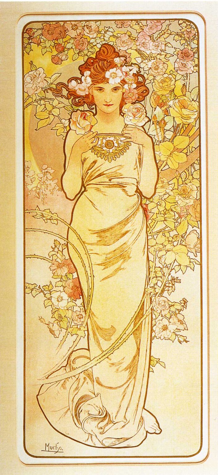
Alphonse Mucha’s “Rose” (1897) is a serenade to radiance. Composed as a tall, gently rounded panel, the work presents a young woman standing among an orchard of roses, her figure wrapped in pale drapery and circled by a field of blossoms that reads like a floral halo. The palette glows in honeyed creams, blush pinks, and soft yellows. Lines swirl and settle with the unhurried grace that made Mucha’s style synonymous with Art Nouveau. This is not a botanical study, nor a portrait in the ordinary sense. It is a personification: the rose as a living presence, beauty gathered into human poise.
A Panel Made to Bloom Indoors
Mucha designed decorative panels for Parisian interiors as attentively as he crafted posters for the street. “Rose” belongs to a group of floral allegories that could be purchased for homes, cafés, and salons. The format itself serves domestic life. The high rectangle lifts the eye, the rounded corners soften architectural edges, and the thin inner border creates a window inside the wall. The work’s warmth is deliberate. Where many late-nineteenth-century images chase drama with sharp contrasts, “Rose” offers mellow light suited to rooms of carved wood, patterned textiles, and quiet conversation. It is decoration that behaves like a companion rather than a spectacle.
Composition as a Living Garland
The composition hinges on a vertical axis that runs from coiffure to bare toes. The figure stands nearly frontal, weight resting on the back leg, with a subtle S-curve in torso and hip. Around her, roses climb in arcs that echo the curve of the inner frame. Mucha plays these arcs against the vertical figure to keep the eye moving. Two prominent thorny canes sweep across the lower half of the panel like calligraphic strokes, anchoring the blossom-cloud with firm diagonals. Nothing is accidental. Blossoms mass around the head to form a halo; larger yellow roses on the right balance the pink field on the left; the necklace at the chest becomes a small sun, a pivot that gathers the surrounding lines.
The Language of the Rose
In fin-de-siècle Paris the rose carried a vocabulary of meanings—love, grace, pleasure, ephemerality—well known to viewers. Mucha respects that inheritance but modulates it. His rose is not a coquettish symbol or an overripe ornament. The woman’s gaze is direct, the mouth calm, the pose steady. She holds a rose in each hand near the necklace, as if acknowledging their perfume before wearing them. Thorned canes run near her body without piercing it, a reminder that beauty carries risk even when tended. The allegory is generous rather than moralizing. Delight is encouraged, but awareness is preserved.
Line That Breathes
Mucha’s signature line organizes the whole. It darkens slightly at turns, thins across long runs, and recovers strength at the next curve, like a singer’s phrase. The contour that encloses the figure reads with the clarity of enamel work, while interior modeling stays light, trusting the paper’s warmth to do half the task. The drapery’s folds are drawn rather than shaded; they behave as measures of time, dividing the panel into a slow rhythm from shoulders to hem. The climbing canes are the most calligraphic element. Their flexible sweep binds border, figure, and flowers into one sentence of line.
Color as Perfume
“Rose” is suffused with a restrained palette that feels like fragrance turned into light. Cream, ivory, and pale gold give the drapery its glow. Petals shift from blush to apricot to lemon, catching the full spectrum of a summer afternoon without ever shouting. Leaves are not harsh green but a softened, yellow-tipped olive. The background is a translucent wash that lets the paper’s tone shine through, keeping the whole airy. Because Art Nouveau lithography thrives on flat color fields, Mucha composes the palette to read from across a room while rewarding close attention with small modulations—a rosy edge here, a faint cool shadow there.
Ornament that Means
The border is more than trim. Its rounded corners and slender fillets echo the panel’s internal curves and stabilize the profusion of rose boughs. Mucha sets a fine outline around the picture field, leaving a light margin before the heavier outer line, so the image appears to float—a mounted jewel rather than a pasted print. Within the field, adornment serves purpose. The heavy necklace gathers the gaze at the heart’s level; the floral crown frames the face so it does not disappear among blooms; the long twisted tresses act like dark ribbon, guiding the eye among lighter tones. Ornament clarifies; it never clutters.
Drapery and the Poise of the Body
Mucha’s women are famously draped rather than dressed. Here the fabric wraps the figure like a column of light. It clings lightly at the waist, then spills in a pooled hem that grounds the composition. The treatment is classical in spirit—no seam or stitch interrupts the flow—yet modern in its candor. The body is idealized but not abstract; knees, ribs, and collarbones are hinted with utmost economy. The result is an image that respects bodily presence while maintaining the allegorical register. The bare foot peeking from the hem adds a small human intimacy, a touch of earth that keeps the goddess approachable.
The Face and Its Address to the Viewer
The portrait at the center of this allegory shows Mucha’s gift for temperate expression. The eyes, slightly narrowed, meet the viewer without challenge; the mouth is relaxed, neither smiling nor severe. This calm sets the tone for the whole panel. The roses can be plentiful because the face is composed; the palette can run warm because the gaze remains cool. The balance keeps the image from slipping into sentimentality. It invites contemplation rather than consumption.
The Halo of Blossoms
Around the head, blossoms condense into a near circle, forming an improvised halo. Mucha had used similar devices in his theater posters to sanctify actresses and allegories. Here the halo is softer—less architectural, more botanical—but its function is the same: it elevates the subject without separating her from the world. The circle’s warmth also makes the face read clearly at distance. In a room filled with pattern and furniture, viewers would still catch the essential encounter: a face luminous among flowers.
The Thorn as Line and Meaning
One of the panel’s masterstrokes is the use of thorny stems as compositional guides. These canes slice gently across the front of the figure, curving like fencing sabres but rendered with such delicacy that they never threaten. Their presence acknowledges the rose’s paradox: beauty with defense, softness with point. They also prevent the lower half of the composition from becoming an undifferentiated sweep of drapery, supplying a counter-rhythm that breaks the vertical with lyrical diagonals.
Lithography and the Glow of Paper
Mucha designed with the color-lithographic stone in mind. In “Rose” the keyline is crisp but not heavy, allowing tinted inks to sit like watercolor within the boundaries. Highlights—the highest lights on skin, petals, and cloth—are almost always the paper left bare. That choice gives the image a unique luminosity: light does not lie on top of ink; it seems to emanate from within the sheet. Soft gradations—particularly in the background circle behind the figure—are achieved by crayon textures on the stone, creating the sensation of powdery atmosphere. The technique avoids the gloss of oil painting and suits the panel’s intention as a daily companion on the wall.
The Rose and the Fin-de-Siècle Ideal
The rose had a special charge in the 1890s. It was the flower of salons and illustrated periodicals, the emblem of refined sociability, the motif of textiles and jewellery. By personifying the rose as a poised young woman, Mucha aligned his art with a broader cultural ideal—the “femme-idole” who embodies virtue and charm without the aggressions of fashion caricature. His treatment leaves room for agency. The figure holds her roses deliberately; she presents herself rather than being presented. In an age negotiating modern roles for women, this quiet authority mattered. It explains why these panels were welcomed into homes not merely as decoration but as aspirational company.
The Viewer’s Path Through the Panel
The eye begins at the face, then drops to the necklace and the roses held near it. From there it follows the long drapery sweep to the gathered hem, where the thorny stems curve across. Those stems lead back up the left edge to the blossoming field, and the rounded inner border returns the gaze to the center. This cycle—face to heart to ground to field to face—mirrors the panel’s theme: a life rooted in earth and crowned in bloom. The path is gentle enough to be taken unconsciously each time one passes the print.
Dialogue with Mucha’s Other Florals
Set beside “Iris,” “Lily,” or “Carnation,” this “Rose” reveals Mucha’s sense of character in flowers. Iris is vertical and cool; lily is chaste and architectural; carnation is sprightly. Rose is abundant yet composed. The differences arise not from radical changes in format but from shifts in line tempo, palette, and posture. By keeping the framework stable, Mucha let small choices carry the personality, just as a jeweler might set different stones in a shared mount. For collectors, the effect was a seasonal or emotional suite that harmonized on the wall.
Modernity within Historic Forms
Although the panel borrows the authority of classical drapery and medieval halo, it remains modern in two ways. First, it trusts flat color and silhouette—the same graphic clarity that made Mucha’s posters legible on the boulevard. Second, it treats allegory not as moral instruction but as atmosphere. The rose does not teach; it radiates. That change of tone helped bridge nineteenth-century narrative art and twentieth-century design, making Mucha a pivotal figure rather than a stylistic curiosity.
The Quiet Ethics of Beauty
Underlying “Rose” is a belief that beauty can be a daily practice. The panel asks little of the viewer besides attention; in return it offers order, calm, and a reminder of seasons. The thorny stems keep sentiment in check; the modest drapery keeps sensuality humane; the balanced palette keeps pleasure from fatigue. In an urban world accelerating toward modern spectacle, such quiet ethics were not trivial. They were a way to shape interior life.
Reception and Afterlife
“Rose” has remained one of Mucha’s most reproduced floral panels. Its adaptability—elegant enough for formal rooms, gentle enough for bedrooms—made it a favorite across generations. Reproductions on paper, tile, textile, and porcelain carry the design forward because its grammar of line and color is resilient. Contemporary designers borrow its rounded borders and floral halos; photographers echo its centered, frontal pose in fashion editorials. The work retains vitality because it answers perennial desires: to bring nature indoors, to dignify decorative pleasure, and to meet a human gaze that is as calm as it is inviting.
Conclusion
“Rose” distills Mucha’s art to a luminous essence. The drawing breathes; the color glows; ornament clarifies what it surrounds. A woman becomes a flower and a flower becomes a mood—abundance brought to balance, elegance offered without effort. The panel does not insist; it abides, and by abiding it changes the space it inhabits. In that gentle transformation lies Mucha’s enduring gift.