Image source: wikiart.org
Introduction
“Rocks on Belle Île” captures a steep, fissured inlet on the Breton island that reshaped Henri Matisse’s art in 1896. The canvas is all stone and surge—tilted planes of rock pressed together like tectonic pages, a seam of sea running between them, and a horizon that flattens into a pale belt of light. Nothing here is anecdotal. There are no figures, boats, or buildings to soften the scene. Instead, Matisse treats geology as subject and structure, translating cliffs and channels into muscular color-blocks and swerving brushstrokes. The painting shows a young artist discovering that composition can be built from forces rather than things: weight versus buoyancy, warm earth against cool water, oblique thrusts countered by horizontal calm. In doing so, he finds a language that anticipates his later simplifications while remaining rooted in the raw, windy reality of Belle Île.
Historical Context: Matisse in 1896 on the Atlantic Edge
By 1896, Matisse had received rigorous academic training, but he was increasingly unsettled by studio conventions. Belle Île offered an antidote. The island’s Atlantic face is a laboratory of cliffs, slits of surf, spray-slick rock, and air that scours color down to essentials. During his stay, Matisse painted outdoors relentlessly, often in unstable weather. He was absorbing lessons from artists who prized direct observation and bold chromatic relations. The rocky coast forced him to simplify. It was impossible to capture every fissure; he had to decide which planes carried the drama. “Rocks on Belle Île” belongs to this crucible. It departs from academic finish and even from high Impressionist shimmer, substituting an architecture of color and a physical brush for optical sparkle.
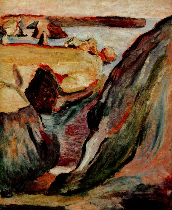
Subject and Site: Geology as Motif
The subject is an angled gully carved by tide and runoff, its mouth opening onto quiet water and a distant bar of land. Two massive promontories frame the foreground—one greenish and shadowed on the right, one darker and cooler on the left. Between them runs a narrow sluice of sea whose layered greens, violets, and reds read like a cross-section of wet stone beneath shallow water. Beyond the cleft, a band of ochre cliff face, stippled with rust, leads the eye outward to a quieter horizon. The motif is elemental and unsentimental. Matisse paints not scenic charm but the coastal machine itself—the way rock channels water, the way the sea eats its path, the way light skids along mineral surfaces.
Composition: Oblique Forces and the Quiet Horizon
The design pivots on a powerful diagonal that plunges from top right to lower left, established by the right-hand wall of rock. This thrust is opposed by the broad, ochre shelf that runs almost horizontally across the upper middle distance, creating a stabilizing armature. The narrow water channel curves inward like a hinge, pulling the viewer into depth and then releasing the gaze toward the horizon’s thin calm. Edges are decisive. Hard, slanted contours slice the picture plane; softer seams allow transitions where water laps rock. The composition feels engineered yet alive, like a ship’s ribs flexing under pressure. Everything is staged so the viewer experiences the coast as a system of tensions rather than a postcard view.
Color Language: Warm Earth, Cool Water, and the Pulse of Red
Color is the lifeblood of the painting. The rocks at right carry a deep green overlaid with bruised violets and coral reds, as if algae, shadow, and iron were vying for dominance. The left mass leans into black-blue, cooler and more sealed, while the central plateau glows in ochres and wheat tones that catch diffuse light. Along seams and planes Matisse drops red accents—thin, arterial streaks that both describe mineral veins and energize the surface. The water is not simply blue; it is a stratified mix of gray-green, teal, maroon, and slate, vibrating where it meets stone. These relationships are not slavish description. They form a color architecture in which warm and cool are the principal actors, and red is the conductor that keeps the eye circulating.
Brushwork and Handling: Carving with Paint
The painting’s surface is built from strokes that feel carved rather than merely laid down. Broad, directional marks follow the geology of the rocks, turning as planes turn, so that brush and stone seem to share a logic. Shorter, scumbled touches articulate texture—lichen, grit, salt—and prevent large shapes from going inert. In the water, horizontal drags and thin, transparent passes suggest ripples and reflected strata. The handling is varied but never fussy; Matisse is less interested in enumerating details than in convincing us of mass, friction, and flow. The result is a tactile reading of the coast. One can almost feel the rasp of the cliff and the slickness of a tide-wet channel.
Light and Weather: A Day of Diffuse Illumination
The sky is pale and largely uninflected, a lid of diluted pearl without theatrical clouds. This choice flattens the top register and pushes attention downward to stone and sea. Light appears to come from high and slightly left, but the more important point is its diffusion. Edges are not defined by cast shadows so much as by temperature switches and value steps. The coastal air acts as a softbox, subduing glare and letting color relationships do the descriptive work. That restraint grants the painting a sober truthfulness: this is the light of the Atlantic on a calm, cool day, the kind of weather in which forms assert themselves without spectacle.
Space and Depth: Shallow Compression with a Pathway Out
Matisse compresses space deliberately. The foreground rocks are monumental and close, cropped aggressively by the frame. The middle ground is a single slab of land with minimal vertical relief, and the background collapses to a slender belt. Yet the picture does not feel claustrophobic because the water channel offers a navigable path. It works like a river of sight: you enter through the cleft, slide through colored shallows, and are released toward the open sea. This controlled depth anticipates Matisse’s later ability to create space through color intervals rather than classical perspective alone. Distance in this picture is something you feel as a sequence of temperature and saturation changes.
Cropping and the Modern Edge
The painting’s cropping is uncompromising. The right rock mass is cut by the frame in a way that denies the old idea of a balanced, centered prospect. The viewer is placed close to a precipice, as if standing on a narrow ledge. This modern edge—both literal and compositional—creates urgency. It also makes the painting about the experience of looking, not just about what is looked at. You sense the body’s position relative to the cliff: a sideways lean to peer down, a reflexive bracing against the pull of gravity. The frame becomes an instrument for translating bodily sensation into pictorial energy.
Psychological Resonance: Stability, Risk, and Passage
Without narrative incident, the painting carries psychological charge. The heavy flanks of rock feel secure but also constricting. The path of water suggests movement and release, yet it is narrow and uncertain. Warm ochres announce a sun-touched respite on the far shelf, but the reds that vein the rocks also hint at fracture and stress. The scene reads as a meditation on opposing states—shelter versus exposure, compression versus expansion, stasis versus flow. It is not fanciful to see in this a self-portrait of an artist at a crossing, weighing the stability of learned methods against the risk of new, more forceful color and structure.
Dialogue with Influences: From Cézanne to Coastal Brittany
The rock-as-architecture approach reflects Matisse’s admiration for Paul Cézanne, whose constructive brushstroke built landscape from planar facets. Yet the chromatic insistence—those reds and ochres laid as declarative accents—also shows the impact of coastal Brittany and of painters there who encouraged bold complementary contrasts. Where Monet would scintillate water into prismatic light, Matisse lets planes hold. Where academic practice would polish, he leaves edges alive. “Rocks on Belle Île” occupies that fertile middle ground between observation and invention, learning and risk—a ground that would soon feed Fauvism.
Foreshadowing Fauvism: Color as Structure, Not Ornament
Although the palette is comparatively earthy, the logic is Fauvist in embryo. Color here does not merely coat forms; it organizes them. A green-violet flank is green-violet because that hue, at that value, will push against the ochre opposite and make the channel read as a corridor. A ribbon of red along a fracture is there because it locks two planes and animates the eye’s path. This is the shift that defines Matisse’s mature work: color becomes the skeleton rather than the skin. Once that principle takes hold, brighter palettes and flatter planes become inevitable, but the thinking is already present on this rocky ledge.
Materiality and the Role of the Ground
The painting’s unity owes much to how paint layers interact with the ground. Thin passages allow the canvas tone to participate, warming halftones and knitting disparate strokes. Thicker impastos occupy accents and ridge highlights, catching literal light and reinforcing the sense of rocky relief. The alternation of transparency and opacity—glaze against scumble, wash against loaded stroke—creates a geological feeling in the surface itself. The painting is not a window but an object whose crust remembers its making, just as the coast’s crust remembers wind and tide.
Rhythm and Movement Across the Surface
The eye does not move passively here; it climbs, slips, and squeezes through. On the right, long vertical-diagonal strokes create a downward slide; on the left, darker masses push upward, resisting. The water’s horizontal drags pick up speed like lines in a score. Small recurring motifs—triangles of dark rock, touches of coral red, crescent slivers of pale shore—form beats that keep attention circulating. This rhythm is more than decoration; it is how the painting enacts the place. The coast is a machine of alternating pressures, and the surface rhythms make those pressures legible.
The Ethics of Omission: No Foam, No Postcard
Matisse refuses picturesque cues. There is little foam, no dramatic breakers, no sentimental sunset. The sky is a workmanlike plane. By subtracting spectacle, he clears space for structure and relation. The omission is ethical as much as aesthetic; it respects the stubbornness of the coast and the seriousness of painting as a way of testing how far marks and colors can carry meaning. What remains is an image that feels truer to sustained looking than to touristic memory.
A Painter’s Problem Solved in Stone and Sea
Look at the junctions where rock meets water: values converge carefully so contours aren’t simply drawn; they’re negotiated. Note how the central ochre shelf sits: its upper edge is softened to avoid cutting the sky; its underside darkens to read as mass. Observe the narrow, pale strip at the horizon: just enough to separate sky from sea without diluting the painting’s compression. These are problem-solving moves, decisions that keep the picture coherent when it could easily fly apart. The resulting clarity is not accidental; it rises from a sequence of precise adjustments made in front of the motif.
Place in Matisse’s Oeuvre
“Rocks on Belle Île” stands among the pivotal Belle-Île works where Matisse learned to treat nature as a set of constructive relationships. It shares with his seascapes from the same year a respect for tonal discipline but pushes harder into chromatic structure and assertive cropping. Soon, these experiments would open onto the blazing harmonies of his early 1900s canvases and, later, the serene inevitabilities of his cut-outs. The rock painting is not a minor prelude; it is a foundation stone. It shows that the courage to simplify was born on an exposed coast where essentials ruled.
How to Look at the Painting Today
Approach the canvas as you would a cliff path: slowly and with attention to footing. First, let your eyes accommodate to the overall tonal key. Then trace the right-hand rock from top to bottom, noticing how color shifts mark changes in plane. Step across the channel and feel the coolness of the painted water, built from lateral drags and stained transparencies. Rest your gaze on the ochre shelf; register how it calms the picture without deadening it. Finally, glance at the horizon and sense the pressure release it provides. The more you move between these zones, the more the painting resolves into a balanced system of forces—stern, persuasive, and surprisingly lyrical.
Conclusion: Why “Rocks on Belle Île” Matters
This canvas matters because it demonstrates, at an early date, Matisse’s instinct to build pictures from relationships of color, value, and direction—relationships strong enough to organize the world without anecdote. The painting’s power does not depend on meteorological drama or picturesque detail; it resides in the conviction of its choices. Rock, water, and air become planes of pressure; reds and greens become structural beams; the frame becomes a cliff edge that implicates the viewer’s body. In short, the picture turns landscape into a modern arena where perception and construction fuse. From this ledge, it is a short step to Fauvism and to the radical clarity that would define Matisse’s century-shaping art.