Image source: wikiart.org
Historical Context And The Nice-Period Studio
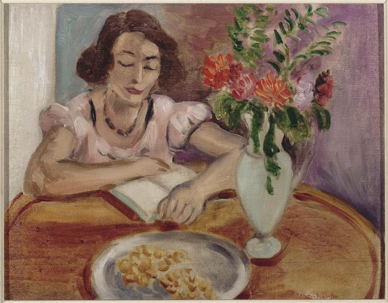
Henri Matisse painted “Reading Girl” in 1922, in the middle of the Nice years when he turned modest hotel rooms into luminous laboratories for color, calm, and attention. After the turbulence of the 1910s he sought an art of balance rather than shock, building pictures from tuned planes, patterned hints, and a light that travels gently through a room. Reading as a theme suited that ambition perfectly. It allowed him to show a living mind without drama, to seat a figure at a table where a few objects could become partners in a visual conversation, and to let time stretch into the unhurried tempo of the Mediterranean afternoon. “Reading Girl” is one of those poised interiors: a woman absorbed by a book, a bouquet alive with garden color, and a plate in the foreground that anchors the table like a low, silvery moon.
Composition As A Circle Of Attention
The composition is engineered as a circular flow that starts with the reader’s face, passes down her relaxed forearm to the open book, drifts across the tabletop to the plate, and loops back up through the tall vase and bouquet to the face again. The round table intensifies that cycle; its oval rim repeats the arc of her bent arm and the bowl of the vase. Matisse sets the figure slightly left of center, leaving space for the bouquet on the right. This asymmetry prevents stasis and keeps the eye circulating. The figure’s head tilts toward the page, creating a gentle diagonal that counters the vertical rise of the vase. The entire arrangement reads like a soft clock of attention whose hands move at the pace of breath.
Color Chords And The Temperature Of Calm
The palette is built from three cooperating chords. The first is a set of warm, honeyed browns in the wood of the table, tempered by deeper siennas that settle under the plate and the vase’s base. The second is the family of cool lavenders and violet-grays that soak the wall, a climate that keeps the room airy. The third is a garden chord of flower colors: coral reds, orange-pinks, and fresh greens, their intensity moderated so they glow rather than shout. The reader’s dress and skin mediate between these zones. The pale pink sleeves, gray-violet shadows, and soft flesh tones stitch warm table to cool wall, bouquet to book. There is hardly any black; darks are achieved with deep greens in leaf clusters, wine tones in hair and necklace, and plum accents in shadow. The result is a steady emotional temperature—bright enough to feel alive, gentle enough to sustain long looking.
The Figure As A Lyrical Center Of Gravity
Matisse renders the “girl” with the economy that marks his best Nice interiors. Her posture is unforced: one arm lies across the page, the other bends so the hand steadies the book. The face is simplified to a few decisive notes—arched brows, closed or almost-closed lids, a small calm mouth—making the act of reading completely believable. The short dark hair frames the forehead and sets off the paler cheek planes. The necklace, a chain of rounded darks, is not jewelry as display but punctuation that holds the center of the composition. Nothing about the figure is theatrical. She is present as a rhythm of volumes and temperatures, a human metronome for the room.
The Bouquet As Countermelody
On the right, a tall, milky vase rises from the table with a bouquet of dahlias or zinnias painted as dabs and curls of coral, salmon, and orange, surrounded by viridian and sap-green leaves. The bouquet counters the figure’s closed-eye inwardness with a worldly flourish. Yet it never steals the scene; its color is tuned to the room’s key, and its vertical thrust is checked by the table’s oval. Matisse uses the bouquet to keep the picture breathing. The leaf fronds at the top edge stretch the air; the pale body of the vase reflects surrounding hues, letting interior and object exchange light. As often in these rooms, flowers are not symbols; they are instruments that hold the harmony.
The Tabletop And Plate As Structural Anchors
Matisse’s tables are platforms, not props. Here the polished wood ring draws an elegant ellipse that binds figure, book, vase, and plate into one field. The plate occupies the near edge like a silver planet. Its cool value against warm wood makes the foreground vivid, while the clusters of small pastries or fruit pieces on the plate echo the bouquet’s blossoms in miniature. The plate also fixes perspective. Its foreshortened oval clarifies the viewer’s vantage and gives weight to the table so that the rest of the scene can remain light. The quiet shadow under its rim and the darker oval cast by the vase supply little counterbeats that keep the plane from going flat.
Light As A Soft Envelope
The light in “Reading Girl” is the Nice light that Matisse loved: even, coastal, and generous. It slips across the wall in a violet wash, gathers gently along the top planes of the arm and cheek, and slides down the side of the vase as a cool vertical glint. There is no theatrical beam, no hard cast shadow. Because illumination is steady, color and temperature can carry the drama. Flesh reads as a series of warm-cool transitions; petals glow by adjacency rather than by highlights; the table shines by the simple lift of value at its rim. This kind of light makes a room feel inhabitable, not staged.
Brushwork And The Velocity Of Thought
The paint handling is brisk and legible. On the wall, the brush lays in long, soft strokes that veer from lavender to gray, imitating air rather than plaster. On the bouquet, strokes shorten and twist, building petals from quick touches and fashioning leaves from slashes and hooks. The dress is made from thin veils that let undercolor influence the surface, perfect for the translucency of cotton. Hands, always a test of confidence, are modeled with a few sure planes that convince by temperature more than by contour. The book’s pages are two light trapezoids with a seam, exactly as much as the eye needs. Everywhere, speed matches subject: the scene reads as a moment of concentration in a day that moves.
Space Constructed By Planes And Overlap
Depth here is modern and modest. The near plate overlaps the table rim, which overlaps the reader’s forearms, which overlap the open book and vase, which in turn overlap the wall. There is no linear perspective scaffolding; instead, tonal steps and contact points negotiate space. The wall’s cooler, less saturated values push back; the warm table pulls forward; the bouquet’s darker core sits mid-depth. The result is a shallow, breathable interior where all actors remain available to the eye at once.
Pattern, Plainness, And Balance
Matisse balances ornament and rest so the room never clutters. The bouquet provides the primary pattern, a lively scatter of organic shapes. The necklace supplies a secondary rhythm, a small chain of ovals. Everything else is held in reserve: a plain table field, a matte wall, the simple geometry of pages. Even the dress’s sleeves, with their gathered edges, are understated. This equilibrium lets the visual music play for a long time without fatigue.
The Psychology Of Reading
The subject is reading, but the painting is not a story about a book. It is an image of a mental posture. Eyes lowered, mouth relaxed, shoulders settled, the reader inhabits a private corridor of attention while remaining bodily present in a social room. Matisse’s genius is to make that corridor visible through relationships of color and rhythm. The warm oval of the table protects the little theater of the page; the bouquet accompanies like a gentle audience; the wall’s lavender hush quiets the air. The scene persuades you that thinking can be a form of repose.
The Role Of Red And Green In The Harmony
Matisse often resolves paintings with a decisive interaction of complements. Here, the green family—leaf, stem, cool glass tones—balances the warmth of rose and coral in the flowers and the faint blood tones in the cheeks. But he softens the pair into many steps: warm greens next to cool greens, cool roses next to warm reds. The necklace’s near-black beads ally briefly with green shadows to keep the center from becoming sugary. This subtle calibration is why the painting feels restful. Complementary tension is present, but it never clangs; it hums.
Drawing Inside The Paint And The Intelligence Of Omission
Matisse’s drawing is executed almost entirely within patches of color. The hand that turns the page is formed by two or three angles of light against mid-tone; the other hand dissolves into the book’s whiteness. The face holds just enough structure—eye arcs, nose bridge, lip line—to sustain likeness. Background architecture is suppressed. No molding, no window grid, no extraneous props appear to steal attention from the core constellation of table, book, figure, and vase. Those omissions are not absences; they are the room’s air.
Comparisons Within The Nice Series
“Reading Girl” belongs with sister canvases such as “Girl Reading, Vase of Flowers” and “Interior in Nice, a Siesta,” where Matisse studies human rest as a pictorial problem. Compared with the more austere “Girl Reading,” this painting turns up the warmth: the table’s wood glows, flowers carry stronger chroma, and the figure’s skin is richer. Compared with the terrace scenes, the space is closer and more intimate; the sea is not needed because the bouquet provides the passage of air. Seen against his earlier Fauvist works, the color here is disciplined; seen against his later cut-outs, the forms are still exploratory. The painting sits at a hinge—calm, clarified, and slightly anticipatory of the larger planes to come.
The Viewer’s Path And The Experience Of Time
The picture choreographs a loop that lengthens time. The eye enters at the reader’s calm face, slides down to the page where a soft seam marks the fold, follows the forearm to the plate with its pale morsels, rises along the vase’s cool body into the bouquet’s warm cloud, and returns by the arc of the table to the face again. Each lap brings new discoveries: a cooler note along the wrist, a hotter petal within the orange bloom, a violet flare in the shadow under the plate. The painting does not deliver a single message; it teaches a way of moving through a moment.
Material Presence And Tactile Hints
Despite the economy, tactile cues abound. The plate’s rim holds a catchlight that feels metallic; the vase’s glaze is suggested by scraped, high-value strokes; the table’s varnish reflects a soft halo around objects; the petals thicken into little ridges where pigment is pressed more generously; the book’s paper is matte and absorbent, a foil to the sheen elsewhere. These signals keep the scene grounded in the body’s memory of touch while the mind travels through the page.
Light, Ease, And The Ethics Of Attention
Matisse wanted pictures one could live with—images that sustain attention without exhausting it. “Reading Girl” embodies that ethic. The light is a continuous veil; colors are tuned rather than paraded; the figure models attention as a form of care. The painting’s ease is not decorative softness. It is the result of precise decisions that allow the viewer to rest and to look, and to feel those actions as the same thing.
What The Painting Offers Today
The scene feels contemporary because it dignifies an everyday act. In a world of hurried images, it proposes slowness as a pleasure and a discipline. Designers can study the way warm wood, cool wall, and a single strong vertical object can organize a room. Painters can learn how to let color do structure’s work and how to draw inside paint without tightening the surface. Viewers can borrow the painting’s tempo—quiet, generous, clear—and carry it back into their own rooms.
Conclusion: A Quiet Loop Of Color, Mind, And Air
“Reading Girl” condenses the Nice period’s ideals into a room small enough to hold in one glance and deep enough to inhabit for a long time. A circular composition of face, book, plate, and bouquet sustains a gentle rhythm; warm and cool chords balance like breath; brushwork keeps the surface alive without noise; light arrives as an even kindness. Nothing is superfluous, nothing is stern. The painting is a quiet loop of color, mind, and air—the sort of image that sends you back to your own book with fresher eyes.