Image source: artvee.com
Introduction
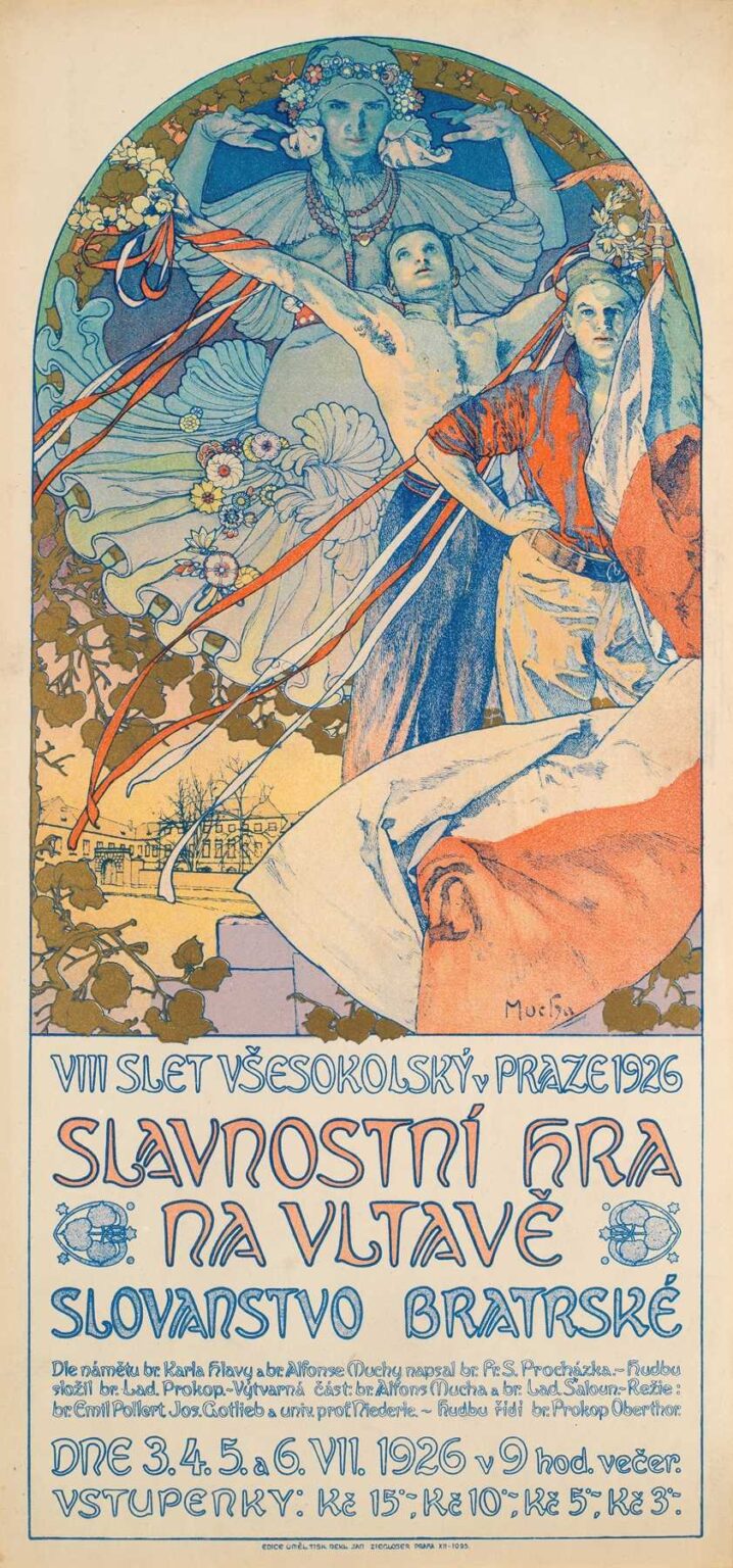
Alphonse Mucha’s 1926 Poster for the Sokol Festival in Prague represents a late but vibrant chapter in the artist’s career, fusing patriotic symbolism with the graceful curves of Art Nouveau. Created to advertise the VIII Slet (mass gymnastics festival) of the Sokol movement held on the banks of the Vltava River, the poster measures roughly 120 × 50 cm. Far beyond mere commercial art, it embodies Czechoslovakia’s aspirations for unity, cultural pride, and physical vitality in the interwar period. Through a dynamic composition featuring allegorical figures, national colors, and folkloric motifs, Mucha both harnesses and transcends his earlier decorative vocabulary. This analysis will explore the poster’s historical setting, Mucha’s personal journey, compositional structure, iconography, color theory, line and ornament, technical execution, public reception, and enduring influence.
Historical Context of the Sokol Movement
Founded in 1862 in Prague, the Sokol movement championed physical education as a means of national awakening under Habsburg rule. By 1926, following Czechoslovakia’s 1918 independence, Sokol had grown into a mass organization promoting gymnastics, moral education, and civic engagement. The VIII Slet (festival of gathering) in July 1926 was both a celebration of bodily strength and a demonstration of newly won national sovereignty. Tens of thousands of participants performed coordinated calisthenics on the riverbanks, drawing large crowds. The festival’s pageantry and patriotic fervor demanded promotional materials that would resonate with a public enthusiastic about rebuilding cultural identity. Mucha’s poster offered a visual manifesto marrying physical grace with Slavic symbolism, galvanizing Sokol members and national supporters alike.
Alphonse Mucha’s Late‐Career Transformation
By the mid‐1920s, Mucha had returned to his homeland after decades in Paris. While his Belle Époque posters for Sarah Bernhardt and commercial clients had cemented his fame, Mucha’s artistic ambitions evolved in the newly independent Czechoslovakia. He devoted himself to the Slav Epic, a monumental series of historical canvases, and to promoting Slavic folklore and national heritage through books and decorative art. The Sokol poster represents an intersection of his commercial expertise and his patriotic mission. Although it retains the sinuous lines and harmonious framing of his earlier work, the imagery is bolder, the scale more monumental, and the underlying message explicitly nationalistic. Rather than subtle allegory, Mucha now deploys declarative symbols—Czech flags, moravian wreaths, stylized folk patterns—to evoke collective identity.
Commission and Purpose
The Sokol Union of Czechoslovakia commissioned Mucha to design the official poster for the VIII Slet with several requirements: the promotion of the festival’s dates (3–6 July 1926), the venue (Vltava riverside), and the broader slogan of Slavonic brotherhood. Mucha’s challenge was to translate logistical details into an appealing visual narrative that captured the event’s scale and significance. The poster would be displayed on tram shelters, railway station walls, and municipal kiosks, reaching urban and provincial audiences. Its dual function was practical—to inform—and symbolic—to inspire national pride and physical vigor. Mucha delivered a design that balanced textual clarity with decorative flourish, ensuring that information and emotion worked in tandem.
Composition and Spatial Dynamics
Mucha’s composition centers on a triumphant human pyramid, emblematic of Sokol calisthenic teams. At the pyramid’s apex stands a heroic male figure, arms outstretched in a gesture of victory. Just below, a female gymnast holds the Czechoslovak flag, her posture confident and assertive. Behind them, a monumental female allegory—her figure ghostlike yet commanding—raises hands in blessing, crowned with a wreath of flowers and oak leaves, symbolizing strength and purity. The trio is set against a circular halo that echoes the sun and the river’s arc, suggesting illumination and continuity. Surrounding this focal group, decorative ribbons in national red, white, and blue swirl dynamically, guiding the viewer’s eye through the vertical format. Text panels at top and bottom are integrated into the frame with custom Slavic lettering, providing title and details without detracting from the central scene.
Iconography and Symbolism
Every element in Mucha’s poster carries symbolic weight. The human pyramid embodies teamwork, discipline, and the ideal of harmonious community action—core Sokol values. The male figure’s nude torso recalls classical heroism, while his outstretched arms evoke the triumph of the human spirit. The female flag‐bearer represents the nation’s feminine soul, nurturing and resolute. The wreath atop the allegorical woman’s head combines laurel (victory) and oak leaves (endurance), while the floral garland hints at fertility and rebirth. The circular backdrop, like a rising sun, signals hope and renewal. Intertwined ribbons in the national tricolor tie the entire image to Czechoslovakia’s identity, reminding viewers that physical culture and patriotic devotion are inseparable.
Color Palette and Visual Harmony
Mucha’s color choices in the Sokol poster are both vibrant and deliberate. The reds and blues of the flag and ribbons stand out against a golden background, creating a warm glow that suggests dawn or festivity. The human figures are rendered in pale flesh tones, their modeling gently outlined to maintain clarity at a distance. The allegorical figure’s garments and the floral wreath incorporate soft greens and creams, linking the human forms to nature. Metallic bronze inks accentuate the wreath’s leaves and the circular frame, catching lamplight in evening streets. Through multi‐stone lithography, Mucha layered translucent inks to achieve depth, allowing the base paper tone to soften contrasts. The overall effect is one of radiant energy tempered by harmonious balance—apt for a celebratory yet dignified event.
Line Work and Decorative Elements
Mucha’s signature “whiplash” curves animate the poster’s decorative ribbons and foliated borders. The flowing lines of fabric and drapery echo the ribbons’ looping trajectories, creating a visual rhythm that unifies figure and ornament. Slavic folk patterns—simplified veined leaves, stylized blossoms—ornament the circular frame, rooting the design in regional tradition. Mucha modulates line weight to separate primary forms from secondary decoration: thick lines define musculature and drapery edges, while finer strokes render ornamental details. The alchemy of contour and pattern transforms a straightforward festival announcement into a dynamic tapestry of movement and meaning.
Typography and Text Integration
Mucha designed custom typefaces for the Sokol poster that draw on vernacular signage and Slavic letterform traditions. The upper panel proclaims “VIII Slet Všesokolský v Praze 1926” in tall, narrow letters with pointed serifs and subtle accent marks. Below, “Slavnostní Hra na Vltavě” (“Festive Play on the Vltava”) appears in broader letters, their curves echoing the flowing ribbons. Explanatory details—dates, entrance fees, organizing committee—are set in a smaller, simpler font toward the bottom, ensuring readability without overpowering the decorative narrative. Mucha’s typographic integration exemplifies his philosophy that lettering should be as expressive and harmonious as imagery, contributing to the poster’s overall unity.
Technical Execution and Lithography
Creating the Sokol festival poster required exacting lithographic technique. Mucha prepared a full‐scale water‐color study, from which separate limestone plates were drawn for each color layer—likely numbering eight to twelve stones. Precision registration ensured that the dynamic lines and multi‐color ribbons aligned perfectly across passes. Printers at Champenois’s workshop mixed inks to match Mucha’s palette swatches, achieving the correct saturation for flag red and ribbon blue. Metallic bronze inks were applied with careful masking to highlight wreath leaves and frame accents. The final proofs underwent quality control to maintain color consistency across print runs. The result was a poster whose luminosity and vibrancy matched Mucha’s original vision.
Reception and Impact at the 1926 Slet
When the poster began appearing in spring 1926, it generated excitement across Czechoslovakia. Sokol local chapters used it to promote membership drives and fundraise for event logistics. Funded by public subscription, the Slet attracted over 80,000 gymnasts and a quarter‐million spectators. First reports in Národní Listy and Český Týdeník praised Mucha’s design for capturing the festival’s spirit of unity and renewal. Attendees noted the poster’s inspiration whenever they saw it on city walls, believing it to embody both the physical vigor and cultural pride of the new republic. The poster’s visibility helped ensure record participation and cemented the image as synonymous with Sokol’s golden era.
Influence on National Graphic Design
The Sokol festival poster set a high watermark for national event promotion in interwar Central Europe. Its integration of folk motifs, patriotic color, and classical allegory influenced Czechoslovak designers for decades. Urban planners commissioned similar decorative signage for civic celebrations, railway stations, and municipal buildings. Schools adopted pared‐down versions for textbook covers and certificates, embedding Mucha’s aesthetic into educational materials. Even contemporary Czech graphic design schools cite the poster as a foundational example of how art and national identity can combine to galvanize public sentiment.
Legacy and Preservation
Original lithographs of the Sokol poster are held in institutions such as Prague’s National Gallery and the Museum of Decorative Arts. Archival records show that Champenois printed several thousand copies before archival destruction during World War II reduced surviving prints to a few hundred. Conservators have stabilized the fragile strips of vertical format paper, addressing minor losses along fold lines and reinforcing weak areas with Japanese tissue. The poster’s enduring popularity ensures that high‐quality facsimiles are available to collectors and educators, while digital reproductions circulate in academic publications and online archives.
Conclusion
Alphonse Mucha’s 1926 Poster for the Sokol Festival in Prague transcends commercial promotion to become a visual manifesto of Czechoslovak national renewal. Through dynamic composition, expressive linework, harmonious color, and potent symbolism, Mucha captures the spirit of collective strength and cultural pride emblematic of the Sokol movement. The poster’s success at the VIII Slet helped galvanize mass participation and shaped national graphic design for generations. Today, it remains a testament to Mucha’s belief in art’s power to unite and inspire, a fitting emblem of a young republic at its most hopeful.