Image source: wikiart.org
Introduction
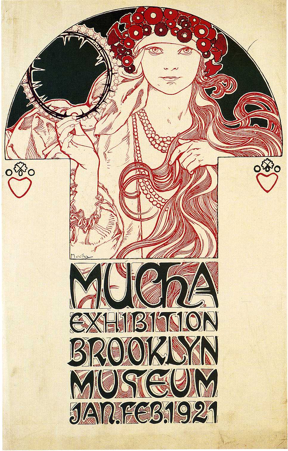
Alphonse Mucha’s “Poster for the Brooklyn Exhibition” (1921) is both a homecoming and a new departure. Created to announce his solo show at the Brooklyn Museum, the sheet distills three decades of invention into an image-and-letter symphony that could stop pedestrians at a city block’s length and still reward the close stare of a gallery visitor. A single woman—part Slavic maiden, part modern icon—rises within a half-round arch, her hair unfurling into arabesques while one hand lifts a circular circlet that doubles as a halo and a designer’s compass. Below her, a monumental block of lettering—each word a little architectural chamber—spells the occasion with a rhythm that feels both ancient and future-leaning. Reduced to a palette of red, black, and warm paper, the poster is a lesson in clarity: how to advertise an exhibition and, at the same time, to advertise a way of seeing.
Historical Moment and Purpose
The poster belongs to a precise moment. By 1921 Mucha had largely finished the most strenuous years of The Slav Epic and had helped usher a new Czechoslovak nation into symbolic life through murals, bank notes, and civic projects. In America, his reputation as the magician of Art Nouveau had never quite faded, and the Brooklyn Museum show offered U.S. audiences a chance to meet his mature work. Advertising that exhibition meant bridging past and present: reminding New Yorkers of the spellbinding line they knew from Paris while introducing the leaner, more deliberate language he forged for national allegory. The poster accomplishes both ends. It is recognizably “Mucha,” yet stripped of decorative excess in favor of signal and structure—perfect for a city street where attention is brief and background noise relentless.
Composition as a Modular Instrument
The sheet is organized like a composer’s score. A half-round at the top holds the figure, its curved edge echoing both the circlet in her hand and the rounded beads of her headdress. From that arch descends a rectilinear shaft that frames her torso and creates a strong vertical, almost like the stem of a key. Beneath, a stacked block of hand-drawn type occupies the lower third, each word set within its own compartment. The overall silhouette reads like a T-shaped monument planted on an expanse of unprinted paper. This modularity serves function—image first, information second—while allowing a viewer to register the whole in a heartbeat and then descend into details at leisure.
The Figure as Embodied Invitation
Mucha’s central figure is not a portrait of a celebrity; she is the personification of the exhibition’s promise. Her face meets the viewer with steady, luminous attention. A wreath-like cap studded with circular forms frames her brow, and strings of beads cascade over her dress, a visual echo of the cascades of hair that flow to the right. The raised hand presents a thin circlet whose edge bristles with tiny points. Read literally, it could be a metal hoop or a fragile glass ring; read symbolically, it becomes a portable halo, a designer’s stencil, or a moon seen in daylight. By having the figure hold the ring rather than wearing it, Mucha transfers sanctity into agency: inspiration is something grasped and used, not merely bestowed.
Hair, Ornament, and the Memory of Art Nouveau
The strand-by-strand tracery of the hair is a signature from the poster years. Yet here the tendrils are disciplined into larger currents that interlock with the rectangular frame around the figure. They are not mere embellishment; they are lines of force that connect the upper image to the typographic block below. The circular motifs in the headdress and necklace further knit the figure to the poster’s geometry, repeating the roundels of the circlet and the rounded bowls of the letterforms. Through these echoes Mucha turns ornament into structure: a pattern you can feel from across the street before you can name it.
Color, Contrast, and the Three-Ink Economy
The palette is austere and brilliant. Black provides contour, shadow, and the dense mass of the letters; red carries warmth, energy, and cultural flavor; the paper itself supplies the third tone, a creamy field that glows like parchment. With so few inks Mucha generates astonishing variety. The hair’s interior is hatched in red to produce volume without gray; jewelry and lips receive the same note, making a few small accents carry the emotional temperature. The expanse of unprinted paper operates as silence in a musical phrase, allowing the figure and the text block to ring. This limited palette isn’t only aesthetic; it is practical lithographic wisdom, reducing cost while increasing legibility.
Line Quality and the Intelligence of Contour
Mucha’s line has always been a form of speech, and here it speaks with exquisite economy. The contour of the face is uninterrupted, as calm as a horizon; sleeves and necklaces are indicated with judicious breaks that let the paper breathe; the hoop’s bristling edge is drawn with saw-tooth precision, a different dialect of line that signals material change. Inside the hair, parallel sweeps and small eddies create a tide that moves the eye toward the title, so the composition reads not only left to right but also top to bottom. That conversational line—firm yet lyrical—is what made Mucha’s advertising irresistible two decades earlier; in this poster it gains a new authority, stripped of frosting and tuned to clarity.
The Hand-Lettering as Architecture
The lower block is a tour de force of custom lettering. Each word is housed in its own rectangle, with black letterforms counterpoised against scarlet hatchings that fill the inner spaces of bowls and counters. The letters themselves merge Roman clarity with Slavic flavor: wide shoulders, rounded terminals, and unusual ligatures give the words a personality that is simultaneously classical and regional. This is not typography chosen from a printer’s case; it is drawing. Mucha uses the weight of the word “MUCHA” as a keystone, then steps down through “EXHIBITION,” “BROOKLYN MUSEUM,” and the date with subtle shifts in scale that maintain balance while guiding reading order. Information becomes ornament, ornament becomes structure, and structure becomes memory—you see the words even before you read them.
Symbolism and Cultural Texture
Mucha’s poster women are rarely neutral. This figure wears visual cues of Slavic identity: the studded headband recalls folk headdresses; the strings of beads are a familiar festive adornment; the embroidered suggestion at the sleeve’s edge nods to regional textiles. Flanking the central shaft, two small heart-and-rosette devices punctuate the empty field like protective amulets. None of this tips into ethnographic costume. Instead, the cues provide a gentle cultural accent—enough to tell an American passerby that the exhibition concerns a European master with a distinct heritage, and enough to tell Czech viewers abroad that the artist carries home with him.
The Halo-Hoop and the Designer’s Metaphor
The ring the woman holds is the poster’s most enigmatic prop. Its pointed rim could be read as a thorny crown, a star-rimmed moon, a jeweler’s circlet, or a lithographer’s template. All interpretations are fertile. A halo aligns her with saints and muses, connecting sacred iconography to modern design. A tool aligns her with the practical, making creativity a craft rather than a visitation. By keeping the ring translucent and by letting it overlap the arch, Mucha uses it as a hinge between image and frame, idea and execution. It is, in a sense, the exhibition itself: a device for seeing.
Negative Space and the Drama of Restraint
Perhaps the most radical aspect of the poster is its reliance on silence. The margins are vast. In a city poster of the 1890s, empty paper would have seemed wasteful; in 1921 it reads as confidence. The emptiness throws the figure and text into relief, increases legibility from distance, and modernizes the sheet by rejecting frills. That negative space also invites the museum or a passerby to imagine their own participation, as if the poster offered a blank page on which the city could write the story of its encounter with Mucha.
Function on the Street and in the Museum
Good posters work twice: at speed and at rest. At speed, this sheet registers as a bold tricolor image crowned by a face and undergirded by blocky words—instantly associated with the name “MUCHA,” which occupies pride of place. At rest, it becomes a map of micro-decisions. One notices the red hatching inside letter counters, the change of line weight around the hoop, the way a bead strand doubles as a guide toward the date. The poster thus promises the same experience as the exhibition: a sudden recognition followed by the pleasure of inspection.
Dialogue with American Modernism
In the United States of the early 1920s, graphic design was leaning toward streamlined forms that would culminate in Art Deco. Mucha’s poster converses with that shift. The disciplined geometry of the text block, the reduction of palette, and the preference for silhouette over modeling all anticipate Deco’s crispness, even as the hair and the organic rings retain the sinuous life of Art Nouveau. Rather than appearing old-fashioned, the sheet demonstrates how a master of the previous era could tune his voice to the new urban tempo without losing accent.
Craft, Lithography, and the Trace of the Hand
The poster’s means are as compelling as its ends. Stone lithography favors drawn line and flat color; it acknowledges the hand in the very grain of the ink. Mucha exploits this with evident joy. The red hatching within letters shows the crayon’s drag; the black outlines vary subtly with pressure; tiny irregularities in the beads keep them human. In an age when advertising was beginning to migrate toward standardized type and photoreproduction, this hand-made quality would have read as luxury and authenticity—appropriate for an exhibition that promised original drawings, paintings, and prints.
Continuities and Departures from the Paris Posters
Fans of the famed theater posters will recognize old friends: the commanding female, the circular halo or medallion, the hair that becomes ornament, and the integration of title with frame. Yet several departures mark the poster as late Mucha. The background remains largely unpatterned; the color range is austere; and the lettering, while decorative, carries information with a firmness that refuses to be overshadowed by the figure. The sheet is less narrative than emblematic. It gives New York a distilled Mucha, a pocket edition after the folio of the 1890s.
Reading Order and the Choreography of the Eye
The poster guides the eye with choreographic skill. The bright face inside the dark arch arrests attention first. The hand lifting the hoop directs a glance to the left, where the circular rim echoes the arch and returns the gaze to the center. Hair currents sweep rightward and downward until they meet the first line of type, “MUCHA.” From there the stacked words descend like steps to the date. Even the small heart-devices at left and right act as peripheral beats that keep the composition from collapsing inward. Nothing is accidental; every mark participates in the poster’s dance.
The Voice and Personality of the Letterforms
Spend a moment with the letters and they begin to speak. The A’s lean with subtle flare, the S’s curl with almost vegetal vitality, the U’s open their arms to catch the red hatching like small baskets. The words are not passive labels; they are chorus. Mucha uses internal hatching not merely as fill but as wind, animating the letters as if the same breeze that moves the hair also ripples through the date. This empathetic relationship between image and word is a hallmark of his best work and a reminder that, for Mucha, lettering is not a separate craft from drawing but the same craft under another name.
Cultural Messaging and the Image of the Artist
The poster is ostensibly an advertisement for an exhibition, but it also advertises a persona: Mucha as an artist who unites craft, culture, and clarity. The Slavic accents claim heritage without chauvinism; the modern typographic block claims contemporaneity without imitation; the confident emptiness claims self-assurance without arrogance. For a public who knew him from the bohemian glow of fin-de-siècle Paris, the sheet updates the brand: here is the master reborn as a statesman of line.
Influence and Afterlife
Designers return to this poster for lessons: how to balance figure and type, how to let negative space do work, how to generate richness from a three-ink economy, how to braid cultural specificity into universal legibility. Its strategies can be traced forward into Art Deco programs, WPA posters, and even contemporary branding that prefers custom type and reductive palettes. The poster’s longevity comes from its dual success as art and instrument; it looks beautiful on a wall and once looked perfectly at home on a Brooklyn street.
Why the Poster Still Feels Fresh
A century later, the sheet feels contemporary because it treats attention as precious. It does not shout; it focuses. It trusts restraint, celebrates drawing, and turns information into experience. The woman’s gaze remains level and human; the ring remains a riddle that design can solve; the letters remain architecture you can walk through with your eyes. In distilling identity and invitation into a single, memorable emblem, Mucha achieved what all great posters attempt: to make time stop for a moment so that seeing can begin.