Image source: wikiart.org
Historical Moment And Why This View Matters
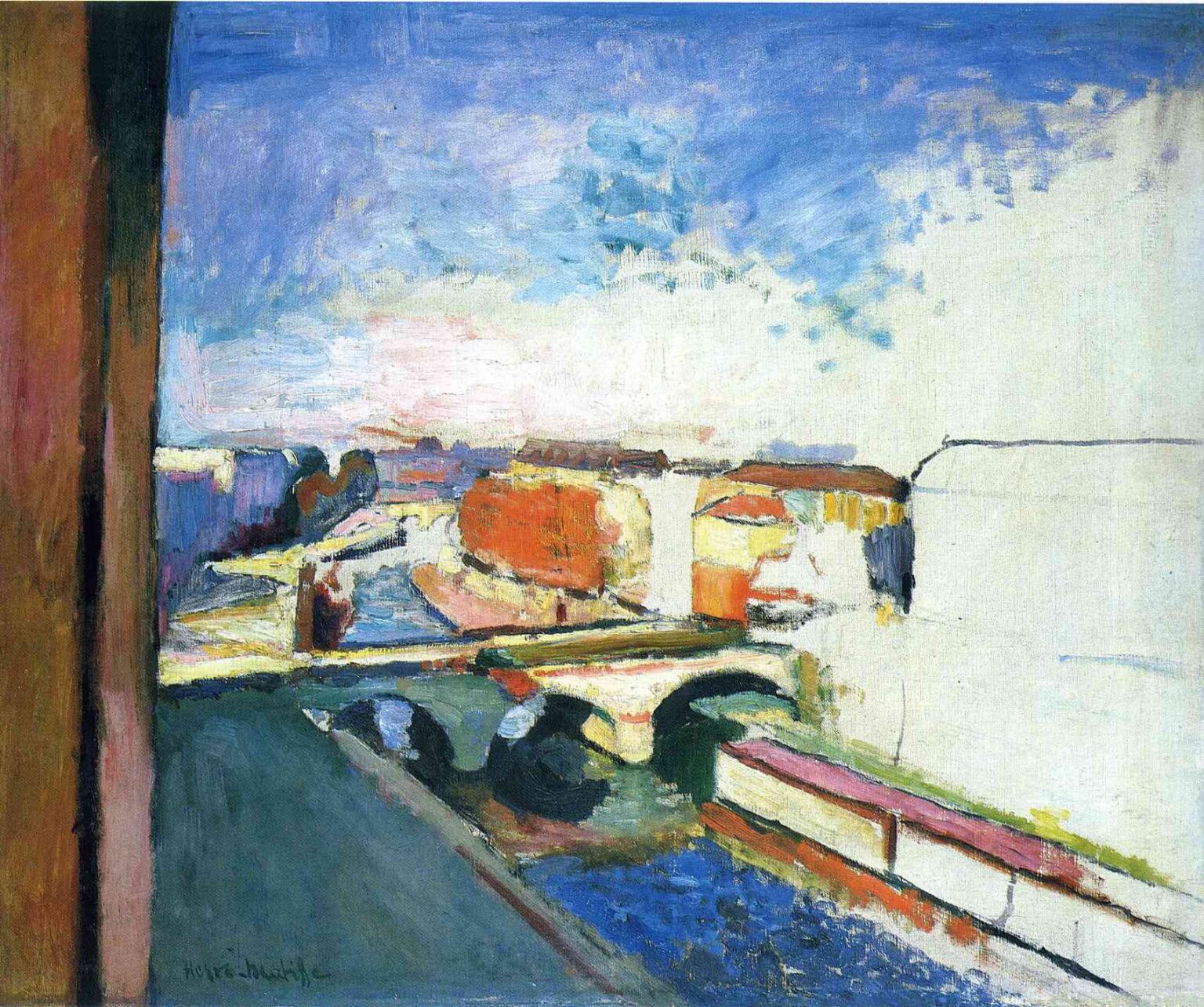
Henri Matisse painted “Pont Saint Michel in Paris” in 1900, at the cusp of his transformation from academically trained painter to the architect of modern color. He was living close to the Seine, studying Cézanne’s constructive planes, absorbing the decorative flatness of the Nabis, and testing how much of a city could be rebuilt with color and edited shapes rather than painstaking detail. This bridge picture captures that pivot with uncommon candor. It recognizes the bridge, quays, barges, and roofs of central Paris, yet it treats them as elements in a larger experiment: can a cityscape be held together by a few tuned chords of color, daring cropping, and expanses of untouched ground that function like light itself?
A Window Onto The Seine
The vantage is elevated, almost certainly from a studio window. At the far left a warm, vertical slab reads as a window jamb, bluntly admitting the painter’s position and anchoring the space. From this perch the Pont Saint-Michel spans the middle ground, its two dark arches cutting into the river like ellipses. The river runs diagonally from lower right toward the distance; a wedge of quay carries the eye to the bend; buildings gather in compact blocks of orange, cream, and rose. Rather than an eyewitness topographical report, the scene is a plan of forces: water flowing, streets streaming, and light dilating across the air of Paris.
Composition As Bold Asymmetry
The first structural decision is audacious. Nearly the entire right half of the canvas is left extremely light, with large passages of unworked ground and the faintest sketched outlines of a façade. Opposed to that broad reserve, the whole city compresses into the left and central bands. The bridge forms a light plank that hinges the field together. That dialogue—compressed city versus expansive interval—creates a modern tension between what is there and what is allowed to remain potential. The left window-jamb, the central bridge, and the right reserve act like three notes in a chord: vertical, horizontal, and open.
Color Architecture And The Prelude To Fauvism
Matisse organizes the picture with a high-key palette that already anticipates his Fauvist language. The sky is a cool, elastic blue scumbled with white, spilling light down the riverside buildings. The bridge and quays are creamy stone that reads as illumination more than masonry. The blocks of architecture along the island are pitched in oranges and pinks, not as local bricks but as warm counterweights to the sky. The river is a saturated blue stitched with darker notes near the arches, and along the lower right the embankment is drawn with ribbons of crimson and yellow that act like underpainting but also like intentional accents. Black is almost absent; where darker values occur—in the arches, in the narrow shadows—they compact energy without deadening surrounding hues. Everything is relational: each color exists to keep its neighbor alive.
The Expressive Use Of Reserve
The large unpainted or thinly painted area at the right is not neglect; it is strategy. It behaves as the brightest value in the painting, an open plane of atmosphere that throws the built city into relief. The reserve also acknowledges the canvas as a material surface and declares that the illusion of space will be achieved with the fewest means necessary. That decision aligns Matisse with the Nabi taste for decorative flatness and with Japanese printmaking, where untouched paper often stands for the highest light. It is also a rehearsal for his later interiors, where wide fields of unmodulated color carry the weight of the scene.
Drawing Through Abutment Rather Than Line
The picture is drawn almost entirely by masses meeting, not by hard contour. Edges occur where the blue of river pushes against the cream of the bridge, where the orange of buildings finds the blue of sky, where the greenish deck joins the dark ellipses of the arches. Lines appear only as quick indications: a faint roofline on the right, a seam along the parapet, a few strokes to anchor barges. This is construction by adjacency—the Cézannian lesson translated into an urban key—where color patches do the work of both modeling and outline.
Light, Weather, And The Breath Of The Sky
The atmosphere suggests a bright day with scudding cloud, a condition that erases theatrical shadow and makes the city read as a set of pale, lit planes. Matisse paints the sky not as backdrop but as a living participant in the composition, laid in with mobile strokes that keep the upper half breathing. That soft, continuous light explains the painting’s reluctance to carve dark shadows and its preference for regulating temperature—cooler blues in water and distance, warmer creams and oranges for stone and roofs—to evoke depth.
Space Compressed Into Readable Bands
Depth is there—bridges recede, water narrows, the far horizon lightly locks the city to the sky—but recession is kept deliberately shallow so that the surface remains a pattern. The bridge sits high on the picture plane, the far bank becomes a band, and the large reserve denies any temptation to tunnel into the distance. The result is a Paris that can be both entered and read at a glance, like a map. This oscillation between space and surface will become a signature Matisse effect.
Rhythm And The City’s Pulse
The painting beats with urban rhythm. The arches act as steady drumheads in the center. The diagonal quay carries the gaze like a procession. The long streamline of the river is a slow-moving belt; the little blocks of buildings are syncopated notes along its edge. Even the window jamb plays a role, holding time at the left edge like the downbeat that sets the measure. You follow these cues in a loop—down along the jamb, across the bridge, into the warm island, out toward the bend, back along the reserve—and in that circulation you feel the city’s daily pulse without a single face being described.
Materiality And The Speed Of Looking
Matisse lets the paint register his pace. The sky is thinly scumbled so underlayers breathe through. The river is thicker and dragged in short pulls that mimic reflected light. The bridge parapet and the edges of roofs receive firmer, higher-body strokes to give them authority. Elsewhere, paint is allowed to be sketchy, even raw, especially in the right reserve where a few wiry marks suffice to suggest a façade. The difference in thicknesses—fat against lean, dragged against swept—becomes another tool for distinguishing kinds of matter while keeping the whole unified.
A Dialogue With Impressionism And Post-Impressionism
The subject and daylight align with Impressionism’s urban sensibility, but the method departs from Impressionist shimmer. Instead of tiny broken touches that imitate retinal vibration, Matisse builds with blocks and bands. The closer kin is Cézanne, whose principle of constructing volume through color planes is audible in the bridge, quays, and houses. From Gauguin and the Nabis he borrows the courage to let large areas of unmodulated color carry the scene and to assign a decorative role to negative space. Yet the temperament is distinctly his: steadier, harmonizing, and already trusting color to do structural work.
The Bridge As Modern Motif
The Pont Saint-Michel is both practical and symbolic. It joins the Left Bank to the Île de la Cité and organizes flows of people and goods. By painting it not as an isolated monument but as a platform within a working urban fabric, Matisse asserts an allegiance to the poetry of the everyday. In pictorial terms the bridge is also the hinge that binds the composition. Its pale deck compresses the field into upper and lower bands; its arches concentrate value contrast exactly where the painting needs ballast. The bridge connects banks, and it connects colors.
Negative Space As Meaning
The right-hand expanse demonstrates that emptiness can be expressive. It reads as a sheet of glare, as fog burned off by midday, and as the visual quiet that lets us hear the rest of the chord. It also stages a philosophical shift: painting does not have to fill every inch to be complete. Leaving space can be truer to how the eye actually experiences a city—glance, concentrate, leave rest unresolved—than a catalogue of details. That belief will underwrite much of Matisse’s subsequent invention.
Human Presence Without Anecdote
No figure is described, yet human life saturates the view: the route of the quay implies walkers, the bridge invites crossings, the barges and embankments presume labor. By refusing anecdote, Matisse protects the surface from narrative clutter and focuses attention on the shared rhythms of a city. The people exist as expectation and motion rather than as portrait, which feels closer to looking from a window where one reads patterns more than individuals.
Season And Weather Encoded In Palette
The red-orange bar of buildings and the relatively low, milky sky suggest a cool season with bright air—early spring or autumn. The palette translates that climate into feeling without resorting to illustrative props. Warmth collects in the island’s architecture; coolness firms in the river and sky; the high key keeps the whole crisp. Rather than copying the weather, Matisse builds an equivalent for its sensation.
Comparing Variants Of The Pont Saint-Michel
Matisse painted this bridge several times around 1900. Some versions present a mauve sky and wine-dark arches, others a hazier opalescence. This canvas is among the most radical because of the audacious reserve at right and the elevated chroma in sky and water. The differences reveal a method: fix the motif, vary the color chords, and watch the city’s temperament change. The series becomes a workshop where he learns that color relationships, not meticulous drawing, hold the most power.
How To Enter The Picture As A Viewer
The painting rewards a sequence of attention. First, let the big structure register: jamb, bridge, reserve. Next, sweep the sky and feel how its cool blue spills onto the edges of roofs. Drop to the river and trace the thickened strokes near the arches, then follow the diagonal of the quay to the orange island. Finally, turn to the right-hand field and notice how a few thin lines do the work of entire buildings. Step back until these parts lock into a single, lucid harmony. In toggling between near and far, you re-enact the painter’s own process of testing and tuning.
The Decorative Ideal Emerging From Observation
Even before the famous scarlet interiors, Matisse is already thinking in terms of an orchestrated surface where each area plays a role in the whole. The sky is a quiet blue ceiling; the city’s orange band is a warm middle register; the bridge is a bright hinge; the water is the cool bass; the reserve is a sustained high note of light. The result is a balanced chord that remains faithful to a specific place. Decoration here is not pattern for its own sake; it is the means by which reality becomes intelligible.
Material Truth And The Ethics Of Economy
There is an honesty in how the picture shows its making. You can see the raw canvas in places, the swift bristle marks, the corrected edges. Rather than hide those traces, Matisse lets them remain, trusting that clarity of relationships is more persuasive than polish. The ethic is economy: say only what the picture needs, and the scene will feel more real, not less. That ethic will guide him from this bridge to the blazing seaside of Collioure and, decades later, to the radical simplicity of the cut-outs.
Conclusion: A Bridge Between Observation And Invention
“Pont Saint Michel in Paris” stands as a bridge in more than name. It spans the distance between the Paris Matisse observed and the pictorial world he was inventing. It joins faithful site and bold surface, recognizability and abstraction, description and harmony. With a few chords of color, a daring reserve of light, and the confidence to omit, he turns a familiar urban vista into a modern construction that still breathes the air of a specific day by the Seine.