Image source: artvee.com
Introduction to the Artwork
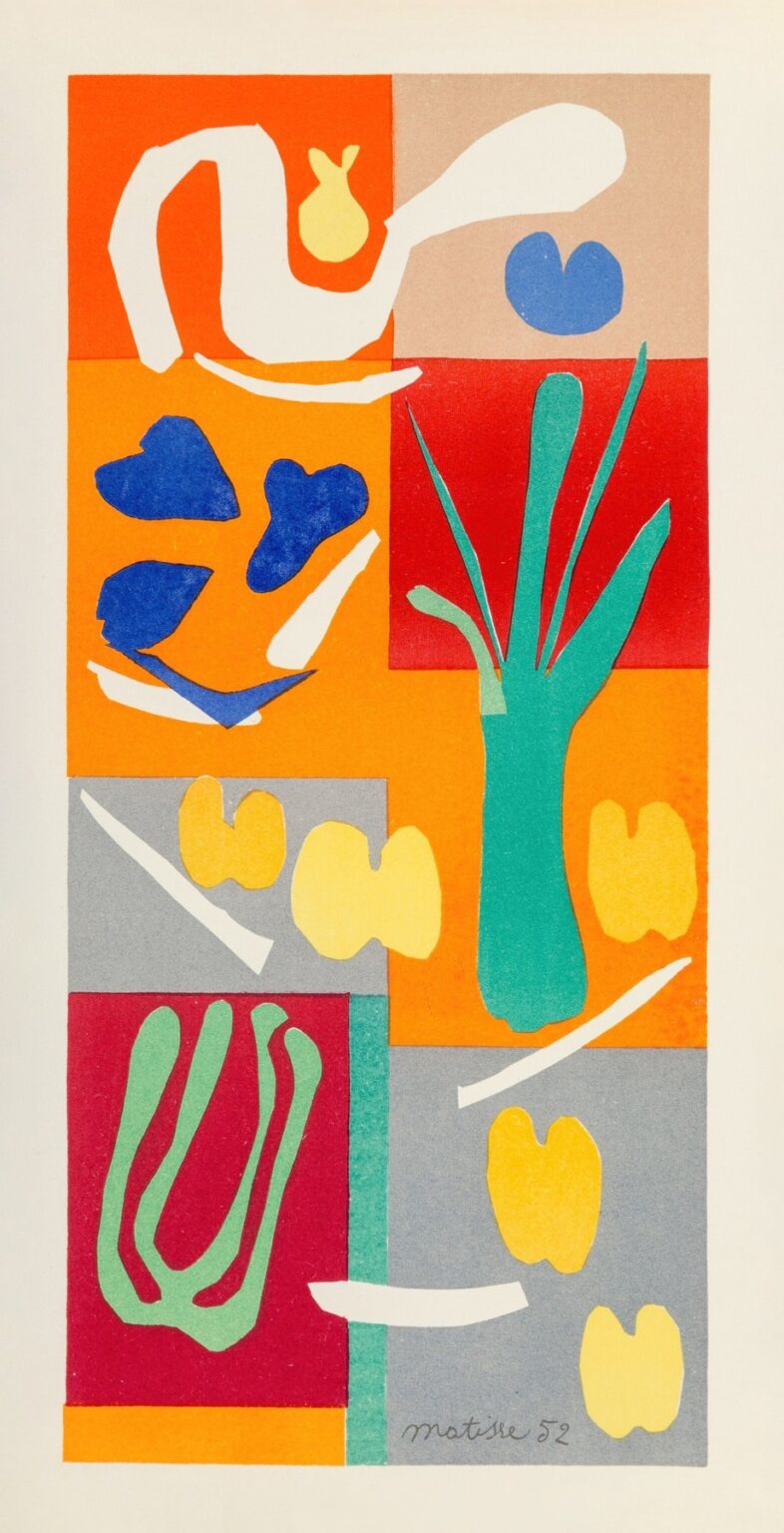
Henri Matisse’s “Plants” (1952) is a late cut-out that compresses his decades of thinking about color, rhythm, and the decorative into a single, lucid page. A column of stacked rectangles—orange, red, gray, and beige—forms a loose grid. Within and across these blocks, crisp silhouettes in white, ultramarine, citron yellow, mint green, and teal appear: a coiling frond at the top, blue petal-shapes that drift like leaves in a breeze, a green vase that sprouts narrow blades, seed-like yellow pairs, white slips that read as clipped stems, and at the bottom a large, succulent-like form. Everything is flat, bright, and immediate. Nothing is modeled or shaded; the drama comes from the collision of cut edges and saturated fields. “Plants” feels at once like a page torn from a gardener’s dream and a small stained-glass window held up to Mediterranean light.
1952: Matisse’s Late, Radical Clarity
By 1952 Matisse had turned a convalescent’s limitation into a new method. Working in Nice and Vence, often from bed or an armchair, he painted sheets of paper with gouache, then cut directly into those colored grounds with scissors—“drawing with scissors,” as he called it. Assistants pinned the shapes to walls so he could see and rearrange them at full scale. Many compositions, including “Plants,” were then translated into pochoir (hand-stenciled) prints to preserve their sharp edges and matte color. The late cut-outs are not detours; they are the logical outcome of lifelong concerns: the primacy of color, the authority of contour, and the ambition to make the decorative the structure of the picture rather than an afterthought.
“Plants” comes shortly after the design of the Chapel of the Rosary in Vence (consecrated 1951), whose glowing windows and pared-down outlines share its spirit. It also follows the 1947 portfolio Jazz, where silhouettes of acrobats and foliage established a grammar of flat color and rhythmic edge. In 1952 that grammar is fluent; “Plants” reads like a sentence spoken by a master—simple words, perfect cadence.
Technique and the Intelligence of the Edge
Everything in “Plants” depends on the edge. Because gouache saturates paper with an even, velvety color, the cut produces a line that is simultaneously outline and shape. The scissor stroke varies like a brush: some turns are brisk and squared, others softly rounded; occasional inner notches announce a pivot where the blades changed direction. These micro-events give the forms personality without any need for internal detail.
The pochoir process honors those edges. Rather than a mechanical half-tone or offset, pochoir forces color through hand-cut stencils, preserving the crispness of the original collage and the slightly different textures of each block. That human method suits a composition whose power lies in its felt exactness: the yellow seeds don’t just sit in rectangles; they lock into them with the pleasure of a puzzle piece clicked home.
The Grid and the Garden
Matisse organizes the page as four stacked ranks of panels, roughly two across, but he refuses strict symmetry. A vertical teal strip runs down the center like a stem or path, anchoring the layout while preventing it from hardening into a checkerboard. The grid behaves like a trellis; organic forms climb over it, through it, and around it. In the top row a coiling white ribbon rolls across an orange field and into beige; in the second row a spray of blue leaves floats opposite a vase whose green fronds shoot upward; in the third and fourth rows yellow pairs and white clippings scatter across gray blocks while a large red niche holds a mint-green succulent.
Because the grid reads clearly from a distance, the eye can travel quickly without getting lost. Closer in, the slight mismatches of panel edges and the angled placement of forms keep the design alive—never mechanical, always growing.
Color: Complementary Heat and Calm
“Plants” thrives on complementary chords. The warm orange and red blocks radiate heat; the gray and beige panels cool the composition and let the colors breathe. Against those fields, three “actors” play their parts. Ultramarine shapes supply a saturated, sea-cooled counterpoint to the oranges. Mint and teal greens provide vegetal presence and connect the scattered motifs into a botanical family. Citron yellows arrive as fruit and seed, carrying light without whitening the palette. White itself appears as an active color—clip, stem, flash—rather than a neutral background.
The harmonies are not random. Where orange or red dominates, Matisse places blue or white to keep temperature balanced; where gray sits, he drops yellow or mint to keep the panel from going quiet. This tuning explains why the page feels bright but never shrill, decorative but not sugary. Color does the structural work drawing once did.
Motifs: Leaves, Stems, Seeds
Each motif is a type rather than a specimen. The coiling white form at the top suggests a frond unfurling, a botanical version of the arabesque Matisse pursued in drawings. The cluster of blue pieces reads like four heart-shaped leaves caught mid-fall. The green “vase” at upper-right is the only explicit container in the composition; its splayed blades puncture the red field like reeds breaking water. Across the middle bands, paired yellow lozenges repeat with small variations—seeds, petals, fruit halves—giving the work a steady pulse. The slender white slivers scattered between them act as pruned stems or glints of sun. At bottom left the large mint form swells into a succulent-like mass, three inner lobes nested within an outer outline; it is the composition’s weight, a counterbalance to the airy cuttings above.
Because the shapes are types, they can be reconfigured in the mind: stems rotate into waves, seeds into petals, leaves into fish. The picture remains firmly about the natural world, yet it never traps us in botany.
Rhythm and Reading Path
The eye moves through “Plants” as if walking down a garden path. Enter at the top left, where the white coil initiates a long, lateral gesture; cross to the beige block with its floating bud; drop to the blue leaves on orange; pass the green vase on red; step down to the gray panels with their yellow pairs; and finish at the base, where the mint succulent and scattered whites bring the tempo to a slower, grounded close. The teal central strip is the spine of this movement, the reassuring vertical that holds the steps together.
This choreographed path echoes the musical pacing of Jazz and the procession-like rhythms of Matisse’s chapel windows. The picture is static only in the sense that it is complete; within, it is all motion—sway, sprout, scatter, settle.
Negative Space as Living Matter
In the cut-outs, empty space is never an afterthought. The beige and gray panels are not “neutral” the way primed canvas can be; they are fully chosen colors with their own temperatures. Within the colored leaves and stems, the uncolored paper reads as interior air. The openings hole-punch the forms so they breathe and bind to their neighbors. For instance, the voids inside the mint succulent rhyme with the white clippings nearby; the space around the blue leaves is curated just as carefully as the leaves themselves, preventing the panel from crowding.
This is Matisse’s late metaphysics of looking: reality is not the object alone but the relation between object and interval. In “Plants” the intervals are as eloquent as the leaves.
From Studio Wall to Printed Page
“Plants” also shows how Matisse converted his wall-scale practice into portable works. The original pinned collage would have carried the tactile depth of stacked papers and the incidental shadows cast by overlaps. In pochoir those shadows become color decisions: slightly darker reds near edges, greens chosen to sit forward or back. The editioned print therefore isn’t a compromise; it’s a translation. What the print loses in relief it gains in the unbroken brilliance of flat color—closer to stained glass, closer to how Matisse imagined light filling a room.
Dialogues with Other Late Works
This page sits comfortably beside La Gerbe (The Sheaf) of 1953, with its bursting bouquet of leaf forms; beside the Blue Nudes (1952), where positive and negative shapes interlock with similar economy; and beside Oceania, the Sky/Sea (1946), which scatters birds and fish across vast, monochrome fields. In each, the subject is distilled to a vocabulary of silhouettes, and the energy comes from how those silhouettes occupy and divide space. “Plants” is distinctive in its panel architecture: it places those silhouettes within a rectilinear scaffold, demonstrating that Matisse could reconcile the joy of growth with the calm of order.
The Decorative As Structure, Not Ornament
When Matisse spoke of the “decorative,” he meant a pictorial logic that achieves harmony across a surface. “Plants” is decorative in exactly that sense. The grid is the score; the motifs are the notes; color provides key and chord. Nothing is secondary; every block and leaf participates in the whole. That is why the work feels complete rather than embellished. It does not decorate a surface; it generates the surface.
Why “Plants” Still Feels Contemporary
The composition’s readability across a room, its intense but carefully tuned color, and its frank, handmade edges make it feel uncannily current. It predicts poster design, brand systems that use modules and icons, and the present taste for flat color with human irregularity left intact. Yet it remains unmistakably personal: you can sense the scissors turning, the hand choosing one curve over another, the pleasure of fitting parts together until the harmony clicks.
How to Look: Three Modes of Attention
First, take in the big chord: warm oranges and reds held by gray and beige, a cool green spine, white and blue accents. Second, attend to the intervals—how much space each leaf has to breathe, how yellow pairs align across panels, how a white clipping points you from one block to the next. Third, imagine the making: sheets of paper brushed with gouache, then the concentrated silence as a long curve is cut in one confident pass. In that reconstructed time you feel the work’s poise.
Feeling and Meaning
“Plants” is not a botanical lesson; it is a mood—sunlit, ordered, generous. The grid’s calm regulates the garden’s exuberance. The yellow pairs read like seeds and fruit, signs of abundance. The white clippings suggest care, pruning, selection—the work of cultivation. Perhaps that is why the page feels restorative. It proposes that attention and editing can produce joy, that clarity is not cold, and that a small field of color can hold an entire world of growth.
Conclusion: A Garden Composed to a Clear Key
Matisse’s “Plants” (1952) assembles a garden from nothing more than rectangles and silhouettes, proving how far a picture can go when color and edge carry the burden of description. The grid is trellis; the motifs are living; negative space is air; and the whole is tuned like a piece of chamber music—small in scale, inexhaustible in pleasure. It is a late work with early vigor, a cut-out that condenses a lifetime of lessons into a single, lucid page.