Image source: artvee.com
Introduction
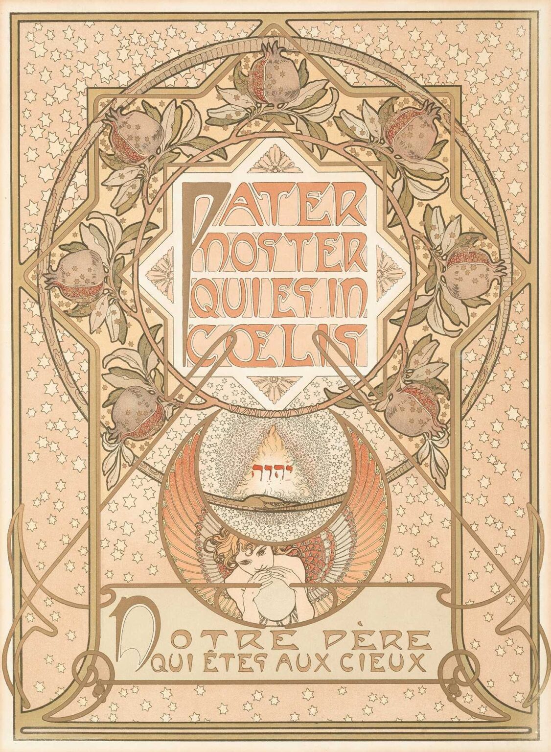
Alphonse Mucha’s Pater Noster (1900) stands as a remarkable fusion of religious devotion and Art Nouveau ornamentation. Rendered as a lithographic poster, this work presents the opening words of the Lord’s Prayer—“Pater noster qui es in cælis”—in a decorative framework that balances sacred text, symbolic imagery, and lush botanical motifs. At a time when Mucha was at the height of his creative powers, he expanded his repertoire beyond commercial advertising into spiritual and allegorical compositions. The poster measures approximately 76 × 56 centimeters and was published by the Parisian firm Champenois. Mucha’s Pater Noster reflects the artist’s deep engagement with typography, iconography, and the aspiration to elevate printed matter into objects of transcendent beauty.
Historical and Cultural Context
Created on the eve of the 20th century, Pater Noster emerges from the confluence of Europe’s religious heritage and the flourishing of the Art Nouveau movement. The late 19th and early 20th centuries saw a renewed interest in liturgical art, influenced by the Gothic Revival and Symbolist currents that permeated painting, poetry, and design. In France, the Dreyfus Affair and secularization debates intensified public discourse on faith and identity. Mucha, a Czech expatriate in Paris, responded by exploring themes of spirituality and the universal aspirations of humankind. His Pater Noster aligns with broader efforts to reconcile tradition and modernity: the sacred Latin text recalls medieval manuscript illumination, while the sinuous lines and botanical tracery affirm Art Nouveau’s forward-looking aesthetic.
Commission and Purpose
Unlike his commercial posters for theatre and products, Pater Noster was commissioned as a devotional art print rather than as direct advertising. Published by Champenois in 1900, it was intended for collectors of decorative prints and readers of Catholic and artistic journals. The piece served both as a visual meditation on the Lord’s Prayer and as a demonstration of art’s capacity to ennoble even the most familiar texts. Mucha’s design responds to the challenge of presenting sacred words in a form that invites contemplation without resorting to academic rigor. By marrying ornate typography with emblematic imagery, he created a print that could hang in private homes or small chapels as a focus for personal devotion.
Iconography and Symbolism
At the core of Pater Noster lies the Latin invocation “PATER NOSTER QUI ES IN CÆLIS” rendered in a stylized, geometric script. Surrounding this central text are layers of symbolic imagery: a ring of pomegranate blossoms, a halo-like star field, and a kneeling angel blowing a horn. The pomegranate, traditionally a symbol of resurrection and the Eucharist, frames the prayer as both a call to divine communion and promise of spiritual renewal. The star-studded background alludes to the heavens—“qui es in cælis”—while the angelic figure suggests the delivery of prayer to the celestial sphere. Together, these motifs encapsulate the aspirational and intercessory aspects of the Lord’s Prayer, conveying both humility and exaltation.
Composition and Spatial Arrangement
Mucha’s Pater Noster employs a concentric structure that guides the viewer’s gaze inward toward the sacred text. The outermost border features interlaced ribbon-like tendrils and leaf forms, creating a delicate frame. Within this, a dense field of cinque-pointed stars evokes the night sky, seamlessly transitioning into a circular band of pomegranate vines. The circular panel at center holds the prayer in octagonal cartouche, establishing a dynamic interplay of curves and angles. Beneath the text, the angel’s half-circle panel balances the composition, reinforcing the visual symmetry. Negative space is judiciously employed to prevent overcrowding, allowing the text and iconography to breathe. This meticulous spatial orchestration ensures that each element supports the others, culminating in a unified, harmonious design.
Use of Color and Light
Mucha’s color palette for Pater Noster is characterized by soft earth tones—muted ochres, gentle greens, and roseate highlights—punctuated by pale gold accents. The choice of subdued hues reinforces the work’s reverential mood, while metallic inks on the pomegranate seeds and star outlines introduce a subtle luminescence. Light seems to emanate from the prayer itself, with the angelic figure bathed in a pale glow that distinguishes it from the darker, celestial backdrop. The gradations of tone in the star field—from cream at the periphery to deeper salmon near the center—create an optical depth that suggests the veiled mystery of the divine. Mucha’s mastery of lithographic layering allows the inks to interact in delicate overlays, producing a gentle, glowing quality reminiscent of stained glass.
Line Work and Decorative Flourishes
Central to Mucha’s Art Nouveau style is his rhythmic, “whiplash” line, which animates the tendrils and floral motifs in Pater Noster. The pomegranate vines curl and loop with a sinuous grace, their stems traced in continuous, undulating strokes. The angel’s wings feature closely spaced, curvilinear feather patterns that echo the looping lines of the plant forms. These decorative flourishes contrast with the geometric precision of the central cartouche, highlighting the tension between organic vitality and structured formality. Line weight varies to emphasize hierarchy: thick outlines anchor the main motifs, while hairline strokes render fine details in petals and feathers. This modulation of line creates a visual vibrancy, drawing the eye along each ornamental curve in an unbroken, meditative journey.
Typography and Lettering Integration
In Pater Noster, typography is not merely an inscription but an integral decorative element. Mucha devised a bespoke letterform for the prayer’s words, blending angular strokes with rounded terminals that echo the surrounding floral arcs. Each letter fits within a hexagonal panel, itself nested in the octagonal frame, reinforcing the composition’s geometric harmony. The spacing of words—stacked in three tiers—ensures legibility while maintaining visual equilibrium. Mucha resisted conventional serifs, opting instead for simplified embellishments that resonate with the work’s spiritual intent. The letters’ pale hue contrasts with the warmer background, causing the prayer to appear to glow. By integrating text and ornament so closely, Mucha elevates the act of reading into an act of contemplation.
Lithographic Technique and Production
Producing Pater Noster required the coordination of multiple lithographic stones—likely seven to nine—to achieve its nuanced palette and precise registration. Mucha transferred his preliminary drawing onto limestone plates using greasy crayon and tusche, then collaborated with skilled printers to calibrate ink densities and color overlays. The use of a cream-toned wove paper enhanced the subtle interplay of inks, as the unprinted ground provided natural highlights. Given the work’s devotional purpose, print runs were likely limited, ensuring high quality control. Surviving proofs display the visible texture of crayon strokes in shaded areas, a testament to Mucha’s insistence on artisanal craftsmanship even within a mechanical printing process.
Reception and Critical Response
Upon its publication in 1900, Pater Noster attracted attention in both artistic and religious circles. Devotional art collectors valued its beauty and theological resonance, while design critics praised its innovative fusion of liturgical content and Art Nouveau aesthetics. Contemporary reviews in journals such as La Plume and Le Monde Moderne highlighted the work’s “harmonious balance of spirit and form,” noting Mucha’s ability to render sacred text with the same lyricism he applied to commercial commissions. The poster’s success encouraged publishing houses to commission similar devotional prints, contributing to a minor resurgence of religious-themed graphic art during the Belle Époque.
Place in Mucha’s Oeuvre
While Mucha is best known for his theatrical and commercial posters, Pater Noster occupies a distinctive niche in his body of work. It represents his explicit engagement with spiritual subject matter, predating his later Slavonic and allegorical series. The poster’s moral and aesthetic ambitions anticipate the epic murals he would later create in Prague, where he pursued grand narratives of national and spiritual renewal. Pater Noster thus bridges his commercial successes and his personal quest to create art that spoke to transcendent ideals. Its devotional purity and decorative sophistication underscore the versatility and depth of Mucha’s artistic vision.
Legacy and Contemporary Relevance
Over a century after its creation, Mucha’s Pater Noster remains a touchstone for designers and collectors interested in the intersection of religion and Art Nouveau. Original lithographs are held in major museum collections—including the Musée d’Orsay and the Art Institute of Chicago—where they are studied for their technical mastery and symbolic richness. Contemporary graphic artists reference the work’s seamless integration of text and ornament when crafting typographic posters and digital interfaces with spiritual or meditative themes. The Pater Noster poster also features in exhibitions on sacred art, illustrating how early 20th-century artists reimagined devotional imagery for modern audiences.
Conclusion
Alphonse Mucha’s Pater Noster exemplifies the power of design to transform familiar words into visual meditations. Through meticulous composition, luminous color, sinuous line work, and integrated typography, Mucha elevated the opening of the Lord’s Prayer into an object of contemplative beauty. Created at the height of the Art Nouveau movement, the poster stands at the crossroads of devotion and decoration, tradition and innovation. Its enduring appeal attests to Mucha’s belief that art—whether commercial or sacred—can touch the human spirit and inspire both aesthetic pleasure and profound reflection.