Image source: wikiart.org
Introduction
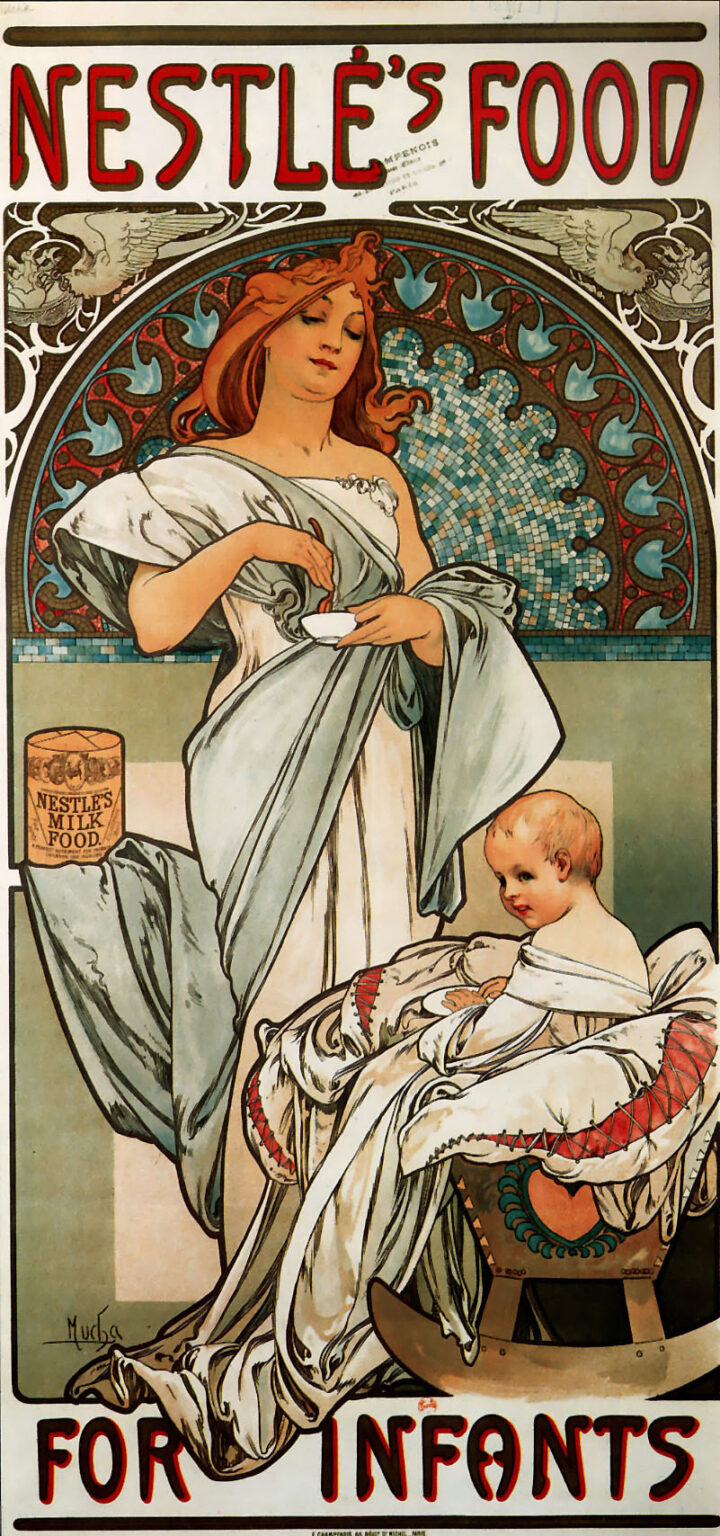
Alphonse Mucha’s “Nestlé’s Food for Infants” (1897) is an advertisement that behaves like a devotional panel. A serene young mother stands at the center, stirring a small bowl as she prepares an infant’s meal. A rosy child sits safely bundled in a rocking cradle, wide-eyed and satisfied, while the scene unfolds beneath an ornate arch set with a shimmering mosaic. Across the top and bottom, monumental red lettering proclaims the product: “NESTLÉ’S FOOD … FOR INFANTS.” Between those headlines, Mucha arranges tenderness, craft, and ornament so persuasively that the poster reads as a promise of modern care framed by timeless grace. It is one of the clearest demonstrations of how Art Nouveau could dignify the most practical goods by giving them a visual ritual.
Historical Moment
The late 1890s were the high tide of the Paris poster. Color lithography had matured; printers such as F. Champenois could deliver large, richly colored sheets in quantity; and public appetite for beautiful graphics was insatiable. Mucha, newly famous for his theatrical designs for Sarah Bernhardt, became the artist who could turn commerce into poetry. Milk foods and prepared infant cereals were comparatively new conveniences, marketed to urban families as reliable, hygienic solutions. “Nestlé’s Food for Infants” thus had to perform two tasks at once: introduce a product’s utility and reassure buyers that the most intimate act of feeding could be entrusted to modern manufacture. Mucha addresses both aims by joining contemporary domesticity to the visual language of sacred images.
Composition and Framing
The poster is constructed as a triptych compressed into a single panel. The main field is a tall rectangle capped by a semicircular halo. Inside that circle, a tessellated mosaic spreads like a firmament, bordered by a band of repeating lobes that suggest a Gothic arcade. The mother stands in front of this celestial disk so that her head and shoulders “enter” a sanctified space, while her flowing drapery drops into the earthly rectangular field where the child and the cradle rest. This spatial hierarchy gives the action a ceremonial clarity. Preparation happens at the human level; care is crowned by a larger, numinous order. The circular top and rectilinear bottom are threaded together by the mother’s long, diagonal sleeve, which slips behind the cradle and returns to the bowl, turning the whole design into a single continuous gesture.
Type as Architecture
Mucha’s lettering is inseparable from the picture. At the top, “NESTLÉ’S FOOD” is carved in tall, open capitals filled with cream and edged in red and black. The letters are weighty yet soft, their rounded corners echoing the curls in the mother’s hair and the scallops in the mosaic border. At the bottom, “FOR INFANTS” repeats the rhythm, closing the poster with a second architectural lintel. This typographic masonry turns the mother-and-child scene into a tableau installed between two cornices, as though the brand itself were the building that houses domestic nourishment. For a passerby in the street, the words read first; for the viewer who lingers, they become the frame that holds a narrative.
Mother and Child: Icon without Theology
The relationship between mother and child is the poster’s heart. Mucha avoids sentimentality by keeping both figures absorbed in their tasks: the mother mixes; the child accepts a shallow dish and plays at feeding. Their eye contact is indirect, yet an invisible thread connects the turning spoon to the expectant hands. The mother’s head tilts with a calm that feels practiced, and her face is almost meditative. This composure, together with the mosaic nimbus behind her, quietly echoes religious Madonnas while removing overt doctrine. The poster borrows the emotional authority of sacred art to endorse a secular promise: that this food will nourish with purity and care.
The Mosaic Halo and Winged Corners
Behind the mother’s head, Mucha paints a neobyzantine mosaic—little squares of blue, teal, cream, and umber that catch imaginary light. The effect is both decorative and symbolic. Mosaics evoke longevity and tradition; they also create a cool, hygienic atmosphere appropriate to a product associated with cleanliness and safety. At the upper corners of the arch, two winged figures—neither fully angels nor mere ornaments—lean inward. Their presence is a blessing made architectural, a way of saying that guardianship surrounds the act of feeding. The arch’s border of repeating lobes echoes the scallops of a shell, a classical sign of birth and nurture, reinforcing the poster’s theme without reducing it to a single emblem.
Drapery and Line
Mucha’s line is famously musical, and here it turns plain fabric into a visual lullaby. The mother’s gown falls in long, cool folds that ripple from shoulder to floor. The child is swaddled in a complicated wrap whose knotting and lacing create a second garden of curves and crossings. The cradle itself includes a heart-shaped motif, a little island of color and sentiment tucked into the woodwork. Contours swell and thin like well-phrased singing; there are almost no hard angles. That softness is a design decision with meaning: nourishment is not a mechanical act but a tender sequence of motions, and the line teaches the eye that tenderness.
Color and Atmosphere
The palette is calm: chalk whites, cool greens, pale teal, and touches of rust in the mother’s hair and the cradle’s ornament. Bright highlights come from the unprinted paper, allowed to shine in the folds of cloth and the glint of porcelain. Shadows are blue-gray, never heavy. This restrained atmosphere accomplishes three things. It reads clearly in the open air where the poster originally hung; it suggests hygienic cleanliness without sterility; and it keeps attention on the red brand name, which stands out like a seal. The dominant sensation is freshness—of milk, of linen, of morning light—exactly the climate a parent wishes for an infant’s food.
Product Placement and Trust
At the left, near the mother’s drifting sleeve, a cylindrical tin sits on a shelf with the label “NESTLE’S MILK FOOD.” The can is small but unmistakable, placed at the level of the mother’s waist where it enters the domestic choreography rather than competing with it. We see not a bottle but a tin—modern packaging that implies measured portions, economy, and safety from contamination. Mucha resists the urge to show pouring or cooking. Instead he concentrates on the moment of mixing, when a human hand completes the chain from factory to child. The poster’s logic is simple and persuasive: the product is reliable, and loving routine brings it to life.
The Rocking Cradle and the Child’s Posture
The cradle’s gentle arc is a design device and a symbol. Visually it repeats the poster’s great arch in miniature, so that the child rests within an echo of the mother’s halo. The rocker’s curve also implies motion—soothing, cyclical, sleep-ward—qualities parents associate with successful feeding. The child’s posture repays attention. Swaddled but upright, the infant holds a tiny saucer or spoon, a mimicry of the mother’s action that converts the scene into a lesson in care. Mucha avoids cherubic exaggeration. The baby’s head is slightly too large for the body, as infants’ heads are; the ear and cheek are meticulously observed; the glance is curious but not saccharine. The image respects the individuality of the child while placing that individuality in a rhythm of nurture.
Ornament with Meaning
Art Nouveau is often accused of excess, but in this poster ornament is functional. The mosaic suggests purity and tradition. The corner wings mark protection. The lace ties on the wrap read as a network of secure touchpoints. Even the decorative rings along the arch’s border perform like a chain of beats, quietly counting time the way a caregiver does—stir, test, offer; stir, test, offer. Mucha’s talent lies in embedding such meanings in forms that never feel allegorical or didactic. The design can be enjoyed as pure pattern, yet on repeated viewing it reveals a memory palace of care.
Printing Craft and Street Legibility
F. Champenois printed the sheet using multiple lithographic stones, each carrying a color pass. Mucha designed for this process with an engineer’s foresight. Large fields of pale tone reduce the risk of misregistration; the heavy black keyline keeps silhouettes crisp when seen at distance; the red headline, surrounded by cream, holds its intensity against city soot and glare. The subtle tessellation of the halo is a printer’s triumph, soft enough to be atmospheric from afar and precise enough to reward close inspection. Even the whites are handled with economy: much of the gown and swaddling is simply the paper’s own brightness, a choice that makes the poster light in both look and weight.
Comparison to Sacred and Domestic Imagery
If one places the poster beside Renaissance tondi of the Madonna and Child, the kinship is immediate: a central mother, a circular frame, a haloed zone of patterned ground, and an infant on a cushion. Yet Mucha recasts these elements in a secular key. Where saints display attributes, this mother displays a spoon; where altars hold relics, the shelf holds a tin. The shift is not cynical; it is culturally diagnostic. The Belle Époque was learning to understand household routines with reverence, not just obligation. By putting a modern brand where sacred instruments once appeared, the poster suggests that industry can be benevolent when it serves intimate life.
Gender, Work, and Modern Care
The mother’s dress is classical rather than contemporary, a deliberate choice that sidesteps fashion to present care as timeless. At the same time, her activity is unmistakably modern. She mixes a standardized product with a tool at hand; she works in a bright, clean interior; she stands confidently rather than kneeling or hovering. Mucha never reduces her to a decorative accessory; she is an operator of the home’s most essential task. The poster thus speaks not only to fathers and shopkeepers but, crucially, to mothers who would see in this image both an ideal and an ally.
The Viewer’s Path
Mucha choreographs the eye with quiet mastery. The gaze catches the red headline, drops into the cool disk of the mosaic, finds the mother’s downturned eyes, follows her spoon to the small bowl, slips along the sloping sleeve to the swaddled child, lingers on the rosy head, glides across the rhythmic ties of the blanket to the rocking curve, and then rebounds to the lower headline. From there it rises again to the product tin and closes the loop at the mother’s hand. This circuit is as soothing as the cradle’s motion, repeating until the message is memorized: brand, preparation, feeding, contentment.
Resonance and Afterlife
“Nestlé’s Food for Infants” has outlived its commercial season to become a touchstone of graphic design. It shows how an advertisement can honor its audience by appealing to culture, craft, and feeling rather than to cheap shock. Designers continue to learn from its integration of type and image, its disciplined palette, and its way of turning product demonstration into a story told by figures. In an age of digital glare, the matte grace of the lithograph and the humane tempo of its line feel newly restorative.
Conclusion
Alphonse Mucha’s poster aligns a brand with a vision of care so complete that the two seem inseparable. The mother’s spoon, the infant’s dish, the rocking curve, the mosaic halo, the protective wings, and the balanced typography compose a visual lullaby in which nourishment becomes ritual. It is not nostalgia but confidence that animates the image: the belief that modern life, when shaped by attention and good design, can cradle the most vulnerable. Few advertisements have managed to be at once so persuasive and so tender.