Image source: artvee.com
Introduction to Mossant
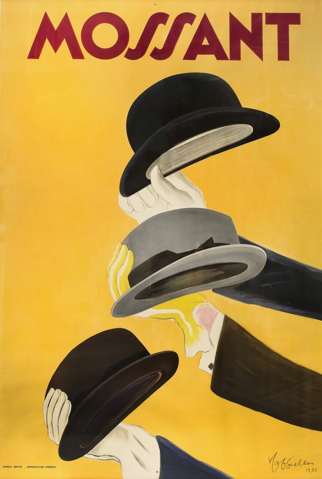
Leonetto Cappiello’s 1938 poster for Mossant stands as a masterclass in mid-century advertising art. At first glance, the composition is both simple and striking: three disembodied hands delicately present three designers’ hats against a flat, vibrant yellow field. The seamless arrangement of these elements speaks to Cappiello’s belief that a single, bold motif could communicate brand essence more effectively than complex narrative scenes. Here, the hats themselves become icons, elevated by the elegant choreography of the hands and the arresting backdrop. This analysis explores how Cappiello’s late-career genius distilled Mossant’s identity into a visually arresting, memorable image that continues to influence graphic design and branding over eight decades later.
Brand History of Mossant and the Importance of Hat Advertising
Founded in the mid-nineteenth century, Mossant quickly earned a reputation as one of France’s premier hatmakers. By the 1930s, Mossant hats—particularly the classic bowler and fedora styles—had become symbols of refinement and urbanity. In an era when headwear was an indispensable element of a gentleman’s wardrobe, successful hatmakers invested heavily in eye-catching posters to differentiate their products. Cappiello’s collaboration with Mossant capitalized on this trend by presenting the hats not as mere accessories but as desirable objets d’art. The poster underscores the brand’s French pedigree and its commitment to superior craftsmanship, while inviting the viewer to imagine the tactile pleasure of touching and donning a perfectly formed hat.
Leonetto Cappiello’s Artistic Evolution and Late Career
By 1938, Leonetto Cappiello was in the autumn of his career yet continued to innovate within the poster medium. Having begun his work in the 1890s, Cappiello had pioneered a move away from ornate, text-heavy advertisements toward stark, playful imagery. Early successes—such as his iconic depictions of lively devils, elegant ladies, and anthropomorphic objects—laid the groundwork for a visual vocabulary that emphasized character and immediacy. In Mossant, he refines these principles to their essence: removing any extraneous detail and focusing on the interplay between object and gesture. This poster reveals his enduring commitment to bold silhouettes, flat planes of color, and the emotional resonance of simple, unexpected juxtapositions.
Visual Composition and Layout
The structural elegance of Mossant hinges on its diagonal axis. From the lower left to the upper right, the three hands and corresponding hats ascend in a measured sequence. This upward trajectory suggests elevation—both literal, as the hats rise, and metaphorical, implying the wearer’s social ascent. The hands, depicted in pale, almost ghostly tones, stand out crisply against the golden background, guiding the viewer’s eye along the implied path. Negative space surrounds the elements, ensuring each shape is read without distraction. Cappiello positions the brand name “MOSSANT” in large, burgundy letters at the very top, balanced by his signature and the year at the bottom right. This framing encapsulates the visual narrative within a contained, harmonious whole.
Color Palette and Contrast
Cappiello’s chromatic strategy in Mossant is deceptively minimalistic. The bright yellow background dominates the composition, conveying warmth, optimism, and energy. Against this vibrant field, the deep burgundy of the Mossant logotype and the dark tones of the top hat provide powerful counterpoints. The mid-gray fedora and black bowler hat offer a nuanced tonal range, while the hands—rendered in off-white with subtle shading—anchor the design without competing for attention. This deliberate use of high-contrast combinations allows viewers to instantly distinguish each element. Moreover, the choice of yellow aligns with the notion of light and clarity, reinforcing the premium quality associated with Mossant headwear.
The Symbolism of the Bowler Hat
Among the three hats depicted, the classic bowler holds particular significance. Introduced in the mid-nineteenth century, the bowler became associated with polished professionalism and urbane sophistication. Its sturdy form and rounded crown impart both practicality and style, making it a staple of European gentlemen’s attire. In Cappiello’s poster, the bowler occupies the highest position, subtly signaling its status as the pinnacle of headwear refinement. By layering this symbol atop two others, the artist crafts a visual metaphor for choice and hierarchy within the Mossant collection. Consumers are invited to consider not just a single style but a spectrum of quality options, each presented with equal care yet arranged to suggest subtle preference.
Dynamism and Movement in the Representation of Hands
The animated quality of the hands in Mossant is central to the poster’s appeal. Cappiello exaggerates their articulation—long, elegant fingers and slightly curved wrists—to convey grace and precision. Each hand cradles its respective hat with an almost choreographed delicacy, as though performing a silent ballet. The progression from the lowest hand, which gestures upward with open palm, to the uppermost, which delicately grips the bowler’s brim, imbues the image with rhythm. This sense of movement enlivens the static objects, transforming hats into active participants in an elegant performance. It also underscores the tactile experience of selecting and fitting a hat—an emotional connection the viewer can almost feel.
Typography and Brand Identity
“MOSSANT” crowns the poster in bold, stylized letters that evoke both modernity and tradition. The sans-serif typeface, slightly condensed and featuring sharply angled terminals, reflects the sleek design of the hats below. Its deep burgundy hue resonates with the shadows of the bowler, visually linking name and product. Placement at the top ensures that the brand remains the first and last element the viewer registers, reinforcing memory retention. Cappiello refrains from additional slogans or descriptive text, confident that the synergy of image and brand name suffices to communicate Mossant’s identity. This restraint exemplifies his philosophy: let the visuals speak, supported by minimal but potent typography.
The Poster’s Reflection of 1930s Fashion and Culture
In the late 1930s, fashion inhabited a space between the flamboyance of the Art Deco era and the austere practicality demanded by impending global conflict. Cappiello’s Mossant poster captures this tension: the hats are clean-lined and unadorned, yet the presentation is theatrical. The choice of three distinct models hints at a democratization of style, suggesting that every gentleman—regardless of class—could find his ideal hat. At the same time, the poster’s luxurious color palette and elegant gestures evoke a longing for refined leisure. Against the backdrop of economic uncertainty, Mossant offered an accessible taste of sophistication, promising consumers a small, wearable luxury that could elevate daily life.
Technical Execution: Chromolithography and Print Techniques
The realization of Mossant relied on the mature art of chromolithography, which allowed Cappiello to achieve precise color separations and flawless registration. Each hue—the golden backdrop, the burgundy logotype, the various hat tones, and the subtle hand shading—required its own lithographic stone. The uniformity of the yellow field and the crisp outlines of each form testify to meticulous plate preparation and expert ink handling by Parisian printers. The choice of durable, fine-grained paper ensured the poster retained its vibrancy when displayed on bustling city streets. These production qualities underscore the commitment to excellence that Mossant and Cappiello shared, reinforcing the brand’s reputation for superior craftsmanship.
Reception, Influence, and Legacy
Upon its release, the Mossant poster garnered acclaim for its elegant simplicity and inventive visual storytelling. Passersby encountered it on billboards and tramcars, where its high-contrast design captured instant attention. Advertising critics noted Cappiello’s continued relevance in an age increasingly dominated by photographic reproduction, praising his ability to communicate through pure graphic means. Over the decades, Mossant became synonymous with quality headwear, while the poster itself entered design anthologies as a benchmark of minimalist elegance. Contemporary graphic artists and branding consultants continue to cite Mossant as a prime example of how restraint and focus can yield enduring impact.
Conservation, Modern Appreciation, and Significance
Today, original Mossant posters are treasured by museums, collectors, and design aficionados worldwide. Conservation efforts prioritize the stabilization of the bright yellow field and the prevention of acid-related paper decay. Exhibitions celebrating the golden era of poster art frequently feature Mossant alongside earlier Cappiello works, highlighting the artist’s evolution and the poster’s reflection of late-1930s aesthetics. Graphic design curricula reference it to demonstrate the potency of stark imagery and the expressive potential of gesture. As digital marketing increasingly crowds online spaces, the poster’s analog clarity reminds modern communicators that a singular, well-conceived idea—executed with precision—can outshine the most elaborate campaigns.