Image source: artvee.com
Introduction
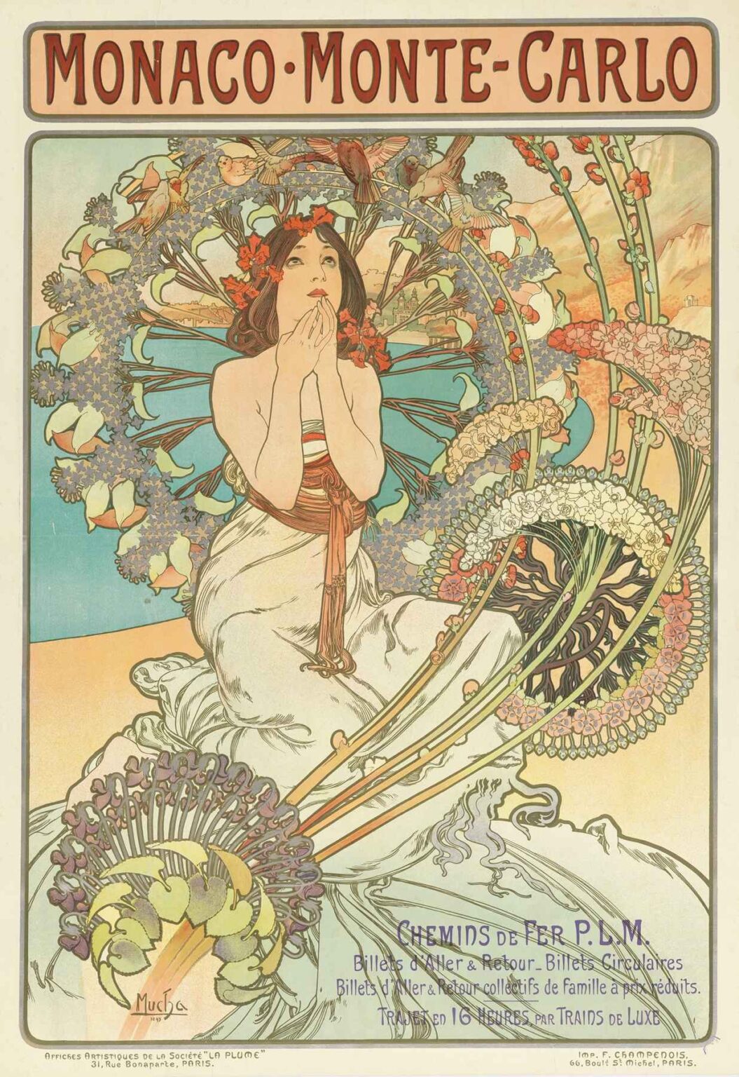
In 1897, Alphonse Mucha unveiled one of his most iconic travel posters: Monaco, Monte-Carlo. Chemins de Fer P.L.M. Designed to promote the Paris–Lyon–Méditerranée railway’s luxury service to the French Riviera, this lithographic image transcends mere advertisement. It encapsulates the elegance of the Belle Époque, marrying ornamental richness with a persuasive visual narrative. Across its sinuous lines, luminous palette, and harmonious typography, Mucha demonstrates the full flowering of Art Nouveau. The poster not only invites viewers to journey southward along sun-drenched Mediterranean shores but also asserts the aesthetic potential of graphic design itself. In this analysis, we explore its historical context, technical execution, compositional brilliance, and lasting cultural impact.
Historical Context of the Belle Époque and Travel Posters
The late 19th century in France—often termed the Belle Époque—was marked by optimism, technological advances, and a flourishing of arts and culture. Rail travel had become both efficient and glamorous, with companies like Chemins de Fer P.L.M. extending services to previously remote Mediterranean destinations. Monte-Carlo, synonymous with luxury casinos, grand hotels, and balmy seaside promenades, emerged as the ultimate leisure retreat for Europe’s elite. Advertisements for rail tickets and hotel packages began to appear in illustrated journals and on station billboards. Within this milieu, travel posters evolved from simple informational notices to works of art in their own right. They captured the public’s imagination, blending promotion with aesthetic innovation. Mucha seized this opportunity, transforming corporate commission into a showcase for Art Nouveau’s organic dynamism.
Alphonse Mucha: Life and Artistic Evolution
Born in 1860 in Moravia, Alphonse Mucha relocated to Paris in the mid-1880s, seeking artistic recognition. After a serendipitous encounter with actress Sarah Bernhardt—who commissioned theatrical posters—Mucha’s distinctive style coalesced around graceful female figures, elaborate floral motifs, and curling graphic lines. By the early 1890s, he had become a leading exponent of Art Nouveau, a movement characterized by its emphasis on natural forms, dynamism, and decorative harmony. His Munich and Prague roots, combined with Parisian influences, fostered a cosmopolitan sensibility. Beyond theater posters, Mucha produced book illustrations, jewelry designs, and decorative panels. Yet none achieved the perfect synthesis of art and commerce as did his travel posters for Chemins de Fer P.L.M. In this regional campaign, he leveraged his mastery of composition and printmaking to craft images that spoke both to the traveler’s desires and the era’s aesthetic ideals.
Commission and Purpose of “Monaco, Monte-Carlo. Chemins de Fer P.L.M.”
Chemins de Fer P.L.M., one of France’s major railway companies, sought to attract affluent holidaymakers to the Mediterranean coast. In commissioning Mucha, the company aimed for more than bare-bones utility; it desired a poster that would embody sophistication and allure. Mucha responded with a lithograph measuring approximately 124 by 82 centimeters, intended for display in Parisian stations, Belle Époque cafés, and international expositions. The image needed to communicate speed, comfort, and the promise of scenic beauty. By centralizing a languid, idealized female figure adorned with seasonal blossoms and set against stylized waves, Mucha invoked both the leisurely grace of Monte-Carlo and the railway’s ability to bridge urban centers with coastal resorts. The poster thus operated on two levels: as a travel advertisement and as a cultural statement about modern tourism’s potential for refinement and rejuvenation.
Composition and Visual Structure
Mucha’s compositional strategy hinges on the interplay between figure and ornament. At the center sits an allegorical female embodiment of Monaco—a classical muse rendered in soft ivory drapery. Her cascading hair and billowing gown echo the rhythmic curves of surrounding botanical and marine motifs. Behind her, concentric arches of stylized flowers frame a pale turquoise sea, while slender stalks of lilies and poppies fan outward like decorative tracery. The background recedes only minimally, preserving focus on the foreground’s luxuriant patterns. Mucha balances the weight of the floral wreath with the curvature of the woman’s posture, creating a sense of both stability and movement. Below, her diaphanous gown merges into a watery foreground, evoking waves lapping the shore. This triangular arrangement of figure, ornament, and marine suggestion guides the viewer’s gaze in a continuous, flowing circuit—an experience akin to the journey itself.
Use of Color and Light
The poster’s color palette exemplifies Art Nouveau’s love of pastel harmonies enlivened by strategic accents. Soft creams and pale aquamarines predominate, interwoven with coral reds, muted golds, and gentle lavenders. The central figure’s fair skin glows against the cool aquamarine behind her shoulders, while the floral wreath introduces warmer tones that balance the composition. Light seems to emanate from within the central circle, illuminating petals and leaves in translucent washes. Mucha achieved these effects through carefully calibrated lithographic layering, using separate stones for each hue. The minimal use of black outlines—limited to defining areas of contrast—allows colors to blend softly. This luminous approach not only conveys the Mediterranean’s balmy atmosphere but also elevates the scene beyond mere depiction into the realm of decorative fantasy.
Iconography and Symbolism
Every element in “Monaco, Monte-Carlo. Chemins de Fer P.L.M.” carries symbolic weight. The central female figure, reminiscent of a water nymph or classical muse, personifies the region’s allure. Her upward gaze and gentle gesture suggest longing or aspiration—a call to journey. The abundant flowers—lilies, daisies, and poppies—symbolize purity, leisure, and the dreamlike quality of sunlit Mediterranean blooms. The wreath-like halo behind her head recalls both ecclesiastical iconography and ancient sun discs, hinting at the Riviera’s golden rays. Waves suggested at the poster’s base evoke both literal seaside imagery and the sleek curves of railway tracks cutting through the landscape. Even the hotel turrets and palm fronds, faintly sketched in the background, anchor the image in Monte-Carlo’s cosmopolitan ambience. Through these motifs, Mucha transforms a commercial poster into a layered allegory of pleasure, travel, and modernity.
Typography and Layout Integration
Mucha’s innovative fusion of image and text revolutionized poster design. The title MONACO · MONTE-CARLO crowns the composition in bold, custom lettering that echoes the arches of the floral motifs below. Chemins de Fer P.L.M. appears in a refined sans-serif at the lower right, integrated seamlessly with decorative swirls. Mucha avoided rigid text boxes; instead, he floated the railway name amid trailing petals, allowing letterforms to interact organically with imagery. Kerning and letter height were meticulously adjusted to maintain harmony with the poster’s curves and focal points. This seamless integration ensures that the text functions as both informational content and ornamental flourish. The result is a unified whole: typography that enhances rather than interrupts the visual flow, embodying Art Nouveau’s principle of Gesamtkunstwerk—a total work of art.
Lithographic Technique and Materiality
The printing process behind this 1897 poster involved traditional stone lithography, requiring the artist to draw directly onto limestone plates with greasy crayons. Mucha’s precise control over line weight and tonal variation demanded multiple stones—perhaps six to eight—for successive color applications. Each color layer had to register perfectly to maintain clarity and vibrancy. The subtle gradients in the background and figure were achieved through graded crayon work rather than mechanical means, a testament to Mucha’s technical prowess. The final prints, struck on heavy stock with a slight cream tone, retained their luminosity under exhibition lights. Wear and tear on public billboards necessitated frequent reprints, meaning that the poster enjoyed wide circulation and immediate visual impact. Today, original proofs are highly sought by collectors, both for their aesthetic significance and as documents of early graphic design craftsmanship.
Reception and Popularity in 1897
Upon its release, “Monaco, Monte-Carlo. Chemins de Fer P.L.M.” garnered widespread praise in France and abroad. Featured in illustrated journals such as La Plume and displayed at the universal exposition in Brussels in 1897, the poster signaled a new era of advertising artistry. Critics lauded its harmonious blend of image and type, while the traveling public responded enthusiastically to its promise of exotic leisure. Railway stations across Europe became galleries for such bold images, and passengers began to collect posters as tokens of aspiration. Mucha’s work also influenced contemporaries like Eugène Grasset and Jules Chéret, who adapted similar ornamental strategies in their own commissions. By mid-1898, Chemins de Fer P.L.M. had commissioned a series of regional posters, all bearing Mucha’s hallmark style and proliferating the aesthetic vocabulary of Art Nouveau.
Influence on Art Nouveau and Graphic Design
Mucha’s 1897 poster became a touchstone for the Art Nouveau movement, its sinuous lines and organic motifs adopted across Europe in decorative arts, architecture, and fashion. Graphic designers recognized that advertising could transcend functional messaging and aspire to artistic excellence. Schools of applied arts incorporated Mucha’s lithographs as teaching models, demonstrating the power of integrated design. Decades later, the visual language he refined in “Monaco, Monte-Carlo. Chemins de Fer P.L.M.” would resurface in mid-20th-century poster revivals and inform contemporary branding strategies that emphasize authenticity and elegance. The poster’s balanced fusion of fine art and commercial appeal continues to inspire designers, reminding them that visual storytelling can elevate even utilitarian content.
Legacy and Contemporary Relevance
Over a century after its creation, Mucha’s poster endures as both historical artifact and living inspiration. Museums such as the Musée Carnavalet and the Musée d’Orsay feature it in exhibitions on Belle Époque culture and graphic design. Reproductions appear in hotels, cafés, and private collections worldwide, often credited with crystallizing the aesthetic of turn-of-the-century Riviera glamour. Contemporary graphic artists and branding agencies reference Mucha’s compositional techniques—especially his integration of figure, ornament, and text—in packaging, editorial design, and fashion campaigns. In digital contexts, echoes of his pastel palette and organic linework underscore the enduring appeal of Art Nouveau principles. The poster’s longevity testifies to Mucha’s ability to capture both the spirit of his age and the universal allure of travel.
Conclusion
“Monaco, Monte-Carlo. Chemins de Fer P.L.M.” stands as a masterwork of Art Nouveau graphic art, synthesizing allegory, decoration, and commercial persuasion into a seamless visual narrative. Through its lyrical composition, luminous colors, and deft typographic integration, Alphonse Mucha crafted more than an advertisement—he created an icon of Belle Époque culture and modern travel. The poster’s success in 1897 paved the way for future generations of designers to view advertising as a legitimate art form. Today, it remains a beacon of artistic innovation, inviting viewers to appreciate how beauty and utility can coalesce in a single image. As both historical document and enduring inspiration, Mucha’s poster continues to guide our understanding of design, tourism, and the art of persuasion.