Image source: wikiart.org
Introduction
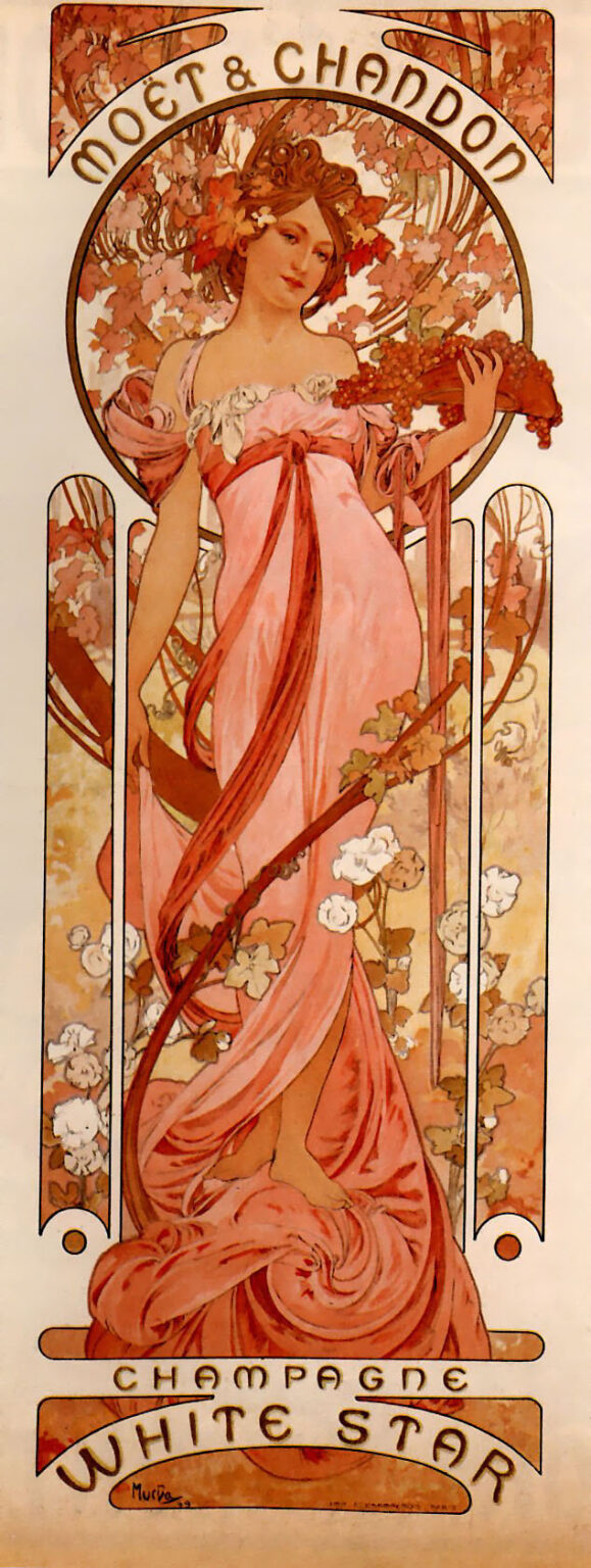
Alphonse Mucha’s “Moët and Chandon White Star” (1899) turns a champagne label into a self-contained world of celebration. In this tall, chapel-like poster, a barefoot young woman in a rose-pink gown steps forward with grapes and flowering vines entwined around her. Arched typography crowns her with the brand name, while a curved cartouche at the base proclaims “Champagne White Star.” Mucha fuses allegory, ornament, and lettering so completely that the sheet functions both as a seductive advertisement and a devotional image to refined pleasure.
An Icon for a Modern Luxury
At the end of the nineteenth century, champagne was more than a beverage; it was a social performance. Moët & Chandon understood that the most persuasive advertisement would not merely picture a bottle but embody the mood that surrounds it. Mucha, already famous in Paris for transforming street posters into art, was the perfect collaborator. In “White Star,” he invents a figure who seems to personify conviviality itself—radiant, generous, and poised—so that the brand speaks through character rather than slogan.
Architecture of a Poster
The composition reads like a façade. A circular niche encases the figure’s head and shoulders, while three tall slit-like windows descend behind her body, turning the floral background into stained glass. At the top, the arching “MOËT & CHANDON” behaves like an entablature; at the bottom, “CHAMPAGNE WHITE STAR” rests within a bowed cartouche that mirrors the crown above. Between these typographic brackets the allegorical hostess stands as the central column. Mucha’s geometry makes the sheet instantly legible from afar, with an iconic silhouette that holds together at any distance.
The Allegory of Abundance
Mucha’s heroine is not a portrait but a distilled idea. The vine leaves in her hair, the clusters of grapes in her hand, and the long tendrils curling around her gown all proclaim harvest and hospitality. She is barefoot, a detail that roots the image in the earth and softens its grandeur. Her faint smile and relaxed pose reduce the distance between brand and viewer; this is a celebration you are invited to share. The cornucopia is absent, but the pink sash that loops and falls throughout the design behaves like an endless ribbon of giving.
The Choreography of Drapery
Few artists could make fabric feel as alive as Mucha. The dress in “White Star” flows in long, columnar folds that emphasize the poster’s vertical thrust. A doubled sash winds across her shoulders and torso, then sweeps down in a serpentine arc that echoes the grapevine, binding figure and ornament into a single rhythm. The drapery’s movement is also narrative: it suggests a host who has just stepped forward, the air stirred as she approaches with a bouquet of fruit and blossoms.
Palette Tasted Through the Eyes
The color is a duet of fruit and flower—apricot, blush rose, coral, and soft cream—tempered by olive-brown vines and the cool gray of the keyline. Mucha keeps the range close and luminous so the paper itself supplies the brightest light. The result is a print that seems to glow from within, like champagne catching evening sun. The tones are sensuous but not sugary; they suggest ripeness and freshness at once, mirroring the drink’s balance of richness and sparkle.
Ornament that Carries Meaning
Mucha’s ornament never idles. The circular halo behind the figure is built from clustered leaves and tendrils, translating effervescence into pattern: bubbles become blossoms, sparkle becomes botanical light. The three vertical window panes turn the vine into a living screen, framing the figure while preventing monotony. Even the small dots and seedlike forms along the sash recall grape pips and blossom centers. The viewer absorbs a coherent world where every mark quietly reinforces the theme of cultivated nature.
Gesture and Welcome
The woman’s left arm extends along a branch laden with leaves; her right gently lifts a bunch of grapes, poised as if to offer them. The gestures are ceremonial without stiffness, a choreography of welcome. Mucha avoids the theatrics of a grand toast; instead he shows the quiet moment before the glass is poured, when anticipation heightens pleasure. This choice makes the poster less about spectacle and more about the beautiful beginning of things.
Typographic Music
The arched “MOËT & CHANDON” and the bowed “WHITE STAR” are not captions but architectural members of the design. Their measured curves rhyme with the circular halo and the arcs of the sash. The letterforms are robust and legible, yet their flared terminals and generous spacing keep them graceful. Between these inscriptions the smaller word “CHAMPAGNE” flows on a straight line, acting like the staff on which the upper and lower melodies are written. Type and image speak in one voice.
The Whiplash Line
The hallmark of Art Nouveau—the sinuous whiplash line—drives the poster’s energy. It is in the ribbon that winds around the body, the vine that serpents through the three panels, and the locks of hair that mingle with leaves. Mucha uses that line not just for beauty but for organization: it guides the viewer’s gaze from title to face, along the grapes to the typography below, and back again, creating a circulation as satisfying as a well-phrased melody.
Lithography and the Glow of Paper
Printed by color lithography, the poster leverages transparent inks that allow the warm paper to serve as the brightest highlight. The black-brown keyline defines shapes with calligraphic certainty while leaving room for midtones to breathe. In the background vines one can feel the crayon’s grain on stone, keeping the surface lively despite the sheet’s elegance. Lithography here is not simply reproduction; it is the means by which the image acquires its characteristic warmth and inner light.
A Dialogue with Icon Painting
Mucha often borrowed the visual language of saints and madonnas to ennoble modern subjects. The circular halo, frontal pose, and architectural framing echo devotional images, but the message is secular and joyous. The transposition is strategic: it suggests that the rituals of contemporary social life—raising a glass, sharing fruit, gathering in gardens—deserve their own icons. The sacred aura is repurposed to sanctify conviviality.
Symbolism of the Bare Feet
The glimpse of bare feet at the hem of the gown is a telling choice. It suggests contact with the vineyard earth, a reminder that luxury begins in nature. The feet also humanize the allegory; she is not a remote goddess but a host who moves among us. In the narrow, vertical format the small detail anchors the design, preventing the figure from floating and reinforcing the poster’s architectural solidity.
The Harmony of Three Panels
The three long, rounded panes behind the figure are more than decorative windows. They divide the background into movements, like acts in a play or courses in a meal. Each pane carries a slightly different mix of blossoms and leaves, preventing monotony and adding rhythm. The center pane aligns with the figure’s axis, while the flanking ones balance the weight of the sash and the vine. The triptych structure allows complexity without clutter.
Branding Without a Bottle
No bottle appears, yet the brand is unmistakable. The name arching across the top is monumental; the product line at the bottom feels like a signature on a painting. By refusing to show packaging, Mucha promotes a feeling rather than an object. The result is stronger than a product shot: the viewer remembers not a label design but a world and wants the drink that belongs to it.
From Vineyard to Salon
“White Star” compresses the journey of champagne into a single scene. Leaves and grapes speak of the vineyard; the gown, sash, and coiffed hair suggest the salon. The poster bridges those realms with unforced ease, implying that what is cultivated with patience in the field is enjoyed with grace in the city. This synthesis, expressed through color and line, is a persuasive narrative of provenance and polish.
Comparisons with Mucha’s Other Champagne Posters
Compared with Mucha’s more hieratic “Chandon Crémant Impérial,” this design is lighter and more pastoral. The figure’s expression is warmer, the palette more floral, and the ornament more leafy than jeweled. Where “Crémant Impérial” projects ceremony, “White Star” offers charm. Both, however, rely on the same structural genius: arched brand, central allegory, and a lower cartouche that completes a visual circuit.
The Viewer’s Path
Mucha conducts the eye with unerring assurance. One enters through the brand name at the top, drops to the face framed by the wreath-like halo, follows the sash down across the body to the grapes, and then travels along the vine into the lower cartouche where “WHITE STAR” rests like a seal. The curved baseline returns the gaze upward along the opposite side of the gown back to the halo. This loop allows the poster to stay fresh even under repeated glances in a bustling street or café.
The Afterlife of an Image
More than a century later, “Moët and Chandon White Star” continues to be reproduced not because of nostalgia alone, but because it offers a complete grammar for dignified delight. Designers study its integrated typography and its orchestration of ornament; collectors prize its warmth and poise. For the brand, it remains an emblem of how to sell celebration: by making the promise of conviviality visible, vivid, and inviting.
Conclusion
“Moët and Chandon White Star” is a lesson in how a single figure can bear the weight of a brand. Mucha builds a small universe where grapes ripen, ribbons flow, and lettering arches like music. The poster radiates welcome without noise, bringing together the vineyard’s earth and the salon’s elegance in one fluent gesture. It is an advertisement that behaves like an icon, and an icon that still persuades.