Image source: artvee.com
Introduction
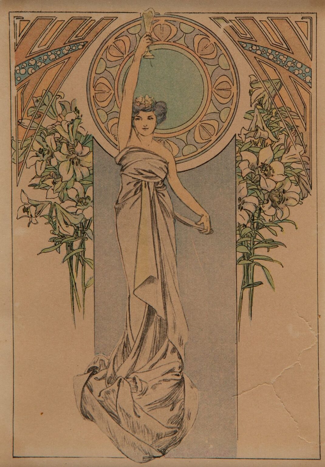
Alphonse Mucha’s “Menu Card,” created in 1900, exemplifies the artist’s ability to transform a functional object into an exquisite work of Art Nouveau art. Commissioned for the prestigious Moët & Chandon champagne house, this lithographic menu elevates the guest’s dining experience by enveloping practical information within a rich tapestry of flowing lines, botanical motifs, and harmonious color. Rather than merely listing courses, Mucha invites viewers into a visual narrative of elegance and refinement. The slender vertical format, tailored to fit at a place setting, ensures that the menu card becomes both a keepsake and a statement of taste, seamlessly blending utility and beauty.
Historical Context and Commission
At the turn of the twentieth century, Paris was the beating heart of the Art Nouveau movement, a style characterized by organic forms, sinuous curves, and an emphasis on craftsmanship. Mucha, who had already garnered acclaim for his theatrical posters featuring Sarah Bernhardt, was in high demand for commercial commissions. In 1900, the renowned champagne maison Moët & Chandon sought to align its brand with the era’s most celebrated artist. By engaging Mucha to design a bespoke menu card, the company demonstrated its commitment to luxury and cultural leadership. The resulting design aligns with Belle Époque ideals, where every aspect of social ritual—down to the printed menu—was infused with artistry.
Purpose and Dining Ritual
More than mere decoration, Mucha’s menu card serves as an integral component of the dining ritual. Placed atop a silver charger or fine china, the card greets guests with a promise of sensory delight. Its blank panel, reserved for the evening’s culinary offerings, appears as a canvas awaiting revelation. This interplay of anticipation and discovery mirrors the unfolding courses themselves. By framing the menu text within an ornate environment, Mucha transforms the act of choosing one’s meal into a moment of aesthetic appreciation. The menu card thus becomes both a functional guide and an invitation to savor the artistry of cuisine.
Composition and Spatial Organization
“Menu Card” employs a vertical, portrait-oriented layout that harmonizes with Mucha’s poster compositions while accommodating the practical need for menu text. The left third of the design features the central figure, a seated woman draped in billowing robes, whose elongated form anchors the composition. The right two-thirds remain largely blank, framed by a slender green border that guides the eye downward. Above this blank field, an arching cartouche bears the Moët & Chandon name in Mucha’s hand-drawn script. This division of space balances image and information, ensuring that neither competes for attention but instead works together to create a cohesive visual narrative.
Mastery of Line
At the heart of Mucha’s aesthetic lies his unparalleled command of line. In the “Menu Card,” every contour flows with rhythmic grace, from the drapery’s gentle folds to the curling tendrils of botanical ornament. The woman’s robe unfurls in long, ribbon-like curves that loop and twist, creating a sense of movement as though caught in a breeze. Line weight varies subtly: fine strokes depict facial features and floral details, while broader sweeps define the fabric’s volume. This modulation lends depth without heavy shading, allowing the design to maintain a flat, decorative quality prized in lithographic prints. The result is a visual cadence that feels both alive and serene.
Color Palette and Lithographic Technique
Mucha’s palette for this menu card is both refined and evocative. The gown’s yellow-green hue contrasts softly with pale grays and creams in the background, while accents of coral blossom in the floral stem and foliage above. Deep forest green outlines the frame and cartouche, grounding the composition. Achieving this delicate harmony required a sophisticated multi-stone lithographic process: each color was applied via a separate stone, demanding exact registration to avoid misalignment. Mucha collaborated closely with the Champenois printing firm to exploit transparent inks, permitting underlying tones to show through and creating subtle gradients. The luminous effect underscores the luxury of the commission.
Symbolism of Botanical Motifs
Botanical imagery plays a central symbolic role in the “Menu Card.” The flowering stem held by the figure suggests both natural beauty and the unfolding pleasures of the meal to come. Ivy leaves and curling vines evoke fidelity and endurance, metaphors for the enduring quality of fine champagne. These organic forms intertwine with the drapery, dissolving the boundary between human and natural realms. In Mucha’s hands, ornament transcends decoration to become narrative: the blooms signal freshness and growth, aligning the guest’s experience of taste with the regenerative powers of nature. The menu card thus weaves together culinary and botanical worlds in a single, seamless design.
Integration of Figure and Ornament
One of Mucha’s greatest achievements is the seamless fusion of figure and ornament. In the “Menu Card,” the seated woman appears to emerge from the surrounding foliage and ribbon-like drapery. Her garments flow into the botanical border, suggesting that she is both part of and framed by the decorative environment. This unity of form reflects Art Nouveau’s aspiration to dissolve hierarchies between fine art and applied design. By weaving her figure into the ornamental tapestry, Mucha generates a sense of wholeness: the menu text will slot into this living composition, becoming an extension of the artistic vision rather than an intrusion upon it.
Custom Typography and Branding
Typography in Mucha’s design is treated with the same care as his illustration. The Moët & Chandon name appears in a bespoke script whose curves mirror the undulating lines of the drapery and vines. Letterforms taper and swell in harmony with adjacent motifs, ensuring that text feels integrated rather than appended. Mucha’s slender signature—“Mucha —Paris”—sits discreetly at the lower right, acknowledging authorship without detracting from the central imagery. This approach reflects his belief that lettering should behave as an organic component of the visual field, reinforcing brand identity while preserving aesthetic unity.
Representation of the Feminine Ideal
The seated figure embodies the Art Nouveau ideal of feminine grace: elongated proportions, serene expression, and an air of poetic introspection. Mucha exaggerates her limbs and drapery flow to emphasize decorative rhythm over strict anatomical realism. Her relaxed pose and downcast gaze suggest a contemplative moment, as though she too savors the anticipation of the meal. Hair styled in loose waves, she carries a flowering stem as if offering the first course. This portrayal transforms her from a mere decorative element into an allegorical hostess, guiding guests through the sensory journey laid out in the menu text.
Decorative Borders and Architectural Echoes
Beyond the central figure, Mucha enriches the menu card with ornamental flourishes that evoke architecture and natural forms. The slender green border recalls the ironwork of Parisian balustrades, while the looping vines and scrolls suggest Gothic tracery. Above the cartouche, the foliage spills over like a pergola in bloom, hinting at open-air dining experiences. These allusions to built and botanical structures situate the design within the urban landscape of Belle Époque Paris, where art and architecture merged in the city’s grand cafés and salons. The menu card thus becomes a microcosm of the era’s aesthetic aspirations.
Japonisme and Cross-Cultural Influence
Mucha’s design reflects the widespread fascination with Japanese art, known as Japonisme, which influenced European artists in the late nineteenth century. The flat treatment of forms, emphasis on outline, and stylized botanical patterns nod to ukiyo-e woodblock prints. At the same time, the calligraphic ribbons and flowing line work evoke Arabic and medieval script traditions. This cross-cultural synthesis underscores Paris’s position as a cosmopolitan hub, where artists absorbed international influences and reinterpreted them through a distinctive Art Nouveau lens.
Technical Collaboration and Craftsmanship
The production of the “Menu Card” involved a close collaboration between Mucha and skilled lithographic craftsmen. He provided meticulous color studies and compositional sketches, specifying the number of stones and ink transparencies. The Champenois workshop then translated these designs into lithographic plates, employing techniques such as grain stippling to create texture and depth. Precise registration ensured that each hue aligned perfectly, while varnish mediums allowed for extended manipulation of ink on stone. The labor-intensive process reflects the high value placed on print quality for elite commissions, distinguishing Mucha’s menus from mass-market chromolithographs.
Impact on Graphic Design and Advertising
Though a bespoke menu card, Mucha’s “Menu Card” embodies principles that reshaped graphic design and advertising throughout the twentieth century. His holistic approach—uniting illustration, typography, and ornament—inspired later developments in corporate identity and branding. Printers and advertisers adopted his emphasis on integrated design, custom lettering, and organic motifs, transforming commercial graphics from mere information carriers into collectible artworks. The menu card’s status as both a functional object and an art piece laid the groundwork for modern hospitality stationery, where menus, wine lists, and promotional materials become expressions of brand ethos.
Preservation and Modern Relevance
More than a century after its creation, surviving impressions of Mucha’s menu card are treasured by museums and private collectors alike. Conservation efforts focus on stabilizing the acidic paper supports and preventing ink fading, ensuring that the delicate pastel hues and intricate lines endure. High-resolution digital reproductions have introduced Mucha’s design to new audiences, inspiring contemporary graphic artists to reinterpret its motifs in both analog and digital media. Luxury brands and upscale restaurants continue to commission bespoke stationery that channels Mucha’s integrated aesthetic, proving that the union of beauty and function remains as relevant today as it was in 1900.
Conclusion
Alphonse Mucha’s “Menu Card” transcends its utilitarian purpose to become a testament to the power of Art Nouveau design. Through flowing linework, harmonious color, and the seamless integration of figure, ornament, and typography, Mucha elevates the act of dining into an immersive aesthetic experience. The card’s botanical symbolism, cross-cultural influences, and meticulous lithographic execution underscore its place at the intersection of art, commerce, and social ritual. Over a century later, this menu card endures as a masterpiece of applied art, reminding us that functional objects—when crafted with vision and skill—can achieve timeless beauty.