Image source: artvee.com
Introduction
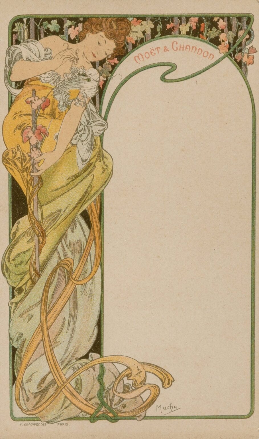
“Menu Card” by Alphonse Mucha, created in 1900 for Moët & Chandon, exemplifies the seamless union of function and artistry that defines Art Nouveau. Far beyond a simple list of dining offerings, this lithographic design transforms the act of selecting a course into an immersive visual experience. Mucha’s delicate interplay of line, color, and ornament invites guests to pause and appreciate the ceremony of the meal before even tasting the first dish. The vertical format, curving ribbons of drapery, and botanical motifs frame a blank panel reserved for menu text, while the signature Moët & Chandon logo crowns the composition in a graceful, swirling cartouche. In this work, Mucha elevates the humble menu into an objet d’art, underscoring his belief that beauty should suffuse every aspect of daily life.
Historical and Cultural Context
At the dawn of the 20th century, Paris stood at the forefront of artistic innovation. The Belle Époque celebrated leisure, luxury, and aesthetic experimentation, and dining itself became a staged event filled with ritual and refinement. Prestigious houses such as Moët & Chandon commissioned leading artists to design custom collateral—wine lists, invitations, and menu cards—that would set the tone for exclusive soirées. Alphonse Mucha had already revolutionized poster art with his theater advertisements and commercial illustrations. His appointment to design a menu card for one of France’s most illustrious champagne producers reflects the era’s appetite for applied art of the highest caliber. In a world enamored with handcrafted detail and visual splendor, Mucha’s creation both served a practical purpose and affirmed the host’s cultural cachet.
Purpose and Function
While the primary function of the “Menu Card” remains the presentation of hors d’œuvre, entrées, and desserts, Mucha reimagines this utilitarian document as an integral element of the guest’s experience. The card would rest atop the place setting, greeting diners with an elegant tableau that prepared them for a journey of taste and texture. By enclosing the menu text within an artful frame, Mucha imbued each course with heightened significance. The card thus became more than a mere list—it was a keepsake, a conversation piece, and a testament to the host’s discerning taste. In transforming the menu into art, Mucha demonstrated that utility need not preclude beauty, but rather could be enhanced through it.
Composition and Layout
“Menu Card” employs a vertical, portrait-orientation layout that mirrors the proportions of Mucha’s theatrical posters. The design is divided into two primary zones. On the left, a nearly full-length figure of a seated woman enveloped in billowing drapery commands attention. On the right, a blank panel awaits the printed menu items, anchored at the top by a large arching cartouche bearing the “Moët & Chandon” name in Mucha’s custom lettering. Fine bands trace the perimeter, unifying the two sections and guiding the viewer’s gaze downward from the logo through the figure’s sinuous form to the ornate base. This careful orchestration ensures that image and text coexist in perfect balance: neither overwhelms the other, but each enhances the viewer’s engagement with the card as a whole.
Use of Line and Form
Central to Mucha’s aesthetic is his mastery of line. In “Menu Card,” every contour unfurls with rhythmic grace. The woman’s robe forms long, ribbon-like curves that loop and cascade like vines, creating a sense of gentle movement. Line weight fluctuates subtly—fine, precise strokes delineate facial features and hands, while broader, more fluid lines define the folds of fabric and the curling tendrils of foliage. The seated figure’s relaxed posture, with one arm raised to hold a flowering stem and the other draped across her lap, forms an elegant S-curve. This sinuous trajectory invites the eye to flow naturally from the top of the cartouche, down the figure’s body, and back up through the ornamental border, creating a harmonious visual cycle.
Color Palette and Printing Technique
Mucha’s palette for this menu card is both refined and evocative. A warm yellow-green envelops the figure’s gown, contrasting with soft grays and muted whites that define the underlayers of her drapery. Accents of coral pink bloom in the background foliage and floral details, while deep forest green outlines the frame and cartouche. Achieving this delicate harmony required painstaking lithographic work. Each hue was applied via a separate stone, demanding exact registration to prevent misalignment. Mucha collaborated with the Champenois firm to exploit transparent inks, allowing underlying tones to permeate and create subtle gradients. The result is a print that preserves the clarity of linework while suffusing the scene with a luminous softness perfectly suited to a luxurious dining environment.
Symbolism of Floral and Ribbon Motifs
Botanical and ribbon motifs play a vital symbolic role in the “Menu Card.” The flowering stem held by the figure suggests growth, fertility, and the blossoming of flavor experiences to come. Ivy and vine patterns in the background evoke fidelity and endurance, apt metaphors for the enduring quality of a fine champagne. The swirling ribbons of fabric mirror the effervescence of sparkling wine—spirits rising in spirals of lightness. These design elements encourage viewers to perceive dining as an organic, almost magical event, where each note of taste corresponds to a motif of natural beauty. Mucha’s symbolic vocabulary thus transcends decoration to become part of the guest’s imaginative engagement with the meal.
Integration of Figure and Ornament
Mucha’s genius lies in weaving figure and ornament into a unified whole. In this menu card, the seated woman emerges organically from the botanical tapestry and ribbon filigree that envelop her. Her garments seem almost an extension of the vines behind her, blurring the boundary between human form and decorative pattern. The empty panel on the right, framed by parallel lines and curvilinear borders, feels as alive as the figure’s environment, hinting that text added later will become part of the visual narrative. By dissolving the distinction between illustration and ornament, Mucha creates a seamless visual dialogue that invites prolonged contemplation—a fitting prelude to a leisurely meal.
Typography and Brand Integration
The “Moët & Chandon” name appears in a custom script that echoes the flowing curves of the decorative elements. Mucha’s hand-drawn typography balances legibility with aesthetic flourish: elongated letterforms and gently tapering strokes lend an air of elegance while ensuring that the brand name remains prominent. The arching curve of the cartouche, which houses the logo, further reinforces the thematic interplay of circles and curves throughout the design. Mucha’s discreet signature, “Mucha Paris,” sits at the lower right, acknowledging his authorship without detracting from the central imagery. This thoughtful integration of text and ornament exemplifies his belief that typography should feel as handcrafted and beautiful as the illustrations it accompanies.
Representation of the Feminine Ideal
The seated figure embodies the Art Nouveau vision of feminine grace. Her softly rounded features, cascading hair, and relaxed posture convey both sensuality and serenity. Mucha elongates her limbs and exaggerates the sweep of her drapery to emphasize decorative flow over strict anatomical realism. Her downcast gaze and gentle engagement with the blossoming stem suggest quiet introspection, inviting viewers to share in her moment of repose. Rather than portraying a specific individual, Mucha presents an archetype of beauty and refinement—an ideal that resonated with Belle Époque sensibilities and elevated the dining experience into a realm of aesthetic pleasure.
Decorative Motifs and Patterns
Beyond the central figure, Mucha populates the menu card with ornamental flourishes drawn from diverse sources. The border’s curling vines recall medieval manuscript illumination, while the rhythmic loops of ribbon pay homage to Gothic tracery. Above the cartouche, stylized foliage suggests a pergola or arbor, evoking the outdoor gardens often associated with leisurely champagne soirées. These motifs coalesce into an ornamental vocabulary that feels at once historic and contemporary, echoing the eclectic influences of Japonisme, Byzantine mosaics, and classical friezes. The result is a richly layered tapestry of forms that rewards extended viewing, transforming a functional object into a visual feast.
Japonisme and Cross-Cultural Influences
Mucha’s design reflects the era’s fascination with Japanese art, visible in the flat treatment of forms, the emphasis on contour over shading, and the stylized botanical patterns. The background foliage appears almost like a Japanese woodblock print, reduced to essential shapes and rhythmic repetition. At the same time, the curving cartouche and calligraphic ribbons draw inspiration from Arabic calligraphy and medieval script. This cross-cultural synthesis underscores Paris’s cosmopolitan climate at the fin de siècle, where artists absorbed and reinterpreted global visual traditions, forging a new aesthetic that celebrated diversity and craftsmanship.
Impact on Graphic Design and Advertising
Though conceived as a bespoke menu card, Mucha’s “Menu Card” embodies principles that would shape graphic design and advertising for decades. His holistic approach—uniting illustration, ornament, and typography—prefigured the concept of brand identity, where every piece of printed collateral reflects a coherent visual philosophy. Printers and advertisers adopted Mucha’s emphasis on decorative unity and custom lettering, transforming commercial graphics from purely functional signage into collectible artworks. The notion that even ephemeral items like menus could carry the prestige of fine art influenced later movements such as Art Deco and Modernism, proving that excellence in applied design could drive both aesthetic and commercial success.
Technical Aspects of the Lithographic Process
The production of “Menu Card” involved a sophisticated multi-stone lithography process. Mucha provided original drawings and color studies to the Champenois workshop, specifying the number of stones and the sequence of printing for each hue. Precise registration marks ensured that the delicate overlapping of transparent inks yielded smooth gradients without color intrusion. Varnish mediums extended ink handling time, allowing subtle tonal variations in the drapery and foliage. This labor-intensive collaboration between artist and craftsman highlights the era’s commitment to print quality—a luxury in contrast with mass-market chromolithography. The finished menu card stands as a testament to the technical possibilities of commercial printing when guided by artistic vision.
Preservation and Legacy
More than a century after its creation, surviving impressions of Mucha’s menu card reside in museum collections and private archives, cherished for their beauty and historical significance. Conservation efforts focus on stabilizing fragile paper supports and preventing ink fading, ensuring that the pastel hues and fine lines endure. High-resolution digital reproductions have introduced new audiences to Mucha’s artistry, inspiring contemporary designers to reinterpret Art Nouveau motifs in digital and print media. Hospitality brands today continue to commission bespoke stationery that channels Mucha’s integrated approach, demonstrating the lasting relevance of his belief that beauty enhances every facet of human experience.
Conclusion
Alphonse Mucha’s “Menu Card” transcends its functional purpose to become a masterpiece of Art Nouveau design. Through fluid linework, harmonious color, and the seamless integration of figure, ornament, and typography, Mucha elevates the humble menu into an art object that primes guests for an unforgettable dining experience. The work’s symbolic motifs, cross-cultural influences, and refined lithographic technique underscore its position at the intersection of beauty and utility. More than a historical artifact, this menu card continues to inspire, reminding us that when artistry and craftsmanship converge, even the most ordinary of objects can achieve timeless elegance.