Image source: artvee.com
Introduction
Alphonse Mucha’s Menu Card (1900) exemplifies the seamless integration of fine art and functional design that came to define the Art Nouveau movement. Commissioned as an elegant dining companion for the prestigious champagne house Moët & Chandon, this color lithograph transforms a humble menu into a celebration of abundance, festivity, and aesthetic refinement. Rather than merely listing culinary offerings, Mucha imbues the card with a sense of ritual and enchantment, inviting guests to partake in both sensory and visual delights. Through an exploration of its historical context, compositional structure, line work, color harmony, symbolism, technical mastery, emotional impact, and lasting influence, we can appreciate how Mucha elevated everyday ephemera into a lasting work of art.
Historical Context
At the turn of the twentieth century, Paris was a crucible of artistic innovation and social transformation. The rapid expansion of leisure culture gave rise to grand cafés, restaurants, and elite soirées, where patrons expected not only exquisite cuisine but also refined surroundings. Meanwhile, the Art Nouveau movement was sweeping Europe, advocating for the dissolution of boundaries between fine and applied arts. Decorative styles drawn from nature—graceful curves, botanical motifs, and elegant arabesques—found expression across architecture, furniture, jewelry, and graphic design. In this climate, commercial publishers and luxury houses recognized the power of compelling visuals to enhance their prestige. Mucha’s earlier triumphs in theatrical posters had demonstrated his capacity to create iconic imagery, and in 1900 he was engaged by Moët & Chandon to apply his decorative vision to a menu card—a challenge that he met with characteristic flair.
Commission and Purpose
The commission for the Menu Card originated from Moët & Chandon’s desire to reinforce its reputation as France’s premier champagne producer. Rather than relying solely on traditional letterpress menus, the company opted for a limited-edition color lithograph that elevated the dining ritual. By enlisting Mucha—whose name was already synonymous with luxury and modernity—Moët & Chandon signaled its commitment to artistry and innovation. The card was intended for exclusive events, private dinners, and upscale establishments where presentation was as crucial as taste. Serving as both a practical guide to menu items and a decorative object, the Menu Card underscores the era’s conviction that beauty should permeate every facet of daily life.
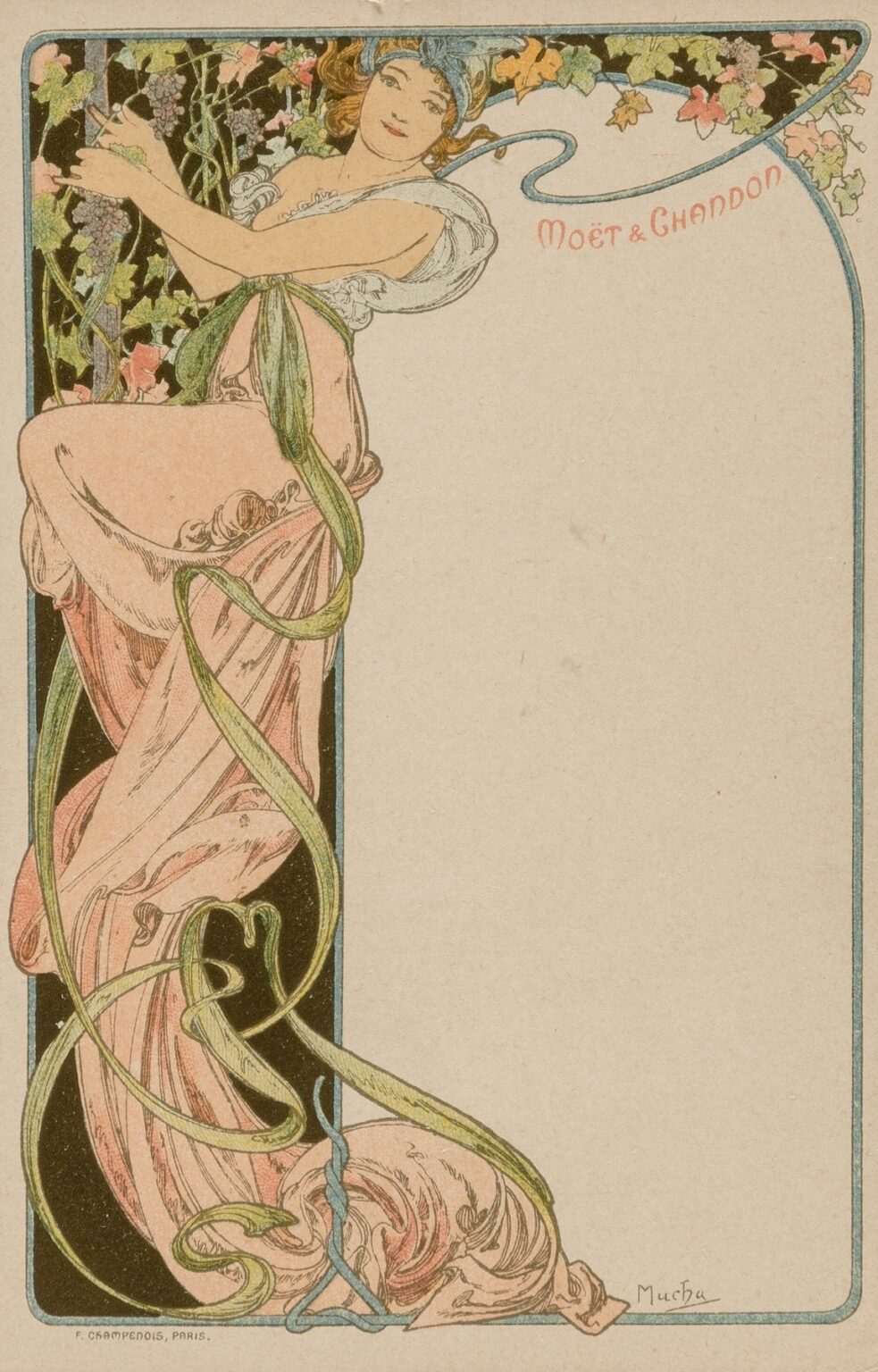
Composition and Layout
Mucha organizes the Menu Card within a single printed sheet, balancing the need for ample textual space with a richly ornamented illustration. The layout divides the card into two principal zones: the left panel, an illustrated vertical strip, and the right panel, a blank field reserved for the day’s menu. The vertical strip features a gracefully posed female figure clutching a vine-laden trellis, her body enclosed within a slender, deep-blue margin that accentuates the card’s overall form. A sinuous ribbon of light blue curves across the top, its tail forming the elegant script “Moët & Chandon” in coral red. The bordering rectangle in pale beige unifies both panels, its corners softly rounded to echo the organic lines within. This careful arrangement ensures that ornament and utility coexist without competing for attention, guiding the eye first to the sumptuous illustration and then to the blank space awaiting menu text.
Use of Line and Ornamental Design
Line is the principal architect of Mucha’s decorative world, and in the Menu Card, every contour sighs with graceful curvature. The figure’s silhouette is delineated by a continuous, confident stroke, while her gown’s folds and the vine’s twisting tendrils emerge from delicate hatching and cross-hatching. The trellis, a dark vertical lattice behind the figure, provides a structural counterpoint to the riot of organic forms, anchoring the composition. From the vine’s sheathing ribbons to the figure’s coiled locks of hair, linear motifs repeat in rhythmic loops, creating a visual melody. Mucha’s ornamental filigree does more than embellish; it animates the negative space, weaving together figure, vine, and ribbon into an integrated tapestry that captures the viewer’s imagination.
Color Palette and Light
Mucha’s color choices for the Menu Card demonstrate his mastery of tonal harmony. The palette revolves around soft pastels—petal pinks, mint greens, and sky blues—tempered by the deeper hues of midnight black and coral red. The figure’s pale flesh and rose-tinted dress stand out against the dark trellis and the unstained beige of the menu field. Highlights on the vine leaves and grapes suggest morning dew, lending a fresh vibrancy. The swirling ribbon that bears the “Moët & Chandon” inscription is painted in a lighter blue, its gentle shade uniting the ornamental and typographic elements. By allowing the paper’s natural tone to serve as highlight, Mucha achieves a luminous warmth that seems to emanate from within the design itself. The overall effect is one of subtle luminosity, perfectly suited to the presentation of fine champagne beneath softly glowing chandeliers.
Symbolism and Iconography
Beneath its decorative surface, Mucha’s Menu Card carries symbolic resonances. The vine, with its clusters of grapes, is a clear emblem of wine and fertility—an apt metaphor for the flowing abundance of champagne. The female figure, sometimes interpreted as a bacchante or grape harvest nymph, personifies the spirit of Dionysian revelry. Her light, windblown attire and upward gaze suggest ecstatic anticipation, as though she is ushering in the first sip of sparkling wine. The ribbon that weaves through the composition functions as a visual representation of effervescence, its curling forms reminiscent of rising bubbles. By interlacing these symbols—vine, female allegory, ribbon curls—Mucha transforms the Menu Card into a ritual object, inviting diners to partake in a multi-sensory experience of taste, sight, and celebratory atmosphere.
Technical Execution and Lithographic Process
Executed as a color lithograph, the Menu Card demanded precise collaboration between Mucha and skilled press technicians. Mucha produced preparatory full-scale drawings, indicating color separations for each stone. The black outlines for the figure, vine, and trellis required one plate, while the pinks of the dress, greens of the vine, and blues of the ribbon each needed separate stones. The script lettering in coral red necessitated its own calibration. Given the slender margin and the intricate ribbon shapes, exact registration was critical; even the slightest misalignment would disrupt the flow of line and break the unity of the illustration. Through successive proofing and careful ink blending, Mucha achieved both crisp outlines and delicate color transitions. The result is a printed sheet whose surface retains the delicacy of watercolor glazing while displaying the bold clarity of graphic design.
Emotional Resonance and Dining Experience
Beyond its aesthetic merits, the Menu Card performs an emotional function at the dining table. As guests held the card in their hands, they would encounter the figure’s bright smile and the vine’s eagerly awaiting clusters, creating a sense of anticipation and communal joy. The decorative richness set expectations for a sumptuous meal and memorable conversation. Mucha’s design suggests that dining is not merely a routine act but a celebration of life’s pleasures, in which art, nature, and cuisine converge. By transforming a utilitarian object into an object of beauty and meaning, Mucha fostered an atmosphere of cultivated delight, ensuring that every moment from menu selection to final course was suffused with aesthetic enjoyment.
Influence on Graphic Design and Hospitality Branding
Mucha’s Menu Card for Moët & Chandon influenced subsequent developments in both graphic design and the branding strategies of luxury hospitality. His approach—to treat even the humblest printed piece as an opportunity for artistic expression—encouraged hoteliers, restaurateurs, and winemakers to invest in custom-designed menus, labels, and ephemera. The concept of a “branded experience,” in which every touchpoint from décor to printed collateral conveys a unified visual narrative, can trace its roots to innovations like Mucha’s menu design. In the early twentieth century, cafés and restaurants across Europe and America commissioned local artists to create bespoke menus and posters, seeking to cultivate an aura of sophistication and exclusivity reminiscent of Moët & Chandon’s gatherings.
Preservation and Contemporary Relevance
Original prints of the Menu Card are prized by collectors of Art Nouveau and by institutions dedicated to the history of graphic arts. Conservation efforts focus on stabilizing the fragile lithographic inks and preventing paper acidification. Digital reproductions have introduced Mucha’s menu design to new audiences, inspiring contemporary restaurants and wineries to revive the tradition of artful menu printing. Designers today draw upon Mucha’s principles—custom typography integrated with illustration, harmonious palettes, and symbolic ornament—to craft menus that serve both functional and experiential roles. In an era of digital menus and minimalistic interfaces, Mucha’s richly embellished card reminds us of the sensual power of the printed page.
Conclusion
Alphonse Mucha’s Menu Card (1900) stands as a testament to the transformative potential of art applied to everyday objects. Through its masterful composition, dynamic line work, subtle yet luminous color scheme, evocative symbolism, and technical precision in lithography, the card transcends its practical purpose to become a work of art in its own right. By infusing the dining ritual with beauty and meaning, Mucha elevated the experience of taste into a celebration of life’s abundance. More than a historical curiosity, the Menu Card continues to inform contemporary practices in hospitality branding and graphic design, reminding us that the union of form and function can yield objects of enduring enchantment.