Image source: artvee.com
Introduction
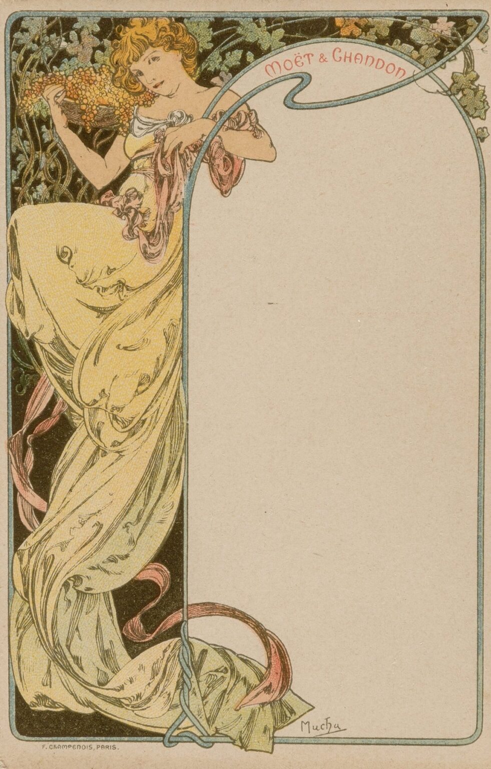
Alphonse Mucha’s Menu Card (1900) encapsulates the essence of the Art Nouveau movement at its zenith, demonstrating how commercial design and fine art could merge seamlessly. Originally created as an elegant companion for a distinguished Parisian restaurant or café, this menu card transcends its utilitarian purpose by transforming into a decorative masterpiece. With flowing lines, botanical motifs, and an ethereal female figure, Mucha imbued what might have been an ordinary printed tally of dishes with an air of refinement and artistic grace. Through a close reading of its historical context, formal composition, line work, color harmony, symbolism, technical execution, and lasting influence, we can appreciate how this ostensibly simple menu card reflects Mucha’s broader vision: to bring beauty into every facet of everyday life.
Historical and Cultural Context
At the turn of the twentieth century, Paris stood at the forefront of artistic innovation. The Belle Époque era was marked by rapid technological progress, expanding leisure culture, and an appetite for decorative art across every medium. Restaurants and cafés became social gathering places where patrons not only consumed food but also engaged with the latest cultural trends. In this climate, proprietors recognized the value of visually arresting menus, wine lists, and event programs to enhance the dining experience and reinforce their establishment’s prestige. Alphonse Mucha, having achieved fame through his theatrical posters and magazine illustrations, was the natural choice to bring his distinctive style to commercial ephemera. His Menu Card of 1900 exemplifies the democratization of art during this period: decorative design was no longer confined to galleries and salons but extended into the very menus diners held in their hands.
Commission and Intended Use
While the specific restaurant or café that commissioned this menu card remains uncertain, the card’s production indicates a collaboration between Mucha and a Parisian printer-publisher—likely F. Champenois, whose imprints appear discreetly at the bottom left of the design. The brief would have required Mucha to craft a format that accommodated text on one side and decorative imagery on the other, yet remained visually cohesive. Patrons would have received the card upon being seated, using it to peruse offerings of hors d’oeuvres, entrées, and desserts. Far from a mere transactional object, the menu card served as an ambassador for the establishment’s aesthetic values, signalling to diners that every aspect of their experience—from cuisine to ambiance—was thoughtfully curated.
Integration of Form and Function
Mucha’s genius lay in his ability to integrate utility and ornament without sacrificing clarity. The menu card’s layout divides the sheet into two primary zones: a blank text field to the right and a richly illustrated panel to the left. Yet this division is softened by the sinuous border that frames the entire composition, weaving a pale blue ribbon around the blank menu area and the depiction of a standing female figure amidst vines and blossoms. This ribbon does not merely outline; it actively guides the eye, suggesting an organic flow between reading the menu and admiring the illustration. Mucha understood that diners might glance repeatedly between courses and conversation, so he designed the card to reward such repeated viewing, ensuring that the decorative elements never felt static or peripheral to the card’s function.
Formal Composition and Balance
The Menu Card demonstrates a masterful balance between symmetry and dynamism. Although the decorative panel occupies the left half of the card, Mucha achieves a sense of equilibrium by extending elements—such as the trailing ribbon and flowing drapery—into the right half. The female figure stands at a three-quarter angle, leaning slightly inward toward the text field, her posture inviting the reader to enter the card’s decorative realm. Behind her, stylized grapevines and leaves create a dense background pattern, their dark hues contrasting with the pale pastel shades of her gown. Yet through careful modulation of line weight and color values, Mucha prevents the background from overwhelming the central figure. The border’s rectangular shape is softened by rounded corners and the curving ribbon, which echoes the organic forms within the illustration, uniting form and content.
The Female Figure as Allegory
Central to Mucha’s works is the idealized feminine archetype—an allegorical muse embodying beauty, abundance, or the seasons. In the Menu Card, the female figure holds a cluster of grapes above her head, immediately evoking associations with the harvest, wine, and culinary pleasure. Her attire—a flowing, draped gown in pale yellow—calls to mind classical robes, suggesting timeless elegance. Her hair, loosely piled and cascading in wavy tendrils, merges with the grapevines behind her, visually binding human and vegetal forms. The figure’s expression is serene yet engaging, as if she invites diners to partake in the fruits of nature’s bounty. Through this allegory, Mucha connects the act of dining to primordial themes of fertility, celebration, and the harmonious cycles of growth.
Line Work and Ornamental Detailing
Line is the vehicle through which Mucha achieves both clarity and decoration on the menu card. The outlines of the female figure, her gown, and the grape cluster are drawn with deliberate precision, their contours varying in thickness to suggest volume and movement. In contrast, the background grapevines and leaves are rendered with finer, more intricate lines, creating a textural tapestry. The border ribbon”—light blue and serpentine—frames the entire composition with a single unbroken stroke, its twists and turns reminiscent of Art Nouveau’s signature whiplash curves. Small breaks in the ribbon align with the grape stems or the figure’s hand, integrating the border into the narrative rather than isolating it. Decorative motifs—such as the curling tendrils and vein-like patterns on the leaves—reflect botanical accuracy filtered through stylization, achieving a balance between realism and ornament.
Color Palette and Harmony
Mucha’s palette for the Menu Card is both muted and vibrant, demonstrating his sensitivity to chromatic relationships. The primary hues include pale yellow for the figure’s dress, soft pink for her flesh tones, muted greens for the grape leaves, and deeper olive tones for the vine background. The pale blue ribbon serves as a cool counterpoint, guiding the eye across the composition and framing the text. Touches of warm brown appear in the grape cluster’s stems and in subtle shading. Mucha mixed these colors so that no single hue dominates; instead, they coexist in harmonious equilibrium. This restrained palette ensures that the blank text field remains unobtrusive, ready to receive menu items in ink without clashing with the decorative side. The overall effect evokes a calm, sunlit vineyard scene, reinforcing the culinary theme.
Symbolism of Grapes and Vines
The choice of grapes and vines carries multiple layers of meaning. Grapes traditionally symbolize abundance, transformation (through fermentation into wine), and communal celebration. Vine imagery suggests interdependence: each leaf, tendril, and fruit cluster supports the whole. In the context of a menu card, these symbols resonate with the pleasures of fine dining and conviviality. Mucha’s depiction emphasizes lushness—the grape cluster held aloft like an offering—while the entwining vines convey an enveloping, almost protective atmosphere. The viewer is subtly reminded of the natural origins of food and drink, harkening back to pastoral idylls even within an urban dining setting. By embedding these symbols, Mucha enriches the menu card’s narrative, transforming it into a microcosm of gastronomic delight.
Technical Execution and Printing Process
Printed as a color lithograph by F. Champenois in Paris, the Menu Card underwent a meticulous production process. Mucha prepared detailed full-scale drawings indicating precise color separations for each lithographic stone. The soft pink of the figure’s skin, the pale yellow of her gown, and the various greens of the vines each required separate stones. Registration—aligning each color layer—was critical to preserving the delicate overlaps where the ribbon crosses the figure or where shadows on the gown blend with the background. The lithographic medium allowed Mucha to achieve subtle gradient effects, such as the transition of flesh tones in the figure’s cheeks, and to maintain crisp line work in the ornamental details. The final prints display a luminous quality, with the paper’s natural tone serving as the highlights in the blank menu field and the folds of the dress.
Integration into Dining Experience
Restaurants and cafés in the Belle Époque understood that atmosphere contributed as much to patron satisfaction as the cuisine itself. The Menu Card thus played a role beyond listing dishes—it became part of the table setting, a decorative focal point that complemented table linens, silverware, and floral centerpieces. Diners holding the card would catch glimpses of Mucha’s intricate illustration, engaging their senses even before the first course arrived. The tactile quality of the printed paper, combined with the visual luxury of color lithography, conveyed the establishment’s commitment to quality. In this way, Mucha’s menu card helped shape the concept of “total dining experience”—an integration of sight, taste, and ambiance—a precursor to modern notions of brand identity and experiential marketing.
Emotional and Psychological Impact
Mucha’s artwork evokes a sense of calm delight. The gentle arching of the ribbon border suggests an embrace, while the living presence of the female figure offers companionship and warmth. The viewer is invited into a serene rural tableau far removed from the city’s bustle—yet the stylized forms and refined color choices keep the image anchored in contemporary sophistication. This balance between escapism and urbane elegance creates an emotional resonance: diners feel both soothed by pastoral imagery and reassured by the design’s cultivated beauty. Mucha understood that decorative art could shape mood as effectively as lighting or music, and his menu card exemplifies this psychological dimension of Art Nouveau design.
Comparison with Mucha’s Other Commercial Works
While Mucha’s theatrical posters for Sarah Bernhardt and product advertisements (such as the Lefèvre-Utile wafers and Moët & Chandon champagne) remain iconic, his menu cards demonstrate an equally high level of craftsmanship applied to smaller-scale ephemera. In all these works, Mucha employs similar strategies—idealized female figures, sinuous lines, botanical ornament—but adapts them to varying formats and functions. The menu card’s narrow vertical panel contrasts with the square or tall dimensions of posters, yet it preserves the same visual vocabulary. Studying the menu card alongside Mucha’s posters reveals his versatility: regardless of size or subject, he maintained a consistent aesthetic that elevated commercial graphics to the realm of fine art.
Preservation and Legacy
Original Menu Card prints are rare, often preserved in museum graphic collections or private archives. Conservation focuses on preventing paper yellowing, ink fading, and abrasion of the lithograph’s delicate surface. The card’s legacy extends beyond its historical moment: it serves as an early example of experiential branding and cross-disciplinary collaboration between artist and merchant. Modern designers draw inspiration from Mucha’s integration of illustration and typography, applying similar principles to restaurant menus, wine labels, and hospitality branding. The Menu Card therefore stands not just as a relic of Belle Époque Paris but as a precursor to contemporary design thinking that values beauty, narrative, and user experience.
Conclusion
Alphonse Mucha’s Menu Card (1900) transcends its basic function as a vessel for listing dishes to become a richly layered work of decorative art. Through its harmonious composition, intricate line work, restrained yet evocative palette, and symbolic use of botanical imagery, Mucha transforms a humble menu into an immersive visual experience. This menu card exemplifies the democratic ideals of Art Nouveau, bringing beauty into everyday life and demonstrating how design can shape mood, reinforce brand identity, and elevate the ordinary. More than a printed document, the Menu Card remains a testament to Mucha’s belief in art’s capacity to enchant, inform, and delight—one dining experience at a time.