Image source: artvee.com
Setting the Stage for a Renaissance Conspiracy
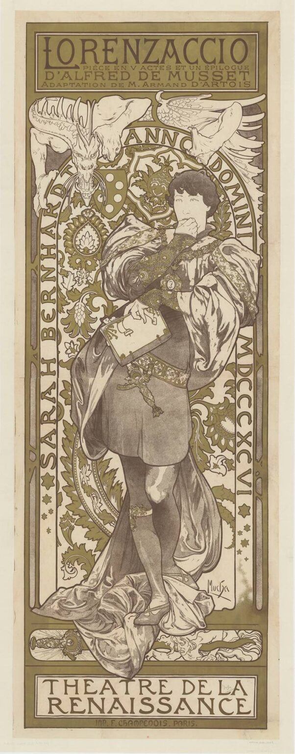
Alphonse Mucha’s 1896 theatre poster for “Lorenzaccio, pièce en V actes et un épilogue d’Alfred de Musset” is a tall, hieratic column of ink and muted color that turns political intrigue into ornament. The sheet was created to announce Sarah Bernhardt’s production at the Théâtre de la Renaissance, and its every curve is engineered to translate the play’s mood—melancholy, plotting, moral doubt—into a form that a passerby could read in seconds. Bernhardt, the most celebrated actor of the age, appears in the traditionally male title role of Lorenzo de’ Medici. Mucha answers that gender-bending casting with a design that makes ambiguity a virtue: the figure’s stance is decisive yet inward, the palette opulent yet restrained, the whole encircled by an emblem that looks half halo, half astrolabe. This is not merely advertisement. It is a Renaissance tragedy condensed into a diagram of thought.
Sarah Bernhardt as Lorenzo: A Trouser Role Turned Icon
At the end of the nineteenth century Bernhardt repeatedly chose male roles—later Hamlet most famously—to showcase a voice and presence that were less about imitation than about authority. Lorenzo, the disillusioned Medici who will assassinate the tyrant Alessandro, is a part built on ambivalence. He is at once conspirator and philosopher, libertine and idealist. Mucha fixes that doubleness in a single pose. Bernhardt-as-Lorenzo stands three-quarter to the viewer, a book tucked to the ribs, one hand raised to the mouth in the reflex of a thinker about to act. It is the Renaissance equivalent of the “to be or not to be” moment, and it reads instantly on a Parisian boulevard: this story is about conscience sharpening itself into action.
Composition: A Column of Conscience
The poster is a vertical stage. A strong rectangular frame holds the scene; a circular medallion behind the head creates a visual fulcrum. Around the circle winds the legend ANNO DOMINI, the arc segmented like a clock or calendar, as if time itself were the character’s judge. Within that geometry, Lorenzo’s S-curve dominates: cloak swirling at the knees, calf crossing over calf, upper body bent forward just enough to suggest conspiratorial whisperings with himself. Mucha’s posters often rely on this marriage of the circular and the serpentine—the circle to stabilize, the long curve to animate. The result is a picture that feels both ceremonial and alive.
A Palette Tuned to Tragedy
Unlike the rose and turquoise fireworks of Mucha’s allegorical panels, “Lorenzaccio” keeps to a restrained duet of olive-green and warm brown enlivened by cream highlights and small flashes of gold. The choice suits both subject and venue. Musset’s play is shadowed by corruption and the sick light of court life; the poster’s colors feel like aged velvet and tarnished metal, as if the whole image were lit by a Renaissance lamp. At street scale the restricted palette also improves legibility. The olive blocks hold the composition at a distance; the cream of flesh and lettering pops forward; the gold details reward closer inspection when the viewer moves nearer to read billing.
Renaissance Ornament with a Modern Purpose
Foliated scrolls and palmettes braid up the side panels, evoking carved choir stalls and Florentine textiles. The motifs are not archaeological recreations; they are Mucha’s pan-historical vocabulary tuned to a Renaissance key. What matters is the function they serve. Ornament here is not filler but atmosphere—perfume for the eyes. It makes the moral world of the play visible. The leaves are lush yet fenced by geometry, like a court whose beauty hides rot; the medallions appear sophisticated yet a little airless, like power dressed in ceremony. A viewer does not need to parse the symbolism to feel the climate of intrigue.
The Medallion, Beasts, and the Emblematic Crown
At the top corners, mythic creatures lean inward toward the title block. Their identities are deliberately ambiguous—part dragon, part winged beast—more heraldic than literal. They supply a whiff of danger and dynastic ferocity, a reminder that Lorenzo plots against a family with talons. Beneath them the circular medallion—half halo, half coin—encases the protagonist in a framework of fate. Mucha often haloed his subjects to make them legible across a boulevard; here the halo also functions as device of history, sealing Lorenzo in a time and a system from which he must cut free. Within the ring, small round bosses read as rivets or calendar points, a subtle way of telling us that the character is counting hours as well as sins.
The Book, the Belt, and the Language of Props
Mucha’s posters are full of props that behave like nouns in a sentence. In “Lorenzaccio” two are decisive. The book tucked beneath the left arm is more than a scholar’s accessory. It stands for conscience and plot, for the words and plans that accumulate before a deed. Its simple rectangle breaks the sea of curves and gives the figure a quiet anchor. The second prop is the ornate belt and chain that fall across the tunic—a cascade of metalwork that reads as privilege and burden. The jewelry catches tiny points of gold; it also binds the torso in the very place where self and will converge. The message is gentle but clear: Lorenzo’s brilliance is gilded restraint; the play will show whether he can cut through it.
Typography as Casting and Credo
A Mucha poster is a masterclass in typographic hierarchy without sacrificing elegance. The title LORENZACCIO sits in a massive block at the very top, letters built of heavy strokes that echo the border’s weight. Beneath, smaller lines credit Alfred de Musset and the adapter Armand d’Artois, ensuring that the literary pedigree is visible even to a brisk passerby. Along the left vertical runs SARAH BERNHARDT, not as a footnote but as a pillar, making the star inseparable from the role. At the bottom the theatre name, THÉÂTRE DE LA RENAISSANCE, grounds the whole. The typography does not float in the image; it is the image’s architecture, just as a theatre’s signage is part of its façade.
From Drawing Board to Boulevard: Chromolithography at Work
The impression is printed by F. Champenois, the Paris firm that translated Mucha’s drawings into sumptuous chromolithographs. You can read the process in the poster’s surfaces. The olive ground sits in even planes; contour lines knit forms together; gold accents are transparent layers over brown that simulate metallic gleam without real ink. This technique mattered for more than craft pride. It made the poster repeatable without losing aura. Dozens of copies could bloom on kiosks and walls, each carrying the same balance of restraint and richness that the street audience would associate with Bernhardt’s brand.
Gender, Agency, and Modernity in a Renaissance Frame
Bernhardt’s casting remains the poster’s shock. Mucha neither hides nor exaggerates the gender play. The face is recognizable, the costume unmistakably masculine, the posture drawn from a vocabulary of male introspection. The combination invites the viewer to read Lorenzo not as a man pretending to be woman or vice versa, but as a role made available to any performer strong enough to hold it. In its quiet way the poster proposes a modern thought: that character is a function of will more than of body, and that theatre, like art, is a place where identity is tested rather than prescribed.
Movement Without Blur: Drapery as Drama
Look at the lower third of the sheet. The cloak gathers into volutes that break against the frame like water against a quay. Mucha’s line thickens and thins to model folds with minimal shading; what looks at first like pure decoration is actually a record of weight and momentum. Because Lorenzo’s upper body is relatively still, the swirl at the feet carries the energy of decision coiling. The viewer senses that the figure could step forward in the next heartbeat—a crucial psychological nudge when one is selling tickets to a play in which a man finally acts.
The Viewer’s Route Through the Image
Mucha engineers a precise path for the eye. The title block catches attention first. The beasts to either side nudge the gaze downward to the medallion. The face locks our attention, and the hand to the mouth anchors it. From there we slide along the line of the book to the belt, through the extravagance of the cloak to the block of theatre lettering at the base. Then the ornamented side panels pull us back up, where the long vertical of SARAH BERNHARDT escorts us to the title again. This loop—title, conscience, props, venue, star—compresses the experience of a programme into a single glance.
How the Poster Speaks Musset’s Themes
Musset’s text weighs idealism against compromise, action against paralysis. Mucha translates those abstractions into design. The circle behind the head is resolve; the meandering drapery is delay; the belt is constraint; the book is thought; the beasts are danger; the vegetal border is the seductive trap of luxury. None of these symbols are didactic; they work because they are also beautiful, and because the viewer feels their logic before naming it. The poster is not an illustration of a scene. It is a map of the play’s moral weather.
Parallels and Contrasts with Mucha’s Other Star Posters
Set beside Gismonda or the later Hamlet, “Lorenzaccio” shares the halo device, the monumental star, and the fusion of image with letter. But the tone is distinct. Where Gismonda glows with Mediterranean light and a crown of palm, Lorenzaccio mutters in olive and bronze. Where Hamlet pits a solitary figure against an apparition, here the apparition is history itself, inscribed in the ring that labels the year and the age. Mucha calibrates each design carefully to the role and the repertory. The style is constant; the temperature shifts.
The Poster as a Promise of Experience
Nineteenth-century posters were not souvenirs; they were promises. This one promises a sophisticated evening in which a famous actor will mine the contradictions of a Renaissance intellect. It promises design as part of the event—an interior glowing with the same olive and cream, programmes and tickets drawn from the same alphabet. It promises that tragedy will be delivered with elegance rather than sensationalism. The promise is credible because the poster practices what it preaches: an act of concentration that turns ornament into argument.
Legacy and Collectability
Many of Mucha’s theatre sheets have survived not because they were meant to but because people tore them from kiosks and kept them. “Lorenzaccio” appeals to collectors for its rare palette, its psychological subtlety, and its place in Bernhardt’s legendary catalogue of roles. Designers still study it for lessons in how to use a limited color set, how to integrate typographic hierarchy without disorder, and how to build a dramatic figure out of contour and cadence rather than painterly modeling. It remains a masterclass in how print can think.
Why the Image Still Works
Stand in front of the poster today and the old machinery still hums. The circle behind the head holds steady like a note; the cloak continues to gather energy; the beasts keep watch; the book keeps its counsel. You may not know a line of Musset, but you understand at once that this is a story about a person standing at the lip of an act that will change a city. That clarity—born of line, letter, and disciplined palette—is why Mucha’s best theatre posters escape their immediate purpose and settle into the broader story of modern design.