Image source: artvee.com
Introduction
Mikuláš Galanda’s Letters (1930), part of his celebrated Poems in Drawings series, represents a pivotal moment in interwar Slovak modernism. With its spare yet evocative line work and abstract symbolism, the drawing transcends mere textual reference to explore the emotive power of written communication. By distilling the form of letters—both as alphabetic signs and as missives—into metaphoric shapes, Galanda invites viewers to engage in a visual poetry that bridges image and language. This analysis delves into the historical context, thematic underpinnings, formal composition, technical execution, and lasting impact of Letters, illustrating how Galanda redefined the possibilities of graphic art in 1930.
Historical and Cultural Context
The late 1920s and early 1930s in Czechoslovakia were years of artistic ferment, as the new republic sought a cultural identity that balanced folk tradition with European avant‑garde innovations. Galanda, having studied in Budapest, Vienna, and Munich, co‑founded the Nová Trasa (New Path) group in Bratislava in 1928, championing an art that was socially engaged and formally experimental. The Poems in Drawings series emerged from this climate, reflecting a desire to fuse poetic sensibility with graphic abstraction. In Letters, created in 1930, Galanda responds to the era’s fascination with typography, symbolism, and the growing role of mass communication, transforming the commonplace envelope into a vessel of universal emotion.
Mikuláš Galanda and the Poems in Drawings Series
Mikuláš Galanda (1895–1938) was a pioneering figure in Slovak graphic arts, revered for his integration of folk motifs and modernist abstraction. The Poems in Drawings series, produced between 1929 and 1931, comprises a group of pen‑and‑ink and watercolor works that blend lyrical themes—such as Letters, Song, and Dream—with simplified, symbolic forms. Unlike his earlier woodcuts and figurative pieces, these drawings eschew direct representation in favor of evocative suggestion. In Letters, Galanda turns to the motif of communication itself, exploring how shapes and marks can evoke the silent poetry of exchanged words.
Thematic Exploration: Communication and Intimacy
At its core, Letters meditates on the paradox of written language: it conveys deeply personal emotions across distance, yet its tangible form—paper, ink, seal—remains mute until opened. In the drawing, Galanda abstracts envelopes and script into geometric and organic shapes that hover between legibility and pure sign. This tension reflects the intimate act of letter‑writing, where hidden thoughts await revelation. By focusing on the materiality of correspondence—the flap, the stamp, the crease—Galanda elevates a routine gesture into an existential inquiry about connection, memory, and the traces we leave on the page.
Composition and Spatial Arrangement
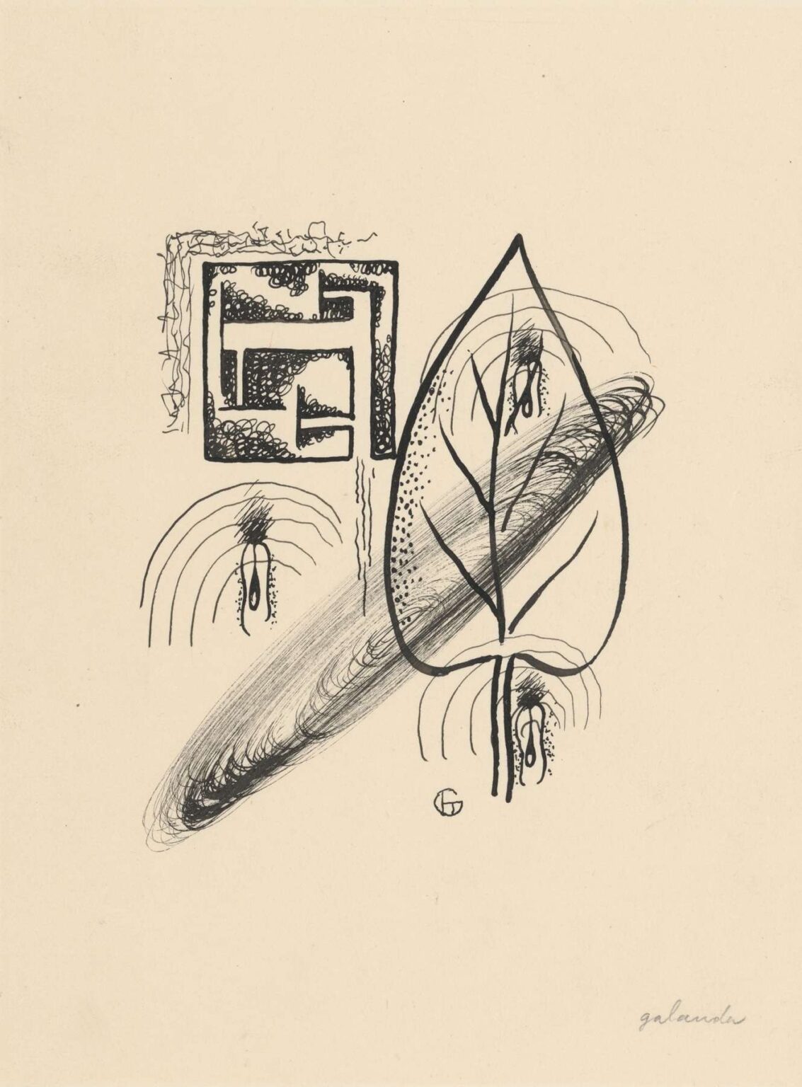
Galanda composes Letters within a generous expanse of empty ground, allowing each form to breathe and resonate. In the upper left, a densely shaded rectangular shape suggests a sealed envelope or a block of text, its interior filled with swirling hatch marks. To the right, a series of curved, concentric arcs emerge like an opening flap or a halo of sound. Below, linear strokes trace the outline of a stylized leaf or a folded sheet, its veins echoing the veins of thought. These elements are anchored by a dynamic diagonal sweep of graphite, linking them visually and guiding the viewer’s eye across the page. The careful balance of positive and negative space creates a sense of quiet tension, as if the drawing itself were waiting to be unfolded.
Line Quality and Graphic Rhythm
Line is the primary expressive medium in Letters, and Galanda’s disciplined yet fluid strokes reveal his mastery of pen and brush. Contour lines—some bold and assertive, others light and tentative—define the boundaries of each form, while internal hatchings and stipplings suggest texture, shadow, and depth. The graphite sweep, by contrast, is looser and almost calligraphic, providing a counterpoint to the more controlled ink work. This interplay of line qualities generates a rhythmic pulse that animates the static page, evoking the cadence of handwriting or the whisper of turning paper. Through this rhythmic graphic dance, Galanda transforms the act of reading and writing into a visual experience.
Color and Tonal Subtlety
Although predominantly a pen‑and‑ink drawing, Letters incorporates subtle tonal accents achieved through diluted graphite or light watercolor washes. These subdued grays punctuate the composition—softening edges, suggesting shadow, and unifying disparate elements. The restrained palette underscores the thematic focus on written paper, its off‑white ground echoing the texture of parchment. By avoiding bright pigments, Galanda maintains a meditative atmosphere, inviting viewers to contemplate the forms as ideograms rather than decorative motifs. The tonal gradations lend the drawing a quiet luminosity, as if the page itself were suffused with the glow of private thought.
Symbolism of Forms: Envelope, Flap, and Seal
Each shape in Letters carries symbolic weight. The rectangular block in the upper left can be read as a closed envelope, its hatchings representing the mystery within. The concentric arcs to the right evoke the act of opening—a flapping motion—or perhaps the sound waves of a whispered message. The large leaf‑like contour below merges the idea of the envelope with that of a natural vessel—underscoring the organic vitality of written communication. These symbols coalesce into a compositional narrative of closure, revelation, and reflection. Galanda’s use of everyday mail imagery thus becomes a metaphor for the human desire to connect, to send part of oneself across space and time.
Relationship to Typography and Calligraphy
Galanda’s interest in written forms extends beyond thematic content to formal experimentation with typography and calligraphy. The precision of his hatchings and the curve of his graphite sweep suggest an influence from typographic design—where letterforms become pure shapes—and from calligraphic tradition—where the brush stroke conveys the living energy of the hand. In this synthesis, Letters aligns with contemporary explorations in book design and graphic arts, where the boundaries between text and image were increasingly blurred. Galanda positions the drawing itself as a “poem” composed of visual “letters,” inviting a synesthetic reading that parallels the multi‑sensory experience of reading a text aloud.
Technical Mastery and Medium Integration
Letters demonstrates Galanda’s adeptness with mixed media on paper. The crisp ink lines—likely executed with a fine nib—offer precision and permanence, while the graphite marks and washes provide softness and tonal depth. The paper’s ivory tone, unvarnished and untextured, becomes an active element, reflecting ambient light and enhancing the drawing’s subtle contrast. Galanda’s layered approach—ink first, then tonal overlays, followed by graphite accents—reflects careful planning balanced with an openness to spontaneous gesture. This technical integration underscores his status as both a graphic artist and a painterly experimenter.
The Role of Negative Space
In Letters, negative space is not mere absence but a dynamic partner in the composition. The ample blank areas around each motif amplify their presence and allow viewers to project their own associations. White paper becomes the silence between words, the pause that gives meaning to the letter. This interplay of figure and ground evokes the silence that surrounds correspondence—the hush of anticipation, the quiet once a letter is sealed. By granting negative space equal narrative weight, Galanda transforms the drawing into a dialogue between presence and absence, between saying and unsaid.
Letters Within Galanda’s Oeuvre
While Mikuláš Galanda is often celebrated for his figural drawings and graphic prints, the Poems in Drawings series reveals an equally vital vein of abstract, symbolic work. Letters stands out within this series for its intellectual rigor and poetic resonance. It marks a departure from narrative depiction toward symbolic distillation, paving the way for Galanda’s later explorations of pure abstraction in the mid‑1930s. As such, the work is a bridge between his early folk‑inspired pieces and his later, more experimental compositions, illustrating his restless drive to expand the visual language of Slovak modernism.
Comparative Analysis: European Avant‑Garde Connections
Letters shares affinities with European avant‑garde artists who integrated text and image, such as Paul Klee’s Writing Girl (1932) or Kurt Schwitters’s Merz collages. Like Klee, Galanda treats writing as a source of abstract form and symbolic depth. Like Schwitters, he elevates the debris of communication—envelopes, letters, scraps—to the status of high art. Yet Galanda’s approach remains distinctively lyrical and intimate, rooted in the contemplative mood of Central European introspection. His work thus occupies a unique position at the intersection of Symbolism, Surrealism, and early Concrete art.
Reception and Critical Appraisal
Upon its initial exhibition in Bratislava in 1930, Letters drew attention for its innovative fusion of graphic clarity and poetic ambiguity. Critics praised Galanda’s ability to evoke layered meanings through minimal means, noting how the drawing transcended literal illustration to become a personal meditation. Subsequent exhibitions in Prague and Vienna further established Letters as a standout in the Poems in Drawings series. In modern retrospectives, art historians continue to cite the work as a landmark in the development of abstract graphic art in Slovakia, praising its seamless integration of form and concept.
Conservation and Display Considerations
As a mixed‑media work on paper, Letters benefits from careful preservation to maintain both the integrity of the ink lines and the subtlety of the graphite washes. Museums typically frame the drawing behind UV‑filter glass, using acid‑free mat boards to prevent discoloration. Controlled humidity and moderate lighting ensure the paper does not yellow and the media remain stable. When displayed, the drawing’s minimalist aesthetic allows it to occupy intimate gallery spaces where viewers can lean in, appreciating the delicate hatchings and the resonant emptiness that defines the work.
Legacy and Contemporary Relevance
Nearly a century after its creation, Letters continues to inspire artists exploring the boundaries between text and image, between illustration and conceptual art. Graphic designers reference its sophisticated calligraphic rhythms, while conceptual artists draw on its thematic focus on communication and its silences. In an age of instant digital messaging, Galanda’s meditation on the tangible, tactile act of letter‑writing resonates with renewed poignancy. The drawing reminds contemporary audiences of the material and poetic richness of slow, deliberate correspondence—a practice threatened by the ephemeral nature of modern communication.
Conclusion
Mikuláš Galanda’s Letters from the Poems in Drawings series stands as a masterful exploration of the poetic potential inherent in the written word. Through a refined blend of precise line work, subtle tonal washes, and evocative symbolism, Galanda transforms the commonplace letter into a vessel of universal emotion and metaphor. Situated at the crossroads of folk tradition, graphic innovation, and avant‑garde abstraction, Letters exemplifies the artist’s unique contribution to Slovak modernism. Its enduring power lies in its ability to evoke the silent poetry of communication, reminding us that beneath every envelope lies a story waiting to be read.