Image source: artvee.com
Introduction and Series Overview
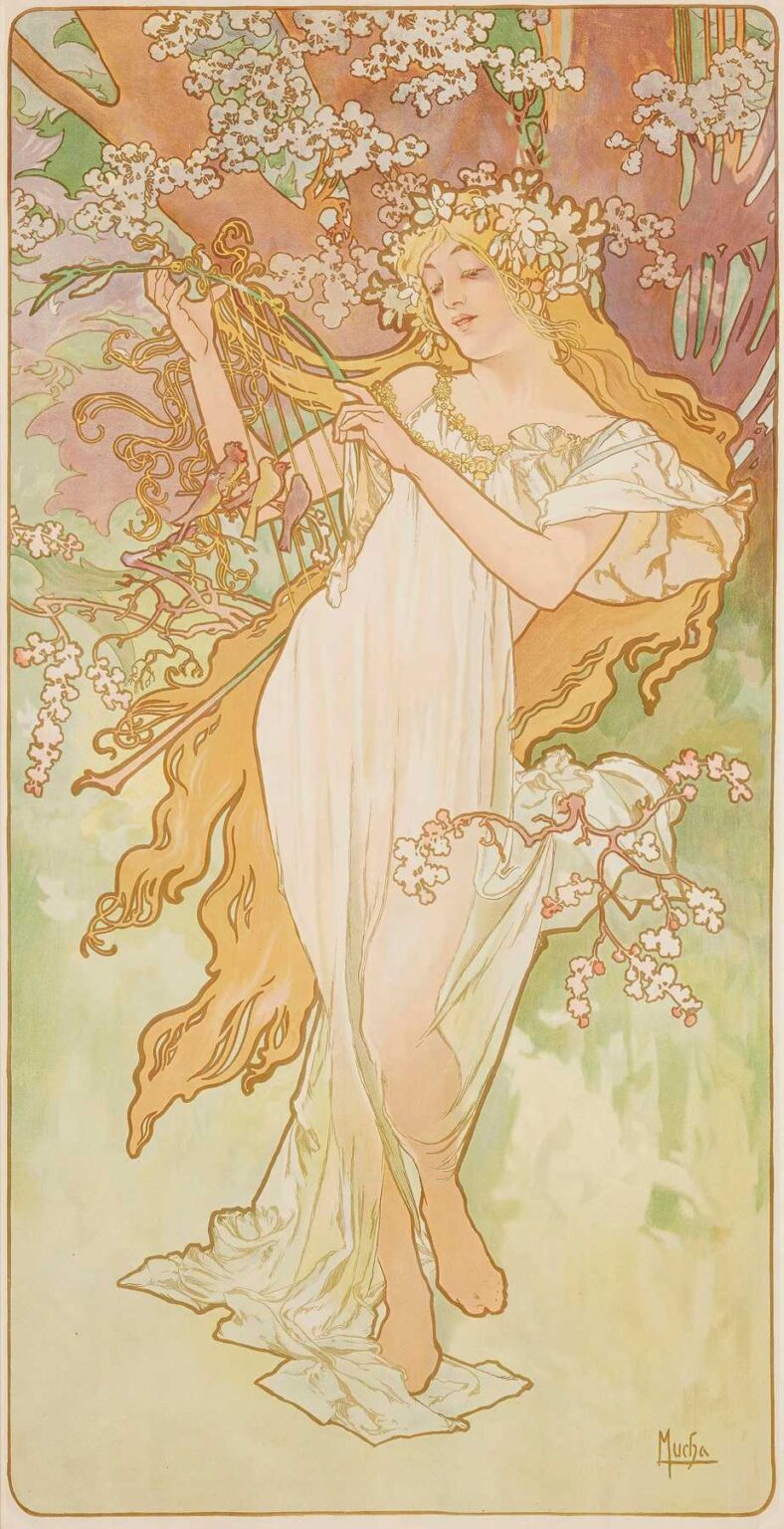
Alphonse Mucha’s Les Saisons 2 (1896) forms part of his celebrated four‐panel series Les Saisons, produced for the Neubert & Snyder publishing firm in Prague. A hallmark of the Art Nouveau movement, the series allegorically represents the changing cycle of the year through idealized female figures enveloped in nature’s shifting moods. In Les Saisons 2, Mucha captures the season’s unique atmosphere—an interplay of burgeoning life and languid warmth—while synthesizing Classical iconography, decorative pattern, and modern lithographic technique. This analysis explores the work’s historical context, formal composition, symbolic content, color and light treatment, line work, technical execution, and its enduring impact on decorative art.
Historical Context and Mucha’s Seasonal Commissions
By the mid-1890s, Mucha had risen to international prominence through his theatrical posters in Paris. His success prompted publishers across Europe to commission him for non‐commercial decorative works. In 1896, Neubert & Snyder approached Mucha to create a set of four lithographs representing Printemps, Été, Automne, and Hiver—the four seasons. Each panel, measuring approximately 60 × 160 cm, was intended for fine art prints, calendar illustrations, and collectible portfolios. Les Saisons 2 corresponds to the second season in the series; although Mucha did not title each sheet directly, collectors and scholars have aligned the order with Spring (1), Summer (2), Autumn (3), Winter (4). The series catered to a burgeoning middle‐class appetite for decorative art that bridged utilitarian calendars and gallery‐worthy prints.
Subject Matter and Allegorical Representation
In Les Saisons 2, Mucha embodies the second season—commonly identified as Summer—through a stately maiden playing a small harp or lyre beneath a flowering canopy. Her serene expression and graceful posture suggest a moment of tranquil reverie amid nature’s fullness. Mucha’s allegory is not didactic; rather than overt seasonal emblems (wheat sheaves for harvest, snow for winter), he opts for subtle botanical cues—clusters of white blossoms, budding leaves—and a sense of languid warmth in the palette. The figure’s classical drapery, flowing gold hair, and floral wreath evoke ancient mythic conceits, reminding viewers of summer’s timeless allure and its place in humanity’s cyclical narrative.
Compositional Structure and Spatial Dynamics
Mucha arranges Les Saisons 2 within a narrow vertical panel framed by a slender border, a format he popularized in his poster work. The composition centers on the figure, whose upright stance bisects the poster’s height. Her headdress crest aligns near the top third, while her bare feet and trailing hem balance the lower third. Diagonal elements—her outstretched arms, the harp’s angled frame, and cascading hair—create dynamic tension, guiding the viewer’s gaze in a gentle S-curve from the blossoms above down through her fingers to the instrument’s strings. Negative space around the figure’s silhouette, especially at the panel’s edges, ensures clarity and focus, while the background’s decorative pattern envelops rather than overpowers the central tableau.
Symbolic Flora and Seasonal Iconography
Mucha’s botanical motifs serve both decorative and symbolic functions. The overhanging branches, laden with clusters of small white blossoms, likely represent hawthorn or elderflower—plants associated with early summer and folkloric celebrations of life’s maturation. The wreath crowning the maiden’s head reinforces the connection between human and nature, signifying victory, abundance, and harmony. The harp itself, an ancient symbol of music and poetic inspiration, ties to the Classical muse tradition, suggesting that summer is a season of artistic flourishing. By weaving flora and allegory, Mucha transforms a simple representation of seasonality into a multifaceted meditation on growth, creativity, and the human spirit’s attunement to nature.
Color Palette and Light Effects
The palette of Les Saisons 2 exemplifies Mucha’s mastery of lithographic color harmonies. Dominant hues include warm golds, soft peaches, pale greens, and muted lavenders—colors that evoke sunlight filtering through foliage on a summer day. Mucha applies translucent lithographic inks over a cream-toned paper ground, allowing the paper’s warm undertone to function as natural highlights. Subtle gradations in the background shift from cool mint near the bottom to warmer terracotta near the top, creating an upward warmth that complements the figure’s ascendant posture. Metallic gold accents—applied via a separate litho stone—highlight her hair, wreath, and instrument, catching ambient light and lending the print a luminous quality reminiscent of gilded book illumination.
Line Work and the “Whiplash” Curve
A defining characteristic of Mucha’s Art Nouveau vocabulary is the “whiplash” or “coup de fouet” curve—a continuous, undulating line that animates figure and ornament alike. In Les Saisons 2, this fluid line shapes the maiden’s hair, the folds of her diaphanous dress, the harp’s ornate frame, and the swirling foliage patterns in the background. Mucha varies line weight masterfully: thick contours anchor the figure’s silhouette, medium strokes articulate drapery folds and botanical outlines, and fine lines detail facial features and hair strands. This rhythmic interplay of curves instills the composition with a sense of living movement, as though a gentle breeze stirs both hair and leaves, reflecting the season’s vibrant yet gentle energy.
Integration of Figure and Ornament
Unlike strictly figurative painting, Mucha’s decorative lithographs blur the boundary between subject and pattern. In Les Saisons 2, the maiden’s gown shares the palette and line quality of the surrounding blossoms, visually linking her to the natural world. Her hair and wreath extend into the background’s swirling vines, creating a unified tapestry of organic forms. This integration exemplifies Art Nouveau’s principle of Gesamtkunstwerk—harmonizing art, ornament, and architecture into a cohesive whole. Mucha’s composition invites the viewer to read figure and ornament as interdependent rather than hierarchical, celebrating the interconnectedness of humanity and nature.
Technical Lithographic Process
Producing Les Saisons 2 involved a complex chromolithographic workflow. Mucha first painted a full‐scale watercolor and pencil study, resolving color harmonies and compositional details. That master was then transferred—typically via chalk dust or crayon—to multiple lithographic stones or zinc plates, each corresponding to a specific hue: light flesh tones, golds, greens, purples, and black outlines. The printers used precise registration pins to align each pass, building the image layer by layer. Translucent oil‐based inks permitted subtle gradations, while metallic gold ink required careful mixing of bronze or mica powders. The result is a richly textured print that retains the vitality of Mucha’s original painting while exhibiting the crispness and repeatability of lithography.
Reception, Distribution, and Collectibility
Upon release in 1896, the Les Saisons series found immediate popularity among collectors of decorative prints, interior decorators, and affluent households seeking to adorn salons and drawing rooms with modern art. Mucha’s reputation ensured wide distribution through Neubert & Snyder’s catalogues and European art journals. Les Saisons 2, often associated with summer, was prized for its light‐filled palette and allegorical grace. Over the decades, original prints have become highly sought by museums and private collectors, commanding significant prices at auction. Their enduring appeal lies in the fusion of aesthetic beauty, technical virtuosity, and the universal theme of seasonal renewal.
Influence on Decorative Arts and Modern Design
Mucha’s Les Saisons series, and Les Saisons 2 in particular, influenced a broad range of decorative arts at the fin de siècle and beyond. Textile designers adapted his floral motifs for silk scarves and tapestries; furniture makers incorporated vine‐like carvings echoing his arabesques; stained‐glass artists used his color harmonies and haloed figure framing as prototypes for ecclesiastical and secular windows. Graphic designers in the early 20th century looked to Mucha’s integration of typography and image when crafting book covers and magazine layouts. Even today, echoes of his seasonal allegories appear in branding, pattern design, and illustration, demonstrating the timelessness of his decorative vision.
Conservation and Legacy
Original lithographic prints of Les Saisons 2 are preserved in institutions such as the Mucha Foundation (Prague), the Art Institute of Chicago, and the Museum of Fine Arts (Boston). Conservators address challenges inherent in turn‐of‐the‐century lithographs: paper acidity, ink fading under UV exposure, and abrasion of metallic inks. Treatments involve careful deacidification, stable climate‐controlled storage, and display under low‐light conditions with UV filters. Digital high‐resolution scanning has democratized access to Mucha’s work, allowing scholars and designers worldwide to study the intricate linework and color layering without risking damage to fragile originals.
Conclusion
Alphonse Mucha’s Les Saisons 2 stands as a masterful embodiment of Art Nouveau’s lyrical synthesis of figure, ornament, and nature. Through its elegant composition, harmonious palette, fluid linework, and symbolic depth, the print transcends mere seasonal illustration to become a timeless allegory of summer’s poetic vigor. Mucha’s combination of ancient mythic motifs and modern lithographic innovation created an artwork that continues to inspire decorative artists, graphic designers, and admirers of beauty over a century after its creation. In Les Saisons 2, we glimpse not only the richness of a single season but the enduring power of art to reflect and shape our experience of the natural world.