Image source: artvee.com
Introduction
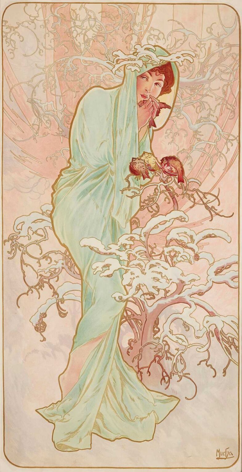
Alphonse Mucha’s Les Saisons 1 (1896) inaugurates his celebrated four-part series celebrating the cycles of nature. This lithograph, measuring approximately 140 × 50 cm, exemplifies Mucha’s mature Art Nouveau style at its most poetic. Rather than depicting conventional allegorical symbols of spring, Mucha presents a young woman in a luminous, almost diaphanous gown, surrounded by swirling organic motifs that evoke budding foliage and morning light. Through a harmonious interplay of composition, color, line, and symbolism, Les Saisons 1 invites viewers into a contemplative space where the promise of renewal and the beauty of ephemeral bloom are interwoven.
Historical and Cultural Context
The year 1896 was pivotal for Mucha and for Parisian poster art. The success of his 1894 Gismonda poster for Sarah Bernhardt had established him as the leading voice of the emerging Art Nouveau movement. The city’s streets and cafés were plastered with lithographs promoting theater, consumer goods, and cultural events, and the hunger for decorative elegance was insatiable. Simultaneously, Japonisme and medieval revivalism inspired artists to break with academic historicism, embracing natural forms and stylized ornament. Commissioned by printer F. Champenois, Les Saisons 1 formed part of a portfolio demonstrating the decorative potential of lithography—and, in doing so, asserted that everyday images could reach the heights of fine art.
Mucha’s Artistic Evolution to 1896
Having honed his draftsmanship at the Académie Julian and worked as an illustrator for French magazines, Mucha found his distinctive voice after encountering Bernhardt’s theatrical world. His early work balanced naturalistic detail with sinuous contours, but by the mid-1890s he had fully adopted the “whiplash” line and implemented a pastel-infused palette. Les Saisons 1 reflects this stylistic maturity: the figure’s modeling is more refined than in earlier posters, ornamental motifs are integrated seamlessly into the composition, and a soft glow emanates from the lithographic inks. Mucha’s confidence in combining classical proportions with modern decorative flourishes is evident throughout the sheet.
Subject and Allegorical Resonance
Rather than depict a literal scene of spring, Mucha opts for an emblematic approach. The young woman in Les Saisons 1 stands in a relaxed contrapposto, her gaze turned inward, suggesting both introspection and delight in the burgeoning world around her. Her gown, rendered in pale greens and creams, billows like new leaves in a gentle breeze. Surrounding her, swirling tendrils and stylized blossoms evoke vine shoots and flower buds, while a circular halo behind her head hints at the sun’s returning warmth. The figure thus becomes both human and elemental—a living embodiment of nature’s annual rebirth.
Composition and Spatial Dynamics
Mucha designs Les Saisons 1 on his characteristic elongated vertical format, optimized for street display and reminiscent of ecclesiastical stained glass. The composition divides into three registers: a narrow title band at the top, the central figure enveloped by ornament, and a lower field left largely open to emphasize the figure’s grounding. Within the central zone, Mucha arranges the young woman slightly off-center to the left, balancing her form with a flourish of curling vines on the right. The implied oval of ornament frames her torso and head, focusing attention on her serene profile. Diagonal folds of drapery and sinuous spray of vegetal ornament create a rhythmic interplay of curves that guide the viewer’s eye in a continuous, graceful loop.
Color Palette and Light Effects
Mucha’s palette for Les Saisons 1 is distinguished by soft pastels keyed to the emergence of spring. The background employs a warm ivory base, allowing printed inks to shimmer. Pale celadon greens in the figure’s robe suggest new growth, while muted peach and rose accents in the blossoms bring subtle warmth. The underdrawing’s graphite or crayon lines are visible in places, lending a hand-rendered quality. Lithographic layering of translucent inks produces gentle gradations of tone, evoking the luminous quality of dawn. Highlights—on the figure’s cheekbones, the crest of a leaf, or the petal’s edge—are achieved by allowing the paper ground to serve as natural white, reinforcing the sense of glowing spring light.
Line Work and Decorative Flourishes
At the heart of Mucha’s approach is the “whiplash” curve—continuous, dynamic lines that animate form and ornament. In Les Saisons 1, the figure’s hair strands, the drapery folds, and the curling vines all follow this principle, intersecting and echoing one another. Mucha varies line weight strategically: the figure’s outline is delineated in a bold contour, ensuring clear legibility from a distance, while fine interior strokes render fabric texture and botanical detail. Stylized blossoms—perhaps lilac or apple blossoms—are sketched with delicate loops, their repetition in the title band above forming a linking motif. The result is a tapestry of interlaced curves that unify figure, frame, and ornament in one harmonious whole.
Symbolism of Spring Motifs
The decorative elements in Les Saisons 1 are far from arbitrary. Budding blossoms and swirling tendrils symbolize nature’s cyclic renewal; the figure’s pale green dress echoes the first leaves of spring. A series of small circles and loops in the background hints at pollen drifting on a gentle breeze. The circular halo behind the figure’s head doubles as a sun symbol, reiterating the season’s long-awaited warmth. This intricate layering of symbolic motifs invites viewers to read multiple levels of meaning—ecological, emotional, and spiritual—within a single, unified image.
Typography and Title Integration
Mucha’s title band at the top of Les Saisons 1 features the words “Les Saisons” in a slender, hand-drawn serif that harmonizes with the poster’s flowing lines. Each letter is integrated into a decorative field of stylized flowers and vines, so that the text emerges almost organically from the ornament. This approach reflects Mucha’s conviction that lettering should be conceived as part of the imagery, not appended after the fact. The letters’ slight irregularities—variations in serif terminals, subtle shifts in stroke width—lend warmth and personality absent from mechanized typefaces.
Technical Execution and Lithographic Process
Creating Les Saisons 1 required meticulous collaboration between Mucha and the skilled lithographers at Champenois’s workshop. Mucha first prepared a full‐scale watercolor and pencil study that delineated the color zones and linework. This study was then transferred to multiple limestone plates—each responsible for a single ink color—through direct drawing or zinc‐plate transfer methods. Registration pins ensured that successive runs aligned perfectly. Translucent inks were chosen for their ability to allow the paper’s warm ground tone to function as highlight, and denser inks defined the bold contours. Occasional use of metallic bronze ink adds discreet highlights to select vine loops and flower centers, capturing ambient light and lending the print a subtle iridescence.
Reception and Contemporary Impact
Upon its release, Les Saisons 1 received acclaim in both popular and critical circles. Le Gaulois praised Mucha’s “lyrical spirit,” while L’Art Moderne lauded the sheet as “a refreshing celebration of nature’s resurgence.” Collectors of salon art sought the lithograph for display in private salons, cafés, and bookshops, where its pastel harmony and decorative richness provided a pleasing counterpoint to urban bustle. The portfolio’s success encouraged Champenois to publish further decorative sheets, and it influenced contemporaries such as Georges de Feure and Eugène Grasset to explore similar series on seasonal or elemental themes.
Influence on Art Nouveau and Legacy
Mucha’s Les Saisons 1 contributed to the international diffusion of Art Nouveau’s principles. Its integrated approach to figure and ornament informed design schools and practitioners across Europe—from the Vienna Secession to the Glasgow Style. Interior designers adapted Mucha’s color harmonies and botanical motifs in fabrics, wallpapers, and ceramics. Graphic designers studied his letterforms and compositional balance, applying them to book covers, magazine layouts, and product labels. Today, Les Saisons 1 endures as a touchstone for those seeking to marry natural beauty with modern decorative clarity.
Conclusion
Alphonse Mucha’s Les Saisons 1 stands as a luminous testament to the transformative power of lithographic art. Through masterful composition, sinuous linework, a delicately layered palette, and evocative symbolism, Mucha elevates the simple theme of spring’s renewal into a poetic meditation on nature and the human spirit. More than a decorative poster, Les Saisons 1 remains a lasting emblem of the Belle Époque’s fusion of art and daily life, inviting viewers to bask in the perennial promise of new beginnings.