Image source: artvee.com
Historical Context: Parisian Poster Art in 1912
By 1912, Paris had emerged as the epicenter of commercial poster art. Advances in color lithography, mass‐printing techniques, and the rapid expansion of outdoor advertising transformed urban boulevards into open‐air galleries. Brands vied for attention through larger‐than‐life images and succinct messaging. Leonetto Cappiello, an Italian émigré caricaturist turned poster designer, led this revolution. Rejecting the dense copy and ornamental frames of 19th-century ads, he distilled each campaign to one powerful visual motif set against a flat background. His 1912 liquor poster—commissioned by Imprimerie Vercasson—exemplifies this mature style. Through a single theatrical figure clad in fin-de-siècle costume, Cappiello conveys the drama, quality, and allure of a fine spirit in an era thirsting for spectacle and sensual pleasure.
Leonetto Cappiello’s Artistic Evolution
Leonetto Cappiello was born in Livorno, Italy, in 1875 and settled in Paris by the early 1890s. He first won acclaim for his caricatures in Le Rire and La Vie Parisienne, where his economy of line and visual wit stood out. Around 1900, sensing that the poster medium demanded a different language than magazine caricature, Cappiello began designing advertisements. His breakthrough came with Amandines de Provence (1902) and Angelus (1902), which introduced his signature approach: a single, evocative image on a flat, high-contrast field. Over the next decade he refined this method, embracing bolder color palettes and more dynamic compositions. The 1912 liquor poster marks the apex of this phase, blending his caricaturist’s flair for character with painterly shading and Art Nouveau elegance, while prefiguring the streamlined energies of forthcoming Art Deco.
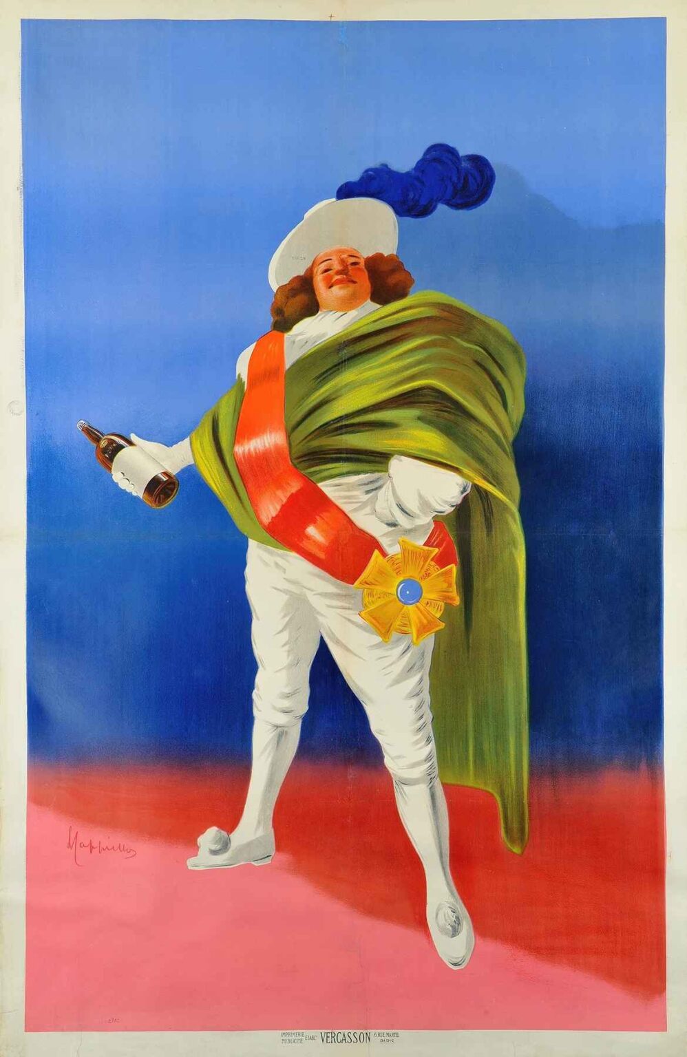
Brand Identity: The Power of a Theatrical Mascot
The 1912 poster features a single male figure dressed in elaborately tailored white breeches, high-collared shirt, and velvet-draped cloak fastened by a radiant star-shaped medal. A plumed cavalier’s hat perches atop his head. In his right hand he holds aloft a bottle of liquor as if toasting an invisible audience; his left hand rests confidently on his hip. Though the brand name and product details are omitted from surviving proofs, contemporary records identify the figure as a playful mascot—an embodiment of the spirit’s refinement and festive character. By personifying the brand in a memorable, larger-than-life personality, Cappiello ensured that consumers would associate the drink with the swagger and joie de vivre the figure projects, creating an immediate and lasting bond.
Composition: Monumental Simplicity and Dynamic Gesture
Cappiello’s poster design achieves maximum visual impact through bold simplicity. The lone figure dominates the canvas, placed slightly off-center to the right. The sweeping diagonal of his cloak and the upward thrust of his arm guide the viewer’s eye from the bottle to his triumphant visage. Negative space—rendered in a luminous gradient from royal blue at the top to rose pink at the bottom—frames the character without distraction. The absence of text around the figure creates a sense of theatrical focus, as if the viewer watches a solo performance. The balanced asymmetry—body angled left, arm raised right—imbues the static print with kinetic energy, a sense of motion that anticipates the viewer’s desire to claim the bottle himself.
Color Palette: Emotional Resonance and Brand Allure
Color operates as a primary narrative force. The pristine white of the figure’s costume suggests purity and quality, recalling the clarity of a well-distilled spirit. The emerald green cloak conveys luxury and botanical richness, hinting at herbal infusions or aged oak nuances in the liquor. A scarlet sash introduces passion and ceremonial flair, its bold tone drawing attention to the star-shaped medal—a symbol of excellence and distinction. The gradient blue-to-pink background evokes a theatrical spotlight or twilight sky, situating the figure in a liminal realm between day and night, propriety and revelry. These warm and cool tones interact to create depth and mood, making the poster both attention-grabbing and evocatively atmospheric.
Typography and Branding Strategy
Remarkably, the surviving design for this 1912 liquor poster omits large headline text, relying entirely on the image to communicate brand identity. The only typographic element is the small credit line at the bottom: “Imprimerie Vercasson” in plain sans-serif. This extreme economy underscores Cappiello’s belief that a poster’s visual center of gravity should be its motif, not copy. By eliminating competing text, he elevates the theatrical figure to symbol status: the brand becomes synonymous with its mascot. In practice, distributors would affix product details and vendor information below the image in standardized banners, preserving the design’s integrity while fulfilling informational needs.
Symbolism and Emotional Narrative
At its symbolic core, the 1912 liquor poster stages an allegory of social elevation. The cavalier’s garb and military insignia evoke chivalry, prestige, and ceremony—qualities the brand aspired to. The bottle, raised in a celebratory toast, becomes a talisman of good company and spirited discourse. The viewer, confronted with this commanding figure, is invited to partake in a ritual of refinement: lifting a glass, engaging in conviviality, and momentarily inhabiting the mask of aristocratic revelry. In a society grappling with the tensions of modernity, mass production, and lingering class hierarchies, this narrative offered a form of accessible luxury—anyone could taste of nobility through a simple purchase.
Spatial Dynamics: Flatness and Depth
While the background remains a flat gradient, Cappiello introduces the illusion of depth through subtle shading on the figure’s cloak and the bottle’s curvature. The cloak’s folds cast soft shadows on the breeches beneath, and highlights on the flute-neck bottle suggest threedimensional form. The star medal’s beveled edges appear to catch the light, adding another layer of dimensionality. These touches, confined to the figure itself, emphasize his tangibility against an otherwise graphic void. The result is a focused interplay of flat and modeled elements that keeps the design modern and painterly without veering into photographic realism.
Technical Excellence in Lithographic Production
Printed by Imprimerie Vercasson & Cie, the 1912 poster leveraged the latest lithographic techniques. Each major hue—white, green, red, blue, pink—required a separate stone and press run. Skilled carvers created fine gradations for the background and painterly textures for the cloak, while pressmen executed largeformat runs with exacting registration. The final prints, typically over a meter tall, displayed uniform ink coverage and razor-sharp lines. This technical rigor ensured that Cappiello’s vision endured on city walls despite weathering and sunlight, cementing his reputation for posters that were both artistic triumphs and commercial workhorses.
Cultural Reception and Market Impact
Upon its debut, the 1912 liquor poster became ubiquitous in Parisian cafés, brasseries, and railway stations. Retailers reported surging inquiries for the spirit bearing the charismatic cavalier, attributing much of this uptick to Cappiello’s arresting design. Critics lauded the poster’s painterly quality and its novel absence of headline copy, contrasting it with competitors’ cluttered promotional bills. The campaign’s success prompted beverage houses across Europe to commission similarly bold, image-first posters, hastening the shift toward modern graphic advertising. In this way, Cappiello’s 1912 design not only sold liquor but also reshaped visual marketing norms for decades.
Legacy and Lasting Influence
More than a century later, Leonetto Cappiello’s 1912 liquor poster stands as a cornerstone in the history of graphic design. Its fusion of seamless illustration, dynamic composition, and minimal text continues to inspire contemporary branding. Design schools cite it as a masterclass in hierarchy, color theory, and the power of metaphor. Original lithographs trade at auction for significant sums, prized for their rarity and pristine condition. Museums from the Musée des Arts Décoratifs in Paris to the Poster House in New York preserve and exhibit these prints as exemplars of the golden age of advertising. The poster’s influence persists in digital media, where the principle of a single hero image remains central to website design and social-media marketing.
Conclusion: The Timeless Appeal of a Single, Bold Image
Leonetto Cappiello’s 1912 poster for a fine liquor captures a moment when advertising art transcended commerce to become a cultural force. By distilling brand identity into one bold cavalier figure set against a radiant gradient, Cappiello demonstrated the enduring power of visual metaphor. Technically impeccable, emotionally resonant, and graphically modern, the poster exemplifies how a single, well‐conceived image can captivate the public and define a product’s place in the collective imagination. Over a hundred years on, the design reminds us that clarity of vision—paired with dramatic composition and color mastery—remains the most potent tool in the advertiser’s arsenal.