Image source: artvee.com
Introduction: Chocolate, Posters, and the Parisian Streetscape of 1911
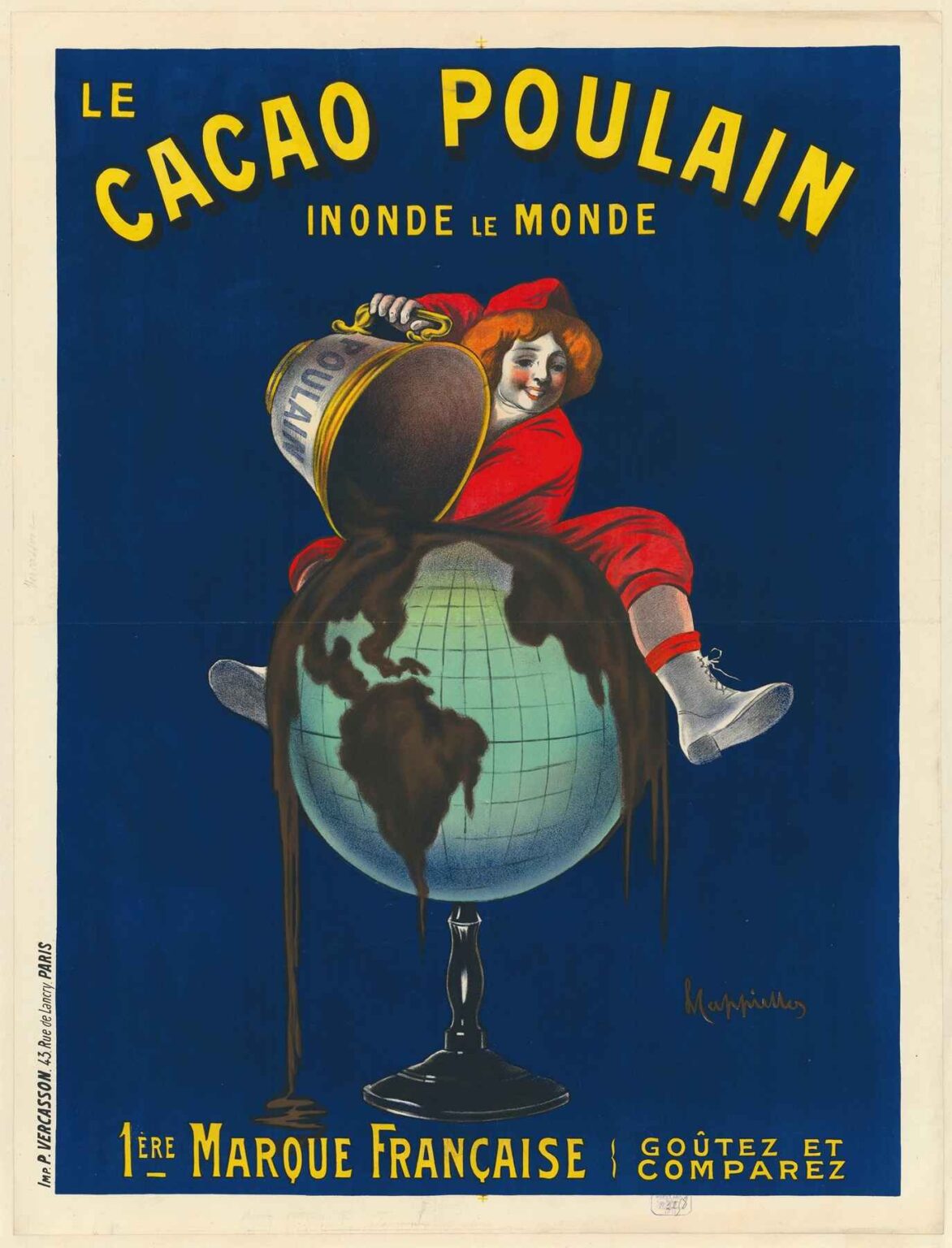
In 1911, Paris’s boulevards were alive with an explosion of color as commercial posters transformed city walls into galleries of modern art. Among these, Leonetto Cappiello’s advertisement for Le Cacao Poulain stands out as a masterpiece of visual persuasion. Commissioned by the venerable Poulain chocolate house to promote its claim as France’s leading cocoa brand, Cappiello’s design depicts a cherubic child in bright red, perched atop a globe, pouring a torrent of melted chocolate that floods the world below. At once whimsical and commanding, “Le Cacao Poulain Inonde le Monde. 1ère Marque Française. Goûtez et Comparez” captured the collective imagination, cementing the power of graphic art in shaping consumer desire. This analysis delves into the historical context, artistic innovation, compositional mastery, and enduring legacy of Cappiello’s 1911 poster, illustrating why it remains a touchstone for designers and advertisers over a century later.
Historical Context: The Rise of Chocolate and Poster Art in Belle Époque France
At the dawn of the 20th century, chocolate had evolved from an exotic luxury to a staple of European confections. The success of houses like Poulain, founded in 1848 in Blois, reflected improvements in cocoa processing, the spread of rail networks, and growing urban affluence. Simultaneously, Paris became the epicenter of lithographic poster art, propelled by technological advances in color printing and a burgeoning appetite for visual spectacle. Brands found that a single, striking image posted on kiosks, walls, and billboards could generate far more attention than newspaper ads. Cappiello, originally a caricaturist for journals such as Le Rire, was one of the first to elevate posters into works of modern art. By 1911, his minimalist, motif-driven approach had crystallized into a formula that communicated product virtues at a glance—an ideal match for a brand like Poulain seeking mass appeal in a crowded market.
Leonetto Cappiello: From Caricature to Graphic Pioneer
Born in Livorno, Italy, in 1875, Leonetto Cappiello moved to Paris in the early 1890s. He initially made his mark as a witty caricaturist for leading journals, where his bold lines and incisive humor stood out. By 1900, he recognized that the poster medium demanded a different visual language—one of immediacy, clarity, and decorative impact. Rejecting the ornate borders and dense copy of earlier posters, Cappiello distilled each campaign to a single, powerful image against a flat background, accompanied by minimal text. His breakthrough with “Amandines de Provence” (1902) and “Angelus” (1902) demonstrated the potency of this approach. Over the next decade, he experimented with increasingly dynamic compositions and richer palettes. The Poulain cocoa poster of 1911 represents the zenith of his early period: it combines playful character design, fluid painterly strokes, and a fearless use of scale to create an unforgettable visual metaphor for chocolate’s worldwide appeal.
Brand Heritage: Poulain Cocoa’s 1ère Marque Française
By 1911, Poulain had established itself as France’s premier cocoa brand. Hippolyte Poulain’s innovations—most notably the steam infusion process that enhanced cocoa’s flavor and solubility—had transformed the product from a coarse, bitter paste into a smooth, accessible drink and baking ingredient. The company’s motto, “Goûtez et Comparez” (“Taste and Compare”), invited consumers to judge its superiority for themselves. To reinforce this message, Poulain sought an advertisement that would dramatize the brand’s global reach and convince an expanding middle class that it offered an unrivaled chocolate experience. Cappiello’s assignment was to personify cocoa’s spread with humor and grandeur, marrying Poulain’s heritage of quality with the exuberant spirit of the Belle Époque.
Composition: Sweeping Motion and Monumental Scale
Cappiello’s composition for Le Cacao Poulain is designed for maximal street-side impact. The poster’s protagonist—a cherubic child clad in vivid red—dominates the upper half of the image. Seated astride an oversized globe, the child tilts a giant metal bucket labeled “POULAIN,” releasing a glistening river of melted chocolate that cascades over continents and drips toward the poster’s lower edge. The globe’s pale green and turquoise tones contrast sharply with the chocolate’s rich mocha hue and the vibrant crimson of the child’s attire. Above the scene, the brand’s headline lettering in bright yellow arcs across a deep cobalt background: “LE CACAO POULAIN INONDE LE MONDE.” Below, the promise “1ÈRE MARQUE FRANÇAISE GOÛTEZ ET COMPAREZ” appears in a straighter, classical sans-serif face. The combination of bold diagonals, sweeping curves, and high-contrast color fields commands the eye, ensuring the poster stands out amid the visual din of cafés and kiosks.
Color Palette: Dynamic Contrast and Emotional Appeal
Color plays a crucial role in this poster’s magnetic allure. The crimson red of the child’s clothing signifies warmth, vitality, and the luxurious richness of cocoa. Red, long associated with both appetite and childhood delight, invites viewers to share the child’s exuberant act. The flowing brown chocolate, painted with subtle highlights and volumetric shading, connotes sensory pleasure and melt-in-the-mouth smoothness. Against these warm tones, the pale green globe evokes freshness and the exotic origins of cocoa beans, transported from far-flung plantations. The cobalt blue background provides a cool, unified field that allows every other hue to flash with brilliance. Finally, the bright yellow typography crowns the composition with an energetic punctuation. Together, these complementary and contrasting colors generate a multisensory suggestion of taste, texture, and excitement that transcends mere product illustration.
Typography and Brand Messaging
Cappiello’s typography balances decorative flourish with directness. The headline “LE CACAO POULAIN” employs a stylized Art Nouveau–inspired font, the letters slightly curved to echo the globe’s roundness. The phrase “INONDE LE MONDE” appears in narrower capitals, emphasizing the promise of global abundance. This heroic scale and dynamic arching of the text make the brand claim impossible to miss. At the bottom, “1ÈRE MARQUE FRANÇAISE” asserts Poulain’s domestic leadership, while “GOÛTEZ ET COMPAREZ” invites skeptical consumers to verify for themselves. By limiting text to the essentials—brand, product claim, market position, and call to action—Cappiello avoids clutter and ensures seamless integration with the central image. The hierarchy of type guides the eye from brand to promise to invitation, anchoring the viewer’s journey through the poster’s narrative.
Symbolism and Emotional Narrative
Beyond its surface playfulness, “Le Cacao Poulain Inonde le Monde” conveys a potent cultural allegory. The child figure, emblematic of innocence and unbridled delight, becomes a heroic bringer of sweetness and joy. By personifying cocoa in human form, Cappiello suggests that Poulain’s product is not merely a commodity but a catalyst for universal happiness. The act of flooding the globe with chocolate conveys abundance, generosity, and the idea that a single brand can unify tastes across continents. In pre-World War I Europe, this message resonated with an expanding middle class seeking comfort and novelty. It also aligned with the era’s colonial narratives—cocoa beans imported from Africa and the Americas reimagined as an elixir for European sensibilities. Cappiello’s poster thus encapsulates both the pleasure economy and the globalized trade context of the Belle Époque.
Spatial Dynamics: Balancing Flatness and Depth
Although the poster relies on large flat color fields, Cappiello introduces a sense of depth through careful modeling. The child’s form and the chocolate’s flow are rendered with painterly shading that suggests volume. Highlights on the bucket’s metallic rim and the liquid’s surface create the illusion of gleaming texture. The globe’s grid lines and muted color graduation imply curvature. Despite the flat expanses of blue background, these touches of dimensionality anchor the central figure in a tangible space. The juxtaposition of flat and modeled elements generates visual tension, keeping the viewer engaged and reinforcing the dynamic flooding motion across the globe.
Technical Mastery: Lithographic Innovation
Printed by Imp. Vercasson & Cie in Paris, Cappiello’s poster exploited the era’s advanced chromolithographic capabilities. Each dominant hue—crimson, brown, green, blue, yellow—required its own limestone stone, meticulously carved to preserve the design’s crisp edges and subtle gradations. The seamless backgrounds and the smooth transitions in the chocolate’s highlight demanded exceptional skill in ink application and press calibration. Final prints, often exceeding one meter in height, showcased uniform saturation and striking clarity. This technical excellence not only realized Cappiello’s complex vision but also ensured that the poster endured on sun-exposed streets without rapid fading or loss of detail.
Cultural Reception and Market Impact
Upon its release, “Le Cacao Poulain Inonde le Monde” rapidly became ubiquitous across Parisian cafés, confectioneries, and street kiosks. Its whimsical yet commanding imagery captivated passersby, driving inquiries and boosting cocoa sales for Poulain. Contemporary accounts in trade journals praised its painterly quality and the novel concept of literally flooding the world with chocolate. Rival confectioners scrambled to commission similarly imaginative posters, but few matched Cappiello’s blend of humor, symbolism, and graphic boldness. The campaign’s success solidified Poulain’s leadership and underscored the primacy of poster art in early 20th-century marketing. It also cemented Cappiello’s reputation as the “father of modern advertising,” a visionarian who transformed brand communication into visual poetry.
Legacy and Enduring Influence
More than a century after its creation, Leonetto Cappiello’s poster for Le Cacao Poulain remains a cornerstone in the history of graphic design. Its single-motif approach, vibrant color palette, and seamless integration of text and image continue to teach fundamental lessons in branding and composition. Museums worldwide—from the Musée des Arts Décoratifs in Paris to the Poster House in New York—display original lithographs, where they command admiration for their technical prowess and creative ingenuity. Design educators highlight the poster’s clarity, emotion, and commercial efficacy as exemplary; contemporary brands still draw upon Cappiello’s principle that a single, powerful visual can convey an entire narrative. Collectors prize early prints for their rarity and impeccable preservation, recognizing their central role in the evolution of modern advertising.
Conclusion: The Timeless Power of a Single, Bold Vision
Leonetto Cappiello’s “Le Cacao Poulain Inonde le Monde. 1ère Marque Française. Goûtez et Comparez” stands as a masterwork where art and commerce converge seamlessly. By depicting a child liberating a flood of chocolate across the globe, Cappiello distilled brand promise into an unforgettable allegory of abundance and joy. His fearless use of color, economy of text, painterly shading, and dynamic composition created a visual experience that transcended mere product illustration to embody the very essence of chocolate’s delight. Over a century later, the poster’s impact endures, reminding us that the most effective advertising draws upon narrative, emotion, and aesthetic innovation in equal measure. In the annals of graphic design, Cappiello’s flood of chocolate continues to wash over and inspire generations of artists and marketers alike.