Image source: artvee.com
Introduction
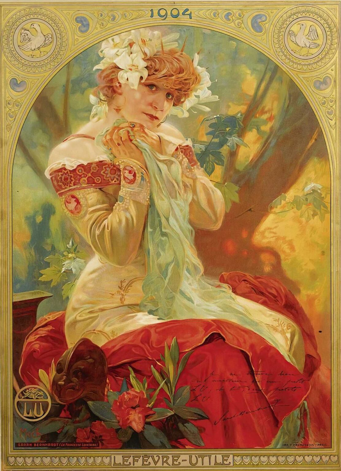
Alphonse Mucha’s 1903 lithographic poster Lefèvre-Utile – Sarah Bernhardt exemplifies the full flowering of Art Nouveau at the turn of the twentieth century. Commissioned to advertise Lefèvre-Utile (“LU”) biscuits through the legendary actress Sarah Bernhardt, this sumptuous image transcends mere commercial illustration to become an icon of decorative art. Measuring roughly 120 by 80 cm in its original billposting format, the work features Bernhardt as “La Princesse Lointaine,” draped in ivory and scarlet, crowned with lilies, and set against a luminous woodland backdrop. Mucha’s design orchestrates figure, ornament, and typography into a seamless whole, offering both visual delight and persuasive branding. In this analysis, we will explore the historical context, Mucha’s artistic evolution, the poster’s compositional ingenuity, and its lasting impact on graphic design and popular culture.
Historical and Cultural Context
At the dawn of the 20th century, Paris stood at the epicenter of artistic innovation and commercial spectacle. The Exposition Universelle of 1900 had showcased advances in industry and the applied arts, while the urban landscape teemed with colorful billboards promoting theater, products, and travel. Sarah Bernhardt (1844–1923), already dubbed “the Divine Sarah,” was Europe’s most celebrated actress, commanding headlines and crowds with her dramatic roles. Meanwhile, Lefèvre-Utile, founded in 1846, had become a household name for its delicately flavored biscuits. In commissioning Mucha—a rising star of poster design—to create a series of advertisements pairing LU with Bernhardt’s star power, the company tapped into a cultural moment that embraced theatrical glamour, artisanal craftsmanship, and the novel possibilities of mass reproduction. The resulting poster bridges the worlds of high art and consumer culture, reflecting fin-de-siècle Paris’s appetite for beauty and novelty.
Alphonse Mucha and the Art Nouveau Movement
Born in 1860 in Moravia, Alphonse Mucha trained at the Munich Academy before relocating to Paris in 1887. His breakthrough came in 1894 with a poster for Sarah Bernhardt’s play Gismonda, after which he forged a signature style characterized by sinuous lines, ethereal female figures, and richly patterned ornament. Art Nouveau—literally “New Art”—celebrated organic forms inspired by plants, Japanese prints, and medieval craftsmanship. Mucha became one of its most visible exponents, producing theater posters, advertisements, book illustrations, and decorative panels that exemplified the movement’s belief in the unity of beauty and function. By 1903, when he created the Lefèvre-Utile – Sarah Bernhardt poster, Mucha had mastered multi-stone lithography, enabling him to deploy a delicate pastel palette alongside jewel-like accents. His work not only defined the aesthetics of Parisian streets but also influenced decorative arts across Europe and North America.
Commission and Purpose of the “Lefèvre-Utile – Sarah Bernhardt” Poster
Lefèvre-Utile sought to associate its butter biscuits with the glamour and prestige of Sarah Bernhardt. The company’s marketing brief called for a striking image that could unify brand identity and celebrity endorsement. Mucha responded with a lithographic sheet designed for display in tram shelters, café walls, and magazine inserts. The poster was titled simply Lefèvre-Utile at the bottom, with Sarah Bernhardt (La Princesse Lointaine) inscribed in small capitals, signaling Bernhardt’s role in the promotional narrative. Rather than depict the actress offering a biscuit directly, Mucha chose to present her in character, enveloped in lilies (symbolic of purity and theatrical romance) and holding a diaphanous scarf. The association between actress and product is thus implied through elegance and refinement, appealing to consumers’ aspirations rather than literal demonstration.
Subject and Iconography
At the heart of the poster stands Bernhardt as the Princess Lointaine from Edmond Rostand’s 1895 play, an embodiment of distant nobility and poetic longing. She gazes directly at the viewer with a blend of vulnerability and quiet authority. White lilies crown her coppery hair—signifiers of innocence, theatricality, and Mucha’s floral vocabulary—while her gown of ivory satin and red brocade evokes both classical drapery and contemporary fashion. In the lower foreground, a cluster of azaleas and an empty theater mask allude to theatrical pageantry. The intertwining of botanical symbols with performative props invites multiple readings: the purity of the biscuit brand, the blossoming of sensual pleasure, and the transitory nature of performance. Mucha’s iconography thus operates on aesthetic, symbolic, and commercial levels simultaneously.
Composition and Layout
Mucha integrates figure and ornament through an arched composition reminiscent of medieval stained glass. The top border bears the date “1904” within filigreed hearts and quatrefoils, framing the scene like a reliquary. Behind Bernhardt, a sun-dappled grove emerges in softly blurred brushstrokes, creating depth without detracting from the foreground. The actress’s pose—body in three-quarter view, head in profile—aligns with the poster’s vertical axis, while the circular halo of mythic scale centers her visage. Below, the lower border of stylized hearts encloses the Lefèvre-Utile brand name, balancing the composition’s visual weight. Negative space around the subject allows her figure to breathe, preventing the dense ornament from overwhelming the eye. Mucha’s precise arrangement ensures clarity of message and aesthetic harmony, hallmarks of successful Art Nouveau design.
Color Palette and Light
Mucha’s palette in this poster fuses warm autumnal tones with cool highlights. Golden sunlight filters through the leaves, suffusing Bernhardt’s skin with a pearlescent glow. Her copper hair picks up amber reflections from the background, while the white lilies contrast with the deep reds of her skirt. Translucent washes of turquoise and sage swirl in her scarf, suggesting breeze and theatrical movement. Mucha achieved these effects through multiple lithographic stones—likely eight to ten—each laid down in successive layers. The interplay of warm ochres and cool aquamarine harmonies reflects the period’s fascination with Japonisme and Impressionist color theories. The poster’s luminosity arises not only from pigment but from the unprinted paper highlights, allowing light to reflect off the surface and enhance depth.
Linework and Decorative Motifs
Central to Art Nouveau’s visual language is the rhythmic curve, or “whiplash” line, which Mucha employs masterfully in Bernhardt’s hair, the folds of her garment, and the trailing scarf. Varying line thickness delineates form: firm outlines anchor the figure against the dappled backdrop, while finer lines trace embroidery motifs and floral details. The upper and lower borders incorporate heart motifs that echo the actress’s passionate gaze, reinforcing the commercial tagline—in effect, “LU biscuits are the heart of Parisian taste.” The integration of theater masks, lilies, and stylized foliage demonstrates Mucha’s skill in generating decorative unity from diverse elements. Each motif flows seamlessly into the next, guiding the viewer’s eye in an unbroken circuit around the composition.
Typography and Branding Integration
Mucha revolutionized the integration of text and image in poster design. In the Lefèvre-Utile – Sarah Bernhardt sheet, the LU monogram appears in the lower left within a medallion, anchoring the brand visually. The main brand name LEFÈVRE-UTILE runs across the bottom in a custom Art Nouveau typeface—elongated, elegant, and echoing the poster’s curves. The minimal use of text focuses attention on the imagery, yet the flowing letterforms participate in the decorative scheme, avoiding rigid text boxes. Bernhardt’s name and role are placed unobtrusively, allowing aficionados to recognize her image instantly without distracting from the visual narrative. This seamless fusion of branding and artistry set a new standard for advertising, demonstrating that commercial messaging could coexist with high aesthetic values.
Lithographic Technique and Material Craftsmanship
Creating this poster demanded rigorous precision in multi-stone lithography. Mucha began with a detailed pencil or charcoal drawing, then transferred the design to limestone plates using greasy crayons and tusche washes. Each color—cream, gold, coral, emerald, teal—required its own plate, with registration pins ensuring exact alignment. The final prints were struck on heavy, slightly cream-toned stock, chosen to enhance warmth and lend an artisanal touch. Visible crayon textures in shaded areas attest to Mucha’s direct involvement at each stage, despite the mechanical reproduction. Given the poster’s public exposure, printers executed multiple runs, making consistent ink mixing and paper quality crucial. Original proofs, distinguished by subtly richer hues and finer detail, remain prized by collectors as exemplars of turn-of-the-century printmaking.
Reception and Cultural Impact
Upon its release, the Lefèvre-Utile – Sarah Bernhardt poster garnered acclaim for its technical brilliance and graceful integration of celebrity and product. Theatergoers, biscuit enthusiasts, and art critics alike admired Mucha’s ability to elevate everyday advertising into an object of desire. The image quickly became ubiquitous across Parisian boulevards, reinforcing LU’s market dominance and Bernhardt’s star persona. Mucha’s approach influenced contemporaries such as Georges de Feure and Eugène Grasset, who adopted similar strategies of decorative cohesion and typographic harmony. The poster also helped cement the notion of the lithographic sheet as a collectible art form, spawning domestic and international demand for Mucha’s works in salons and galleries.
Legacy and Influence
More than a century later, the Lefèvre-Utile – Sarah Bernhardt poster remains a touchstone of Art Nouveau and early advertising art. Museums worldwide—including the Musée d’Orsay and the Victoria & Albert Museum—exhibit original prints as emblematic of turn-of-the-century design. Graphic designers continue to study Mucha’s compositional strategies and typographic innovations, applying his lessons to contemporary branding and digital media. The image’s enduring appeal lies in its fusion of elegance and emotion, demonstrating the power of well-crafted visuals to shape public perception. Bernhardt’s visage, immortalized amid lilies and golden light, also symbolizes the fleeting yet immortal nature of fame—an idea that resonates in today’s celebrity-driven culture.
Conclusion
Alphonse Mucha’s Lefèvre-Utile – Sarah Bernhardt poster transcends its commercial origins to become a masterpiece of decorative art. Through masterful composition, rich color harmonies, and seamless integration of text and image, Mucha elevated advertising to a form of visual poetry. The poster’s success in 1903 underscores the convergence of consumer culture, theatrical glamour, and artistic innovation that defined Belle Époque Paris. More than a mere advertisement for biscuits, it stands as a testament to the enduring power of beauty in everyday life—and to Mucha’s singular vision that art and commerce need not be mutually exclusive. Over a century later, this iconic sheet continues to captivate audiences and inspire designers, affirming its place in the pantheon of graphic art.