Image source: wikiart.org
First Look: A Portrait That Breathes in Color
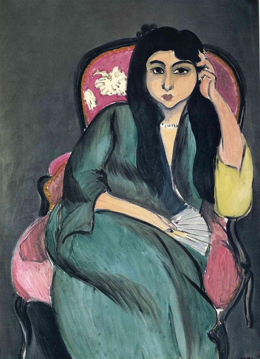
Henri Matisse’s “Laurette in Green in a Pink Chair” (1917) welcomes the viewer with a calm yet charged encounter between a model and her surroundings. Laurette, the artist’s most frequent sitter in 1916–1917, reclines in an ornate pink bergère against a flat, dark-gray ground. She wears a flowing green robe, her long black hair framing an oval face whose expression is at once alert and inward. One hand props her head; the other rests near a small folding fan. A narrow necklace glints at the throat, and at the right sleeve a surprising yellow cuff breaks the dominant green. The canvas is large but stripped of clutter. The chair, the robe, the hair, the face, a fan, a necklace—these few elements are asked to carry all the weight. They do so through a set of clear relationships: green against pink, light flesh against black contour, soft drapery against the hard silhouette of the chair. Nothing is fussy, yet everything is precise.
1917: Discipline Under Pressure
The year matters. In 1917, with the war still raging, Matisse’s painting shed the fireworks of early Fauvism and took on a language of discipline: reduced palettes, controlled value separations, and the use of black as a structural color. Laurette was central to this transformation. She allowed Matisse to hold the human figure steady while he rebalanced drawing and color. This portrait condenses that experiment into a poised, frontal image—at once modern in its flatness and timeless in its classical serenity. It prepares the ground for the Nice interiors soon to follow, but it retains the wartime ethic of clarity.
Composition: A Triangle of Calm
The composition resolves quickly. The pink chair is an elegant oval that cups the sitter and locks into the rectangular frame; the green robe swells outward in a broad triangular mass that tips gently to the left; Laurette’s head, dark and compact, completes the triangle’s apex. This geometry stabilizes the pose without stiffening it. The chair’s curving arms and crest echo the roundness of Laurette’s shoulders and hair, while the thin black contours that trace chair and figure act like ligatures holding the design in place. The pose leans to one side, but the composition refuses to feel precarious; the figure and chair rest on a quiet scaffold of arcs and diagonals.
The Pink Chair as a Stage
Matisse loved furniture as much for its shape as for its function. Here the bergère is a stage. Its pink upholstery—saturated but softened by chalky whites and pearly highlights—sets a chromatic climate that makes the robe’s green glow. Decorative white sprays on the back cushion, abbreviated almost to stencils, telegraph pattern without distracting from the figure. A gold strip along the frame warms the edge and keeps the pink from floating. The chair’s curves repeat throughout the picture: in the rounded hairline, the oval face, the fan’s arc, and the robe’s folds. The furniture, then, is not background; it is the architecture the portrait breathes within.
Color Structure: Green, Pink, and a Single Yellow Spark
The picture’s power rests on a limited but exquisitely tuned palette. The robe’s green is modulated from deep bottle tones to bluish teal; its cooler notes advance against the pink and recede against the gray ground, creating subtle depth without perspective tricks. The chair’s pink, built from rose and salmon, sets a warm field that flatters the flesh and intensifies the green by complement. The background is a broad, matte gray that refuses to compete; it lets color relationships do the talking. And at the right sleeve Matisse plants a small, confident shock of yellow. That single spark bridges warmth and coolness, turning a two-part chord into a triad and energizing the entire right side of the canvas.
Black Contour as Architecture
In this period Matisse returned to black not as mere shadow but as an active color—an armature. The eyebrows, lids, and hair are set with thick, elastic strokes; the chair’s frame is drawn with a steady, sign-like line; seams in the robe are indicated by quick, calligraphic passes. Because these blacks thicken and taper with pressure, they feel alive rather than outline-y. They keep large fields of color from dissolving and make forms read instantly across a room. They also give the portrait a sculptural certainty, which allows the face to remain soft without losing definition.
Drapery as a Language of Touch
The green robe invites the eye to read the painter’s touch. Broad horizontal sweeps map the lap and skirt; longer vertical pulls suggest the fall of fabric over the torso. At fold crests, a lighter green scumble implies sheen; in troughs, a bluer shadow cools the plane. The drapery’s surface is frank: you can see where a brush dragged nearly dry, where a seam was corrected with a darker sweep, where the hand slowed to trace a cusp. This honesty of touch prevents the picture from turning decorative. You feel the garment as an object with weight, not an illustration.
The Face: Quiet Modeling and Compelling Restraint
Matisse models Laurette’s face with the fewest possible moves. Cheeks are large, calm planes that meet a narrow, well-planned nose; eyelids are drawn as simple arcs with darker accents at the inner corners; lips are a compact, dark red that glow without stealing the scene. The expression is neither coy nor severe—an alert withholding. Her eyes look slightly to the side, avoiding the descriptive stare that can freeze a portrait. The modeling remains shallow, keeping the face at the surface of the painting where color and line govern.
Hands, Fan, and Necklace: Small Facts That Count
The hand at the temple supplies the portrait’s only clear diagonal and adds a human pressure: fingers gently compress the hairline, and the wrist inflects the sleeve. The fan, reduced to a pale arc with a few fine ribs, introduces a second diagonal and a crisp pale accent among darks. The small necklace, a string of little whites, punctuates the throat and secures the head to the torso. None of these accessories is detailed; each acts as a structural cue that clarifies gesture and scale.
Spatial Depth Without Perspective Tricks
There is no traditional depth: no cast shadows, no modeled background, no view into another room. Yet the painting breathes. Depth comes from overlap—the robe over the chair, the chair against the ground—and from the way color values play off each other. The gray field behind Laurette is slightly lighter near the head and darker toward the lower left, a quiet modulation that holds the figure forward. The pink chair’s inner edge, rimmed with a slim line of gold, reads as a lip, just enough to keep her seated in space rather than floating.
Negative Space as a Quiet Sea
The expanse of gray around Laurette is not empty; it’s a sea that steadies the figure. Long, even strokes create a faint lateral grain, like a wall wiped by light. This negative space lets the eyes rest and, by contrast, deepens every accent: the yellow cuff, the white fan, the necklace, the pinks and greens. It also contributes to the portrait’s modernity; by flattening the setting, Matisse replaces illusionistic room with a designed field.
A Psychology of Nearness
Because there’s no narrative clutter, the portrait’s psychology lives in spacing. The slight tilt of Laurette’s head toward her hand suggests inwardness tempered by attention. The robe’s folding mass anchors the body, conveying a certain settled strength. The face, framed by heavy hair and bounded by clear contours, has the clarity of an icon, yet the pose—the body set diagonally within the chair, the fingers at the temple—keeps the image human and contemporary. Matisse lets the viewer come close without turning the sitter into spectacle.
Laurette Across the Series
Seen alongside other Laurette canvases—heads with curls, portraits with white blouses or green shawls—this picture occupies a middle register between the close-cropped intensity of the head studies and the more decorative setups of later interiors. It retains the economy of the head pictures (frontal clarity, elastic contour) while staging the figure in a setting that already predicts the Nice period’s armchairs, fans, and patterned textiles. The pink chair belongs to the same family as the red grounds and screens that will soon fill Matisse’s rooms by the Mediterranean.
Echoes of “Orientalism,” Transformed into Form
Matisse’s travels in Morocco earlier in the decade left a mark on his sense of drapery, gesture, and color. In “Laurette in Green,” those impressions are translated from exotic costume into compositional resource. The robe becomes a single, legible field; the fan is an arc; the hair a dark curtain; the yellow sleeve a simple chord change. This is not a staged odalisque; it is a modern portrait that borrows the breadth and clarity of North African drapery to build form.
Light as Even Air
Illumination is broad and diffused. Highlights sit gently on the robe’s folds and the chair’s pink planes; the face brightens at forehead and nose ridge and cools around the eyes and mouth. There is no dramatic spotlight to force a narrative. Light’s job is to clarify relationships, not to theatricalize them. This even air aligns with Matisse’s wartime ambition to make paintings that offer balance and repose.
The Role of Drawing in a Colorist’s Picture
Matisse is celebrated as a colorist, yet drawing carries equal weight here. The chair’s outline is a continuous arabesque that flows behind Laurette and returns with the inevitability of a melodic phrase. The robe’s interior seams and edges are placed exactly so, articulating volume without recourse to heavy modeling. Facial features are reduced to a few decisive lines; the result is legibility without fuss. Drawing operates as an ethic: say only what is needed and say it with authority.
The Eye’s Path Through the Picture
The portrait suggests a graceful itinerary. From a distance the green robe appears first, a broad, cool field. The eye then slides up the diagonal of Laurette’s arm to the hand at her temple, crosses to the eyes, pauses at the small glinting necklace, and descends to the pale fan. The pink chair catches the gaze next, especially where the white sprays dance on the back cushion. Finally, the yellow sleeve flashes like a delayed surprise at the right edge and sends the eye back to the face. This loop can repeat indefinitely because each stop is marked by a strong contrast of value or temperature.
Brushwork and Material Presence
Up close the painting is frank about its making. The gray background’s long passes sometimes leave hairline streaks where the brush ran light; the green robe’s strokes overlap visibly, creating ridges that catch real light and read as fabric sheen; the pink chair reveals underlayers of cool white pulled through rose to simulate plush upholstery. Such decisions do not simulate texture in a literal way; they assert painting’s own textures as equivalents of velvet, hair, and skin. Material truthfulness keeps the picture fresh.
What the Painting Refuses
The portrait refuses ornament for ornament’s sake. Jewelry is minimal, pattern is abbreviated, and details like the fan are compressed almost to signs. It also refuses sentimental posing or theatrical psychology. Laurette is not dramatized; she is present. These refusals let Matisse pursue a different richness—the richness of relations: color to color, plane to plane, line to field. The painting’s satisfaction lies in how completely those relations have been weighed.
A Bridge to the Nice Interiors
Within a year Matisse would settle into the Nice apartments whose sun, screens, and textiles spurred a famous series of interiors. “Laurette in Green in a Pink Chair” foreshadows that world in its love of furniture silhouettes, dresses as single color fields, and flat grounds that act like walls of air. Yet it remains leaner and more austere than the Nice canvases, marked by the 1917 discipline that insists on essentials.
Why the Portrait Endures
This painting endures because it harmonizes three ambitions that rarely coexist: a humane likeness, an abstract design, and a restful mood. As likeness, it presents Laurette with dignity and quiet intelligence. As design, it is a masterclass in balancing a few large shapes and a handful of accents. As mood, it offers steadiness—an earned calm that does not deny complexity. The result is a portrait you can live with, returning again and again to the same relations and finding them inevitably right.