Image source: wikiart.org
The Summer When Color Became Structure
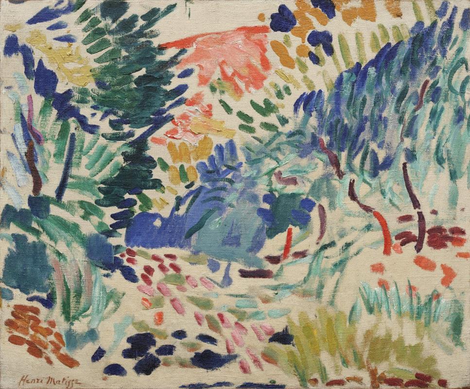
“Landscape at Collioure” was painted in 1905, the watershed summer when Henri Matisse discovered that color could carry a painting’s architecture on its own. Working in the small Mediterranean town of Collioure, he shed the academic habit of constructing forms with careful shading and the Neo-Impressionist discipline of optical blends. In their place he adopted a brisk, declarative language of pure hues set down as independent strokes. This canvas belongs to that eruption. It renders a modest ravine or garden path with nothing more than flicks of pigment, patches of unpainted ground, and a handful of decisive temperature contrasts. What might once have been arranged through line and tonal modeling is here orchestrated through hue, rhythm, and air.
First Impressions And The Lived Motif
At a glance the painting appears like a breeze captured on canvas. Small strokes accumulate into thickets of blue-green foliage on the left and right, while the center opens into a cool pool of cobalt and lavender that reads as shaded ground or a hollow where light settles. Above this center, a flare of coral orange interrupts the cools, suggesting rock warmed by sun or a distant bank catching direct light. Every part of the scene is built from touches that remain visible as touches. The brush does not conceal its path; it leaves a trail the eye can follow, as if the viewer were walking through the grove and registering flashes of color more than fixed outlines of things.
Composition As A Weave Of Paths And Canopies
The canvas is organized as a shallow amphitheater. Fronds and branches lean inward from the sides, forming a soft canopy that frames the opening at center. A path begins near the bottom edge as a crescent of pink, fuchsia, and brick-red notes; it rises diagonally through the middle in lighter strokes and dissolves into the blue hollow. The whole structure tilts from lower left to upper right, a motion reinforced by the slant of green and ultramarine dabs that sweep across the picture like gusts. There is almost no conventional perspective—no converging lines or measured recession—yet depth is felt because colors thin and cool as the eye moves upward and because overlapping clusters of marks mimic the way leaves and grasses obscure one another in space.
Color As Architecture And Weather
Matisse constructs the scene from temperature zones. Cools dominate: blue-greens, teals, ultramarines, and blue-violets mark shade and the cooler interior of the grove. Into that dominant field he inserts heats—citron yellow, ochre, and a burst of coral orange near the top—so the canvas alternates between relief and intensity. These shifts do more than describe sunlight; they engineer the space. Warm notes advance toward the viewer, cooling notes recede, and the intervals between them allow the unpainted ground to shine as glare. Color therefore acts as both structure and atmosphere, telling where forms sit and how the day feels.
The Productive Role Of The White Ground
One of the canvas’s marvels is how much of the primed linen Matisse leaves untouched. Between nearly every mark are slivers of white that behave like a third medium—neither pigment nor emptiness, but active light. Those reserves keep mixtures pure, prevent the high key from turning chalky, and produce the sense of dust-bright air you feel in Mediterranean heat. In the central hollow, a pale web of ground lifts the blues without whitening them. Around the path, small intervals of bare canvas state sun striking pebbles more convincingly than any painted highlight. Light seems to emanate from within the weave rather than sit as a glaze above it.
Brushwork, Tempo, And The Memory Of Divisionism
The surface is a mosaic of short strokes, each one a discrete unit whose direction matters. Matisse has not entirely abandoned the divisionist idea that neighboring notes vibrate when placed separately. But he loosens it. The marks are not uniform dots; they vary in size, angle, and pressure. Along the left edge, fernlike strokes pile up into a dense rhythm; in the right mid-ground, vertical, slightly curved dashes suggest slim trunks; in the center, broader, almost rectangular touches calm the surface into a pool. The changing tempo—dense here, open there—becomes a way to control attention. The eye lingers where the strokes cluster and speeds up where they thin, so looking turns into a gentle walk punctuated by rests.
Drawing Without Outlines
There are almost no enclosing lines. Form is an event between colors rather than a contour that wraps around them. A bush is sensed where a pocket of teals meets a ring of yellow-green; a tree trunk exists where a few vertical maroon dashes cut through a press of cooler tones. Matisse gives us just enough edge to keep the scene legible—most clearly in the small, wine-colored bars that read as stems or split trunks on the right. The rest is negotiated in the intervals between marks. This method eliminates the hierarchy that once placed drawing above color. Here, color does the drawing.
Light, Hour, And The Feel Of Air
The palette suggests a bright morning or late afternoon, when the sun lies low enough to set warm accents on upper leaves and rock while the understory remains cool. There are no long, cast shadows; instead, shade is expressed as temperature—blues and blue-greens—and as density—closer spacing of marks. The topmost coral patch carries the heat of direct sun, while the central hollow holds the day’s coolness. The painting does not try to catalog meteorological facts; it conveys the sensation of moving from glare to shade and back again.
Space Built By Temperature And Interval
Because Matisse avoids linear perspective, he must generate depth through other means. Temperature is the first. Cool blues dominate at the center, pulling that zone backward; warms flare on the periphery, pushing forward. Interval is the second. In near spaces the strokes are larger and more widely spaced, allowing the ground to breathe; as forms recede, strokes shorten and gather, creating a felt compression. Overlap is the third. A veiling of green marks crosses a patch of blue; a string of rose dabs slants in front of a teal bank. These subtle cues are enough to place the viewer on the path, not looking at a map but moving through a thicket of sensations.
Rhythm, Movement, And The Eye’s Path
This landscape moves. Strokes sweep from lower left to upper right like currents of wind. The path of pink and brick arcs upward, then breaks into scattered, lighter notes, as if the ground grew stonier underfoot. On the right, the small verticals of maroon and aubergine step forward like a row of saplings. In the top band, mustard and indigo dashes bounce against the coral flare, a counter-rhythm that keeps the canopy lively. The viewer’s gaze follows these lines unconsciously, looping through the painting in a figure-eight: up the left, across the orange, down through the blue hollow, and back up the right. Space is experienced as choreography.
Comparisons Within The Collioure Series
Placed alongside the seascapes and grove scenes of the same summer, “Landscape at Collioure” occupies a particularly airy register. The coastal pictures often rely on broad planes—the red of a cliff against a band of blue sea—whereas this canvas disperses energy across hundreds of strokes. It is closer to “Madame Matisse in the Olive Grove,” yet even lighter, with more ground left open and more trust placed in suggestion. The painting shows Matisse at a moment of testing limits: how little can be placed on the canvas while still summoning a convincing place? Its success would embolden him to rely ever more on color and interval, leading toward the radical interiors where entire rooms resolve into large, breathing fields of hue.
The Psychology Of Color And Mood
The painting’s mood is calm despite its speed, because its colors are tuned like instruments in a small ensemble. The cool center works like a low, steady note; the coral flare and mustard dabs supply brief, bright accents; the blue-green foliage murmurs around them. Nothing in the palette screams; complementary clashes are softened by the white ground that separates them. The mood is not narrative but bodily: you feel a little cooler when your eye rests in the blue, a little warmer as it passes the coral and yellow. Matisse famously wished for an art that offered ease and balance. The canvas achieves that not by muting color but by distributing it with poise.
Material Facts: Pigment, Pressure, And Scale
Even in reproduction one can sense the tactility of the marks. Fat, creamy strokes sit beside thin scrubs where the bristle has ran almost dry. Some touches, especially the darker blues, are deposited with a single, confident press; others, such as the pale turquoise marks in the grass, are dragged lightly to leave the weave visible. The small scale of the canvas intensifies intimacy. You are close enough to count strokes, to see how a single navy dab can stand for a stone, how two teal marks can make a leaf cluster. Materiality and motif converge: the roughness of paint becomes the roughness of foliage and ground.
Decorative Heritage And Living Nature
“Landscape at Collioure” emerges from Matisse’s admiration for decorative art—Persian textiles, Islamic tiles, Japanese prints—and his conviction that those arts’ clarity and rhythm could renew painting. The repeated dashes behave like motifs on a patterned cloth, yet they never tip into mere design because they map a living place. The tension between decoration and description is precisely calibrated: enough repetition to give harmony, enough variation to keep the scene breathing. Matisse refuses to choose between ornament and nature; he makes them partners.
How To Look So The Picture Opens
Begin near the lower left where the signature sits among earthy orange strokes. Let your eye step onto the path of pink and brick notes. As you climb that path, feel it lighten into paler touches and then spill into the cool blue pool at center. Track the diagonal sweep toward the coral flare at top; notice how the yellow-green dabs warm as they approach it. Drift right through the little maroon trunks and look back across the painting: the canopy now reads as a soft arch, the path as a ribbon of rhythm, the center as shade that breathes. After a few circuits the scene becomes vividly three-dimensional without ever ceasing to be a lattice of strokes.
What This Painting Meant In 1905 And Why It Matters Now
In 1905 such liberties with color and description were startling. Critics at the Salon d’Automne would soon dub Matisse and his circle “wild beasts” for their high-key palettes and refusal to temper hues into naturalistic tones. A century later, the painting still feels fresh because it identifies accuracy with effect rather than detail. It shows that a place can be built from relations—warm versus cool, dense versus open—without exhaustive drawing. That insight now underlies much of modern and contemporary art, from the large planes of Color Field painters to the economy of digital imaging. “Landscape at Collioure” is modest in size but foundational in method.
Anticipations Of Later Matisse
Seeds planted here sprout throughout Matisse’s career. The reliance on temperature to build space leads to interiors where walls of red and fields of green construct rooms with no need for cast shadows. The trust in decorative rhythm blossoms in the paper cut-outs of his last decade, where color and edge become one material. Even the habit of letting the ground act as light becomes a principle in the cut-outs’ white paper reserves. This landscape therefore reads both as record and rehearsal: a sunlit path in Collioure and the blueprint for a future in which color writes space unaided.
Conclusion: A Pathway Where Vision Learns To Walk
“Landscape at Collioure” condenses the summer of 1905 into a single, lucid experience. A path of pinks rises toward a pool of blue; foliage sways in dashes of teal and ultramarine; coral and mustard ignite the canopy; and everywhere the white ground breathes daylight between marks. With very little, Matisse gives the eye everything it needs to travel, to sense temperature, to believe in depth, and to feel the hour. The painting’s bravest act is its restraint. By refusing to overload the surface with information, it allows color and rhythm to speak plainly. What remains is not just a view of a small grove in southern France but a lesson in seeing—how attention, moving through intervals of hue, can build a world.