Image source: artvee.com
Introduction
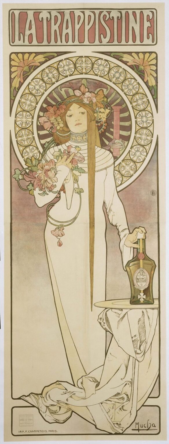
Alphonse Mucha’s 1896 poster La Trappistine stands as one of the most elegant embodiments of Art Nouveau’s marriage of fine art and commerce. Commissioned to advertise the Trappistine liqueur produced by Cistercian nuns, the image transcends mere product promotion to become a visual poem celebrating purity, devotion, and serenity. Mucha’s graceful female allegory, rendered in his signature sinuous lines and muted color palette, invites viewers into a realm where spiritual devotion and earthly beauty coexist in harmonious balance. This analysis will explore the historical context of the commission, Mucha’s compositional strategies, his refined use of line and color, the layers of symbolism embedded within the work, the technical mastery of lithography, and the poster’s enduring legacy in the canon of graphic design.
Historical Context and Commission
By the mid-1890s, Alphonse Mucha had achieved widespread acclaim in Paris for his theatrical posters—most notably those for Sarah Bernhardt—and was at the forefront of the Art Nouveau movement. His style, characterized by organic motifs, flowing contours, and integrated typography, quickly became emblematic of contemporary poster art. In 1896, the Brasserie des Bords de l’Eure and the Trappistine nuns sought to market their distinctive herbal liqueur, emphasizing its origins within monastic tradition. Rather than employing conventional product imagery, they commissioned Mucha to create a work that would evoke the spiritual purity and artisanal craftsmanship behind the beverage. The result was La Trappistine, a poster that gracefully blends religious allusion with the movement’s decorative exuberance.
Composition and Spatial Harmony
La Trappistine is structured within a tall, narrow format—a design choice that accentuates the vertical sweep of the central figure’s drapery and hair. At the top, the title “LA TRAPPISTINE” appears in bold, hand-drawn lettering set against a soft rose field, immediately establishing the poster’s purpose. Below the title, two stylized flower motifs grace the upper corners, acting as visual foils to the circular halo that frames the figure’s head.
The central woman occupies the majority of the composition. She stands in an elegantly contrapposto pose, her body draped in a long, white, habit-like gown that pools at her feet and cascades beyond the poster’s lower boundary. Her left hand rests lightly on a small table, fingertips brushing the slender neck of the liqueur bottle, while her right hand holds a cluster of blossoms close to her heart. Behind her, a large circular halo emerges, its rim adorned with interlocking medallions and geometric cross-like motifs, suggesting both ecclesiastical ornament and the golden glow of spiritual illumination. This halo contrasts with the rectangular border, whose angular lines and corner florals ground the image and guide the eye upward toward the title. The interplay of circular and rectilinear elements, of soft drapery and precise ornament, creates a dynamic equilibrium that leads viewers from the product name at the top, down through the allegorical figure, and finally to the bottle itself.
Use of Color and Tonal Restraint
Mucha executes La Trappistine in a refined palette of ivory, soft rose, muted gold, and sage green. The white of the gown conveys purity and simplicity, while the flesh tones are rendered in gentle apricot washes that lend the figure a warm underglow. The circular halo’s inner field glows with concentric rays of pale gold fading into rose and green, echoing the colors of the flowers and further emphasizing the figure’s sanctified aura.
The two corner flower panels introduce touches of deep olive and buttery yellow, linking the natural world to the halo’s geometric forms. Soft shadows under the folds of fabric and along the bottle’s contours are achieved through delicate crosshatching and tonal overlays, rather than heavy chiaroscuro. This restrained approach to color allows the poster to retain clarity—even when reproduced in large quantities on newsprint—while ensuring the overall effect remains one of serene luminosity.
Mastery of Line and Ornamental Detail
At the core of Mucha’s style lies his virtuosic command of line, and La Trappistine provides a masterclass in its expressive potential. The figure’s silhouette is defined by a single, unbroken contour that flows from the tip of her hair, down the drapery, and into the poster’s lower framing lines. Within that primary outline, Mucha uses parallel hairline strokes to articulate the intricate folds of the gown, the fine strands of hair cascading to the floor, and the veining of the floral bouquet. The halo’s rim is constructed from a series of circular medallions—each containing stylized crosses—that evoke ecclesiastical iconostasis without resorting to literal church references.
In the corner motifs, curving stems and abstracted flower heads recall the same botanical inspiration found in Mucha’s Parisian work, yet here they are more tightly integrated into the formal border, suggesting a unity between natural forms and geometric structure. By varying line weight—using thicker strokes for the poster’s structural elements and finer strokes for interior detail—Mucha achieves both visual stability and exquisite textural richness. The overall ornamental field feels both spontaneous and meticulously organized, capturing the dual spirit of monastic devotion and artisanal precision.
Symbolism and Allegorical Resonance
La Trappistine is rich in symbolic associations that elevate a simple liqueur advertisement into a contemplative allegory. The woman’s white gown and serene expression align her with the Trappistine nuns, known for their vows of poverty, chastity, and obedience. Yet her flowing hair and floral crown suggest a gentle union between earthly beauty and spiritual grace. The bouquet she holds—comprising blossoms that likely include lilies and roses—symbolizes both purity and devotion, while the single bottle on the table serves as a discreet but clear reference to the liqueur. The use of a halo, traditionally reserved for saints, frames her as a guardian of artisanal tradition, bestowing a near-sacred quality upon the product.
The geometric crosses in the halo’s medallions allude to the Cistercian Order, of which the Trappistines are a branch, yet Mucha refrains from overt religious iconography—there is no crucifix or chapel setting. Instead, he evokes spiritual heritage through ornamental means, allowing viewers of varied backgrounds to appreciate the poster’s aesthetic while intuitively grasping its subtext of sanctified craftsmanship. This subtle allegory reflects Mucha’s talent for embedding layered meaning beneath the surface beauty of his compositions.
Integration of Product and Art
One of Mucha’s distinguishing achievements is the seamless integration of commercial messaging into a sophisticated artistic vision. In La Trappistine, the liqueur bottle appears almost as a votive object—placed gently upon a small table draped in fabric that echoes the figure’s gown. The label on the bottle is rendered with enough clarity to be legible, yet it does not detract from the overall compositional harmony. Mucha situates the product within the narrative context—held by a figure who embodies its heritage—rather than presenting it in isolation or resorting to text-heavy descriptions. The title at the top, the decorative frame, and the graceful figure all serve to guide the viewer’s attention toward the bottle in an organic progression, ensuring that commercial intent and artistic integrity coexist in perfect balance.
Technical Mastery and Lithographic Innovation
La Trappistine was produced using chromolithography, a printing technique that allowed Mucha to reproduce his delicate line work and subtle color gradations at scale. He began with detailed gouache and watercolor studies, then transferred his design onto multiple lithographic stones—each stone responsible for a specific hue. Precise registration marks ensured that each color layer aligned perfectly, preserving the clarity of both line and wash. Mucha collaborated closely with the prestigious F. Champenois printing house in Paris to refine ink viscosity and paper selection, achieving a luminous finish that captured the sheen of the figure’s skin and the soft glow of the halo.
Master printers mixed metallic inks for the gold accents in the halo and corner motifs, adding a slight shimmer that would catch ambient light when displayed. Rarely did posters of the era achieve such fidelity to the artist’s original hand, but Mucha’s reputation and technical acumen ensured that La Trappistine appeared on walls throughout Europe exactly as he intended. This technical triumph enabled the widespread distribution of high-quality art, democratizing access to beauty and reinforcing the poster’s cultural impact.
Reception and Legacy
Upon its release, La Trappistine was celebrated by both the general public and artistic circles for its refined elegance and tasteful integration of commercial purpose with high aesthetic standards. The poster helped to popularize the Trappistine liqueur across Paris and beyond, lending the product an aura of monastic tradition and artisanal excellence. Critics lauded Mucha’s ability to transcend mere advertisement, producing work that could hang in private collections and salons as a piece of fine art. Over the ensuing decades, La Trappistine would be reproduced in design anthologies, exhibited in museum retrospectives of Art Nouveau, and cited as a benchmark in the history of graphic design.
Today, original proofs of La Trappistine command high prices at auction, and the poster continues to influence contemporary designers who seek to blend commercial clarity with artistic refinement. Its legacy endures as a testament to Mucha’s vision of art in everyday life—where even a label for a liqueur can become an occasion for beauty, contemplation, and cultural enrichment.
Modern Resonance and Cultural Significance
In the twenty-first century, La Trappistine maintains a compelling resonance for artists, marketers, and historians alike. In an era flooded with mass-produced imagery and rapid digital advertising, Mucha’s work reminds us of the power of carefully crafted design to evoke emotion and convey layered meaning. Contemporary brands occasionally commission limited-edition labels and packaging inspired by Art Nouveau principles, citing La Trappistine as an exemplar of how art and commerce can enhance each other.
Cultural institutions highlight the poster in exhibitions exploring the intersections of gender, spirituality, and consumer culture, noting how the feminine allegory both aligns with and transcends the historical context of monastic production. Design students study Mucha’s integration of figure, ornament, and product as a masterclass in visual storytelling, while typographers mine his hand-lettered title for its balance of personality and legibility. Through its enduring appeal, La Trappistine continues to remind us that beauty and meaning can be woven into even the most commonplace objects, transforming them into vessels of cultural memory and aesthetic delight.
Conclusion
Alphonse Mucha’s La Trappistine remains a luminous synthesis of Art Nouveau artistry, religious allusion, and commercial purpose. Through its harmonious composition, refined palette, and masterful line work, the poster elevates a simple beverage advertisement into a contemplative allegory of purity, devotion, and artisanal tradition. Mucha’s seamless integration of product, figure, and ornament exemplifies his belief that art belongs in everyday life, enriching both public spaces and the objects that inhabit them. Over a century later, La Trappistine endures as a testament to the transformative power of graphic design—where beauty, meaning, and marketing coalesce into an enduring cultural icon.