Image source: artvee.com
Introduction
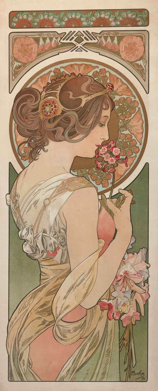
La Primevère, created by Alphonse Mucha in 1899, stands as one of the most celebrated panels in his celebrated series depicting the four seasons. Often translated as “The Primrose,” this work exemplifies the artist’s mature Art Nouveau style, where organic forms, stylized linework, and harmonious color converge in a refined decorative composition. Measuring approximately 76 by 30 centimeters and rendered as a lithographic print, La Primevère presents a graceful young woman in profile, her features softened by the gentle glow of primroses and curling tendrils of hair. Far beyond a mere calendar illustration, this image encapsulates the turn-of-the-century fascination with nature’s cycles, the elevation of ornament to high art, and the aspiration to integrate beauty into everyday life. In the following analysis, we will explore the painting’s historical backdrop, Mucha’s evolving practice, compositional strategies, chromatic innovations, symbolic resonances, and lasting impact on decorative and graphic arts.
Historical and Cultural Context
By the closing years of the 19th century, Paris had solidified its status as the world’s cultural epicenter. The Belle Époque era brimmed with technological innovations, international expositions, and a zeal for decorative modernism. Art Nouveau emerged in this fertile climate as a reaction to academic historicism and industrial uniformity. Embracing sinuous lines inspired by plant forms and Japanese art, designers sought to create a Gesamtkunstwerk or “total work of art” that unified architecture, interior décor, furniture, and graphic imagery. Mucha’s seasonal panels, including La Primevère, were conceived for publication in art journals and for sale as individual prints, making high-quality art accessible to the burgeoning middle class. The popularity of such images reflected a broader hunger for elegant, nature-infused aesthetics that could uplift homes, boutiques, and public spaces. In this sociocultural milieu, Mucha’s primrose maiden became a symbol of renewal, harmony, and the optimistic spirit of the turn of the century.
Alphonse Mucha’s Artistic Evolution
Born in 1860 in the Austrian Empire’s Moravian province, Alphonse Mucha arrived in Paris in 1887 to pursue his artistic ambitions. His early training in Munich instilled a firm foundation in draftsmanship, but it was his breakthrough poster for Sarah Bernhardt in 1894 that crystallized his signature style. Over the next five years, Mucha refined a visual vocabulary of elongated figures draped in flowing garments, halo-like ornamental backgrounds, and graceful botanical motifs. By 1899, when he executed La Primevère, he had fully mastered lithographic techniques that allowed him to blend hand-drawn flourishes with the reproducibility of print. This period also saw Mucha’s deeper engagement with decorative panels, book illustrations, and design commissions that expanded his influence across Europe. La Primevère thus represents a moment when Mucha’s aesthetic ideals—uniting beauty, function, and nature—coalesced into an enduring visual statement.
Commission and Purpose of “La Primevère”
La Primevère was produced as part of a four-panel series, each dedicated to a season: Primavera (Spring), Éte (Summer), Automne (Autumn), and Hiver (Winter). Commissioned by the Parisian publisher Champenois, these panels served both as standalone art prints and as thematic illustrations for the art journal La Plume. Unlike ephemeral posters, they were meant for intimate display—framed on salon walls or inserted into high-end magazines. The choice of the primrose, one of the earliest flowers to bloom each spring, underscores the panel’s seasonal focus. Mucha’s task was to capture not only the physical beauty of the flower but also the emotional resonance of renewal and hope. By positioning the figure in quiet contemplation, inhaling the primrose’s scent, he created an image that appealed to contemporary audiences’ desire for both decorative elegance and poetic reflection on nature’s rhythms.
Composition and Spatial Arrangement
Mucha’s compositional genius in La Primevère lies in the interplay between figure, ornament, and empty space. The female figure occupies the central vertical axis in a poised three-quarter profile, her head inclined toward the cluster of primrose blossoms she holds delicately between thumb and forefinger. Behind her, a circular halo of stylized primrose petals frames her head, echoing religious iconography and elevating the mundane bloom to the status of sacred emblem. Above and below, decorative cartouches filled with abstracted floral patterns bookend the panel, providing a visual balance without overwhelming the central image. The figure’s flowing drapery cascades into broad swaths of negative space on either side, allowing the eye to rest and then re-engage with ornamental details. This careful orchestration of filled and empty areas generates a rhythm of movement and stillness, reinforcing the panel’s contemplative mood.
Use of Color and Light
La Primevère’s color palette exemplifies Mucha’s mastery of pastel harmonies enlivened by warmer accents. Soft greens and muted apricots dominate the background, reflecting the gentle freshness of spring’s first foliage. The figure’s gown, rendered in ivory with gold filigree, contrasts subtly with the pale rose of her skin and the deeper blush of her lips and primrose petals. A delicate greenish wash on her hair and shadows imparts a cohesive tonality, uniting the decorative motifs and figure. Mucha achieved these effects through a lithographic process requiring multiple stones, each adding a discrete hue with precise registration. The overall luminosity stems from printing on cream-toned paper, which allows light to reflect through the thin layers of ink. Strategic highlights on petal edges and the subject’s cheekbones create a gentle glow, suggesting the soft, diffused sunlight of early spring mornings.
Linework and Form
Central to the panel’s aesthetic is Mucha’s sinuous linework, which imparts both structural clarity and decorative flourish. The contour of the figure’s profile is delineated by a single, unbroken curve from forehead to chin, conveying serenity and grace. Her hair, arranged in undulating waves, flows into the pattern of petal-like swirls in the halo, establishing an organic continuity between figure and ornament. Drapery folds, hinted at with rhythmic, parallel lines, suggest the garment’s texture without resorting to heavy modeling. Mucha employed varying line weights—thicker outlines for the figure’s silhouette, finer strokes for floral details—to guide the viewer’s focus. This modulation of line not only defines form but also imbues the composition with a musical sense of movement, as curves rise and fall like melodic phrases across the panel.
Iconography and Symbolism
While La Primevère celebrates the beauty of early spring, it also weaves symbolic meanings into its imagery. The primrose, or Primula vulgaris, historically represented youth, renewal, and the fleeting nature of beauty. By having the maiden inhale the flower, Mucha suggests a communion with nature that revitalizes both body and spirit. The circular halo of petals behind her head evokes sun disc symbolism, alluding to the increasing daylight of spring and the rebirth of the natural world. The upward gaze of the figure hints at aspiration and spiritual awakening, while her gentle holding of the blossoms conveys respect for life’s delicate beginnings. Subtle details—such as the intertwining stems that echo the figure’s neckline ornament—reinforce the theme of interdependence between humanity and nature, a core tenet of Art Nouveau philosophy.
Material Technique and Production
Creating La Primevère required the precise coordination of artistic vision and technical expertise. Mucha began with a detailed charcoal or pencil drawing, which he translated onto lithographic stones using greasy crayons and tusche washes. Each color necessitated its own stone, making registration marks critical to align successive impressions. The printing was executed on high-quality, slightly textured paper, chosen for its ability to receive ink evenly and allow light to permeate. The result is a subtle layering of translucent inks that produce soft graduations and delicate color shifts. Early proofs reveal slight variations in hue saturation, suggesting that Mucha and the printer adjusted ink densities to achieve the ideal balance. The finished prints, disseminated widely in both portfolio editions and journal inserts, reached audiences across Europe, establishing Mucha’s reputation as a master printmaker.
Place within Mucha’s Oeuvre
Though Mucha is best known for his theatrical posters and advertising lithographs, his seasonal panels occupy a distinct niche in his body of work. La Primevère and its companion pieces demonstrate his commitment to elevating graphic art to the realm of fine art. In contrast to large-format posters designed for public billboards, these panels were intended for private viewing, allowing for more intricate detailing and subtle coloration. They also reveal Mucha’s deep engagement with symbolic and allegorical content, prefiguring his later Slav Epic series, in which he returned to grand historical and mythological themes. La Primevère thus serves as a bridge between his commercial successes and his ambitious, personal projects, highlighting the versatility and depth of his artistic vision.
Reception and Legacy
Upon publication in 1899, La Primevère captivated critics and collectors who admired its harmonious design and poetic resonance. It quickly became one of Mucha’s most popular seasonal images, reproduced in art journals, postcards, and decorative albums. Designers in Europe and America adapted its motifs for ceramics, textiles, and architectural ornamentation, testifying to its broad influence. Art Nouveau exhibitions frequently featured the primrose panel, cementing its status as an emblem of the movement. In the decades that followed, Mucha’s work experienced ebbs and flows of critical attention, but La Primevère remained a touchstone for artists and scholars exploring the intersection of symbolism, nature, and decorative form. Today, museum collections and private archives hold original proofs and variants, while contemporary graphic artists cite it as a foundational model of integrated design.
Conservation and Modern Display
Many surviving impressions of La Primevère require careful conservation due to paper acidity and light exposure. Curators employ deacidification treatments and UV-filtering glass to prevent ink fading and paper embrittlement. Framing choices—such as mounting on acid-free mats and using museum-grade humidity control—ensure the panels can be exhibited without rapid deterioration. In recent retrospectives on Mucha’s career, La Primevère is often displayed alongside preparatory sketches and lithographic stones, offering viewers insight into the artist’s creative process. Digital reproductions further extend its reach, appearing in art history textbooks and online archives, where scholars analyze its color separations and registration techniques. These preservation and display efforts underscore the continuing importance of Mucha’s seasonal panels as both historical documents and sources of aesthetic inspiration.
Conclusion
Alphonse Mucha’s La Primevère exemplifies the zenith of Art Nouveau’s fusion of natural imagery, decorative innovation, and graphic elegance. Through its harmonious composition, nuanced palette, and symbolic depth, the panel evokes the delicate beauty of early spring and the era’s aspiration to bring art into daily life. Situated within Mucha’s broader oeuvre, it highlights his dual mastery of commercial lithography and allegorical fine art. Over a century after its creation, La Primevère continues to enchant audiences with its timeless grace, serving as both a historical artifact of the Belle Époque and a perpetual source of inspiration for designers and art lovers alike. In celebrating the primrose’s first bloom, Mucha crafted more than a seasonal portrait; he created a visual ode to renewal, beauty, and the enduring power of ornament.