Image source: artvee.com
Historical Context and Publication
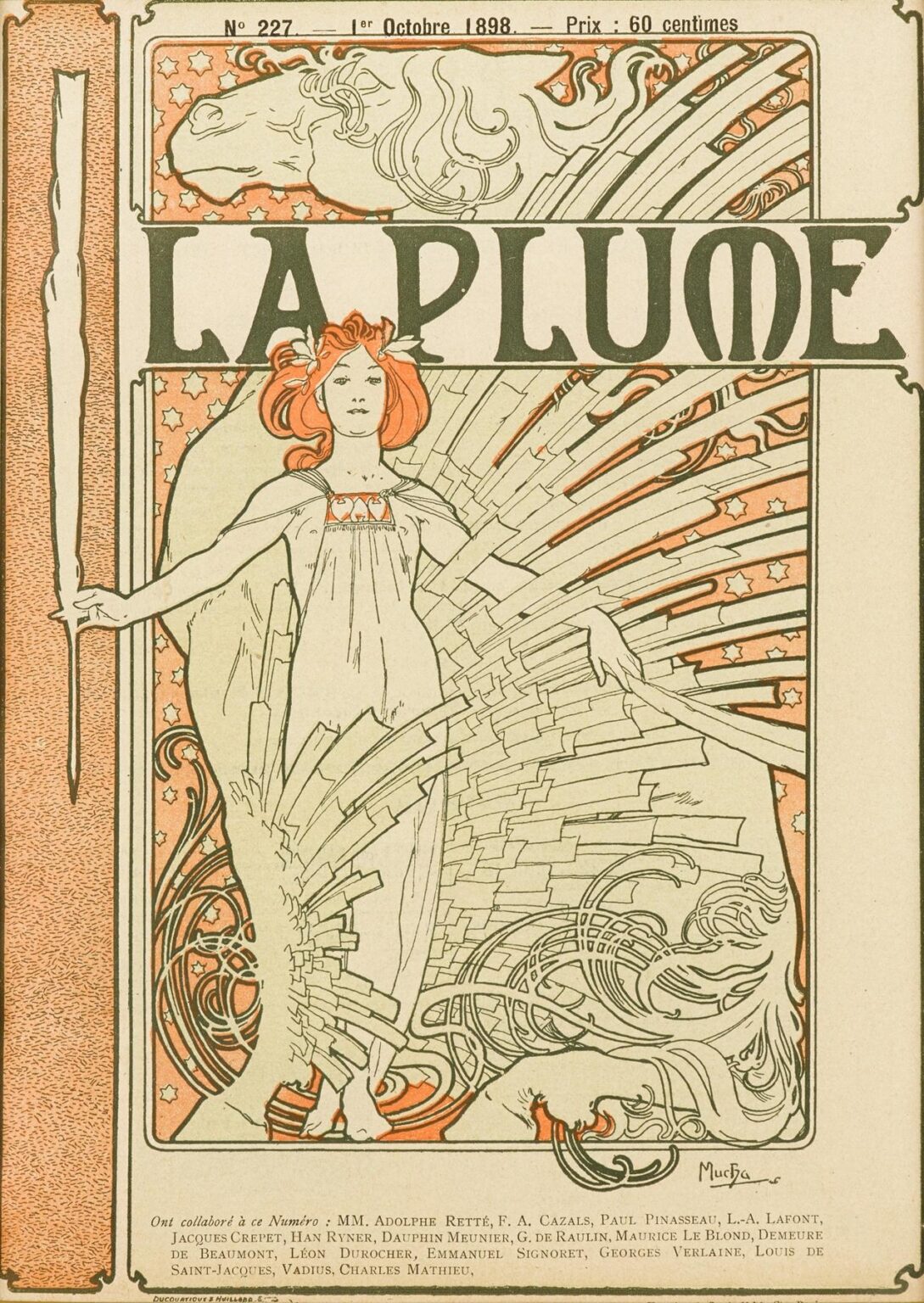
In October 1898, the Parisian literary magazine La Plume commissioned Alphonse Mucha to craft a special cover—issue No. 227—which would stand among the most celebrated examples of turn-of-the-century graphic art. La Plume, founded in 1889, served as a key forum for Symbolist poets, avant-garde writers, and emerging artists, championing the cross-pollination of literature, visual art, and theater. By the late 1890s, Mucha had already achieved international renown through his theatrical posters for Sarah Bernhardt and his earlier magazine illustrations. His distinctive Art Nouveau style—characterized by sinuous lines, botanical ornament, and idealized female figures—aligned perfectly with La Plume’s mission to merge aesthetic beauty and intellectual innovation. The resulting cover, rendered in a restrained palette of olive greens, soft corals, and creamy neutrals, transformed the magazine into a collectible art object even before its contents could be read.
Editorial Purpose and Symbolic Theme
Unlike commercial posters designed to advertise a product or performance, the La Plume cover functions as an emblem of literary creation itself. The central figure—tall, statuesque, and alabaster-skinned—appears as the personification of “the pen” and “the written word.” In her right hand, she wields an oversized quill, poised as if to inscribe the world with new ideas; in her left, she holds a scroll or manuscript, symbolizing the fruits of creative labor. Surrounding her, a complex interplay of geometric beams and organic curls suggests both the structured form of typography and the untamed spirit of imagination. By embodying writing as a living, radiant force, Mucha conveys La Plume’s identity as a magazine where letters and images converge to illuminate human thought and emotion.
Composition and Spatial Structure
Mucha orchestrates “La Plume” within a multi-layered frame that guides the viewer’s attention through nested zones of meaning. The broad vertical format is divided into three primary sections: a narrow margin of stippled texture on the left, the central image block, and a slender text strip at the bottom listing the issue’s contributors. Above the central image, a narrow panel depicts a stylized horse’s head against a field of stars—an emblem of creative inspiration or the “white steed” of poetic fancy. Directly below, the bold title “LA PLUME” spans the width of the panel, its heavy capitals anchored by the figure’s outstretched arms. The central field envelops the Muse, whose draped gown fills the middle third, while dynamic rays and curling motifs emanate from her torso and manuscript. The bottom text block, although functional, remains elegantly integrated through a custom serif that echoes the cover’s ornamental curves. Mucha’s spatial arrangement balances vertical grandeur with rhythmic horizontals, ensuring that no element feels static or tacked on.
Mastery of Line and Contour
At the heart of Mucha’s aesthetic is his sinuous, calligraphic line. In “La Plume,” his contours both define form and generate ornamental pattern. The Muse’s drapery falls in long, ribbonlike folds, each fold outlined by a confident, unbroken stroke that tapers and swells to suggest both volume and movement. The oversized quill, its barbed feather stylized into repeating arcs, mirrors the swirling tendrils of abstract ornament at the lower right, forging a visual echo. Even the horse’s mane above the title is traced in flowing curves that anticipate the rhythms of the central figure’s gown. This modulation of line weight—thicker at primary edges, finer in interior details—imbues the composition with a palpable sense of energy, as though the very act of writing animates the artwork itself.
Color Palette and Printing Technique
Mucha’s palette for this cover is remarkably restrained—limited to three inks plus the ivory of the paper—but no less rich for its subtlety. A deep olive green saturates the bold lettering and the horse panel; a warm coral red enlivens the decorative curls and small accent areas; a pale sand tone fills background fields, providing a warm glow that unites the composition. Achieving such precision required a four-stone lithographic process: one stone for linework (printed in olive), one for the coral accents, one for the sand ground, and a fourth for any tonal gradations. Mucha worked closely with the Parisian Imprimerie Ducrocq-Mauclair, specifying transparent wash techniques and meticulous registration to ensure that the overlay of inks maintained crisp contours without muddying. The resulting print demonstrates both painterly softness and graphic clarity, qualities that made original issues of La Plume prized by collectors.
Allegory of the Pen and Written Word
The cover’s central allegory elevates the pen from a mere tool to a personified force of transformation. The Muse’s serene expression and upright stance suggest authority and confidence, as if she stands at the threshold between unexpressed thought and published text. The enormous quill symbolizes not only handwriting but also the lineage of literature—from ancient scribes to contemporary journalists. The scroll she holds implies both history and potential, a blank slate or a record of ideas already brought into being. Radiating lines behind her evoke typographic bars or the layout of a page, while the curling filigree at her side hints at illuminated manuscript decoration. Together, these elements assert that writing is an act of creation on par with painting or sculpture—a notion central to La Plume’s ethos.
Feminine Personification and Psychological Presence
Mucha’s idealized female figures consistently balance otherworldly grace with subtle psychological nuance, and “La Plume” is no exception. The Muse’s face, rendered with soft shading around the eyes and lips, conveys both calm composure and a hint of inner fire. Her hair, arranged in stylized waves crowned by the smallest floral or feather-like accents, frames her face like a halo, underscoring her mythic status. Mucha elongated her torso and limbs to emphasize an elegant outline; yet her slight turn of the shoulders and the poised angle of her quill arm impart a naturalism that avoids stiffness. Viewers sense that she stands in mid-gesture—about to write or reveal—to engage the imagination directly. This blend of idealized beauty and suggestive movement makes her both an allegorical symbol and a relatable presence.
Integration of Text and Typography
Mucha’s approach to lettering always treated type as a graphic element rather than a separate label. In “La Plume,” the magazine’s name is rendered in custom capitals whose weight, serif shapes, and slight irregularities in stroke reflect the curvature of the pen and the swirl of the surrounding ornament. The left margin’s stippled texture echoes the granular quality of ink dots or typographic screens, while the bottom contributor list appears in a clean serif that maintains readability without jarring against the dynamic imagery. Mucha’s typography enhances the cover’s compositional balance: the large title anchors the central figure’s arms, while the slender text strip at the bottom provides a visual foundation. In this way, words and image become inseparable, each reinforcing the other’s impact.
Decorative Motifs and Patterned Borders
Surrounding the Muse, Mucha deploys ornamental bands that draw upon historical and botanical sources. The top panel features a mythical horse’s head—a possible reference to Pegasus or the stallion of poetic inspiration—set against a field of stylized stars. This header motif connects the act of writing to flight, transcendence, and celestial imagination. Beneath it, the central field’s radiating rays resemble both page rulings and architectural beams, bridging the literary and the structural. The lower right corner’s curling filigree flows like ink lines spilled across a page, while the left stippled margin suggests the margin of a printed column. These decorative elements offer modular design vocabulary, inviting artisans to extract and adapt patterns for book covers, decorative friezes, or textile inlays.
Japonisme, Medievalism, and Eclectic Synthesis
Mucha’s style reflects the eclectic artistic currents sweeping Paris at the fin de siècle. The flat color areas and strong outlines owe much to Japanese ukiyo-e prints, which he absorbed through exhibitions and illustrated publications. Simultaneously, the horse’s head panel and the stylized stars evoke medieval manuscript illuminations and Gothic tracery, lending the cover a sense of historical depth. Mucha’s genius lay in synthesizing these disparate influences into a unified visual language: organic curves are balanced by linear structures, exotic references by classical allegory. The resulting image feels both fresh and timeless—an emblem of the age’s cosmopolitan artistic ferment.
Technical Collaboration and Workshop Practices
Producing the “La Plume” cover required seamless collaboration between Mucha and the Ducrocq-Mauclair lithography workshop. Mucha’s process began with pencil line drawings and gouache color keys at full magazine-size. Skilled technicians then transferred these lines to limestone plates, using greasy crayon for the bold outlines and tusche washes for intermediate tonal areas. Each color—olive, coral, sand—was laid down in separate press runs. Precise registration marks carved into the plate edges guided alignment, while proof sheets informed adjustments in ink density or plate cleaning. This labor-intensive method ensured a high degree of fidelity to Mucha’s original art, yielding a print whose line quality and chromatic subtlety set a high standard for magazine illustration.
Reception and Influence
Upon its release, the “La Plume” cover became a talking point in Parisian literary and artistic circles. Readers prized the special issue as a work of art they could display or remove and frame. Competitor magazines took note, commissioning their own stylized covers in hopes of similar success. More broadly, Mucha’s fusion of illustration, typography, and ornament fueled the golden age of magazine design in France, Belgium, and beyond. The concept of a magazine cover as a collectible art object endured well into the 20th century, influencing the emergence of illustrated quarterlies and luxury periodicals. In the digital age, Mucha’s “La Plume” continues to inspire cover designs that seek to marry editorial content with high-impact visuals.
Preservation and Modern Relevance
Original first-issue copies of La Plume with Mucha’s cover have fragile, acidic paper and require climate-controlled storage and archival framing to prevent yellowing and brittleness. High-resolution digital facsimiles now allow museums, libraries, and design schools to study the cover’s details without risking the original. Contemporary graphic designers and publishers cite Mucha’s work, including “La Plume,” as foundational to branding strategies that emphasize aesthetic coherence and narrative impact. The cover’s legacy endures in luxury fashion lookbooks, cultural festival posters, and art-book publications, demonstrating the enduring power of Mucha’s integrated design vision.
Conclusion
Alphonse Mucha’s “La Plume” cover transcends the demands of magazine illustration to achieve the status of a decorative masterpiece and an allegory of creative power. Through sinuous linework, a refined yet expressive palette, integrated typography, and layered symbolism, Mucha transforms a simple editorial wrapper into a testament to the pen’s ability to shape ideas and inspire art. Over a century later, “La Plume” remains a touchstone for graphic designers, typographers, and illustrators seeking to balance functional clarity with poetic ornamentation. In Mucha’s hands, the act of publication itself becomes a work of art—an invitation to readers to partake in the dialogue between words and images, imagination and form.