Image source: artvee.com
Introduction
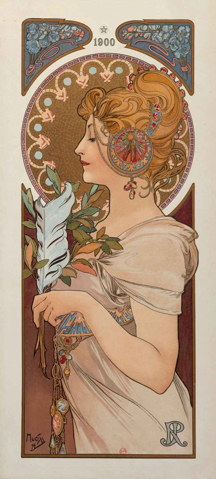
Alphonse Mucha’s La Plume, created in 1899, stands as a masterful example of Art Nouveau’s fusion of fine art and graphic design. Originally produced as a decorative panel for the French literary and artistic journal La Plume, the lithograph depicts an elegant woman in profile, delicately holding a quill and sprig of foliage. Measuring approximately 76 by 30 centimeters, the work exemplifies Mucha’s mature style: sinuous lines, stylized botanical motifs, and harmonious color harmonies. Far more than mere illustration, La Plume embodies the period’s aspiration to integrate beauty into everyday visual culture. In this comprehensive analysis, we will explore the historical context, Mucha’s artistic evolution, compositional strategies, chromatic innovations, material techniques, symbolic nuances, and the work’s enduring legacy in decorative arts.
Historical Context of Turn-of-the-Century Paris
At the close of the 19th century, Paris thrived as a global center for art, literature, and design. The Belle Époque era (circa 1871–1914) witnessed remarkable advances in printing technology, enabling richly colored posters and panels to adorn walls and magazines alike. La Plume, founded in 1889, quickly gained prominence as a leading literary and artistic review, showcasing essays, poetry, and illustrations by contemporary avant-garde figures. By 1899, when Mucha produced this panel, Art Nouveau had crystallized as a movement that sought to break with academic historicism. It embraced organic forms drawn from nature, fluid linework, and the concept of the Gesamtkunstwerk, or “total work of art,” wherein architecture, furniture, textiles, and graphic art shared a unified aesthetic. La Plume thus emerged within a cultural milieu that celebrated the democratization of art and the elevation of everyday objects to works of creative expression.
Alphonse Mucha’s Artistic Evolution
Born in 1860 in Moravia (then part of the Austro-Hungarian Empire), Alphonse Mucha trained in Munich before settling in Paris in 1887. His early career included book illustration and theater scenery, but his breakthrough came in 1894 with a poster for Sarah Bernhardt’s production of Gismonda. Over the next five years, Mucha refined a distinctive style of elongate female figures crowned by halos of floral ornament, framed by geometric tracery. By the late 1890s, he had mastered lithography’s multiple-stone printing process, achieving soft color gradations and precise linework. La Plume represents a culmination of these developments: the woman’s profile reveals a confident elegance, while the surrounding decorative elements illustrate Mucha’s growing sophistication in integrating figure and ornament. This panel reflects his commitment to making art accessible through reproduction, as well as his philosophical belief in art’s ability to ennoble daily life.
Commission and Purpose of “La Plume”
The journal La Plume commissioned Mucha to create a series of decorative panels to accompany its issues and to serve as promotional gifts or collectible prints. Unlike the large posters intended for public spaces, these panels were designed for intimate display in private salons or reading rooms. La Plume specifically celebrates the written word: the quill in the figure’s hand symbolizes literary creativity, while the magazine’s title initial appears as an elegantly stylized monogram in the lower right. Through this commission, Mucha was tasked with visually translating the ethos of the journal—its dedication to poetry, critique, and artistic innovation—into a singular, cohesive image. The panel’s refined scale and format invited viewers to contemplate the interplay between text and image, reinforcing the journal’s identity as a convergence point for art and letters.
Composition and Spatial Dynamics
Mucha’s compositional design in La Plume balances figure and ornament through careful use of geometric framing and negative space. The central figure occupies a vertical panel, her profile aligned with the canvas’s long axis. Behind her, a circular backdrop of mosaic-like pattern anchors the head, recalling a halo or sun disc. Above and below, decorative cartouches filled with stylized blossoms mark the panel’s boundaries without confining the image. The woman’s arm and quill project diagonally into the space, creating a dynamic tension between static profile and implied motion. The foliage she holds extends beyond the circle, linking foreground and background. By alternating areas of intricate detail with open expanses of pale, unadorned paper, Mucha achieves a rhythmic visual flow that guides the eye naturally through figure, botanical motifs, and decorative borders.
Use of Color and Light
The palette of La Plume exemplifies Art Nouveau’s affinity for pastel harmonies enlivened by strategic accents. Soft peaches and muted greens dominate, while touches of pale blue and gold inject warmth and refinement. The figure’s skin glows with subtle gradations, achieved through layered lithographic washes, and stands out against the warmer, earth-toned mosaic circle. Highlights along the quill’s plume and the porcelain-like cheek reinforce the delicate modeling of shape. Mucha’s careful control of color balance ensures that no single hue overwhelms the composition; instead, each tone interplays with its neighbors to create a gentle luminosity. The result is an image that glows from within, akin to a stained-glass window, invoking both the material beauty of print and the ethereal quality of light itself.
Linework and Decorative Elements
At the heart of La Plume lies Mucha’s signature sinuous linework, which imbues both figure and ornament with rhythmic movement. The contour of the woman’s profile is rendered in a single, flowing stroke, evoking serenity and confidence. Her hair, arranged in gentle waves, merges seamlessly into the circular motif behind her, binding human form and decorative pattern. Botanical flourishes—roses, buds, and curling vines—populate the upper and lower panels, echoing natural growth and reinforcing the theme of creativity blossoming. Mucha varies line weight to distinguish primary forms from background details, using thicker outlines for the figure’s silhouette and finer strokes for foliage and textile folds. This contrast of line densities orchestrates depth and emphasis, drawing viewers into a layered visual experience that rewards close examination.
Symbolism and Iconography
La Plume weaves symbolism into its iconography, transforming everyday objects into emblems of higher meaning. The quill, held aloft by the female figure, represents not only La Plume magazine itself but also the broader power of the written word to shape thought and inspire emotion. The circular backdrop suggests a halo or sun, implying that creativity is a source of illumination and perhaps even sanctity. The intertwining plant motifs symbolize growth, renewal, and the organic nature of artistic expression. The figure’s serene gaze and poised posture convey intellectual calm and mastery. Together, these symbols create an allegory of literary creation as both a personal endeavor and a universal force, aligning with the journal’s mission to celebrate artistic achievement and cultural discourse.
Material Technique and Lithographic Process
Creating La Plume required the meticulous application of multi-stone lithography, a process that involved separate limestone plates for each color layer. Mucha began with a detailed drawing, which he transferred to the stones using greasy crayons and tusche washes. Each hue—peach, green, blue, gold—was laid down in succession, with registration marks ensuring precise alignment. The creamy texture of the chosen paper enhanced translucency, allowing light to reflect through the thin ink films and produce a soft glow. Because these panels were intended for limited print runs as collectible items, quality control remained high throughout production. The visible texture of crayon strokes in shaded areas attests to Mucha’s direct hand in the studio, even as the work embraced reproducibility. This fusion of artisanal craft and mechanical printing epitomizes Art Nouveau’s embrace of technology in service of beauty.
Place within Mucha’s Oeuvre
While Mucha’s large-format theatrical posters and advertising lithographs often garner the most attention, his journal panels—such as La Plume—occupy a critical niche in his body of work. These pieces allowed for more intimate scale, subtle coloration, and deeper symbolic layering than public posters. The seasonal panels he produced concurrently similarly demonstrate his facility with allegory and decorative pattern. La Plume bridges these two realms: it retains the theatrical majesty of his billboard art while inviting personal reflection akin to his allegorical portfolios. Moreover, the panel foreshadows Mucha’s later Slav Epic series, where he would return to mythological and historical themes on a grand scale. In this sense, La Plume represents both a culmination of his commercial successes and a precursor to his ambitious, personal projects.
Reception and Legacy
Upon publication in La Plume magazine, the panel was met with admiration from readers and critics who praised its elegance and thematic depth. Collectors eagerly acquired printed proofs, and decorative art enthusiasts adapted its motifs in ceramics, textiles, and interior décor. Over the ensuing decades, the image featured prominently in retrospectives of Art Nouveau, cited by historians as emblematic of the period’s seamless integration of function and ornament. Today, original prints of La Plume reside in major museum collections—including the Musée d’Orsay and the Metropolitan Museum of Art—where they continue to captivate audiences. Contemporary graphic designers and typographers reference Mucha’s integration of image and text as a model for unified visual identity, testifying to the panel’s enduring influence on visual culture.
Conservation and Modern Presentation
Preservation of La Plume prints poses challenges due to paper acidity and sensitivity to light. Museums employ deacidification treatments and UV-filtering glazing to prevent discoloration and ink fading. Framing on acid-free mounts and maintaining stable humidity levels ensures the panel’s longevity. In modern exhibitions, curators often display La Plume alongside preparatory sketches and lithographic stones, offering insight into Mucha’s creative process and the technical complexity of multi-stone printing. Digital reproductions in catalogs and online archives expand access, allowing scholars to analyze color separations and registration marks. Such conservation and presentation efforts highlight the panel’s dual status as both historical artifact and living work of art, bridging past and present through careful stewardship.
Conclusion
Alphonse Mucha’s La Plume stands as a testament to the power of Art Nouveau to elevate everyday objects—such as journal illustrations—into enduring masterpieces. Through its harmonious composition, luminous palette, expressive linework, and rich symbolism, the panel transcends its original function to become an allegory of literary creativity and artistic aspiration. Positioned at the apex of Mucha’s career, La Plume both encapsulates his commercial triumphs and foreshadows his later, more monumental works. Over a century since its creation, the panel continues to inspire designers, art historians, and the general public, affirming the timeless appeal of beauty thoughtfully integrated into the fabric of daily life.