Image source: artvee.com
The Birth of Modern Advertising in Early 20th‐Century Paris
In 1911, Paris thrummed with energy as modern advertising emerged as a distinct art form. Advances in lithographic printing and mass distribution of posters revolutionized commercial communication. Urban streets, café façades, and tram shelters became kaleidoscopic galleries, where bold graphics jostled for attention. Audiences, no longer content with plain text and monochrome bills, craved vibrant, easily legible images. Into this lively milieu arrived Leonetto Cappiello, the Italian‐born caricaturist‐turned‐poster artist whose innovative approach would come to define the golden age of advertising. His 1911 creation, “Kub. Exigez le KUB,” promoted the KUB bouillon cube—a breakthrough seasoning product—through a single, dynamic tableau that fused humor, color, and brand messaging in an unforgettable design.
Leonetto Cappiello’s Evolution from Caricature to Poster Pioneer
Leonetto Cappiello was born in Livorno, Italy, in 1875. His early work as a caricaturist for French satirical magazines such as Le Rire and La Vie Parisienne honed his skill at capturing personality and narrative economy. Around 1900, he recognized the transformative potential of poster art and began designing for the Atelier Devambez in Paris. Rejecting the cluttered, type‐heavy posters then common, he pioneered a lean visual language centered on one dominant image against a flat, high‐contrast background. Early classics like Amandines de Provence (1902) and Angelus (1902) showcased the power of his approach. By 1911, with dozens of successful campaigns under his belt, Cappiello had refined his style: stark color fields, minimal text, and a single, arresting motif that embodied the product’s essence. “Kub. Exigez le KUB” stands as a testament to this mature phase, demonstrating how a single letter, one figure, and a shower of bouillon cubes could revolutionize brand recognition.
The KUB Bouillon Cube: Culinary Innovation and Market Context
The KUB bouillon cube was introduced to French consumers in 1908 by the Maggi company, building on earlier German and Swiss innovations in concentrated seasonings. Encased in small cardboard boxes, each cube dissolved in hot water to yield a flavorful broth. The product appealed to busy urban households, offering a convenient, hygienic alternative to homemade stock. Early 20th‐century France experienced rapid urbanization and industrialization. As more women entered the workforce or domestic servants became cost‐prohibitive, kitchen shortcuts gained popularity. KUB’s marketing emphasized both quality and simplicity. Yet to achieve widespread penetration, the product needed a strong visual identity. Cappiello’s poster delivered precisely that: by anthropomorphizing the brand letter “K” and surrounding it with playful imagery, he transformed a utilitarian cooking aid into a cultural icon worthy of display outside the grandest cafés.
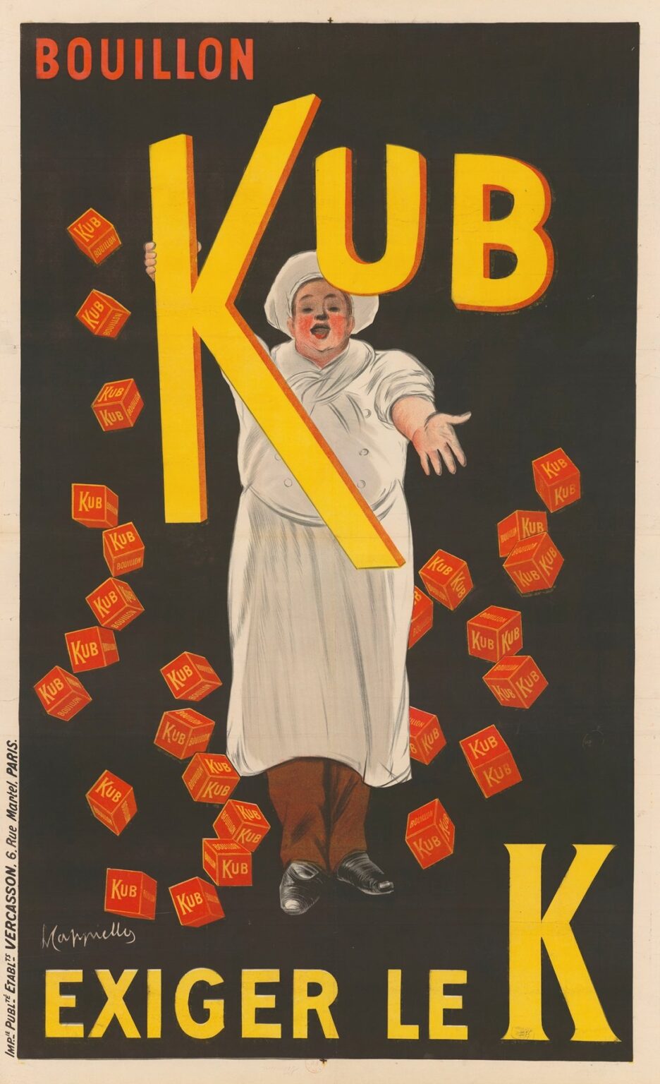
Composition: The Playful Chef and Oversized Letter “K”
At the heart of the poster stands a rotund, merry chef in full white uniform and toque, emerging from gloom with open arms. He grasps an oversized yellow letter “K” outlined in red—an acronym for “Kub.” The chef’s face, cheeks flushed with delight, seems to exclaim the brand’s name. Around him tumble numerous small red and yellow bouillon cubes imprinted with the word “KUB,” scattered like confetti. Above, the bold red headline reads “BOUILLON”, while the subtitle “KUB” appears in giant yellow letters at the top right. Along the bottom, the imperative command “EXIGEZ LE K” (Demand the K) reinforces the call to action. Cappiello cleverly uses the chef as both mascot and proxy for the consumer: his embrace of the letter “K” embodies public affection for the product. The cascading cubes dramatize abundance and flavor, while the flat black background guarantees that every element pops with maximum legibility.
Color Palette: High Contrast and Emotional Resonance
Color functions as a primary communicative device in this design. The rich black background establishes a dramatic stage and emphasizes the vibrancy of foreground elements. The sunny yellow of the letter “K” and the banner cubes conveys warmth, freshness, and the golden hue of bouillon broth. Its red outline prevents visual bleeding into the background and adds a crisp, layered effect. The ruby red of the headline and cube faces—complemented by the red rim on the “K”—signifies appetite stimulation, a long‐recognized effect of warm tones. The chef’s white uniform, rendered with subtle gray shading, offers relief from the intense palette, while his rosy complexion echoes the warmth of the brand colors. This interplay of warm hues against the stark black field creates instant attention and evokes the sensory pleasure of a steaming cup of bouillon.
Typography: Emphasis and Economy
Text appears only at the top and bottom margins, a testament to Cappiello’s economy of messaging. The headline “BOUILLON” in uppercase red letters sets the category. The single “KUB” at top right, oversized and in yellow, functions as a logo and brand anchor. The imperative “EXIGEZ LE K” at the bottom translates directly to “Demand the K,” urging the consumer to request the authentic product. The choice of a sans‐serif, blocky typeface signals modernity and clarity, contrasting with earlier serif fonts in 19th‐century advertising. By limiting copy, Cappiello ensured immediate comprehension even by hurried passersby. Optical weight and color hierarchy guide the viewer’s eye: first the category, then the brand, and finally the call to action, all in under a second.
Symbolism and Emotional Narrative
On a deeper level, the poster weaves several symbolic threads. The chef, a universal emblem of culinary expertise, signals quality and trust. His joyous embrace of the letter “K” positions the brand as both an authoritative staple and a source of delight. The repetition of cubes swirling around him dramatizes abundance, suggesting that one box of KUB yields a multitude of servings. The tagline “Demand the K” imbues the brand letter with talismanic significance, as if to say: only the genuine cube, marked by its iconic letter, assures true flavor. This narrative of authenticity and pleasure resonated powerfully in early 20th‐century France, where food traditions were sacrosanct and new conveniences eagerly embraced.
Spatial Dynamics and Visual Flow
Cappiello’s composition directs the viewer’s gaze on a dynamic arc. Starting with the bold red “BOUILLON” at the upper left, the eye travels down to the chef’s outstretched arm and the embracing “K,” then sweeps along the cascade of bouillon cubes, finally settling on the imperative call “EXIGEZ LE K.” The black negative space ensures that each visual element stands out crisply, while the diagonal trajectory implied by the falling cubes and the chef’s outstretched pose injects energy and motion. By skillfully arranging positive shapes within the void, Cappiello creates an image that feels both balanced and exhilarating.
Technical Mastery: Lithographic Precision
Printed by Imp. Vercasson & Cie in Paris, the 1911 “Kub. Exigez le KUB” poster exemplifies technical excellence in color lithography. Each hue—black, red, yellow, gray, and subtle flesh tones—required a separate limestone stone and press run. Maintaining perfect registration was critical to aligning the chef’s detailed shading, the crisp letterforms, and the tiny cube imprints. The large format, often over one meter tall, tested the lithographic pressmen’s ability to deliver uniform ink coverage. The result was a poster whose bold colors and clean lines retained their vibrancy even after months on street walls, cementing Cappiello’s reputation for prints that combined artistic flair with industrial durability.
Cultural Reception and Market Impact
Upon its release, the “Kub. Exigez le KUB” poster quickly became omnipresent in Parisian neighborhoods, suburban towns, and railway stations. Café owners, grocers, and bistro proprietors clamored for the design, recognizing its ability to draw customers. Early sales figures from the Maggi company indicate a marked increase in bouillon cube purchases in districts where the poster was prominently displayed. Critics of the day lauded Cappiello’s painterly touch and the humor of the plump chef figure, contrasting it with more formulaic ads. The campaign’s success also influenced competitor brands to adopt more dynamic, image-driven posters, accelerating the shift toward modern graphic advertising.
Comparison with Contemporaneous Works
Leonetto Cappiello’s “Amandines de Provence” (1902) and “Angelus” (1902) share stylistic DNA with the Kub poster: single motif, minimal text, bold color. However, the Kub design feels more playful and animated, owing to the scattered cubes and the chef’s exuberant pose. Compared with his later Art Deco extravaganzas of the 1920s and 1930s—such as the 1926 “Cinzano” poster’s mythic horse—the Kub poster retains stronger ties to caricature and the Belle Époque’s whimsical decorative tradition. It can thus be seen as a transitional work, bridging Cappiello’s early decorative experiments with the streamlined modernism that would define his mid‐career masterpieces.
Legacy and Lasting Influence
Over a century later, “Kub. Exigez le KUB” endures as one of Cappiello’s most celebrated works. Original lithographic prints are coveted by museums and collectors worldwide, appearing in exhibitions on vintage advertising and design retrospectives. Graphic designers cite the poster when illustrating principles of hierarchy, contrast, and narrative economy. In the age of digital media, the lesson remains vital: a single, well‐conceived image, supported by minimal text, can capture attention and embed a brand in public consciousness. The comedic chef, the monumental “K,” and the tumbling cubes continue to enchant audiences, reminding us that effective advertising marries artistry with a clear promise—flavorful broth in an instant.
Conclusion: The Enduring Power of a Singular Vision
Leonetto Cappiello’s 1911 poster “Kub. Exigez le KUB” stands as a milestone in the history of advertising art. By uniting painterly charm, bold color schemes, and a streamlined message within a single, dynamic tableau, he created a design that transcended novelty to become a cultural icon. The jubilant chef and cascading cubes convey both quality and delight, while the imperative call to “Demand the K” elevates the brand letter to a symbol of authenticity. Technically superb and thematically rich, the poster exemplifies the golden age of lithographic advertising and continues to inform modern principles of graphic design. More than a historical artifact, “Kub. Exigez le KUB” remains a vivid reminder that the most memorable campaigns spring from clarity of vision, emotional resonance, and the transformative power of a single, unforgettable image.