Image source: artvee.com
Introduction
Alphonse Mucha’s Krajinská výstava v Ivančicích (Regional Exhibition at Ivančice), created in 1912, marks a mature celebration of Moravian folk culture and a testament to the artist’s ongoing exploration of Art Nouveau principles. Unlike his earlier commercial posters for Parisian theatres and luxury brands, this work embraces a rural subject: two young women dressed in traditional folk attire, framed by the exhibition’s iconic bell tower and fluttering festival ribbons. Mucha transforms a straightforward announcement into an immersive visual narrative that fuses national pride, folkloric charm, and modernist design. Through a sophisticated interplay of composition, line, color, symbolism, and typography, Krajinská výstava v Ivančicích elevates a regional fair into an event of almost mythic resonance, uniting simple village motifs with an artful decorative flourish.
Historical Context
At the turn of the twentieth century, the Czech lands were part of the Austro-Hungarian Empire, yet a vibrant national revival was underway. Intellectuals, artists, and political activists sought to assert Czech cultural identity through language, literature, music, and the decorative arts. Folk traditions—costume, song, dance—became crucial symbols of this revival, celebrated in festivals and regional exhibitions known as “krajinské výstavy.” These fairs showcased local crafts, gastronomy, and peasant customs for urban audiences and international visitors. Ivančice, a historic town near Brno with medieval roots, hosted its first major regional exhibition in the summer of 1913. Mucha, who had returned to Prague from Paris and immersed himself in Czech cultural institutions, was invited to create the official poster—a commission that reflected both his status as a leading graphic artist and his dedication to national heritage.
Commission and Purpose
The organizing committee for the Ivančice exhibition, composed of local merchants, craftsmen, and cultural patrons, envisioned a cohesive visual identity that would distinguish their event from similar fairs across Bohemia and Moravia. They sought a poster that would capture the region’s pastoral charm and convey the excitement of a summer festival dedicated to folk tradition and agricultural achievement. By commissioning Mucha, they aimed to lend artistic prestige and to attract both local visitors and travelers from afar. The resulting poster needed to serve multiple functions: as a street advertisement, a program cover, and a decorative keepsake. Mucha’s task was to create an image that would be instantly legible at several paces, yet rich enough in detail to reward close study—an objective he achieved masterfully.
Composition and Form
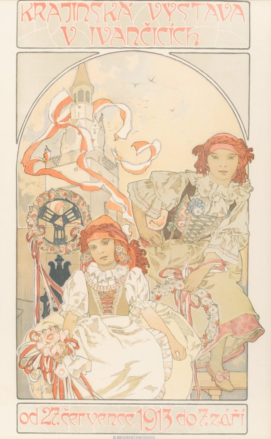
Mucha organizes Krajinská výstava v Ivančicích within a tall, rectangular format, framing the central tableau in a broad border that echoes the soft curves of his Art Nouveau idiom. At the top, the exhibition title appears in stylized Czech lettering rendered in coral-red, set against a pale beige background patterned with faint circular motifs suggesting festival decorations. Below, a large arch encloses the main scene: the bell tower of Ivančice, its angular forms softened by unfurling red-and-white ribbons, emerges behind two young women. The elder girl stands on a low wooden bench, one hand on her hip and the other lifting a garland of daisies; her direct gaze addresses the viewer with spirited confidence. In front of her, a smaller girl sits on a stone ledge, clutching a bouquet of roses entwined with festival ribbons, her expression poised between solemnity and wonder. The figures’ vertical lines contrast with the arch’s curve, while the bench and ledge provide horizontal anchors. At the bottom, the exhibition dates—“od 27. července 1913 do 7. září”—appear in matching coral-red script, balanced by a slender frame that unifies the composition.
Use of Line and Decorative Motifs
Line is the fundamental building block of Mucha’s decorative strategy, and here it manifests with both elegance and precision. The figures’ outlines are defined by smooth, continuous strokes that vary in weight: thicker in areas requiring emphasis—cheeks, shoulders, elaborate folds of the girls’ skirts—and finer within the intricate embroidery of their bodices and sleeves. The field behind them is animated by looping ribbons that spiral around the tower and through the air, their trailing ends drawn with lively whiplash curves characteristic of the Art Nouveau style. Subtler vine-and-leaf motifs cluster near the lower border, linking the floral accessories to the region’s agricultural identity. Mucha’s border lines, in a muted gray-green, form a delicate counterpoint to the mail-order saturation of color in the central scene, reminding the eye of the poster’s decorative unity.
Color Palette and Atmosphere
Mucha’s color palette for this poster is restrained yet evocative, reflecting both the summer setting and the folk aesthetic. The dominant hues are coral-red and creamy beige—colors borrowed from traditional wedding ribbons and harvest garlands—offset by gentle pistachio greens, pale sky blues, and earthy ochres. The bell tower is rendered in soft ivory with pale gray shading, its prominence underscored by the vivid red-and-white festival streamers that swirl about it. The girls’ folk costumes combine warm cream for the blouses, rich brown for the bodices, and sprightly splashes of coral and green in embroidery and ribbons. The stone ledge and wooden bench beneath them carry natural gray-brown tones that ground the scene without competing for attention. Overall, the palette achieves a celebratory warmth tempered by pastoral serenity, conjuring an idyllic summer day suffused with communal joy.
Symbolism and Folk Tradition
Every element in the poster carries symbolic weight tied to regional traditions. The bell tower—floral wreath at its base and ribbons above—serves as both landmark and heart of the festival, ringing in the fair’s opening and closing ceremonies. The red-and-white streamers recall peasant rituals of blessing the crops and honoring the Virgin Mary, while the floral wreath, traditionally worn at weddings, evokes fertility, union, and communal solidarity. The older girl’s assertive posture suggests youthful leadership in festival processions, whereas the younger girl’s seated stillness evokes reverence for ancestral customs. Their traditional garments—embroidered bodices, full skirts, lace collars—signal respect for artisanal craft and regional identity. Together, these symbols transform a simple announcement into a vivid tableau of folk ritual and local pride.
Typography and Visual Hierarchy
Mucha’s custom lettering at the top and bottom of the poster is a study in decorative legibility. The title characters—elongated and slightly flared at their terminal strokes—echo the verticality of the bell tower and the ribbons’ undulations. The coral-red hue ensures readability against the pale background, while the faint pattern behind the letters adds depth without obscuring form. The date line at the bottom employs a narrower version of the same script, maintaining visual coherence. Mucha’s typographic choices create a clear hierarchy: viewers first register “Krajinská výstava v Ivančicích” as the event’s name, their eyes then descend to the central image, and finally they note the precise dates. This hierarchy mirrors the natural reading sequence and harmonizes with the poster’s overall design.
Technical Mastery and Lithographic Process
Krajinská výstava v Ivančicích was printed as a color lithograph, a demanding process that required separate stones or plates for each hue. Mucha’s studio prepared full-scale drawings indicating the coral-red, pistachio green, beige, ochre, and pale blue separations in meticulous detail. The printer’s craft lay in translating these separations onto limestone or metal plates and achieving perfect registration during successive print runs. The iconic red streamers and floral wreath demanded sharp saturation, while the pastel backgrounds required subtle glazing to maintain their luminosity. Mucha’s insistence on quality paper and careful inking prevented issues of banding or misalignment. The finished prints, distributed to local innkeepers, shops, and municipal buildings, retained the vibrancy and finesse of Mucha’s original designs even after prolonged outdoor display.
Cultural Impact and Reception
Upon its release, Mucha’s poster dominated the streets of Ivančice and surrounding towns, its memorable imagery and festive tones attracting widespread attention. Local newspapers lauded its combination of folk authenticity and modern artistry, crediting Mucha with capturing the spirit of Moravian peasant culture. Exhibition organizers observed increased attendance, attributing part of the success to the poster’s compelling suggestion of community celebration and rural charm. Beyond the immediate fair, the poster circulated as a collectible—mounted in student rooms and displayed in town halls—becoming a visual emblem of regional pride. Its influence extended to subsequent rural exhibitions across Bohemia and Moravia, which emulated Mucha’s model by commissioning local artwork that blended folk subject matter with contemporary design.
Influence on Mucha’s Later Work
Krajinská výstava v Ivančicích represents a key milestone in Mucha’s evolving practice. Having spent years creating theatrical and commercial works for an international audience, he now turned his talents toward national commissions that foregrounded Czech culture. The poster’s integration of folk motifs with Art Nouveau ornament presaged Mucha’s later Slav Epic—a monumental cycle celebrating Slavic history and mythology. Techniques he refined here—harmonious pastel palettes, folkloric subject matter, seamless typography—reappear in the Slav Epic’s allegorical panels. Furthermore, Mucha’s success in melding local specificity with universal decorative principles encouraged him to explore other regional exhibitions and cultural projects, deepening his engagement with the notion of art as national expression.
Preservation and Legacy
Original Krajinská výstava v Ivančicích posters are prized by collectors and cultural institutions, particularly in the Czech Republic, where they are preserved in archives and displayed in exhibitions on Art Nouveau and national heritage. Conservation efforts focus on stabilizing the lithographic inks and preventing paper acidification. Modern reproductions have introduced Mucha’s rural imagery to new audiences worldwide, inspiring graphic designers to explore the interplay of local tradition and modern design. The poster’s enduring appeal lies in its vivid evocation of festival energy, its masterful decoration, and its role as a visual bridge between urban art nouveau currents and countryside traditions.
Conclusion
Alphonse Mucha’s Krajinská výstava v Ivančicích (1912) stands as a crowning achievement of late Art Nouveau, merging regional folklore with modern graphic artistry. Through its balanced composition, expressive line work, harmonious color palette, evocative symbolism, and expert lithographic execution, the poster transforms a modest provincial fair into a grand celebration of Czech cultural identity. Mucha’s design not only captured the spirit of Ivančice’s summer exhibition but also paved the way for his subsequent national projects, including the Slav Epic. More than a historical artifact, Krajinská výstava v Ivančicích continues to enchant viewers with its timeless blend of tradition and innovation, reminding us of art’s power to unite community and heritage.