Image source: artvee.com
Introduction
Wassily Kandinsky’s penultimate suite of black‑and‑white and color woodcut prints collectively known as the Klänge (Sounds) series stands among the most radical visual experiments of 1913. Plate 11 in this series presents a vibrant tapestry of interlocking shapes and contrasting hues that transcends literal representation to conjure a synesthetic experience. In this analysis, we will trace the origins of Kandinsky’s theoretical and artistic evolution through 1913, explore the compositional strategies and formal elements at work in Klänge Pl.11, examine its technical execution and material qualities, and consider the emotional and symbolic resonances that arise when line, color, and space converge to create abstract “sound” on paper.
Historical and Theoretical Background
By the early 1910s, Kandinsky had emerged from his Munich circle as a leading proponent of pure abstraction. His celebrated essays “On the Spiritual in Art” (1911) and various lectures articulated a vision for painting that operated on the same emotional wavelengths as music, free from the constraints of mimetic depiction. Between 1912 and 1914 he produced his landmark oil canvases (Improvisation 27) and (Composition V), works teeming with swirling color and gestural line. In parallel he began to experiment with woodcut and linocut prints, attracted to their stark contrasts and ability to reproduce rhythmic patterns across multiple impressions. The Klänge series was conceived amid growing enthusiasm for the avant‑garde, and Kandinsky embraced the print medium to push abstraction further. He treated each print as a visual “note,” assembling suites of plates to function like musical movements. Plate 11 was created during the same year that saw his celebrated presentation at Der Blaue Reiter Almanac, and it reflects both the confidence of his fully abstract style and an embrace of the printmaker’s graphic clarity.
Composition and Formal Structure
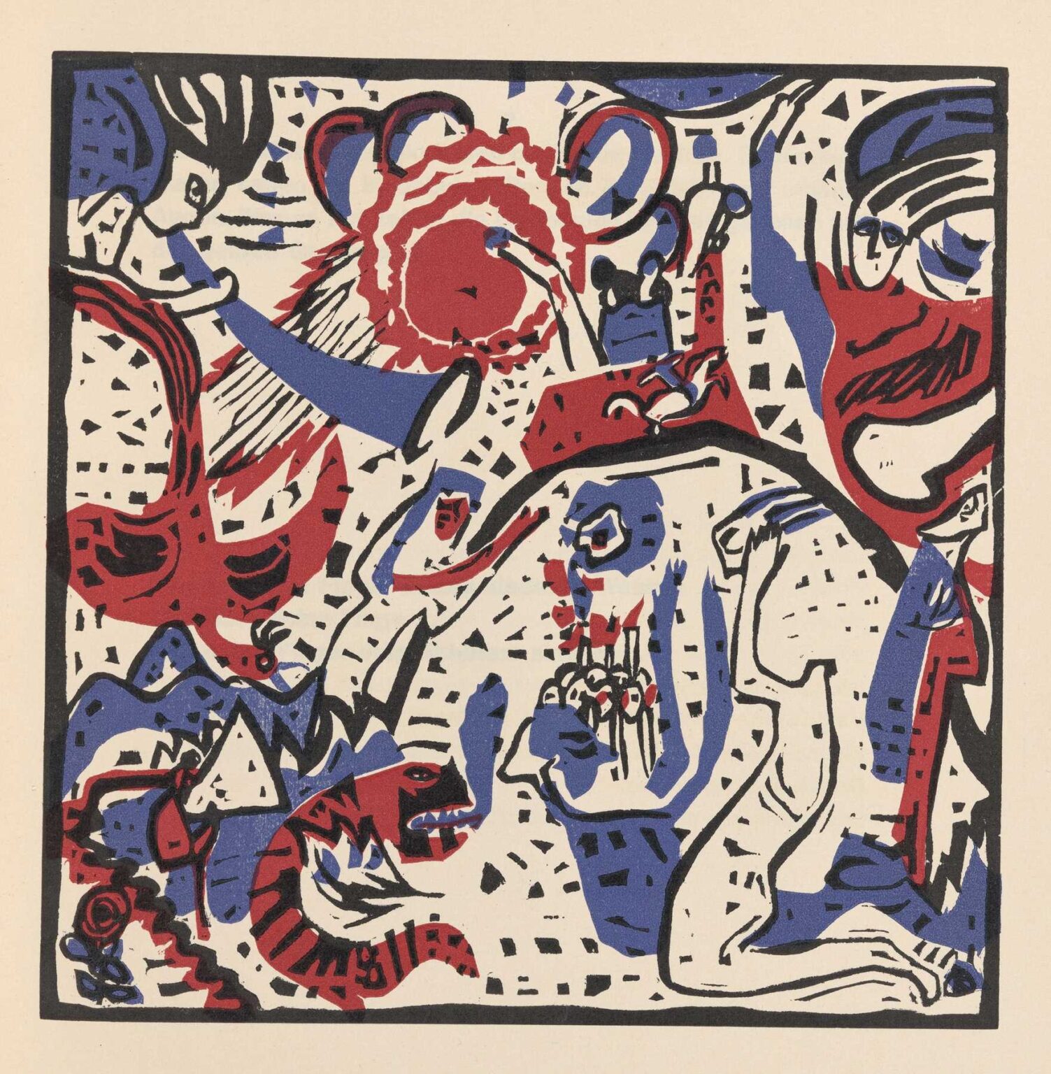
At first glance, Klänge Pl.11 presents a choreographed interplay of vibrant red and cobalt blue shapes laid into broad fields of pristine negative space. A thick black contour frames the entire sheet, establishing a boundary within which shapes pulsate. Within this frame, red crescents and wavy bands curve around and through patches of black hatchings and stippled dots. Blue serpentine forms wind sinuously across the surface, at times splitting the red masses or momentarily retreating into the cream ground. Throughout, squarish checkered motifs in black suggest fragments of architectural or geometric order, offset by fluid organic contours that push toward the realm of the biomorphic. The overall effect is one of controlled exuberance: each hue and shape balances against its neighbor, creating zones of tension and release much like the rising arc of a musical phrase.
Line, Rhythm, and Movement
Kandinsky’s mastery of line is unparalleled in Klänge Pl.11. Thick black outlines define the major red and blue masses, while secondary hatchings and tiny dots animate interior surfaces with frenetic energy. These textural scratches and stipples serve as rhythmic echoes, akin to percussion or staccato passages in a composition. Larger curved bands impart a sense of sweeping gesture, guiding the eye in looping circuits across the print. Sharp angular notches and triangular peaks interrupt the curves, introducing accents that function like sudden key changes. The juxtaposition of smooth curves and jagged strokes generates an almost audible visual tempo: the print seems to vibrate with the memory of a lived performance, as though each shape were a different instrument calling to one another in a polyphonic chorus.
Color Interaction and Tonal Contrast
Although the Klänge series began in black and white, Plate 11 incorporates two primary color notes—crimson red and ultramarine blue—set against the neutral ivory of the print ground. Kandinsky uses these hues not as mere decoration but as active participants in a tonal dialogue. The red shapes dominate through their warmth and mass, drawing the viewer’s attention immediately. Blue shapes, cooler and receding, provide counterweights that stabilize the composition. In places where the two colors overlap or abut, they generate a visual vibration, akin to two complementary musical tones played in close alternation. The cream ground becomes a vital third element, furnishing respite from the intensity of red and blue and allowing the eye to rest before re‑engaging with the print’s intricate dance. The limited palette reinforces unity, yet the high contrast between primary colors and black accents yields a dynamic tension that propels the viewer through the visual field.
Spatial Ambiguity and Layering
Despite its flat medium, Klänge Pl.11 conjures a compelling sense of spatial play. Overlapping forms create zones of foreground and background, yet no single element fully recedes. A red ribbon may appear at times to lie atop a black grid of dots, then seem to tunnel beneath a curling blue spiral. These ambiguous relationships invite the viewer to oscillate between competing perceptions of depth. Kandinsky avoids conventional perspective cues, instead trusting the viewer’s eye to negotiate spatial puzzles through the layering of shapes and the modulation of line weight. The absence of a fixed horizon or vanishing point enhances fluidity, allowing forms to drift and intersect freely across the print surface.
Technical Execution and Printmaking Process
Technically, Klänge Pl.11 is a color woodcut or linocut—Kandinsky’s medium of choice for this series—printed by hand from multiple blocks. Each color required its own block, meticulously carved to align with the others in precise registration. The rich, even ink coverage attests to expert inking and impression technique, while subtle variations in tone suggest the careful inking methods used to impart depth. Black outlines were likely printed first, establishing the structural framework; this was followed by red and then blue passes, each applied with a clean, firm pressure. The print’s crisp edges and the uniform surface of color testify to the collaboration between Kandinsky and skilled printshop artisans, possibly the firm of Adolf Gerstenberg in Munich. Yet the slight irregularities in ink density—slight pooling in recessed dots, gentle texture within bold shapes—reveal the human touch and imperfection that enliven the mechanical process.
Symbolic Interpretation and Emotional Resonance
While Kandinsky resisted literal interpretation, he often spoke of the spiritual affinities between color, form, and emotion. In this print, the bold red arcs may signify passionate intensity or inner fire, while the cooler blue spirals evoke calm reflection or introspection. The dotted grids could allude to the structured rhythms of logic or intellect, set against the untamed energy of curved forms. The overall composition can be read as a metaphor for the human psyche in symphonic motion—passion, reason, intuition, and chaos interacting in cycles of tension and resolution. Emotionally, viewers often report sensations of exhilaration, uplift, or even a meditative trance when immersed in the lively interplay of shapes. Kandinsky intended such works to function not as static decorations but as catalysts for inner awakening, encouraging each individual to “hear” the painting rather than simply see it.
Relation to Kandinsky’s Artistic Trajectory
Klänge Pl.11 exemplifies the transitional moment in Kandinsky’s career when he fully embraced pure abstraction while experimenting with the graphic possibilities of printmaking. In his earlier Improvisations and Compositions, he used brush and oil to explore spontaneous gesture on canvas. By 1913, he recognized woodcut as ideally suited to exploring rhythmic repetition and serial visual language. The Klänge series anticipated his later ventures into the geometric precision of the Bauhaus era yet maintained the emotive immediacy of his Expressionist roots. Plate 11 can thus be seen as both a culmination of his prewar abstraction and a springboard toward the more architectural, formally rigorous works of the 1920s.
Influence and Legacy
Although these woodcuts reached a narrower audience than his large paintings, their influence on subsequent generations of graphic artists and printmakers has been profound. Klänge Pl.11 in particular has been cited by mid‑century abstractionists and by contemporary designers seeking to fuse organic form with geometric clarity. Kandinsky’s theories on color‑sound synesthesia and the spiritual dimension of abstraction continue to inform modern art education and theoretical discourse. Prints from the Klänge series remain sought after by collectors and museums, revered for their inventive marriage of process and cosmos. Plate 11’s striking red‑and‑blue palette has even inspired textile and wallpaper designers, attesting to Kandinsky’s lasting power to resonate across disciplines.
Conclusion
In Klänge Pl.11, Wassily Kandinsky distilled his lifelong exploration of synesthetic art into a single print that balances spontaneity with structure, emotion with intellect, and chaos with harmony. Through a masterful interplay of red, blue, and black forms, he invites the viewer to engage in an inner dialogue—to hear shapes, see sounds, and sense the spiritual currents beneath the surface of appearance. Created in the crucible year of 1913, this print stands as a testament to Kandinsky’s conviction that abstraction can touch the soul more directly than any literal depiction. Over a century later, Klänge Pl.11 still pulses with the energy of its original conception, affirming the timeless capacity of art to transform perception and awaken the spirit.