Image source: artvee.com
Introduction to Kali Klor
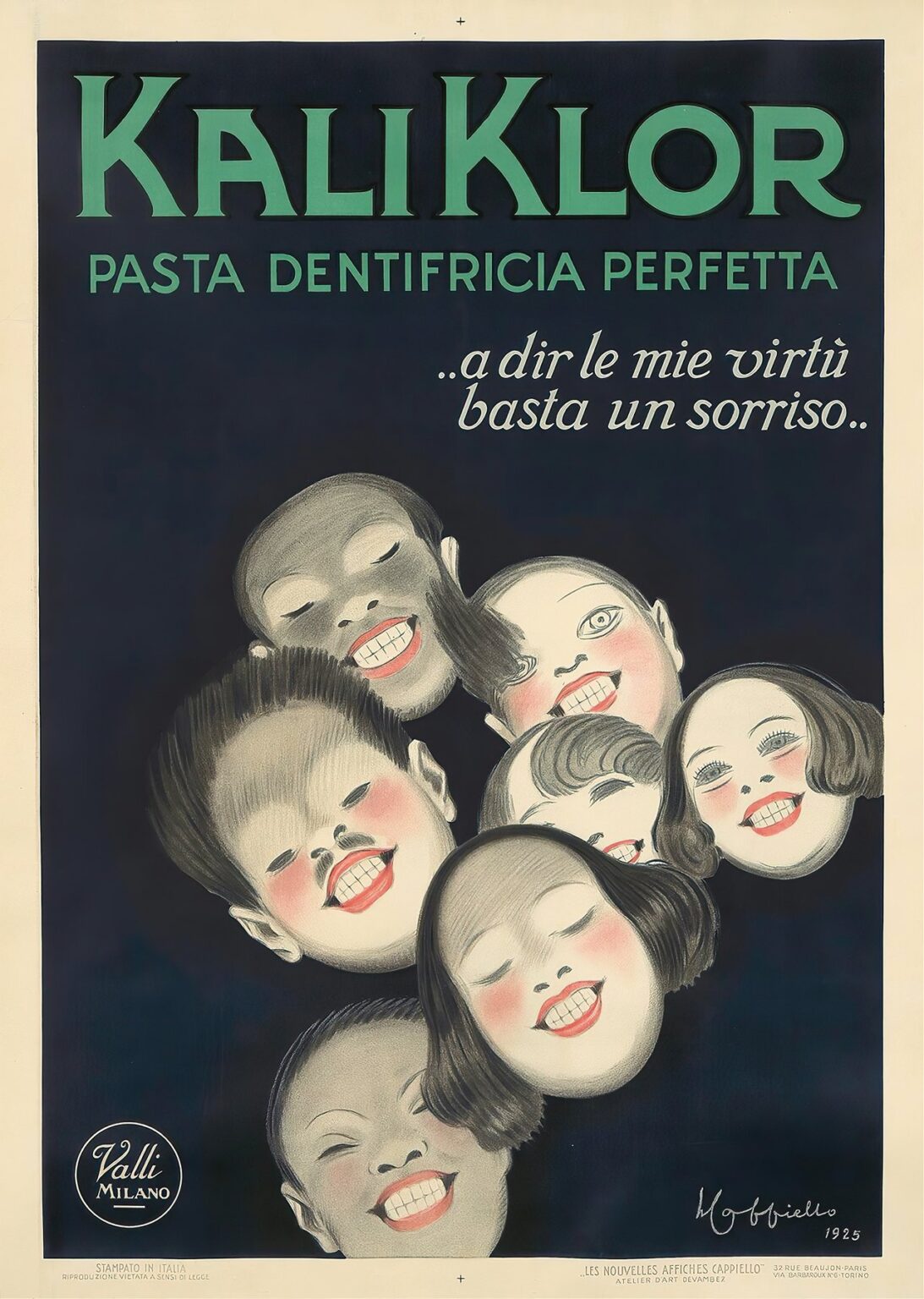
In 1925, Leonetto Cappiello created a striking poster for Kali Klor, a toothpaste marketed under the motto “..a dir le mie virtù basta un sorriso..” (to proclaim its virtues, a smile is enough). Departing from conventional advertising that often featured domestic bathroom scenes or medicinal imagery, Cappiello’s design centers on an energetic cluster of faces, each baring impeccably white teeth against a deep navy background. This visual arresting arrangement elevates the simple act of smiling into a collective celebration of health, hygiene, and youthful exuberance. By focusing on the universal language of a smile, Cappiello transforms a dental product into a social phenomenon, imbuing Kali Klor with a sense of joy and shared confidence that resonates across cultures and generations.
Historical Context of Dental Hygiene Advertising
The 1920s witnessed rapid growth in consumer health products, with toothpaste emerging as a staple of modern personal care. Prior to this era, oral hygiene was often relegated to private routines guided by local dental practitioners. As urbanization and mass media expanded, manufacturers recognized the power of visual persuasion to drive product adoption. Kali Klor, produced by Valli Milano, sought to capitalize on the public’s growing interest in preventive care and the social importance of a healthy smile. Cappiello’s poster arrived at a moment when graphic artists were moving away from instructional illustrations toward emotive, character-driven compositions, forging a new visual vocabulary for advertising that prioritized engagement and memorability.
Leonetto Cappiello’s Visionary Approach
Leonetto Cappiello (1875–1942) earned the moniker “father of modern advertising” by pioneering a minimalist yet bold style. Rejecting cluttered tableaux and exhaustive text, he distilled a brand’s essence into a single, powerful image set against a monochromatic field. His talent lay in selecting motifs that captured both the product’s function and its emotional appeal. For Kali Klor, Cappiello recognized the potency of the human smile as a symbol of confidence and well-being. Instead of depicting a toothbrush or a bathroom setting, he chose to represent the outcome—a radiant grin—thereby promising value through a single, instantly relatable gesture. This conceptual leap exemplifies Cappiello’s ability to fuse artistic innovation with marketing acumen.
Composition and Spatial Dynamics
Cappiello’s composition for Kali Klor is built around a clustered arrangement of seven faces floating against a deep navy backdrop. The heads are positioned in a rough upward spiral, leading the viewer’s eye from the bottom left toward the top right of the poster. Each face tilts at a slightly different angle, creating a sense of dynamic motion that mimics the act of sharing laughter or calling out to a friend. The negative space around the cluster intensifies the focus on the smiles, while the slight overlap of faces suggests community and collective endorsement. This spatial orchestration exemplifies Cappiello’s mastery of isolating key forms to create an unforgettable visual narrative.
The Power of the Smile as Central Motif
By centering kaleidoscopic smiles, Cappiello turns a quotidian facial expression into a potent symbol. Smiling serves as a universal signal of friendliness, trust, and vitality—qualities that Kali Klor promised to deliver. The wide, gleaming teeth form a repetitive motif, reinforcing the brand message through visual echo. Each set of teeth, rendered in bright white and framed by rosy cheeks, becomes a badge of the product’s effectiveness. In Cappiello’s world, the consumers themselves become spokespeople, their healthy grins testifying to Kali Klor’s ability to clean, polish, and protect. This person-centered approach foregrounds the psychological benefits of personal care, inviting viewers to imagine themselves as part of the smiling circle.
Color Palette and Emotional Resonance
Cappiello’s choice of a deep navy field provides the ideal canvas for the contrasting flesh tones, white teeth, and soft blush of the cheeks. Navy evokes stability and cleanliness, serving as a visual stand-in for the hygienic qualities of toothpaste. The faces, rendered in subtle grays and warm pinks, appear almost luminous against this dark background. The bright green of the Kali Klor lettering at the top introduces an accent color that enlivens the composition and echoes the connotation of freshness associated with mint or herbal ingredients. The overall palette balances trustworthiness with youthful vitality, illustrating how color can reinforce both functional and emotional aspects of a brand.
Typography and Brand Identity
At the top of the poster, the brand name “KALI KLOR” commands attention in bold, uppercase letters rendered in a modern sans serif. The mint-green hue underscores themes of freshness and purity. Directly beneath, the descriptor “PASTA DENTIFRICIA PERFETTA” appears in a slightly smaller size, assuring the viewer of the product’s perfect formulation. The slogan, italicized and set in white cursive—“..a dir le mie virtù basta un sorriso..”—draws the eye with its gentle rhythm and poetic flourish. This typographic hierarchy ensures that brand recognition comes first, functional benefit second, and emotional promise third, all while maintaining clarity and cohesion within the visual field.
The Faces: Portraiture and Perception
Although Cappiello’s caricature roots lent him a gift for exaggeration, the faces in Kali Klor retain a delicate balance between stylization and realism. The eyes, mostly closed or gently curved, contribute to a sense of genuine pleasure rather than a forced grin. Cheeks are softly blushed to suggest health rather than artificial coloring. Hairlines and ears are sketched with minimal lines, keeping the emphasis squarely on the teeth. This restraint in detail allows each portrait to function as an archetype—child, adult, or elder—inviting viewers from different demographics to see themselves reflected in the smiles. Through these universal features, Cappiello cultivates broad appeal.
Psychological Appeal and Consumer Engagement
Cappiello understood that advertising must resonate on a psychological level to drive behavior. By showcasing smiling faces, he tapped into the phenomenon of emotional contagion—viewers experience positive feelings simply by observing others’ expressions. In the context of toothpaste, where tangible benefits like cavity prevention occur behind closed doors, the public display of a healthy smile bridges the gap between functional outcome and social reward. Kali Klor’s promise becomes visible. Prospective customers are not merely told about freshness; they see the communal joy that the brand can unlock. This empathetic strategy forged a stronger bond than mere product demonstration.
Technical Execution and Chromolithography Craftsmanship
The Kali Klor poster was realized through chromolithography, a printing process that allowed for flat, saturated color fields and crisp registration of multiple plates. Each hue—navy, skin tones, white, pink, and green—required its own stone, demanding meticulous alignment to prevent color bleed. The soft gradients in cheek shading and subtle transitions in hair textures demonstrate the high level of skill in both stone preparation and ink application. Devambez’s imprint at the bottom right attests to the partnership between artist and printer, ensuring that Cappiello’s original gouache or charcoal studies were faithfully reproduced on posters destined for high-traffic urban display.
Cultural Reception and Commercial Impact
Upon its release, Kali Klor’s poster garnered immediate attention in Milanese and Parisian streetscapes. Pedestrians paused to admire the joyous faces, while retailers reported heightened curiosity about the toothpaste’s qualities. Period accounts note that families and dentists alike praised the poster for bringing a playful yet credible aesthetic to a category often associated with clinical sterility. Kali Klor sales rose notably in the months following the campaign’s launch, demonstrating the efficacy of Cappiello’s associative branding. Critics lauded the design for prioritizing emotional storytelling over product illustration, solidifying Cappiello’s status as an advertising innovator.
Influence on Later Advertising Strategies
Cappiello’s emphasis on human emotion over product mechanics became a template for subsequent health and beauty campaigns. The idea that a consumer’s visible transformation—glowing skin, shiny hair, radiant teeth—could serve as the primary selling point resonated deeply with marketers. In the decades that followed, toothpaste brands around the world adopted smiling faces as their core motif, echoing the success of Kali Klor. Even in the digital age, before-and-after evidence and celebrity endorsements employ the same psychological underpinnings first popularized by Cappiello’s work. His legacy endures in every advertisement that leverages personal allure to communicate product efficacy.
Preservation, Legacy, and Continued Relevance
Original Kali Klor posters are highly sought after by collectors and institutions preserving graphic design history. Conservation efforts focus on stabilizing the dark navy background to prevent fading and protecting the delicate chalk-like sheen of the portraits. Exhibitions on Art Deco and early twentieth-century advertising routinely feature Cappiello’s Kali Klor alongside his other masterpieces, underlining the transformative power of minimal imagery. Contemporary brands continue to draw inspiration from the poster’s emotive focus, reminding designers that at the heart of any effective advertisement lies a simple human truth: people respond to people.
Conclusion
Leonetto Cappiello’s 1925 poster for Kali Klor exemplifies the fusion of artistic ingenuity and persuasive marketing. By centering on vibrant, smiling faces set against a stark background, Cappiello elevates a personal care product into an emblem of shared joy and confidence. His choice of minimal text, bold color contrasts, and human-centric imagery forged a blueprint for modern branding—one that continues to influence toothpaste and wellness campaigns nearly a century later. “Kali Klor” stands as a testament to the power of the smile, reminding viewers that the most potent advertisement is the one that speaks to our universal desire for health, beauty, and connection.