Image source: artvee.com
Introduction
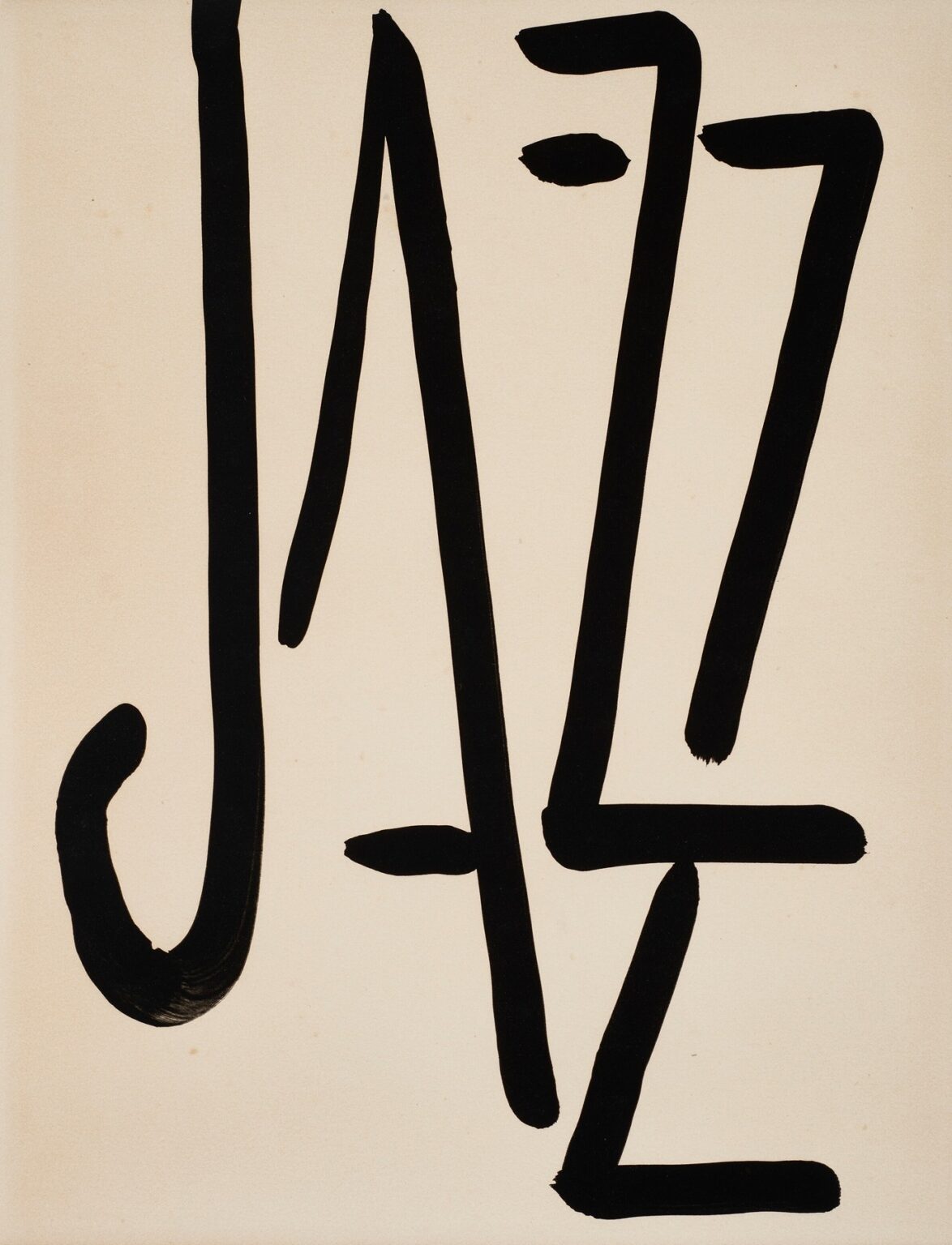
Henri Matisse’s “Jazz – Title” (1947) is one of the most economical and audacious title pages in twentieth-century art. Four enormous, black brushstrokes declare the word “JAZZ” on cream paper. There is no image of a musician, no stage, no instrument—only letterforms, each one a performance of speed, weight, accent, and swing. The page introduces the portfolio Jazz not by illustrating the music but by enacting it: the calligraphy is rhythm, the intervals are rests, the pressure shifts are syncopations. With almost nothing, Matisse sets the key for the entire book and for the late period of his career, when clarity and energy were distilled to their most essential means.
The Place of “Jazz” in Matisse’s Late Career
By 1947 Matisse had reinvented how he worked. After serious illness he developed the cut-out method, painting sheets of paper with opaque gouache and then cutting shapes to “draw with scissors.” The Jazz project—twenty color plates reproduced by hand-stenciling (pochoir) from those cut-outs and accompanied by his own handwritten reflections—became the manifesto of this reinvention. “Jazz – Title” functions as the overture: it states the theme of velocity and economy that will run through tumbling acrobats, swimmers, knife-throwers, and plant forms. The page also demonstrates a parallel thread of the late work: a return to direct, calligraphic mark-making that matched the confidence of the cut-outs. Here, Matisse does not cut; he writes—with a brush so loaded and assured that the letters behave like dancers crossing a stage.
From Word to Picture: Why a Title Can Be a Composition
The brilliance of the title lies in Matisse’s refusal to treat lettering as mere labeling. He composes the word as a full pictorial field. Each letter occupies the vertical height of the page, pushing the edges the way a figure pushes the frame of a painting. Negative space—the pale paper—becomes as consequential as the black strokes; its columns and wedges breathe, pause, and set tempo. The tall forms don’t align like typeset characters; they lean, flare, and hook with the variable pressure of a hand moving very quickly. The result is a page that reads in a fraction of a second and then rewards sustained looking for how differently each stroke is made.
Materials, Gesture, and the Authority of the Brush
“Jazz – Title” is executed in dense black on cream. The pigment sits matte and opaque, recording the history of its making with unusual clarity. At the base of the “J,” the brush curves and drags, leaving a thick, crescent tail with visible ribbing; along the verticals the stroke narrows, a sign that the wrist lifted and speed increased; the diagonal and horizontal bars of the “Z”s terminate in squared, calligraphic ends where the brush was stopped decisively. This is writing that behaves like choreography. You can reconstruct its timing: load, place, press, release, turn, stop—each decision left visible. Because Matisse allows the tool’s character to show, the letters feel lived rather than manufactured.
Reading the Letters as Music
The page is read left to right as “J-A-Z-Z,” but the letters are also sounds. The downstroke of the “J” is a bass note, a standing pulse. Its hooked terminal is a flourish, like the slide of a trombone. The “A” is spare and open—constructed from a narrow left stroke and a steep right stroke, with a short crossbar that acts less as grammar than as a small cymbal strike. The first “Z,” all angle and cut, introduces syncopation; its zigzag accelerates the eye downward and to the right. The final “Z” repeats the rhythm but not mechanically; its proportions change just enough to feel like improvisation on the theme. Between the top of the “A” and the first “Z,” Matisse adds a compact oval accent—a note head, a beat, an intake of breath. Lettering becomes score.
Negative Space as Silence and Structure
Matisse’s greatest late discovery is that emptiness can be a participant. In “Jazz – Title,” between the tall strokes lie pale corridors of air that function like musical rests. The gap after the “J” is generous, a first breath; the spacing tightens between “A” and the first “Z,” quickening the tempo; the last interval opens slightly again so the page resolves rather than crashes. These decisions determine legibility, but they also regulate feeling. The alternating pressures—narrow/wide, fast/slow—give the composition the swing that the word promises.
Black as Color, Not Absence
The title’s black is not a neutral void; it is an active color that asserts itself against the cream. Matisse uses black throughout Jazz to sharpen nearby hues and to command attention. Here, because no other colors share the field, black must do all the work: volume, force, contrast, melody. Its matte density reads as a physical presence, like cut velvet or ink sucked deep into paper. This makes the page feel materially rich even in its spareness. Black also collapses the distance between writing and drawing—letters become figures because they have the weight of bodies.
Calligraphy, the Arabesque, and Cultural Sources
The brush forms invite comparison with Arabic and East Asian calligraphy—traditions Matisse admired for their ability to produce clarity and emotion through directed gesture. The notion of an “arabesque,” central to his thinking since the 1900s, returns here as an organizing principle: a line that carries the whole composition in one long breath. Each letter is an arabesque scaled to the height of the page, and the sequence of letters is a chain of arabesques. In this sense the title sits comfortably beside the contemporaneous cut-outs of leaves and swimmers, where long curves and decisive angles organize broad fields of color.
The Title as Overture to the Portfolio’s Themes
The plates of Jazz oscillate between carnival and contemplation—knife throwers, acrobats, clowns, seascapes, and leafy arrangements. Matisse’s handwritten commentary speaks of improvisation, memory, and the “crystallization of ideas.” The title page enacts those concerns before a reader reaches any plate. Its inventiveness suggests improvisation; its economy suggests memory distilled; its surface clarity suggests an idea that has crystallized through practice. In short, the title is not separate from the content; it is the first plate in spirit, setting expectation for a book where pictures do not explain music but find an equivalent energy.
Scale, Legibility, and the Lessons for Design
Viewed at original size, the letters tower, nearly touching the margins. The scale delivers immediate legibility—a poster-like punch suited to a portfolio meant to be leafed through slowly yet grasped quickly. Designers have long noted how Matisse anticipates contemporary branding by trusting a single, powerful mark to bear the weight of meaning. The proportions here feel modern because they ignore typographic convention in favor of a hand-drawn logic that privileges rhythm over standardization. The page teaches an evergreen design lesson: memorable communication depends as much on tempo and spacing as on the shapes of the letters themselves.
The Balance Between Control and Freedom
Matisse’s achievement is to balance improvisatory energy with structural poise. The page is not loose; it is calibrated. The “J” anchors the left edge so the composition does not tip; the “Z”s share a family resemblance but avoid mirroring each other; the small oval accent is placed high enough to read as punctuation without crowding the top margin. Freedom—visible in the brush’s speed—occurs inside a framework of carefully measured intervals. This is also the logic of the Jazz plates: exuberant shapes corralled by rectangles of pure color.
Why Letters Instead of an Image?
Choosing a typographic title rather than a figurative frontispiece is more than an aesthetic decision. It positions Jazz as a book about inscription—about the act of cutting, writing, and placing. It frees the imagination from specific instruments and allows the music analogy to travel across the whole series. It also democratizes entry; anyone can read the word, and everyone can feel the vitality of its making. Because the letters are both legible and gestural, the page welcomes viewers who love design, calligraphy, or painting alike.
The Physical Trace of Time
One of the pleasures of this title is its temporal legibility. You can follow the order of the strokes: the heavy curve of the “J,” the two slanted legs of the “A” with a quick flick for the crossbar, the top-down slash and the leveling bar of the first “Z,” then the reprise in the second “Z.” Unlike the plates that were translated into pochoir from cut paper, the title looks like a direct transfer from Matisse’s wrist to the page—hence its palpable sense of time. The work feels alive because it allows a viewer to reenact its creation with their eyes.
The Sensation of Sound Without Illustration
“Jazz – Title” achieves something rare: it evokes sound without depicting a sound-maker. The tall letters are not notes on a staff, yet their verticals suggest bars; the diagonal breaks and crossbars echo rhythms; the single dot reads as a beat or grace note. Even the creamy background contributes, acting like the quiet between phrases. The page exemplifies Matisse’s belief that different senses can be bridged by structure—that music’s architecture of duration and accent can have a visual counterpart in line and interval.
Context Within the History of Artist’s Books
The Jazz portfolio stands at a decisive moment in the history of artist’s books: not merely illustrated text, but a total artwork where images, hand lettering, sequence, and production method form a unified statement. The title page’s boldness announces this ambition. It is not an apology that yields to printing conventions; it bends the conventions to the energy of the work. Subsequent generations—from concrete poets to contemporary graphic artists—have learned from its fearless assertion that letters can be pictures without ceasing to be letters.
The Human Scale of a Late Master
Despite its graphic certainty, the page is tenderly human. Minor variations in stroke thickness, the slight softening of ends, and the way the black sometimes feathers at the edges keep the title from becoming a logo. They remind us that it was made by a person, late in life, with hands that had learned the shortest route to vitality. This humanity—clarity without chill—is why the title continues to feel welcoming rather than severe.
Looking Strategies for Viewers
A rewarding way to see the page is to alternate distances. From afar, read the word once and feel the snap of black on cream. Step closer and examine how the brush traveled: the loaded start of the “J,” the hesitations that become squared terminals, the slight drag in one of the diagonals where paper absorbed more pigment. Then stand at mid-range and attend only to the spacing—the pale columns and wedges. You will notice how strongly those silent intervals govern the composition’s poise.
What “Jazz – Title” Teaches About Matisse’s Aesthetic
The page condenses Matisse’s mature aesthetics into a single glance. He believed that a picture should be legible, that its parts should harmonize like notes in music, and that economy is not poverty but concentration. He sought balance without symmetry, movement without agitation, brightness without noise. All of those aims are present here. The page is a model of how restraint, when backed by mastery, can feel exuberant.
Continuing Relevance and Influence
Seventy-plus years later, the title still reads as contemporary. Its balance of hand-made warmth and poster-like impact anticipates many currents in modern design and branding. Calligraphers study it for its rhythm; typographers for its spacing; painters for its authority of stroke. It offers a standard: if a single word can stand as a complete composition, then every mark in a work of art must carry intention. That lesson travels far beyond the Jazz portfolio.
Conclusion
“Jazz – Title” does not merely name a book; it performs it. The page turns lettering into a stage where pressure, interval, and gesture become music for the eye. It captures the essence of Matisse’s late period—clarity achieved through reduction, vitality achieved through mastery of rhythm—and invites the reader into a sequence of images that will keep that rhythm alive. The work endures because it is both immediate and profound: a word anyone can read, a performance only a great artist could compose.