Image source: wikiart.org
Introduction
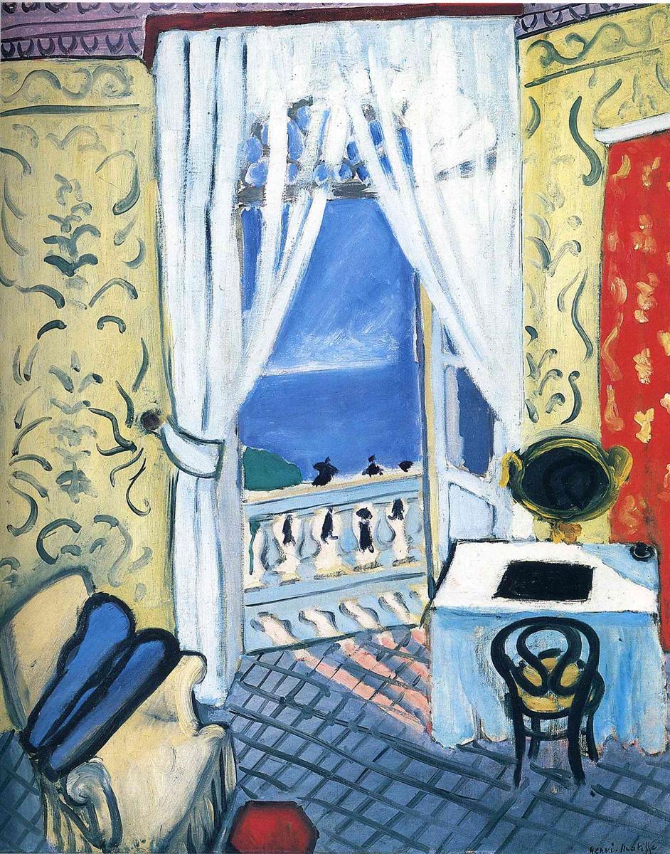
Henri Matisse’s “Interior with a Violin Case” (1919) is one of the clearest statements of his Nice-period idea that a room can be an instrument for color, rhythm, and calm. The motif is deceptively simple: an elegant hotel-like interior with patterned yellow walls; an open pair of French doors draped in translucent white curtains; a glimpse of sea and sky beyond a balustrade; a tiled blue-gray floor; a white-clothed table, gilt mirror, and bentwood chair; and, at lower left, a pale armchair holding a dark, wedge-shaped violin case. Nothing is incidental. Each element—window, curtain, wall pattern, grid floor, and instrument case—works like a note in a chord tuned to a Mediterranean key. The painting feels airy and intimate at once, a sanctuary that looks out to the world.
Historical Context
Painted the first year after the Armistice, the canvas belongs to Matisse’s early Nice period (1917–1921), when he pivoted from prewar intensity toward interiors and balconies flooded with steady southern light. Having long proved that color could shout, he now asked how it could soothe without losing power. The Nice pictures—women with parasols, nudes on pale couches, still lifes of lemons and flowers, windows half-open to the sea—are experiments in a gentler modernism. Decoration becomes structure; pattern is not a surface accessory but an organizing principle; and space is shallow enough to keep the painting a designed object while remaining hospitable. “Interior with a Violin Case” condenses all of those ambitions and adds the quiet theme of music as a sign of human presence.
First Impressions and Motif
At first glance the eye registers the cool central axis of open doors and sky: a tall blue rectangle framed by bleached curtains. Warmth gathers on both sides: wallpaper in pale yellow traced with greenish arabesques to the left and right, and a vertical red panel patterned with gold on the far right that reads like a hanging textile. Below, a diagonal lattice of blue-gray tiles makes the floor breathe toward the balcony; a small red hexagon near the bottom edge punctuates that grid like a drumbeat. On the left sits a plush armchair in cream hues, and across the room a white table glows beside a gilt oval mirror. The subject named in the title—the violin case—rests on the armchair like a dark blue slash with black edges. The atmosphere is poised between activity and repose, as though someone has just set the instrument down to step out onto the balcony for air.
Composition and Framing
The design hinges on a central opening balanced by lateral walls. The doors and curtains form a vertical rectangle whose geometry is softened by the curtain’s scalloped hem and gathered knots. That rectangle divides the room into two bays: a left half anchored by armchair and case, and a right half organized by table, mirror, and a bentwood chair. The floor’s diagonal grid establishes recession without insisting on deep perspective; its converging lines push the eye toward the balustrade and the cool band of sea. Crop and overlap are decisive. The armchair is cut by the frame, the red panel runs off the edge, and the balcony’s carved posts slice the horizon. These purposeful interruptions keep the space shallow, intimate, and charged.
Color Architecture
Color builds the room’s architecture more than drawing does. Three families set the chord. The first is a group of pale, warm yellows and creams that define the walls and chair. The second is a cool family of blues—sky blue at the window, slate blue on the floor, and inky blue-black in the violin case and the chair shadows. The third is a set of accents: coral red on the right wall, a deep ochre at the mirror frame, and the small hexagonal patch of red on the floor. Because each family appears in more than one place, relations are audible: the blue of the sky resonates with the blue of the floor; the yellow wall supports the ivory curtain and chair; the reds on floor and wall knit across the central cool. Color is not ornament but structure.
Light and Atmosphere
The light is even and maritime, typical of Nice. It diffuses through the white curtains, softening every surface it touches. Shadows exist but do not dominate; instead, Matisse turns forms with temperature shifts. The tablecloth is cooler near its shadowed side, warmer along the edge facing the balcony. The floor tiles accept a faint diagonal blush of pink—the reflection of the red wall or of awning stripes beyond—so that light itself seems patterned. Outside, a cobalt sea lies beneath a band of paler sky; the horizon is a breath, not a boundary. This atmosphere lets the eye travel slowly, as though listening.
The Violin Case as Narrative Anchor
Among the room’s objects, the violin case does the narrative work. It is the least colorful yet the most pointed element, placed where the viewer will find it immediately and recognize a human story. A case standing open would shout; this one, closed and resting, suggests pause. Music hovers in its absence. The color of the case—blacks and midnight blues—gives the composition a low register that steadies the high, bright chords elsewhere. It also echoes the black silhouettes of tiny strollers on the promenade outside, connecting private interior music with the social rhythm of the world beyond.
Curtains and the Window as Luminous Architecture
Matisse famously turns windows into luminous walls. Here the white curtains, roughly brushed and translucent, behave like columns of light. They tame the exterior into two planes: a high blue sky, a deeper blue sea. The balustrade’s repetitive shapes act like notes on a staff, and beyond them small dark marks—figures on the promenade—add tempo. The open door is a hinge between two climates: inside, patterned calm; outside, pure color and air. The window is less a view than a blue canvas placed within the painting to make the room’s yellows sing.
Pattern and Ornament
The walls carry scrolling greenish arabesques over pale yellow, familiar from many Nice interiors. Such pattern is not mere decoration; it slows the eye and provides a quiet counter-rhythm to the floor’s grid. On the far right a vertical panel blazes red with a gold repeat, setting off the gilt oval mirror set just in front of it. The interaction between patterns—wall arabesque, red panel, curtain scallops, balustrade repeats—creates a layered orchestration that replaces traditional perspective. Ornament becomes the device by which space is felt and relationships are clarified.
The Floor’s Grid and the Sense of Pace
The lattice of tiles is one of the painting’s most eloquent structures. Its diagonal lines pull the interior together and encourage a measured entry into the balcony space. The small red hexagon acts like a metrical downbeat against the cooler field. Where the light crosses the floor from the balcony, a faint pink grid overlays the blue—an echo of exterior awning or railing, perhaps—so that different systems of order coexist. The grid makes the room legible and walkable; it also roots the image in the astringent clarity Matisse sought after the war.
Drawing and the Living Contour
Matisse’s drawing is frank and elastic. Thick, dark strokes harden the edges of the violin case, the black interior of the mirror, and the chair’s curved back; elsewhere the line relaxes so color planes can meet without a fence. The curtains are drawn with long, watery strokes that leave the weave of canvas visible; the balustrade’s shapes are briskly notated, more rhythm than stone. The result is a room that feels lived-in by the brush as much as by its missing occupant.
Rhythm and Movement
Though no figure appears, the composition pulses with movement. The diagonal floor calls you in; the open door invites you out; the curtains billow inward; the red panel pushes back. Your eye loops: from the violin case on the chair to the cool blue opening, down along the balustrade to the pinked floor, across the white table to the dark oval mirror, up the red panel to the patterned wall, then back to the case. The painting is a score for the gaze, and the violin case is the clef that sets the key.
Psychological Tone
The mood is not sentimental. It is composed. The instrument suggests culture, practice, attention; the open window offers air and the low music of the sea; the patterns promise order; the red panel keeps the interior from dissolving into pallor. This equilibrium—between recollection and anticipation, between private and public, between design and sensation—is the emotional center of the Nice interiors. They are rooms for healing by clarity.
Dialogue with Tradition
Matisse’s window pictures nod to a lineage from Vermeer to Vuillard, yet he modernizes the genre by flattening distances and letting pattern carry spatial work. The violin case quietly invokes the long association between painting and music—arts of time and tone. But unlike the allegories of earlier centuries, Matisse’s reference refuses symbolism; it is concrete. The case sits, weighty and shaped. Its job is to tune the room, not to preach.
Relations to Other Works of 1919
Compared with balcony scenes populated by women with red parasols, this picture is more strictly architectural; compared with nudes on coral couches, it is cooler and more public; compared with still lifes of lemons or daisies, it brings exterior blue into the interior’s chord. The floor grid relates to the red lattices seen in other Nice rooms, here transposed into blue. The gilt oval mirror returns from many studio settings, now facing a bright field rather than a shaded wall. “Interior with a Violin Case” thus operates as a hinge, connecting the whole year’s vocabulary.
Material Choices and Surface
The paint sits in varied thicknesses that translate material rather than imitate it. Curtains and sky are thin, scumbled, and breathable; table and red panel receive heavier, creamy applications; the violin case and mirror interior are dense and matte, absorbing light. The balance among these surfaces contributes to the sense that each object has its own weight and temperature—a sensitivity often lost in reproductions but palpable in front of the canvas.
The Ethics of Restraint
One of the picture’s quiet lessons is economy. Nothing is over-described. The sea is a band, the figures are flecks, the balustrade is a rhythm of ovals, the case a solid wedge. Restraint is not lack; it is discipline in service of harmony. In 1919, that restraint had moral weight: after years of rupture, Matisse chose clarity and relation over spectacle. The room is elegant because everything in it is proportioned to everything else.
How to Look
Enter through the floor grid, noticing how the cool blue slides under the warm light from the balcony. Let the curtains’ whites teach your eye the room’s key. Pause on the balustrade’s repeated forms, then visit the little dark silhouettes moving beyond. Return to the violin case and feel how its darkness steadies the cool opening. Cross to the white table and the black oval mirror; let the red panel warm your peripheral vision; finally, step back to take in the whole chord once more. The painting rewards repeated circuits; each loop clarifies a new relation of warm to cool, solid to airy, pattern to plane.
Conclusion
“Interior with a Violin Case” distills Matisse’s Nice-period convictions into a single, lucid interior. The open window is a blue canvas within the canvas; the patterned walls and grid floor are structural rhythms; the violin case is a narrative anchor and a tonal counterweight; light is an even climate that lets color carry meaning. The result is not merely a charming room with a view, but a complete architecture of calm—proof that after upheaval, order can be rebuilt from simple, carefully tuned relations.