Image source: wikiart.org
Introduction
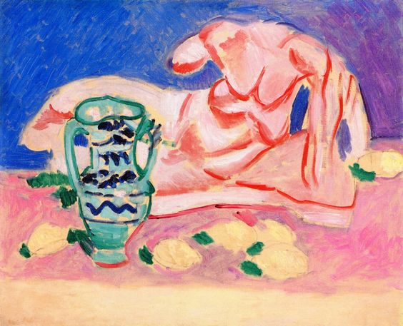
Henri Matisse’s Ilyssus from the Parthenon (1908) stages a vivid encounter between antiquity and modern color. A reclining male nude derived from the Parthenon’s river god Ilissos lies across a high-key field of pink, lemon, and lapis blue. The figure is not modeled with academic light but traced in hot vermilion contour and filled with quick, high-value strokes of peach and rose. In front, a green amphora—decorated with black, sign-like marks—stands among scattered lemons and leaf accents. The scene is at once a quotation of Greek sculptural calm and a manifesto of painterly freedom. Matisse uses the canon of classical beauty as a launch pad for a radically contemporary language built from color planes, calligraphic line, and decorative rhythm.
Classical Source and Why It Matters
Ilissos, the reclining river god from the west pediment of the Parthenon, is among the most celebrated embodiments of classical repose and muscular clarity. By choosing this subject, Matisse aligns himself with the long European tradition of studying antiquity to learn proportion, rhythm, and the logic of the human body. Yet he does not imitate marble; he translates it. The cool, carved permanence of the original becomes a warm, breathing shorthand in paint. The red contour functions like the cut edge of a relief; the simplified planes recall chisel strikes; the inclined pose reprises the flowing diagonal of the sculptural prototype. In short, the painting is not a copy of a statue but a conversation with it, testing how the classical ideal can survive—and even thrive—inside a modern chromatic world.
Historical Context
Painted in 1908, the work belongs to Matisse’s post-Fauvist consolidation. The shocks of 1905–06 had demonstrated the power of non-naturalistic color; now he sought equilibrium between chromatic audacity and structural clarity. He was also deeply engaged with sculpture in these years, reducing bodies to decisive volumes in the Back reliefs and casting heads with mask-like planes. Ilyssus from the Parthenon merges these pursuits. Its color remains high-key and joyous, but its construction is disciplined: the figure is locked by contour, the space is organized into broad bands, and every mark has structural consequence. The canvas becomes a bridge between studio classicism and modern decoration.
Subject and Motif
Matisse abstracts the reclining god into a sequence of interlocking shapes: bent arm, arched ribcage, wedge of thigh, and angular shin. The head turns away, keeping the face generalized and preventing anecdote from diluting form. In front of the figure, a tall amphora rises with twin handles, its light green body banded by dark ornamental signs. Lemons and leaves dot the pink ground like musical beats. The motif is simple but generative: figure, vessel, fruit. Together, these elements evoke Greece by association—nude hero, amphora, citrus—while remaining entirely at home in Matisse’s studio of color.
Composition and Spatial Organization
The picture is organized in horizontal bands—a pale strip at the bottom, a large pink middle zone, and a broad wedge of ultramarine blue above. The nude spans the entire width, forming a slow diagonal that counters the horizontals and creates dynamic repose. The amphora sets a vertical at the left, a necessary punctuation that keeps the reclining body from sweeping the eye off the canvas. Overlap is minimal; instead, separation by color establishes relationships. Pink presses against blue; the green of the amphora slices into pink; the lemons sit as islands of light. The effect is a shallow, decorative space consistent with Matisse’s interiors from the same period, in which planes, not perspective, carry spatial meaning.
Palette and Color Strategy
Matisse chooses a triad of saturated primaries—blue, red (as contour), and yellow—tempered by pink and green. The background’s ultramarine saturates the upper register, making the warm body blaze by contrast. The pink ground is not timid; it is a deliberately artificial stage that refuses the neutrality of brown or gray. The lemons supply small crescendos of yellow that rhyme with the skin’s warmth, while the amphora’s mint green answers the pink with a complementary cool. The most startling device is the red outline of the figure. It is not merely a drawing line; it is a color field in its own right, vibrating against the pale flesh tones and announcing the body’s architecture without shading. This palette converts the classical nude into a bouquet of high-key agreements.
Drawing, Contour, and the Artist’s Hand
The red contour is the painting’s backbone. It flows in long, unbroken arcs—around the shoulder, down the flank, along the shin—before snapping to sharp angles at elbow and knee. These lines function like calligraphy: they are expressive in their pressure and speed yet exact in their placement. Inside the contour, Matisse uses fewer marks than one expects for a reclining figure. A handful of interior strokes locate ribs, clavicle, and knee; a few blue shadows cut into recesses at the arm and thigh. This economy does not reduce the body; it condenses it. The viewer’s eye participates, completing form from suggestion, which is precisely the modern wager Matisse wants to place.
Brushwork and Surface Energy
Across the canvas, the brush moves briskly in visible, directional strokes. The blue field is laid with quick, slanting hatches that keep the color alive, like wind skimming water. The pink ground is a mixture of scumbled salmon, warm white, and lilac, applied in short strokes that create a soft, granular tapestry. On the figure, the paint is lighter, almost translucent in places, allowing the canvas to flicker through and heighten luminosity. Little is blended; adjoining colors meet with slight ridges that catch light. The surface thus records the time of making. It feels improvised yet assured, more like a musician’s take than a sculptor’s polish—appropriate for a painting that converts stone into song.
Space, Flatness, and Decorative Intelligence
Rather than a receding room, Ilyssus from the Parthenon offers a layered plane. The blue background behaves like a hanging fabric or open sky—both and neither. The pink ground reads as tabletop, floor, and cloth at once. The amphora casts no conventional shadow, yet it stands securely because its contour is firm and its value slightly darker than the ground. This is Matisse’s decorative intelligence at work: he gives each element enough contrast to be read, then frees the surface to operate as a unified pattern. The result is a space that is believable as an environment but loyal to the canvas’s flatness.
The Amphora and the Citrus
The amphora is more than a prop; it is a vertical counterweight and a cultural sign. Its decorative bands—zigzags and dark lozenges—may allude to Greek ornament, but Matisse renders them as free, graphic marks that harmonize with the red contour of the body. The vessel’s green is pitched to balance the warmth of skin and lemons, producing a triadic equilibrium across the canvas. The lemons, scattered along the pink ground with clipped green leaves, punctuate the field like rests and notes in a musical line. They anchor the lower register and carry the eye rhythmically from left to right before returning to the amphora and the reclining figure.
Antiquity Reimagined
In the Parthenon sculpture, Ilissos is robust, his marble flesh cool and shadowed by the pediment’s overhang. Matisse instead offers a high-key, almost weightless body, one that seems to float on the pink plane even as the red outline insists on mass. The shift from carved shadow to colored contour is the central translation. Where the original depends on the play of light across stone, Matisse’s version depends on the intervals between colors. Antiquity survives as rhythm and proportion, not as texture or illusion. It is no accident that the result feels playful rather than reverent; for Matisse, classicism is a living language, not a museum catechism.
Rhythm, Music, and the Body’s Arabesque
The nude forms a continuous arabesque whose path can be traced with the finger: down the bent forearm, across the shoulder, over the ribcage, around the hip, along the thigh, and into the foot. This line is musical in the sense Matisse loved: it organizes time for the eye. The lemons articulate beats along the base; the amphora’s wavy band offers a visual melody; the blue field provides sustained harmony. The painting can be “heard” as much as seen—a modern rephrasing of the Greek ideal in which proportion and measure were always allied with music.
Relationship to Matisse’s Wider Oeuvre
This canvas resonates with several nearby projects. It shares with The Blue Nude (Souvenir of Biskra) the transformation of the body through strong contour and decorative ground, but it replaces the garden’s deep greens with a poster-like triad. It anticipates the simplified, frontal figures of the 1910 panels Dance and Music, where contour and color bands entirely supplant modeling. It also dialogues with Matisse’s sculptural Back series: the insistence on silhouette, the reduction of planes, and the clarity of profile. Finally, the amphora and fruit connect the picture to his interiors and still lifes, where objects from Mediterranean cultures become partners in the orchestration of color.
Modern Strategies and the Ethics of Looking
The painting’s strategies—flattening, non-local color, economy of line—constitute a modern ethic of seeing. Rather than persuading the viewer with illusion, Matisse offers candor about the painting’s constructed nature. You are not asked to believe you stand before a river god; you are asked to savor how a handful of colors and lines can reinvent one. This candor affects the gaze, too. The nude is not a body on display but a form in dialogue with a vessel and a field of color. The absence of facial detail or erotic narrative keeps attention on structure and harmony rather than on voyeurism.
Atmosphere and Emotional Tone
Despite its classical source, the painting feels remarkably fresh and light. The blue suggests Mediterranean air; the pink reads as warm stone or cloth irradiated by sun. The quickness of stroke conveys spontaneity; the lemons add a note of everyday pleasure. There is no solemnity here. Matisse presents the past as something companions to the present, not as a weight to carry. The emotional tone is one of lucid joy—assertive but not aggressive, bright but not brittle.
Technique and Material Considerations
The apparent simplicity of the surface masks technical acuity. Matisse uses relatively high-value pigments to keep the figure luminous without heavy impasto. He spaces reds, blues, and greens so that each has air around it; he avoids muddying by letting colors meet cleanly rather than blending them into neutral transitions. The red contour likely contains a touch of vermilion or cadmium red that holds its intensity when laid over pale underlayers. The blue field is varied just enough in direction and saturation to avoid poster flatness while retaining graphic power. These decisions ensure that the painting will remain optically alive under different lights and distances.
Reception and Legacy
This translation of a revered classical subject into a decorative, color-driven idiom contributed to the broader modern reassessment of the antique. It demonstrated that classicism need not entail brown palettes, hard shadows, and chilly correctness. Instead, it could become a resource for proportion and rhythm within a language of pure color. Later artists—from the School of Paris to mid-century designers—drew from this approach: classical forms rendered as silhouettes, bright fields organized by contour, Mediterranean motifs reduced to signs. The painting thus sits at the beginning of a lineage that extends from early modernism to the cut-outs of Matisse’s final decade, where blue nudes and dancing figures are distilled to their purest contours.
Practical Lessons for Looking
To read the image fruitfully, linger over the intervals between elements rather than the elements alone. Notice how the amphora’s vertical corrects the reclining diagonal; how the lemons’ spacing governs the lower edge; how the blue’s cool pushes the pink forward; how the red contour both separates and binds. Pay attention to where lines close and where they remain open; these choices control breath and movement. Observe that no area is left unattended—each zone has a rhythm of stroke appropriate to its role. Through such noticing, the painting reveals itself as a score where every note is tuned to the whole.
Conclusion
Ilyssus from the Parthenon reimagines one of antiquity’s most serene bodies through the audacious means of early twentieth-century painting. Matisse keeps what matters—proportion, flow, repose—and lets go of what does not—illusionistic shadow, marble finish, narrative gravity. The result is a hybrid: classical in its armature, modern in its surface, and unmistakably Matisse in its orchestration of color and line. Amphora, lemons, pink ground, blue air, and a red-outlined nude become a single, singing structure. The painting affirms that the past can be renewed not by copying its look but by re-inhabiting its spirit—measure, clarity, and joy—within a contemporary syntax.