Image source: wikiart.org
Introduction
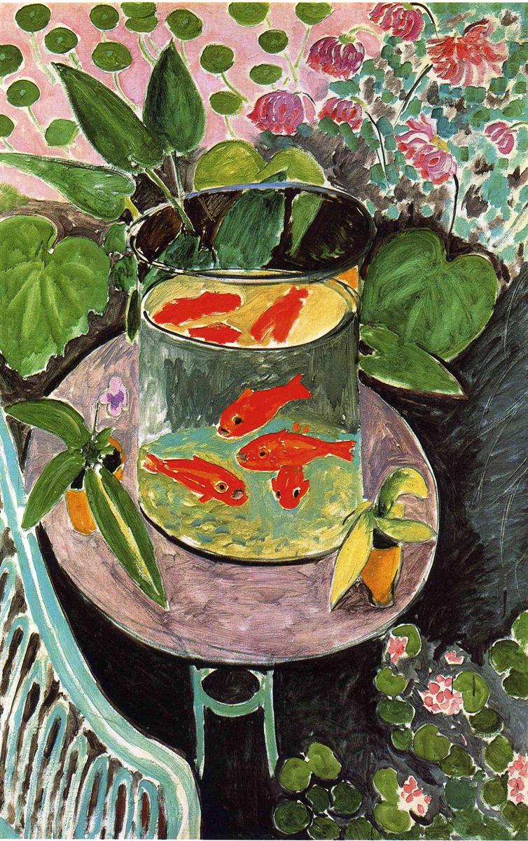
Henri Matisse’s “Goldfish” (1911) is one of the most concentrated meditations on looking in modern painting. A cylindrical bowl packed with fiery orange fish sits on a small round table, encircled by potted leaves, a pale aqua chair, and a screen of patterned greenery and blooms. The scene is simple, but the surface vibrates with decisions. Thick black contours, tender pinks, viridian greens, and the liquid ellipse of glass pull the eye into a calm, hypnotic circuit. Rather than describe a place in naturalistic depth, Matisse builds a decorative world where pattern is structure, color is architecture, and vision itself—hovering, circling, pausing—becomes the subject.
A Motif About Seeing and Being Seen
At the center of the painting stands a cylinder of water, its rim an emphatic oval whose black line announces the bowl as both object and lens. The fish are suspended like embers in pale yellow water. Above, their reflections double in the top film, hovering like a second school in an inverted sky. One fish looks out toward us with a blunt, almost comic snout, a small reminder that the viewer is not just observing but being met by a gaze. Everything around the bowl—leaf clusters, chair slats, petals and stipples—tilts toward it. The result is an image of attention: plants lean in, the chair invites a sitter to lean in, the painter leans in, and we, inevitably, lean in too.
Composition: A Circle Within a Circle
The composition is a tight choreography of curves. The oval rim of the bowl sits inside the round tabletop; the table’s ring echoes the smaller foot of the stand; lily pads and leaf disks repeat the curve at multiple scales. These concentric and rhyming circles stabilize the picture, while the diagonal splay of leaves and the soft crescent of the chair introduce motion. Matisse suspends the bowl slightly off-center, so the eye loops around rather than locking into symmetry. The rim is drawn with a strong contour that thickens and thins, articulating tilt and depth without resorting to elaborate modeling.
Color Architecture and Climatic Chords
The painting rests on three interlocking color families. The first is a luxuriant green—sap, viridian, and blue-green—spread across leaves of different weights and textures. This is the climate of the image, a saturated garden air. The second family is a field of pinks: the tabletop’s mauve, the pale rose pattern behind the foliage, and small floral touches that keep warmth circulating across the surface. The third family is the orange-red of the fish, the most saturated and compact note in the work. Because red and green are complements, the fish vibrate against their leafy setting, making the water feel luminous without painted reflections. Black serves as binding agent and conductor, crisping edges and guiding rhythms across the surface. White appears where needed for highlights and for small blossoms that ventilate the denser fields.
The Cylinder of Glass: Painting a Lens
Matisse renders the glass with remarkable economy. There is no fussy shine or laboratory realism. Instead, the bowl is described by its boundaries and by how it distorts what it contains. The water near the top lightens into a creamy yellow, while the lower zone cools toward blue-green, a soft gradient that suggests depth. The thick black oval reads as a physical meniscus. A single dark seam at the far edge gives the cylinder its roundness, and a shallow shadow under the base tethers it to the table. Most of the feeling of glass comes from the doubled fish—a set floating near the top, another submerged—so that transparent material is grasped through the behavior of color rather than through a catalog of highlights.
Reflection and Refraction as a Second Painting
The upper layer of water functions like a mirror, capturing a red silhouette and a sliver of leaf. That reflection is not a photographic copy; it is a painter’s shorthand, a bright apparition that tells us the water’s surface is different from water’s depth. This approach creates a painting-within-a-painting: a shallow pond of reflection enclosed by the larger cylinder. The device allows Matisse to place two temporalities on the same stage—the slow, suspended motion of fish below and the instantaneous gleam above—without breaking the decorative unity of the surface.
Pattern as Structure
Everywhere in the painting, pattern clarifies space. Big leaf shields flank the bowl and carry the eye into the depth of the garden without linear perspective. The pink wall behind is dotted with a climbing array of circular leaves and peony-like blooms; those disks repeat the lily pads at lower right, weaving foreground and background into a single fabric. The tabletop reads as a mauve plane not because of perspective lines but because its color is a contiguous field edged by the dark curve of the rim. Pattern is not ornament added after the fact; it is the geometry that makes the shallow space legible.
Drawing With the Brush
Contour does the heavy lifting. Matisse’s lines are painted, not drawn then filled. They swell and relax with the turn of form: a strong, almost calligraphic stroke defines the bowl’s rim; supple lines shape the leaves; quick hooks articulate tails and mouths. The chair is a cascade of aqua bars set off by dark partitions, a single passage that demonstrates how few strokes can declare a recognizable object. When contour doubles or leaves a halo, the effect is not sloppy but lively—the line remains a record of searching and arrival rather than a sealed outline.
Light by Adjacency, Not Chiaroscuro
The picture glows without conventional shadow. Illumination arises from adjacency and temperature. The orange fish blaze because they sit in green water. The bowl is luminous because pale yellows and blue-greens are framed by black contour. Leaves shine because warm greens lie against cool greens; blossoms pop because pinks meet darks. Where a plane needs a lift, Matisse places a single light stroke instead of a modeled gradient. This method keeps the surface crisp and readable while giving the eye enough cues to sense depth and sheen.
Movement Inside Stillness
“Goldfish” is famous for stillness, yet it is full of motion. The fish describe little ellipses with their bodies; leaves arc forward like hands; the pattern on the wall climbs diagonally; the chair’s ribs stream downward. These movements are small and interlocking, never breaking the overall calm. Matisse achieves a balance between rest and animation by letting repeated curves control the tempo. The painting breathes at the speed of an aquarium: quiet, continuous, and absorbing.
Garden and Interior, Nature and Design
The setting is paradoxical: a domesticated garden and a gardened interior at once. The black ground at lower right reads as earth; the pink wall blooms like wallpaper; a houseplant in a tiny pot sits on the table; a larger potted leaf bends from the left. The bowl gathers all these registers into one circular theater. Nature appears both alive and patterned, disciplined by the decorative order of the room. Matisse dissolves the distinction between outside and inside, offering an art that brings the restorative effect of a garden into the human-scaled intimacy of a table and chair.
The Psychology of Looking
At heart, the painting is about a particular kind of attention. Goldfish move in short bursts and sudden stills; watching them slows the viewer to their tempo. Matisse builds that slowness into the image. The big rim invites us to trace its oval; the repeated leaf disks encourage counting and wandering; the fish themselves ask to be followed as they loop and turn. Even the little pot with a single purple bloom is a cue to linger. The viewer is not commanded by narrative; we are courted by rhythms. It is the visual equivalent of listening to a steady melody under small variations.
Kinship With Matisse’s Decorative Interiors
“Goldfish” stands beside Matisse’s great interiors of the years around 1910–1912, where a few saturated planes and a handful of objects create a whole world. Here, as in “The Cuckoos, Blue and Pink Carpet” or “Painter’s Family,” shallow space is made with color fields, and pattern distributes interest evenly across the surface. The difference is the presence of living creatures whose hot color concentrates emotion. The painting confirms Matisse’s conviction that the decorative could be humane and modern, that serenity achieved through order was not the opposite of intensity but its best vessel.
Material Presence and the Evidence of Making
Up close, the surface reveals its process. Leaves are built with a loaded stroke that leaves ridges; pink ground sometimes peeks between green marks; black contours vary in width along a single edge, showing the pressure of the hand. Where water shifts from yellow to blue, the join is visible, a seam rather than a blend. These traces of making keep the image from becoming a printed schema. They give the painting the warmth of a handmade object—the very quality one senses in the rim of a real glass bowl or the edge of a terra-cotta pot.
Scale and the Viewer’s Body
The bowl is scaled near to hand and eye, like a tabletop subject we could lean over. The chair to the left arrives at the right size to receive us. This bodily calibration is crucial to the painting’s intimacy. We recognize, not just as an idea but physically, what it feels like to hover at this distance, to peer through glass and follow a fish’s turn. That recognition anchors the decorative abstractions—the disks, arcs, and patterns—in lived experience.
Lessons in Seeing
The painting offers practical lessons that extend beyond its historical moment. Limit the palette to a few families and let complements do the work of light. Use pattern to articulate planes and to carry space without perspective tricks. Draw with the brush so contour remains alive. Rely on adjacency rather than heavy shading to make things glow. Repeat curves at multiple scales to stabilize rhythm. And place a small, hot color note—here, the fish—at the center to gather attention and give the whole surface a pulse.
Why the Image Still Feels New
More than a century later, “Goldfish” remains fresh because its decisions are legible and generous. The color relationships, the shallow stage, the frank contours, and the play between representation and pattern continue to match how we read images today. The motif itself—a small contemplative world inside a bowl—has not lost its appeal. In a noisy visual culture, the picture’s premise still works: attention can be a refuge, and harmony, far from being bland, can be the most radical clarity a painting offers.
Conclusion
“Goldfish” is not a portrait of pets; it is a quiet manifesto about how to build a restorative image. Matisse places a cylinder of water at the center of a gardened interior and tunes every surrounding element—leaf, chair, table, wallpaper, petal—to make that cylinder sing. Color families create climate; contour conducts rhythm; pattern does the work of space; and light arises from relations rather than from theatrical shadow. The result is a painting that invites lingering, slows the eye to the tempo of fish, and makes a small corner of the world feel inexhaustibly rich. In its calm intensity, it shows why Matisse believed painting could be “like a good armchair,” not because it lulls the mind, but because it steadies it.