Image source: wikiart.org
Introduction
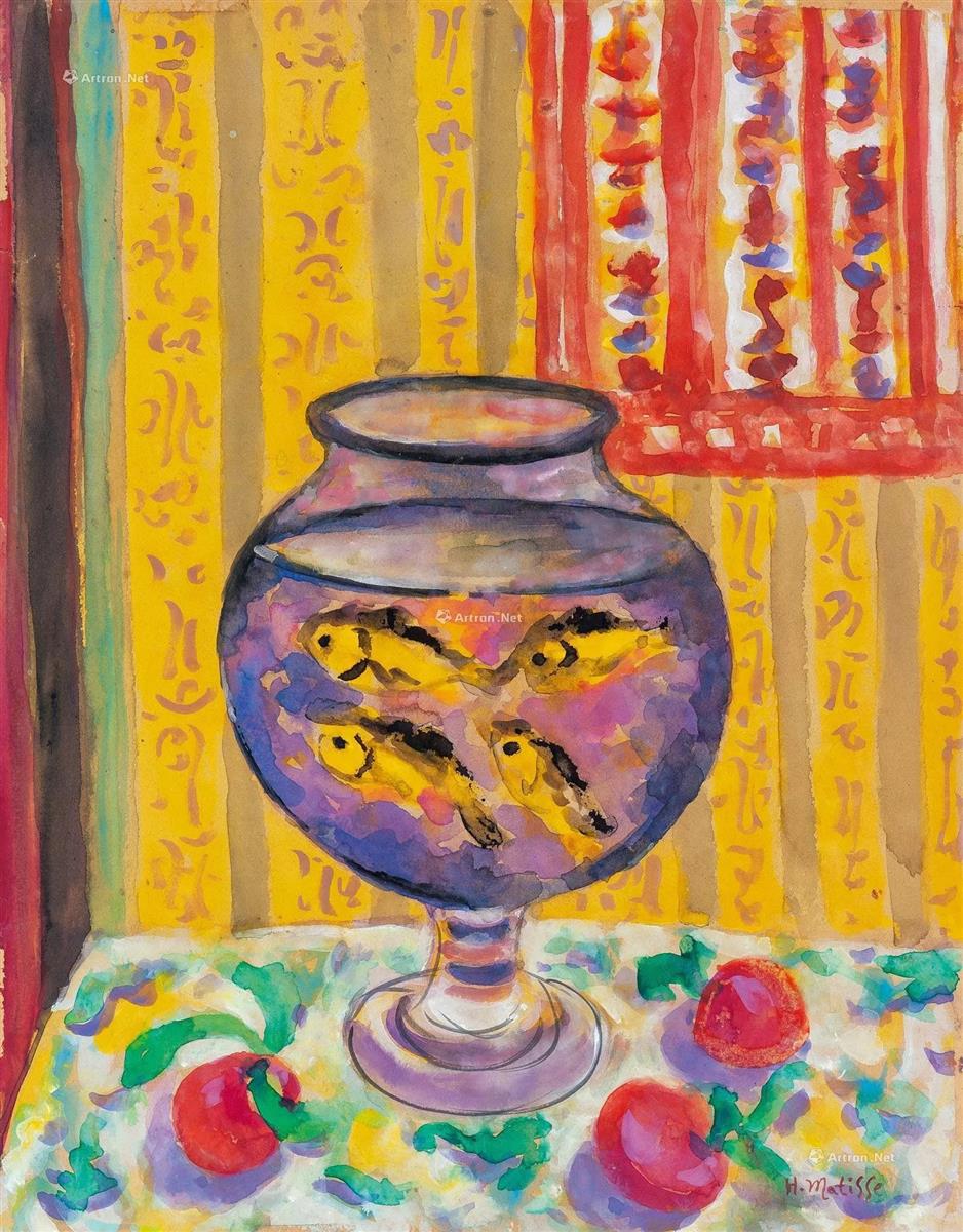
Henri Matisse’s “Goldfish Bowl” (1924) is a glowing still life from the late Nice period that distills the painter’s lifelong fascinations—decorative pattern, saturated color, and the search for a restful, lucid harmony—into one compact, luminous stage. The subject could not be simpler: a round glass bowl filled with water and darting goldfish sits on a patterned cloth against a wall of yellow stripes and ornamental motifs, with a red-and-white hanging at the right edge. Yet in Matisse’s hands the ordinary becomes orchestral. The bowl is a lens, a world-within-a-world where color dissolves and reforms; the background is a textile fugue; the fruit on the table echo the fish as living notes of red. Rather than a descriptive inventory, the painting is a demonstration of how looking can be slowed, brightened, and balanced by color relationships alone.
From Issy-les-Moulineaux to Nice: The Goldfish Motif
Matisse’s goldfish first appear in paintings from 1912, during and after his trips to Morocco. He associated the sight of goldfish with the gentle habit of idling and gazing—Rabat shopkeepers watching their bowls as time drifted by in the sun. The motif became his private emblem for contemplation. By 1924, living and working in Nice, he revisited the subject with the fluent, decorative language he had refined since 1917: compressed space, ambient light, and a “democracy of surfaces” in which figures, flowers, fabrics, and vessels share equal pictorial dignity. In “Goldfish Bowl” the fish are joined by ornamental walls and patterned linens—an indoor garden of color tuned for calm.
Composition: A Lens at the Center
The composition is anchored by the round bowl placed dead center on the table. Its pedestal is a concise stack of ellipses, drawn with a loose, elastic line that swells and thins as it travels—an honesty of touch that keeps the glass immediate and lively. The sphere occupies nearly the full height from table to hanging, turning the canvas into a kind of mandala: the eye is invited to revolve around and within it. The background divides into two major vertical zones. At left, a set of soft, multi-colored stripes rises like a curtain; at right, a red-and-white panel pattern flickers in a tighter rhythm. Between them a broad yellow field stamped with ornamental motifs creates the warm breathing space against which the bowl sits.
Matisse builds a counter-rhythm on the tabletop. The cloth—brushy blues and greens tangled with scarlet fruit—tilts gently forward, flattening the surface and making the bowl feel both solid and buoyant. The fruit, placed asymmetrically, keep the foreground alive and pull the viewer’s gaze back to the base of the bowl before sending it up again into the water.
Color Climate: Warmth and Cool in Circulation
Color provides the painting’s atmosphere and its structure. The golden wall radiates a citrus warmth that saturates the room; the red hanging intensifies that heat. Against this climate the bowl introduces a cool interior world: violets, lavenders, and slate blues swirl within the glass, punctuated by the bright cadmium bodies of the fish. This warm-outside/cool-inside polarity is the canvas’s central chord. It sets up a pleasurable oscillation for the eye—move out to the sunlit wall, then dive back into the water’s violet hush.
Despite the contrast, all hues are tuned to speak the same language. The yellows within the bowl echo the wall; the reds of the fruit and hanging answer the fish; the greens of the cloth slip into the bowl’s edges and return as soft, aquatic tones. Nothing is isolated; everything circulates, as if the room’s light entered the water and came out again transformed.
Drawing with Water
One of Matisse’s most elegant choices is to treat the bowl not as a technical challenge of representation but as a painterly opportunity. He avoids fussy refraction effects and instead uses soft, stained washes that bleed into one another, allowing wet edges to bloom and knots of color to form where the brush pauses. The line around the bowl is confident but permeable, letting interior and exterior meet. The water feels thick with color—as if slowly stirred—while remaining translucent. The goldfish themselves are quick, simplified shapes, their dark eyes and fins placed with just enough emphasis to register motion. They are not specimens; they are strokes of living pigment.
Pattern as Architecture
The interior is constructed from textiles and ornament rather than traditional perspective. The left stripes are wide, vertical, and slightly irregular—handmade rather than machined—so the wall feels like a drape rather than a solid surface. The central yellow zone carries faint arabesques that read like a stenciled wallpaper; they repeat the bowl’s curves at a larger scale, tying vessel to background. The red hanging, with its ladders of white and small loops of blue-violet, tightens the visual tempo on the right and pushes warm air across the painting like a curtain caught in a breeze. Because these planes are flattened and pressed forward, the bowl seems to hover in front of a living tapestry; depth is created by overlap and temperature, not by vanishing points.
Rhythm, Interval, and the Music of Looking
The painting works like music. Vertical stripes keep a slow beat; the red panel taps a quicker rhythm; the tabletop’s green swirls provide syncopation; the round bowl is a sustained tone at the center. The fish become moving accents, passing across the sustained note in brief flashes of yellow-orange. The fruit act as off-beat drums in the foreground; you feel their weight as color more than as mass. As the eye moves—up the bowl, around the rim, through the purple water, out to the warm wall, down to the cloth—the rhythms interlock and then release, like a phrase returning to its tonic.
Light Without Theatrical Shadow
In the Nice period Matisse preferred ambient light that lets color carry emotion. “Goldfish Bowl” is bathed in a general, even illumination—no raking shadows or spotlight effects. Highlights on the glass are soft, milky curls rather than hard glints; the fruit show gentle, cool reflections; the wall’s pattern glows rather than gleams. This approach preserves the autonomy of each colored shape, keeping the surface optically alive but visually calm. You sense a sun-warmed room with diffused daylight, perfect for idling and looking.
The Tabletop as Garden
The cloth beneath the bowl is more than support; it is a small garden of paint. Leaf-like marks in green and teal curl and overlap, broken by sprays of yellow that read as light falling on a print. Three red fruits sit among the foliage, their circular bodies echoing the bowl and predicting the fish within. These motifs do not try to convince us of botanical accuracy; they aerate the composition, prevent the lower third from becoming heavy, and provide a ground in which the transparent pedestal can convincingly “stand.” The tabletop’s cool whites and greens also mediate between the warm wall and the cool water, completing the painting’s chromatic circuit.
The Goldfish as Emblems of Contemplation
For Matisse the goldfish were never merely cute. They represented an art of living and looking. Watching them drift became his metaphor for patient attention—the kind of attention painting requires and rewards. In this 1924 version, the fish appear unbothered by the ork of pattern around them; they float in a self-sufficient atmosphere. Their calm becomes the viewer’s. The bowl is a meditation bell: to look into it is to be reminded to slow down, to let color and rhythm rearrange the nervous system.
Material Presence: The Pleasure of Touch
Even in reproduction the surface reveals the pleasure of making. Washes pool along the edges of stripes; the red panel’s strokes overlap in translucent ladders; violet inside the bowl is broken by drier, scrubbing touches that suggest cloudy water; the pedestal is built from brisk, elastic loops that catch at their ends. Everywhere the paint records speed and pressure—fast in the fruit’s edges, slower in the big yellow passages—so the painting feels performed as well as composed. This embodiment of time—the visible history of each stroke—keeps a simple subject from becoming static.
Dialogue with Earlier Goldfish Paintings
Compared with the large “Goldfish” canvases of 1912–13, where the bowl often sat amid flowers and open windows, this 1924 version is more compressed and ornamental. The view has moved closer; the bowl swells into the role of protagonist; floral still life has been traded for wall pattern. Yet the essential logic is unchanged: a central vessel of cool violet water, warm surroundings, and a handful of precise red accents that clinch the harmony. The Nice-period refinement lies in the seamless melding of object and décor. The bowl doesn’t sit in front of the room; it belongs to the room’s rhythm.
How to Look, Slowly
Begin at the leftmost stripe and follow the vertical to the top rim of the bowl. Circle the ellipse, feeling how the line thickens and thins, then slip into the violet water. Track a fish as it arcs across the interior—yellow body, dark dot of an eye, a lick of orange at the fin—and then exit through the bowl’s clear side into the yellow field. Cross to the red panel; count its white ladders until you return to the tabletop. Rest your gaze on a fruit, notice the cool reflected violet in its shadow, then climb the pedestal back to the rim. Each circuit clarifies the painting’s grammar: warm outside, cool inside; round within vertical; moving accents over sustained chords.
Meaning Through Design
What does “Goldfish Bowl” ultimately say? That beauty is not a matter of subject but of relations—how yellows answer violets, how reds punctuate greens, how a round form can pacify a room of verticals. It proposes a humane ethic of attention: ordinary things, arranged carefully, can produce calm. And it reminds us that painting is a craft of tuning. Matisse’s brush does not describe so much as it composes; the goldfish do not illustrate idleness so much as they embody the tempo of looking.
Conclusion
“Goldfish Bowl” is a compact manifesto of Matisse’s Nice-period ideals. A central lens of water gathers and transforms surrounding color; patterns act as architecture; ambient light keeps everything poised; quick, confident drawing lets the paint remain lively. The bowl is both object and metaphor—an image of the mind at ease, suspended in a balanced environment. Almost a century later, the canvas still offers a usable wisdom: when the world grows noisy, put a simple thing at the center, tune the colors carefully around it, and watch until the eye becomes quiet.