Image source: artvee.com
Introduction
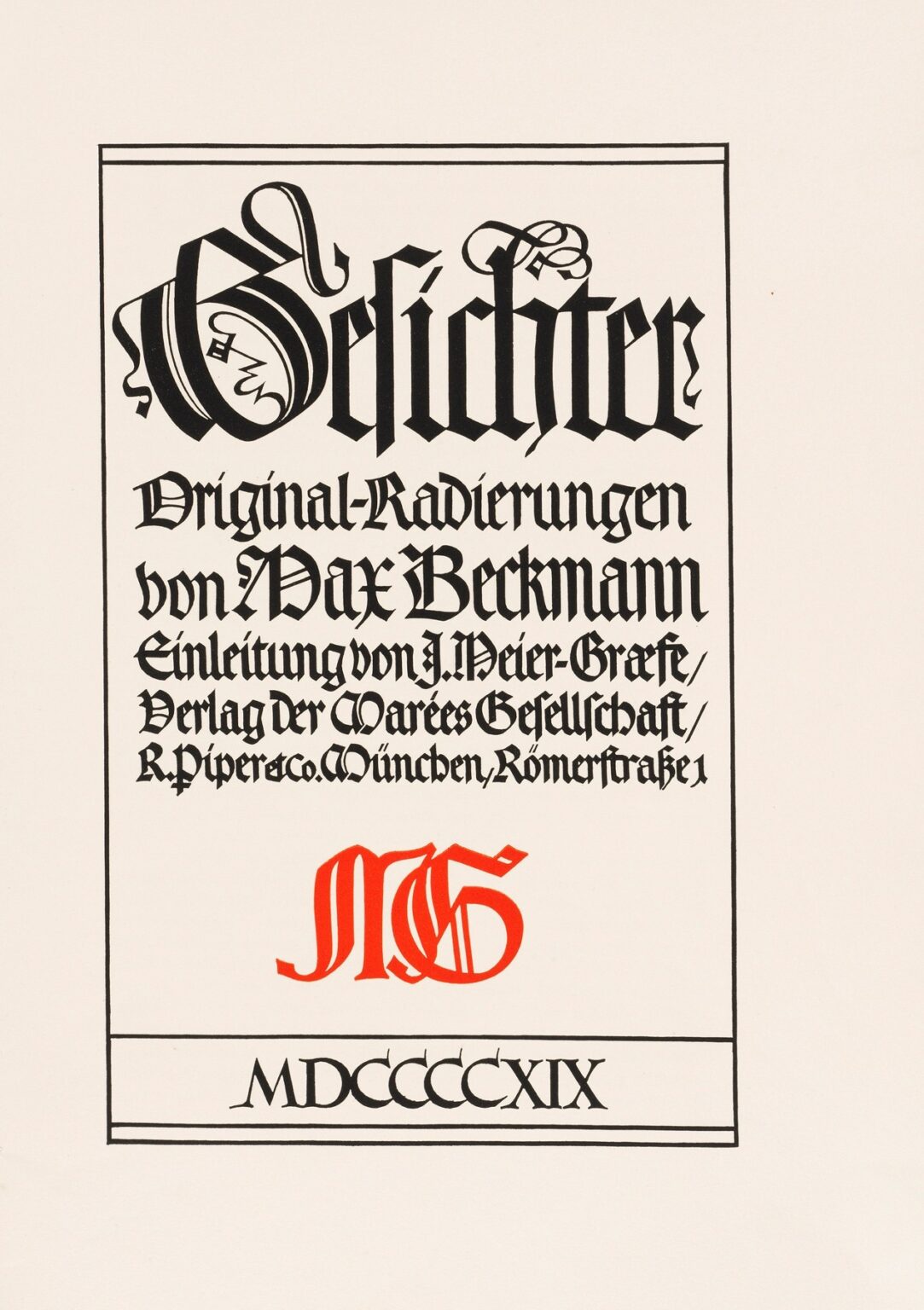
Max Beckmann’s Gesichter Pl. 11, etched between 1914 and 1918, stands as a pivotal work in his landmark Gesichter (“Faces”) series. Far from a straightforward portrait, this plate merges expressive typography, architectural framing, and symbolic shorthand into a single, arresting composition. Executed at the height of World War I, it reflects Beckmann’s transition from academic precision to a rawer, Expressionist graphic language. In this analysis, we will explore the historical context that shaped the etching, Beckmann’s innovative technical methods, the unique interplay of text and image, the composition’s spatial dynamics, and the symbolic resonance of its Gothic lettering.
Historical Context: War, Typography, and Expression
The years 1914–1918 marked Europe’s descent into unprecedented violence. Beckmann, initially conscripted into service, soon fell ill and returned to Berlin. The trauma of modern warfare and societal upheaval permeated every facet of cultural life. Artists rejected prewar conventions in search of new modes of expression to capture collective anxiety. Beckmann turned to printmaking—particularly etching—as a medium capable of immediacy and reproducibility. His Gesichter series, conceived during these tumultuous years, leveraged the flexibility of intaglio to fuse personal testimony with graphic experimentation. Pl. 11 emerges not as a depiction of a single face but as a manifesto: the word “Gesichter” emblazoned in dramatic Gothic script becomes both title and central image, asserting the power of language and form in times of crisis.
Beckmann’s Etching Technique
Beckmann approached etching with the rigor of an architect and the spontaneity of an Expressionist painter. Beginning with a meticulously polished copper plate, he applied a hard‐ground resist, then incised lines of varied depth. Deep acid bites yielded the thick blacks of the Gothic lettering, while shallower bites produced finer hatchings along frame lines and Roman numerals. Beckmann accentuated key areas using drypoint burr—a slight “halo” around strokes that catches ink and adds a tactile, velvety quality. The interplay of hard‐ground etching, acid bites, and drypoint gave Pl. 11 its characteristic contrast: text rendered in bold calligraphic flourishes balances the refined line work of peripheral details.
Composition: Text as Image
What sets Gesichter Pl. 11 apart within the series is its near‐total focus on typographic form. At its center, the word “Gesichter” is wrought in expansive Gothic capitals, each letter alive with calligraphic curves, ribbon‐folded torsos, and ornamental serifs. Below, a block of smaller script announces “Original‑Radierungen von Max Beckmann” (Original etchings by Max Beckmann), followed by publication information rendered in the same blackletter. A bright red monogram “MB” interrupts the black text block, introducing a sudden chromatic pulse. At the foot, roman numerals “MDCCCCXIX” (1919) ground the composition in its date of publication rather than creation, suggesting Beckmann’s evolving relationship to the war’s aftermath.
Gothic Lettering: Historical Resonance
Beckmann’s choice of Gothic (Fraktur) type carries deep cultural connotations. Once the prevailing script of German books and official documents, Fraktur had become associated by the early 20th century with tradition, authority, and national identity. By deploying and manipulating this script, Beckmann invoked a complex dialogue: he both honored a German typographic heritage and subjected it to Expressionist distortion. The letterforms twist and fold like restless figures, their customary rigidity given a new life of movement and emotional charge. This subversion of familiar typography reflects the contradictions of wartime Germany—proud yet destabilized, anchored in tradition yet yearning for renewal.
The Red Monogram: Beckmann’s Signature
The bright red “MB” monogram at the plate’s center functions as both logo and dramatic focal point. Its fluid, interlaced strokes contrast with the surrounding black script, drawing the eye and asserting the artist’s personal imprint. In a series devoted to faces, the monogram stands as Beckmann’s own “face” on the plate—a bold claim of authorship and identity. The chromatic shift also introduces a modernist tension between monochrome intaglio tradition and emerging color printmaking. By deliberately breaking the black‐ink convention, Beckmann signals his refusal to be confined by medium or convention.
Framing and Borders
Beckmann encloses the text block within a simple double‐line border that echoes the rectilinear edges of a bookplate or official proclamation. This framing device does more than contain the letters—it transforms the entire etching into a public announcement or title page. The proportions of text, border, and negative space are carefully calibrated: the broad margins allow the dense lettering to breathe, while the thin outer lines subtly guide the viewer’s gaze back to the center. In this way, the plate both references and transcends its origins as a book frontispiece, becoming an autonomous artwork in its own right.
Spatial Dynamics and Negative Space
Despite its focus on typography, Pl. 11 exhibits a sophisticated sense of spatial balance. The dominant blackletter occupies the upper two‐thirds of the plate, while the red monogram and roman numerals anchor the lower third. Negative (unetched) paper space surrounds the text block, ensuring the visual weight does not overwhelm. Small details—the artist’s etched signature in the lower right corner, delicate numbering, and publisher’s address—sit unobtrusively in the margins, integrating functional information without distracting from the central drama. This dynamic of text and emptiness creates tension: the eye is drawn into the bold letters, then released into the surrounding calm.
Symbolic Implications of Language
In Gesichter Pl. 11, language itself becomes a “face,” a carrier of social meaning and emotional resonance. Beckmann’s etching suggests that words, like human countenances, bear histories, betray identities, and can be contorted under pressure. The very term “Gesichter” (faces) rendered as facades invites reflection: what does it mean to speak of faces in a time when so many lives were hidden behind masks of duty, censorship, or despair? The plate posits typography as a proxy for human visage, elevating letterforms to stand in for the countless individual stories disrupted by war.
Relation to the Gesichter Cycle
Within the broader Gesichter series, Pl. 11 occupies a unique position. While other plates present clusters of heads, masks, or allegorical figures, this work foregrounds the conceptual framework—its title and authorial credit—transforming the cycle’s thematic spine into an image. It is both an interlude and a manifesto: midway through the series, Beckmann pauses the visual narrative to offer a meta‐graphic statement. By doing so, he highlights the self‐reflexivity of his project: the etchings are not only studies of faces but also explorations of representation itself.
Technical Innovations in Print Publishing
Gesichter Pl. 11 was issued by Piper & Co. in Munich, under the auspices of the Marées Gesellschaft. Its publication in 1919, as indicated by the roman date, coincided with the fragile interregnum between war’s end and the tumultuous Weimar years. Beckmann’s experiments with colored monogram and large‐scale typography anticipate later advances in graphic design and poster art. By integrating color into intaglio, he prefigures the fusion of fine art and commercial typography that would flourish in the 1920s. Moreover, the plate’s clean layout foreshadows the modernist grid systems championed by the Bauhaus and subsequent design movements.
Reception and Legacy
Contemporary viewers first encountered Gesichter Pl. 11 in avant‑garde circles, where its bold interplay of text and image signaled a new direction for graphic art. Fellow Expressionists recognized its subversive use of Gothic script, while typographers noted its formal virtuosity. In subsequent decades, the plate has been studied in art historic surveys of Beckmann’s prints, often cited as evidence of his polymathic engagement with painting, printmaking, and design. Today, Pl. 11 remains a touchstone for artists and graphic designers exploring the expressive potential of typography within fine art contexts.
Conservation and Presentation
Preservation of Gesichter Pl. 11 requires careful attention to both paper and ink. Its etching paper, inherently acidic, is buffered with alkaline mats and stored under UV‑filtered glass to prevent discoloration. The red monogram’s pigment demands additional light protection, as color lithographic and intaglio inks are more light‑sensitive than black. Exhibitions often present Pl. 11 alongside original volumes of the Gesichter series, allowing viewers to appreciate its role as a frontispiece. Detailed labels explain Beckmann’s technique, the historical milieu of its publication, and its significance within graphic design history.
Contemporary Resonance
A century after its creation, Gesichter Pl. 11 speaks to ongoing dialogues between text and image, tradition and innovation. In an era of digital typography and branding ubiquity, Beckmann’s hand‑etched, hand‑lettered plate reminds us of the tactile origins of letterform design. Its interrogation of cultural scripts resonates in today’s debates over historical memory, national identity, and the power of language to shape collective consciousness. Graphic artists continue to draw inspiration from Beckmann’s fusion of expressive line and typographic precision, weaving personal narrative and social critique into their own work.
Conclusion
Max Beckmann’s Gesichter Pl. 11 (1914–1918) transcends its origins as a bookplate to become a profound statement on the relationship between language, identity, and artistic expression. Through masterful intaglio technique—bold Gothic script, a vivid red monogram, and precisely etched publication data—Beckmann transforms letterforms into living “faces,” bearing the weight of wartime trauma and creative defiance. Positioned at the heart of his Gesichter series, the plate serves as both manifesto and intermission, inviting viewers to reflect on the face as word, the word as image, and the enduring power of graphic art to bear witness.