Image source: wikiart.org
A Storm Shaped into Clear Relations
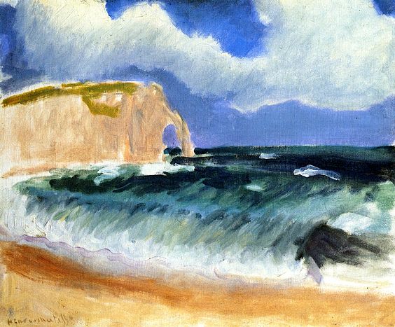
Henri Matisse’s “Gale at Étretat” (1920) compresses the power of a Channel storm into a handful of strong, legible relations: the chalk headland at left, the heaving green-black water pressed on a diagonal toward the sand, and a sky carved into gusting bands of blue and gray-white. The brush moves quickly, the paint sits alive on the surface, and yet the scene never dissolves into chaos. Matisse translates weather into structure. Rather than dramatizing the sea with virtuosic detail, he states the architecture of wind and surf so plainly that the storm feels inevitable.
Where and When: Étretat After the War
Étretat, on the Normandy coast, had long been a proving ground for modern painters. Courbet made its cliffs monumental, Monet chased it through hours and weathers. Matisse arrived in 1920 with a different aim. Having emerged from the upheaval of early modernism and the First World War, he sought a new classicism: fewer parts, greater poise, clear armatures that could carry sensation without theatricality. “Gale at Étretat” belongs to that project. It is not a bravura spectacle; it is a lesson in how to contain force within a balanced sentence of forms.
What Meets the Eye at First Glance
The canvas reads at once. The beach gathers warm sand in the foreground; a dark wave, thick with green, climbs diagonally and breaks in a bright seam of foam; the open water beyond is flecked with small whitecaps; and to the left rises the famous chalk headland with its hollowed arch, its upper edge tufted by grass. Above, heavy clouds tear open blue rents, making a sky that is both threatening and freshly washed. The entire image tilts forward as if wind were pushing both air and water toward the viewer.
A Composition Built on Two Dominant Diagonals
The picture’s stability arises from two diagonals that cross near the cliff’s arch. One diagonal is the shoreline, running from the lower left to mid-right where the breaking wave leans forward. The other is the slanted ceiling of cloud, driven from right to left as if by the same gale that piles the sea. These diagonals compress the view and increase the sense of pressure. The cliff, a triangular mass with a rounded arch, acts like a buttress, locking the movement into place and preventing the composition from sliding off the canvas.
The Sky as a Map of Wind
Matisse divides the sky into broad, calligraphic passages. Greys, whites, and blues are laid in long, sweeping strokes that appear to have been dragged by the same gusts that roughen the sea. Rather than rendered cloud volumes, they are directional planes—air shaped by weather. Bright blue openings are as important as the clouds themselves, because they supply cool, high notes that echo the water’s color while relieving the sky’s weight. The sky is not a background; it is a partner in the storm, a visible record of invisible forces.
A Sea Rendered as Weight and Direction
The water is a field of green-blacks and blue-greens swept by long lateral strokes. Matisse makes the sea feel heavy by keeping the middle tones dense and by reserving brightest whites for the moments of break, where a loaded brush rides the crest and falls into the trough. He does not describe individual waves; he sets a system of motion. The long diagonal of the near wave carries the eye into the picture, while small, angled whitecaps farther out confirm that the wind is quartering across the surface rather than blowing straight onshore. It is a sea that moves as one, not a cartoon of isolated swells.
The Foam Line as the Picture’s Pulse
Along the break, a near-continuous line of white picks up the light. Matisse allows the brush to skid, leaving broken ridges and occasional beads of impasto. This ragged seam does two jobs. It clarifies the rhythm of approach—crest, collapse, return—and it ties the entire width of the canvas into a single, pulsing beat. Where the foam thins, sand color intrudes and the water’s weight feels momentarily checked; where the foam thickens, you sense a stronger burst. The line is the painting’s audible edge, the place where wind is translated into sound.
The Headland as Compressed Monument
The chalk promontory at left is simplified to near-abstraction: a pale, sunstruck mass inflected with peach and cream, its top capped with a stroke of grassy green, and its arch stated by a single clean bite. The cliff is not a tourist view; it is a stabilizing geometry, a necessary counterweight to moving water and air. The warm tones of chalk and sand also temper the composition’s cold register, keeping the painting alive as color rather than slipping into monochrome storm.
Color Intervals That Keep the Air Breathable
The palette is maritime but measured: cool blues, blue-greens, and green-blacks for water; warm creams and ochres for cliff and beach; a sky that balances cerulean with silver gray. Matisse spaces these intervals so that no zone suffocates another. The small touches of yellow-green on the cliff top repeatedly refresh the chord, while the peach of sand bounces warmth up into the lower sky. Because the colors are tuned rather than raw, the storm reads as bracing, not bleak.
Brushwork and the Life of the Surface
Matisse assigns a touch to each zone. The sky receives long, elastic sweeps; the sea is pulled in horizontal trains with occasional scumbled cross-strokes; the foam is laid in thicker, broken dashes; the sand is scrubbed in warm, granular passages that let the ground peep through. These changes of touch make the surface itself feel like a participant. Paint behaves like air, water, and earth, not like a uniform coating. The viewer perceives motion because the brush, not just the image, is moving.
Space, Flatness, and the Honest Picture Plane
Depth is clear, but the painting never surrenders its surface truth. The horizon is a stable band; the cliff reads as a flat, leaned plate; the foreground wave is a broad diagonal wedge. The sea does not open endlessly; it is a plane that tilts and stacks. This refusal of theatrical depth is exactly what allows the gale to sit comfortably in Matisse’s classicism. We feel the receding water and the distance of sky, yet we remain in front of a constructed harmony of planes.
Sound, Temperature, and the Body’s Empathy
Looking at the canvas, the body responds. The diagonal pressure of wave and cloud encourages a slight lean; the cool palette registers as wind on skin; the broken foam-line evokes hiss and thump. Matisse achieves this empathy without narrative or anecdote. There are no figures bracing themselves on the beach, no ships laboring offshore. The viewer supplies the sense of scale and sound from the painting’s measured cues.
Vantage Point and the Cinematic Crop
The viewpoint sits low at the waterline, as if the painter stood on damp sand where the last rush slides out. The choice amplifies the wave’s height, shares its diagonal, and shortens the distance to the cliff so the arch remains intimate. The headland is cropped without apology; there is no attempt to show the entire scenic promontory. This crop gives the painting a modern immediacy. We are not tourists admiring a landmark; we are witnesses to weather.
Dialogue with Monet and Courbet at Étretat
Any Étretat picture converses with predecessors. Courbet made the sea a pounding substance and the cliff a geological fact; Monet multiplied cliff and water across hours and seasons. Matisse’s answer is to state a few relations so clearly that variation becomes unnecessary. He does not catalogue effects; he proposes a syntax of storm. In this, his 1920 classicism feels contemporary: restraint replaces accumulation as the route to truth.
Kinship with Matisse’s 1920 Coastal Suite
“Gale at Étretat” belongs with Matisse’s other Normandy canvases from the year—boats hauled onto shingle, fish heaps on the beach, women sitting in wind, close views of the arch casting dark shadows. Across the suite he tests different anchors against the same coastal grammar. Here the anchor is simply weather itself, held by cliff and shoreline. Elsewhere it might be a black hull or a pile of catch. The persistence of the armature across subjects reveals his method: find a few decisive lines that can absorb change.
The Ethics of Reduction
One of the painting’s quiet virtues is what it declines to include. No driftwood, gulls, or foam freckles are added for ornament. The gale’s credibility arises from the strength of the main relations, not from cataloged particulars. This ethic of reduction was hard won. After years of experimentation, Matisse discovered that he could say more by saying less, provided each stroke carried structural weight. In storm painting, that discipline prevents melodrama.
Reading the Image as Time Scales in Concert
The picture layers several clocks. Geological time speaks in the eroded arch; meteorological time pushes clouds and water; human time is implied by the viewer’s minutes on the beach. Because the elements are balanced, none overpowers the others. The cliff’s endurance does not dwarf the wave’s life; the wave’s energy does not trivialize the beach’s warmth. The harmony of scales becomes a form of consolation: the world is large enough to hold them together.
Lessons for Painters and Designers
The canvas is a precise tutorial in dynamic balance. Set a dominant diagonal to carry motion, then oppose it with a stabilizing mass. Reserve brightest whites for the line of impact; let mid-tones state weight. Use warm local colors—sand and chalk—to temper a cold palette so movement remains hospitable to the eye. Assign a distinct touch to each material zone, and keep space shallow enough that the surface remains audible. These decisions make energy legible from across a room and satisfying at arm’s length.
Why the Painting Still Feels New
The image remains fresh because it makes force feel intelligible. Many storm pictures rely on quantity—more spray, more cloud, more incident. Matisse relies on relation. The gale is credible because line, color, and touch align under pressure. Viewers sense both the painting’s order and the weather’s disorder and enjoy the friction between them. In an age saturated with images, the clarity reads as radical.
A Storm You Can Stand In
The final pleasure of “Gale at Étretat” is how inhabitable it feels. You know where your feet would be on the wet sand; you can choose to face the wave or step back; you can glance left to the cliff’s massive shoulder or up to the racing sky. The composition gives you room to be a body in weather. That generosity is Matisse’s hallmark in 1920: not spectacle delivered to a passive eye, but a structure that invites you to breathe with it.
Conclusion: Poise Under Pressure
“Gale at Étretat” is a compact essay on poise under pressure. A cliff, a wave, a sky—and between them a field of sand—are arranged so that the storm’s energy becomes readable and, paradoxically, restful. Color is storm-toned yet balanced; brushwork is rapid yet exact; space is shallow yet convincing. Matisse shows that modern painting need not choose between sensation and order. It can hold both, if the few essential relations are placed unforgettably well.