Image source: artvee.com
Introduction
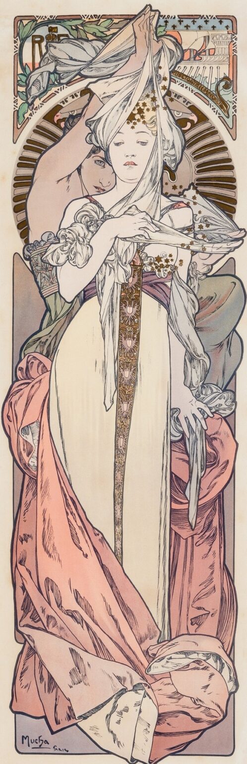
“French Advertisement” by Alphonse Mucha, created in 1897, stands as a quintessential example of Art Nouveau’s seamless fusion of beauty and commerce. Though no specific product or event title appears in this design—hence the descriptive name “French Advertisement”—the work nevertheless radiates the elegance and sophistication characteristic of Mucha’s poster art. Measuring roughly 80 by 40 centimeters in its original lithographic form, the composition features two stylized female figures enveloped by swirling drapery and botanical motifs. Mucha’s mastery of line, color, and ornament transforms what might have been a purely utilitarian design into a work of enduring aesthetic power. In this analysis, we explore how Mucha elevates advertising to high art, how each visual element contributes to the overall effect, and why this poster continues to inspire designers more than a century after its creation.
Historical and Cultural Backdrop
The late 1890s in Paris were a heady moment for the intersection of art and everyday life. Art Nouveau had emerged as a reaction against academic historicism and industrial blandness, advocating instead for organic forms and handcrafted beauty. Alphonse Mucha rose to prominence in this milieu through a series of highly successful theatrical posters for Sarah Bernhardt, and publishers quickly recognized the commercial value of his distinctive style. Manufacturers and event promoters sought Mucha’s talents to bring an aura of refinement to their printed materials. The “French Advertisement,” produced at the height of Mucha’s reputation, reflects a cultural moment when decorative arts permeated urban life—adorning shop windows, café walls, and social invitations with the same artistic care once reserved for salons and galleries.
Purpose and Innovation of the Design
Unlike posters that advertise a named play or product, this composition leaves its cartouche blank, signaling its intended role as a template to be customized for various commercial uses. Such “stock” advertising designs allowed printers to purchase an artist’s work once and then imprint different texts as commissions dictated. Mucha’s innovation lay in creating a design so richly ornamented and visually compelling that it would lend prestige to any content later inserted. The blank area at the top-center invites personalization—be it for a perfume, a fashion house, or a luxury confectioner—while the rest of the imagery establishes an atmosphere of elegance and allure. In this way, Mucha effectively turned advertising into a flexible art form, bridging the gap between bespoke fine art commissions and reproducible graphic design.
Spatial Organization and Hierarchy
Mucha organizes the composition into distinct yet harmonious planes. The upper third features an arched cartouche framed by stylized foliage, providing a space for the client’s name or logo. Below, two female figures dominate the central panel, their elongated forms rising from the bottom edge to just beneath the cartouche. The lower third completes the frame with a narrow border that echoes the sinuous lines above, grounding the design. Despite its segmented look, the poster reads as a cohesive whole: the figures’ drapery and the botanical scrolls guide the viewer’s eye upward toward the blank cartouche, ensuring that any inserted text becomes the focal point. By balancing positive and negative space, Mucha guarantees that both image and message can coexist without visual competition.
Mastery of Line
At the core of Mucha’s style is his exquisite command of line. In “French Advertisement,” every contour—from the folds of drapery to the curl of a vine—flows with rhythmic grace. The two women’s garments unfurl in long, ribbon-like strands that twist and turn across the panel, creating an almost calligraphic movement. Lines vary in thickness: fine strokes delineate facial features and hair, while broader sweeps define the weight of fabric and botanical forms. This modulation of line weight suggests depth and volume without recourse to heavy shading or hatching. The result is a visual language that feels both airy and substantial, guiding the eye through a dance of curves that feels alive and dynamic.
Chromatic Harmony and Printing
Mucha’s palette in this poster revolves around soft pastels—creamy ivory for the garments, pale peach for skin tones, gentle rose and sage green in the drapery and foliage. Accents of muted terra cotta and dusky blue punctuate the design in select areas, adding dimension and contrast. Achieving this subtle color harmony required a meticulous lithographic process: each hue was prepared on a separate stone and printed in succession, demanding precise registration. Mucha worked closely with the Parisian printer Champenois to calibrate ink transparencies, permitting underlying layers to show through and create delicate gradations. The restrained palette not only reflects Art Nouveau’s preference for organic tones but also ensures that any overprinted text remains clear and legible.
Interplay of Representation and Symbolism
Though primarily decorative, Mucha’s imagery is rich in symbolic resonance. The two female figures suggest dual aspects of the advertised commodity: one figure, placed behind, carefully drapes a veil, implying service, preparation, or unveiling; the front figure, gazing forward, embodies presentation and allure. Their interaction evokes themes of transformation—preparation giving way to reveal—which would suit goods ranging from cosmetics to fashion. Botanical motifs—stylized laurel or ivy—frame the scene, alluding to victory, fidelity, and natural elegance. Stars dusted across the veil hint at magic or aspiration, inviting the viewer to imagine that the product or event promised by the cartouche could bring wonder or prestige into their lives.
The Portrayal of the Figures
Mucha idealizes the female form according to Art Nouveau aesthetics: elongated limbs, delicate features, and serene expressions. The seated figure stabilizes the composition with her composed posture, while the standing figure behind her adds vertical lift, her raised arms creating an arch that echoes the cartouche above. Facial features remain softly defined, avoiding strict realism in favor of an archetype of feminine grace. Mucha’s treatment of anatomy is stylized: knees taper inwards, shoulders slope gently, and hands rest in elegant curves. The two figures act less as portrait subjects and more as allegorical embodiments of beauty and refinement—perfect vessels through which the advertised message would flow.
Ornament as Narrative
In Mucha’s hands, ornament transcends mere decoration to become part of the narrative. The curling tendrils of foliage and drapery weave through the composition like threads binding the figures to their surroundings. The border lines that frame the poster are not static; they pulse with the same rhythmic energy found in the central imagery. Each leaf, vine, and fold of fabric participates in a larger story of natural abundance and aesthetic unity. This holistic approach epitomizes Art Nouveau’s ambition to integrate art into every facet of life, from architecture to printed matter. The ornament does not distract from the figures but envelops and elevates them, converting a blank advertising field into an immersive visual experience.
The Blank Cartouche and Customization
The unfilled cartouche at the top of the design is a masterstroke of functional art. By reserving this prime real estate for client text, Mucha ensures maximum visibility for the advertiser’s name or logo. Yet he surrounds the cartouche with the same ornamental care as the rest of the poster—arched vines, starry accents, and floriated scrolls—so that it never appears as an afterthought. Printers could easily replace the blank space with gold-leaf lettering or dense block type without disrupting the overall harmony. In this way, the “French Advertisement” becomes a versatile template: its decorative power remains constant, while its message adapts to the needs of each commission.
Text and Typography
While Mucha left the main cartouche empty, he designed subtle typographic accents within the ornamental frame. Small emblems—perhaps initials or monograms—sit at strategic points, hinting at how lettering might integrate with decoration. Mucha’s own signature, “Mucha Paris,” appears discreetly in the lower-left corner in his familiar flowing script. This choice reflects his belief that typography should harmonize with imagery, not compete with it. In finished commissions, text set in complementary curvilinear typefaces would echo the poster’s curves, further blending content and ornament. The “French Advertisement” thus serves as both an image and an invitation to textual creativity.
Art Nouveau Aesthetic Realized
Art Nouveau strove to erase the boundary between fine art and applied design, and this poster embodies that ambition. Mucha drew from diverse sources—classical sculpture, Japanese prints, medieval manuscripts—to forge a unique visual language defined by organic line, stylized forms, and decorative synthesis. In “French Advertisement,” these traits coalesce: figures and ornament interlock seamlessly, colors resonate with natural hues, and the whole composition exudes a sense of refined unity. Rather than a mere vehicle for marketing, the design becomes a gesture of aesthetic celebration, proving that even ephemeral promotional materials can achieve lasting artistic merit.
Cross-Cultural and Historical Influences
Mucha’s eclectic approach channels Japonisme through flattened shapes and emphasis on outline, while medieval illumination inspires the intricate border patterns. Classical Greek sculpture manifests in the idealized drapery and poised gestures of the figures. Byzantine mosaics resonate in the repetitive star motifs and the sense of sacred geometry in the arching forms. By synthesizing these influences, Mucha crafted a style that felt at once timeless and modern. The “French Advertisement” thus stands as a testament to Paris’s cosmopolitan ferment at the fin de siècle, where artists freely appropriated and reimagined global visual traditions.
Impact on Advertising and Poster Art
The success of Mucha’s poster art reshaped advertising practices across Europe and North America. Printers and designers adopted his emphasis on figure-ornament unity, custom lettering, and pastel palettes, transforming commercial posters into collectible artworks. The concept of a “stock” advertising design—an image template to be personalized—became a staple of print houses seeking to balance artistic appeal with economic efficiency. Mucha’s influence extended into packaging, book design, and even early cinema intertitles, laying the groundwork for modern branding and identity systems. “French Advertisement” exemplifies the prototype of a design that is both artistically compelling and commercially pragmatic.
Conservation and Modern Relevance
Original impressions of “French Advertisement” survive in museum archives and private collections, cherished for their technical excellence and historic significance. Conservation efforts focus on preserving the delicate lithographic inks and paper substrates, ensuring that the pastel tones and fine lines remain vivid. In the digital era, high-resolution reproductions circulate widely, inspiring contemporary graphic designers to reinterpret Art Nouveau motifs in web and print media. Luxury brands often commission bespoke collateral echoing Mucha’s integrated approach, demonstrating that the principles embodied in this 1897 poster continue to inform visual communication strategies today.
Conclusion
Alphonse Mucha’s “French Advertisement” transcends its utilitarian purpose to achieve the status of an Art Nouveau masterpiece. Through fluid linework, harmonious color, and ornate integration of figure and motif, Mucha crafts a design that celebrates both artistic beauty and commercial function. The blank cartouche underscores the work’s adaptability, while the surrounding imagery beckons viewers into a world of elegance and enchantment. More than a relic of Belle Époque Paris, the poster serves as a timeless exemplar of how art can elevate everyday objects and how commercial design can aspire to the sublime.