Image source: artvee.com
Introduction
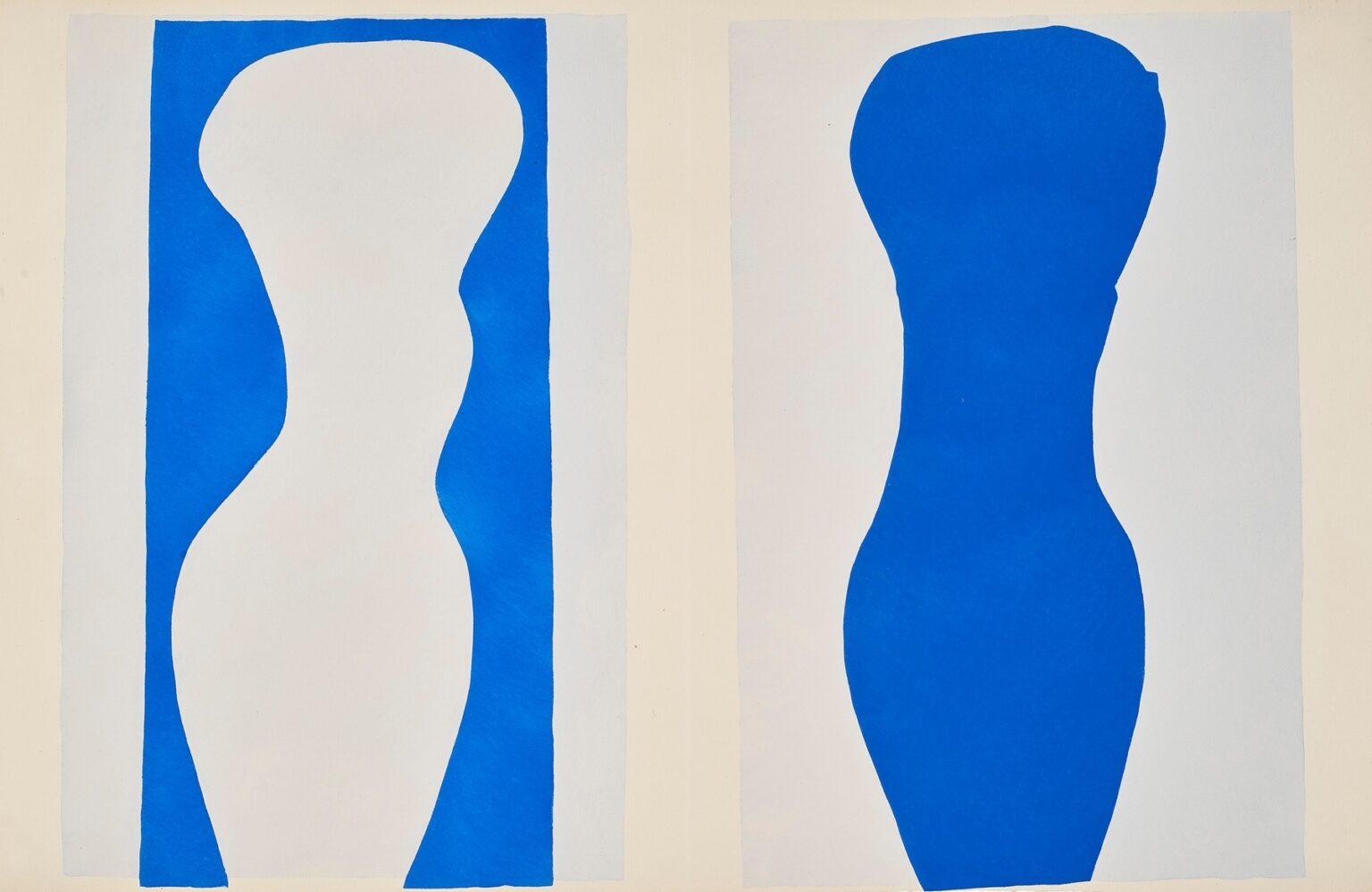
Henri Matisse’s “Forms” (1947) reduces looking to its essentials. Two vertical panels, set side by side like twin stages, hold a pair of silhouettes that are at once bodies, vases, columns, coastlines, and pure cut shapes. On the left, white expands inward, its edges bitten by bands of blue. On the right, the relation reverses: an ultramarine figure swells against a pale field. With almost nothing—paper painted with gouache, scissors, and the intelligence of placement—Matisse turns positive and negative space into a conversation about presence and absence. The sheet comes from the period of the Jazz portfolio, when he “drew with scissors,” transforming colored paper into a complete language. “Forms” is a lesson in that language at its most distilled.
Late Career and the Invention of the Cut-Out
By the 1940s Matisse had left the long, physical labor of easel painting for a method that fused drawing and color in a single gesture. He brushed sheets of paper with matte gouache in saturated hues, then cut directly into them, composing with fragments pinned to the wall until everything locked. He called it “drawing with scissors,” a phrase that is not a metaphor but a description: the contour and the color arrived together at the exact moment the scissor blades bit through the painted sheet. Works from this period slough off modeling, perspective, and the descriptive details of earlier decades. What remains is structure—balance, rhythm, and the pressure between masses. “Forms” belongs squarely to this reinvention, revealing how far simplification can go while still carrying the sense of a body in space.
Composition as a Paired Experiment
The sheet is divided into two tall rectangles separated by a pale vertical gutter. Each panel contains a central silhouette flanked by slender margins of color, like a figure standing between two columns. The left panel shows a white shape whose curving edges are carved out of blue, so that blue reads as the frame and white as the subject. The right panel flips that logic: a blue shape bulges into a pale field, making ultramarine the figure and light the ground. This back-and-forth establishes the work’s primary theme—figure–ground inversion—and invites the eye to experience both panels as different statements of the same melody.
Figure–Ground Inversion and the Psychology of Seeing
“Forms” stages a simple but profound test of perception. In the left panel, the mind reads the white as a body because the blue acts like a frame pinching and expanding around it. Yet nothing in the sheet insists that white must be figure; one can choose to see the blue bands as twin bodies pressed together, the white merely the river between them. On the right, the blue silhouette asserts itself more forcefully, but a mental blink can reverse that relation too. Matisse understood this physiological agility and composed to activate it. The result is not a puzzle to be solved but a rhythm of seeing: figure, ground, figure again; foreground, background, exchange.
Color as Temperature, Weight, and Breath
The palette is minimal—ultramarine, pale blue, and paper white—yet the color does the heavy lifting. Ultramarine carries mass and cool depth, a blue as dense as enamel; the pale blue reads as air; white glows as unpainted paper, the light of the studio itself. Because the paint is matte gouache laid flat, there are no shadows or secondary hues to distract from the structural role color plays. Blue is weight; pale is breath; white is a pause so bright it becomes a presence. The triad creates a climate that is calm and crystalline, the visual equivalent of a clear day after rain.
The Edges as Handwriting
Look long at the edges and you can feel the scissors move. No contour is mechanically straight; each carries the minute vibrato of a human hand adjusting pressure as it arcs and turns. Those deviations—almost imperceptible bulges, slight spurs where a cut resumed after a pause—are not flaws. They are the work’s calligraphy, a record of the moment when thinking became shape. The edges are where Matisse’s authority resides. He was a master of the drawn line; in the cut-outs, the line becomes an edge of color, and “Forms” lets that edge carry the entire statement.
Rhythm, Measure, and the Music of the Panels
The two silhouettes look like phrases in a score: a swelling note, a taper, a rest, a reprise. The left panel’s white contour rises from a narrow base to a generous upper register and then narrows again; the right panel mirrors that movement in reverse tones. Together they generate syncopation—the left presses outward into the blue, the right pushes inward into the pale. The thin side bands act like bar lines that keep time. This musical intelligence runs through the Jazz portfolio, and “Forms” is among its most musical plates: nothing but measure and melody.
Bodies, Vessels, and the Elastic Sign
Many viewers see human torsos in the silhouettes: head, shoulder, waist, hip. Others see amphorae or totemic columns. Matisse engineered the contours to keep all those readings available. The implication of a shoulder satisfies our appetite for the human; the amphora reading connects the image to classical craft and the history of the studio; the column reading keeps the composition architectural and impersonal. The power of the cut-out method lies in this elasticity: the sign can carry multiple associations without committing to any single narrative. The title “Forms” protects that openness, naming the game rather than the subject.
Scale and the Architecture of the Page
Tall, narrow panels compress the body into a columnar pose. This verticality gives the sheet architectural resonance, like twin pilasters flanking a doorway. The central gutter that separates the panels matters. It is not just a book seam; it is an interval, a void that allows both shapes to breathe and that heightens their dialogue. The outer pale margins do similar work, keeping the compositions from crowding the page edge and giving the silhouettes a kind of plinth, a space from which to rise. The architecture is simple, but it is exact, and the exactness is what allows such minimal means to feel monumental.
The Discipline of Restraint
“Forms” is a study in how not to overreach. Matisse resists the temptation to “finish” the figures with interior details, shading, or texture. He refuses ornamental distraction. The paper’s slight brush streaks from painting the ground remain visible, but they never compete with the silhouettes. Restraint is not caution here; it is discipline. It places all the expressive weight on proportion and edge, confident that those will suffice. In return, the viewer experiences unusual clarity: there is nothing to decode, and everything to feel.
From Cut Paper to Pochoir
The Jazz plates were reproduced using pochoir, a stencil process that preserves the original collage’s flat, dense color and the crispness of edges. In “Forms” the pochoir translation is crucial, because the entire drama depends on the precision of boundaries and the evenness of the color fields. Pochoir’s matte surface maintains the quiet brightness of gouache without the sheen of printing ink. What we see is not an imitation of painting; it is the faithful presentation of the cut paper’s material truth.
Dialogue With the “Blue Nudes” and Other Cut-Outs
“Forms” predates the famous “Blue Nudes” series by several years and anticipates their logic. In the “Blue Nudes,” fragments of ultramarine paper coalesce into reclining bodies assembled like puzzle pieces. Here, the body is unified into a single silhouette, but the issues are the same: how much curve signals a hip; how little is needed to carry the sense of volume; how a single color can feel sculptural without modeling. “Forms” is the germ of that later flowering—an economy of means that would become a late-career signature.
Reading at Two Distances
Across a room, “Forms” registers as two clean signs, a pair of verticals that structure the wall like architecture. Up close, the hand in the edges and the delicate breaths of brush in the pale fields animate the surface. Matisse designed for this dual experience. He understood the poster maker’s need for distant legibility and the studio artist’s need for intimate presence. The cut-outs satisfy both, and “Forms,” with its spareness, may be the most direct demonstration of that dual competence.
Emotion Without Illustration
What does a work this abstract feel like? Surprisingly human. The swelling and narrowing of the silhouettes carry a bodily empathy; we sense breath and posture in the curves. The blue’s coolness calms; the white’s brightness invites. The paired panels create a companionship that is neither conflict nor mirror image—more like two dancers sharing a stage. Emotion here is not produced by narrative but by relation: a form beside a form, answering and echoing, both confident, both necessary.
The Ethics of Clarity
Matisse spoke often about wanting art to be a “soothing, calming influence on the mind,” not as decorative avoidance but as a gift of equilibrium to the viewer. “Forms” embodies that ethic. Its clarity is not simplistic; it is considerate. By stripping away all but structure and color, it creates a place where attention can rest without boredom. The sheet models a kind of visual honesty that still feels radical: trust the essentials; let the eye do the rest.
Influence and Continuing Relevance
Designers and artists continue to mine works like “Forms” for first principles: balance of masses, figure–ground reversals, the expressive power of edge, and the authority of a limited palette. In an age of screens, where images must read at icon size and billboard scale, the cut-out grammar is newly instructive. “Forms” could be a logo, a textile repeat, a stage backdrop, or a painting; its adaptability proves how deeply it taps the fundamentals of visual organization.
Conclusion
“Forms” distills Matisse’s late invention to a calm, crystalline statement. Two silhouettes, one white carved from blue and one blue pressed into light, enact the basic drama of seeing: figure rising from ground, ground reclaiming figure, shape breathing in a field of air. Scissor-cut edges hold the entire composition with the authority of line; color sets temperature and weight; space, carefully measured, lets the duet unfold. The sheet needs no narrative to justify itself. It is an argument for clarity, a celebration of gesture refined to edge, and a reminder that the oldest promise of art—to make presence from paper and color—can be renewed with stunning simplicity.