Image source: wikiart.org
First Impressions: A Nocturne for a Bouquet
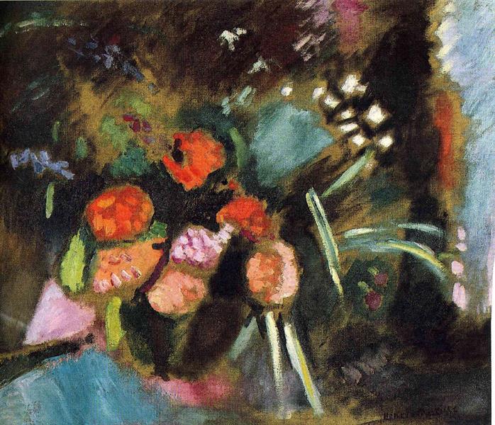
“Flowers” gathers its subject out of darkness the way a melody rises from silence. Petals flare in hot orange and coral; pink heads glow like embers; long stems catch sudden bars of light; and the ground around them seethes with deep greens, bottle blues, and umbers. The bouquet seems to hover rather than sit in a vase, suspended in an atmosphere dense enough to feel touched. Instead of a polite tabletop arrangement rendered with tidy highlights, Henri Matisse gives us a living tangle, a floral constellation forming and dissolving inside a shadowy room. The mood is quietly electric—night-like, but not somber—where color flickers against dark the way fireflies spark in summer air.
1906 in the Studio: From Sunlit Fauvism to Interior Drama
Painted one year after the blazing Collioure summer of 1905, this work shows Matisse testing how the language of high-key color behaves indoors and under lower light. In the landscapes of 1905, saturation announced itself with sunlight and sea glare. Here, he lowers the register and discovers a different kind of intensity: saturated notes made more vivid by surrounding dusk. The greens and oranges are not softer; they are sharpened by contrast. “Flowers” thus belongs to the crucial moment when Matisse proved that Fauvist color did not need the Mediterranean sun to make sense. It could generate its own weather inside the studio.
Composition: A Diagonal Constellation
The bouquet’s heads mass along a left-to-right diagonal, starting near the lower left corner and rising toward the picture’s middle. Three or four main blooms—two fiery oranges, a pink, and a smaller coral—form a loose cluster that acts as the picture’s fulcrum. From this center, stems and leaves radiate outward in slashing arcs, some catching white light, others disappearing into thick shadow. A pale wedge at lower left, a turquoise plane near the middle, and a column of purple-lilac toward the top subtly triangulate the darkness, keeping it spatial rather than flat. The right edge carries a vertical passage of warm browns and plum, like a curtain pulled back, while the upper right flashes a starburst of pale facets that read as reflections or the face of a cut-glass object. The eye moves in ellipses around these anchors, always returning to the orange blooms that pulse at the core.
Color Architecture: Complements that Make Light
Matisse engineers light by pairing complements. The red–orange petals ignite against surrounding greens; cool petrol blues deepen the value of adjacent yellows; occasional lilac notes temper hot passages so they can blaze without burning the picture. Because he keeps pigments relatively clean—laid in patches rather than blended into mush—each hue retains its identity while cooperating in chord-like harmonies. The real brilliance lies in how he lets a small, high-chroma note do the work of illumination. A single coral dab on a petal edge reads as a highlight if it sits beside a cooler, darker field. White is used sparingly, not to “add shine” everywhere but to strike the scene like lightning in a few necessary places.
Brushwork and Surface: Smoke, Velvet, and Sparks
Matisse varies touch to differentiate substance and space. Petals are built with compact, rounded strokes that follow their curves, letting warm pigment pile just enough to catch real light. Leaves are mapped in flatter, more lateral sweeps that imply broad surfaces turning in shadow. The deep ground is scumbled—thinly dragged color that lets underlayers breathe—so the darks feel like air, not asphalt. Over this velvety field he flicks sharper marks: a thin linear highlight on a stem, a diamond of pale paint that could be a reflection off glass, a constellation of tiny mauve notes that supply rhythm without literal description. The contrasts of handling—thick against thin, drag against dash—give the bouquet its palpable presence.
Space Without a Set Table
Still-life tradition often relies on the firm geometry of tabletops, bowls, and vases to anchor objects. “Flowers” keeps those props elusive. If a vase exists, it dissolves into the dark. Instead, space is constructed through overlapping masses and value steps: warm heads advance, cooler leaves hover behind, and the darkest ground recedes. Sudden light bars serve as spatial cues—near things catch light as they turn; far things stay submerged. This choice increases the image’s dreamlike authority. The bouquet feels discovered rather than arranged, as if seen by lamplight at the edge of the painter’s studio and seized before it could wilt or the light could shift.
Light as Narrative
There is no anecdote in the literal sense, but light creates one. The lower-left pale wedge suggests a cloth or paper catching illumination from outside the frame; the upper-right facets hint at a crystal or glazed surface reflecting the same source; the stems’ bright bars trace the path of that light as it falls across the tangle. You feel the moment of looking: the painter pauses, the lamp is angled, the flowers flare into significance. This narrative of perception—how color behaves when light suddenly strikes it—replaces still-life storytelling with a more modern drama: the instant of seeing becoming the subject.
The Bouquet: Species and Invention
Matisse is not cataloging botany. The orange heads might be ranunculus or late peonies; the pink could be a carnation or zinnia. He distills each to essential signs: a cupped volume, scalloped rim, central core. Leaves appear as ideograms—elongated teardrops, hooked blades, split ovals. This economy keeps the scene from clutter, but it also intensifies sensation. We remember not the name of the flower but the flare of orange against green, the cool hush of a blue leaf beside a warm petal, the way stems flash as they turn toward the light.
Rhythm and the Eye’s Path
The painting scripts a graceful itinerary. You begin at the brightest orange, slide to its neighbor, dip to the pink head below, and then follow a pale stem rightward until the white facets catch your glance. From there you arc back along the curving greens, dive into the deep center, and surface at the lower-left wedge before rising again to the cores of the blooms. The loop repeats because each region previews the next through echoing direction or color. Looking becomes a slow orbit, a choreography set by petals and stems rather than by architectural lines.
Black and Deep Darks: Structure Without Outlines
In many 1905 canvases, Matisse used black as a linear brace. Here, the darks are broader and more atmospheric, but they still function structurally. A near-black bowl of shadow cradles the bouquet; deep green-black pockets separate heads so they don’t merge into a single flare; a darkness at lower right pins the composition like a bass note. Because these darks are modulated—greenish here, brownish there—they avoid deadness while providing the essential resistance that makes color luminous by contrast.
Comparison with “The Geranium” and Other 1906 Works
Seen alongside “The Geranium” of the same year, “Flowers” reveals Matisse’s dual approach to the still life. “The Geranium” is airy, with thin paint and a bright wall; “Flowers” is dense, its color suspended in dusk. Both rely on temperature to construct form and allow the ground to participate, but they distribute weight differently. In the geranium, clarity depends on separation of planes; here, clarity grows from interpenetration—forms emerging from a common darkness. The pair shows Matisse testing extremes and proving that his color system can orchestrate both a sunlit interior and a nocturne.
Decorative Intelligence Without Pattern
Matisse admired textiles and ceramics, and his still lifes often quote pattern overtly. In “Flowers” the decorative mind is present even without printed cloth. Petal clusters repeat like a motif; stems create parallel diagonals akin to stripes; scattered small notes—mauve, mint, chalk white—act like sprigs within a field. This implicit patterning prevents chaos and gives the picture its satisfying inevitability. The result is not decorative in the sense of wallpaper; it is decorative as an organizing intelligence that distributes attention across the surface.
Material Presence and the Sensation of Touch
The painting is insistently physical. Petals have the thickness of paint; leaves are flatter but still tactile; the ground is a layered haze you can almost feel with the back of your hand. These material facts are not merely sensual bonuses; they anchor the image’s truth. A flower is fleshier than a leaf, and Matisse lets the paint say so directly. The more you notice the surface, the more the flowers seem real—not because they are meticulously described, but because pigment has been made to behave like living matter.
How to Look So the Picture Opens
Start very close at a single orange petal and watch how the color tilts from warm red to yellow at the rim; step back and see how that tilt becomes a turning form. Trace one bright stem until it vanishes into the dark, then search for where it reappears—this hide-and-seek clarifies the bouquet’s weave. Rest your eyes on the cool turquoise patch near the center and feel how it quiets the oranges around it. Finally, stare a moment at the faceted white cluster in the upper right until it stops reading as an object and starts functioning as a rhythmic counter to the blooms. After a few such circuits the picture resolves from mystery into inevitability.
Meaning and Mood Beyond Description
“Flowers” proposes that vitality is not the same as noise. The painting hums with life while remaining intimate and restrained. It offers the consolation of color lifted out of darkness, of forms cohering inside a patient, receptive ground. In that sense it embodies a belief Matisse held for decades: painting can be a site of calm intensity, a place where looking slows and pleasure concentrates.
Why the Picture Still Feels Modern
A century on, the canvas reads as contemporary because it relocates accuracy from descriptive detail to durable relations—complements, value steps, intervals of movement. It accepts incompletion as a virtue, allowing viewers to supply connections the eye is well equipped to make. It treats darkness not as absence but as active partner. And it proves, again, that color can carry structure even when most of the room is in shadow. These are lessons that still instruct painters and delight audiences used to images that reveal everything too quickly.
Conclusion: A Bouquet That Generates Its Own Light
In “Flowers,” Matisse trades the Mediterranean sun for studio dusk and discovers that color can make its own radiance. Blooms flare, stems flash, and darkness breathes—organized not by meticulous outline but by temperature and rhythm. The bouquet is not simply beautiful; it is convincing, occupying space and time with quiet authority. The picture holds your attention the way a good piece of music does: by balancing repetition and surprise, weight and air, melody and bass. You leave it feeling that you met something alive.