Image source: wikiart.org
Introduction
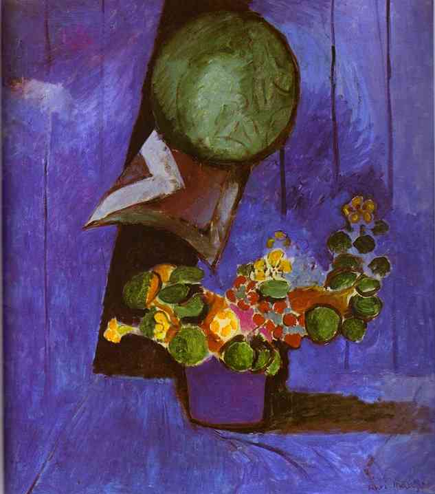
Henri Matisse’s “Flowers and Ceramic Plate” (1911) condenses an interior into a taut, luminous arrangement of color, shape, and interval. A circular green plate hovers near the top of the canvas, off-center and alive with embossed relief. Beneath it a wedge of folded cloth or paper tilts forward like a beak, cutting into a black trapezoid that reads as a shelf or shadow. Anchoring the lower field, a violet pot spills a spray of blossoms and coin-like leaves across the surface. Everything sits before a saturated blue-violet wall whose vertical seams suggest boards. It is a still life, but also a stage: the actors are a circle, a triangle, a trapezoid, and a flowering arc, tuned until the entire surface hums with harmony.
A 1911 Turning Point
The painting belongs to Matisse’s critical early-1910s period, when the blazing experiments of Fauvism resolved into a controlled decorative order. He was learning to replace illusion with structure, to make color carry form, and to treat interiors as shallow, persuasive stages. In 1911 he produced a group of works that fuse still life with room—“The Cuckoos, Blue and Pink Carpet,” “Painter’s Family,” and this canvas—each one testing how a few saturated planes can generate depth, rhythm, and light without conventional modeling. “Flowers and Ceramic Plate” is the most distilled of the trio. Its reduced cast of objects becomes a grammar: circle against wedge, organic vine against geometric supports, warm blossoms against a sea of purples and blues.
Composition as a System of Balances
The design hinges on an oblique diagonal that falls from the plate toward the bouquet. The green disk asserts a firm, frontal presence; the triangular fold beneath it projects outward; the black trapezoid recedes, creating a pocket of space; and the flowers surge across the picture’s lower half in a counter-movement to the plate’s weight. The pot, centered low, provides a fulcrum, while the short base shadow tethers the arrangement to the “floor.” A wide violet field surrounds everything, giving the eye room to register small shifts. Nothing is crowded. The balance of large, simple shapes with smaller accents—yellow blossoms, olive disks of leaves—keeps the surface both legible and alive.
Color Architecture and Climatic Chords
The painting rests on three families of color. The first is a cool ground of blue-violet that spans background and floor and sets the room’s climate. The second is a complementary burst of warm orange-yellows in the blossoms and ochres within the bouquet’s stem. These touches are small but intense, and they energize the entire field through contrast. The third family centers on greens: the plate’s deep green, the leaf disks, and darker olive notes that bridge flower and plate. Because the violet and green are near complements and the yellow accents sit opposite violet on the color wheel, the whole arrangement locks into a chromatic chord that is both serene and electric. Matisse narrows the palette so relations, not variety, do the expressive work.
The Blue-Violet Stage
Matisse’s background is not inert; it is a painted atmosphere. The blue-violet is brushed in broad, directional strokes, with places of thin wash where the weave shows and thicker ridges where the brush loads. Vertical seams hint at paneling, which adds a faint architectural rhythm. Cooler and warmer passes shift gently across the surface, keeping the plane from flattening into a poster. The background’s evenness is what allows small accents—tiny yellow flowers at the bouquet’s tips, a white edge on the fold—to ring like bells.
The Ceramic Plate: Circle, Relief, and Gravity
The green plate is both image and symbol. Its circle is the most stable geometric form; Matisse sets it slightly left of center and high on the wall, where it reads like a moon or shield. He paints its relief with short, rounded strokes that echo the leaves below, tying object to bouquet. Around the rim, a darker contour thickens and thins, giving the plate a palpable edge and softening where reflected wall color glows. The plate’s mass is emphasized by the triangular wedge under it—as if a bracket supports the object—and by the abrupt fall of black behind it, which reads as a cast shadow. The result is convincing without pedantry: we sense the plate’s weight and proximity even though there is no measured perspective.
The Folded Wedge: Pivot Between Wall and Table
Beneath the plate, a triangular fold of pale tones—white, mauve, and russet—projects sharply. It is easy to read as a folded napkin or card set on a narrow ledge. In compositional terms it is a pivot. Its acute angle directs the eye down to the bouquet; its pale value cuts cleanly against the violet ground; and its inner zigzag of stripes echoes the notches and scallops found later in the flower mass. This is how Matisse works: one small shape sends ripples through the entire painting.
The Violet Pot and the Arc of Growth
The vessel is a block of purple with just enough tonal variation to suggest curve and volume. Matisse keeps the drawing minimal: a dark outline at the base, a few interior strokes to show glaze reflections, and a broad shadow that grounds it. From this simple base the bouquet springs outward in a broad S-curve, drifting toward the plate’s lower edge and then lifting again at the right. The movement is architectural, like a flying buttress that stabilizes the heavy circle above. The pot’s color also knits foreground to background: it is the same family as the wall, just shifted warmer and darker, so the container feels at home on its stage.
Leaves as Coins, Blossoms as Sparks
Matisse treats the leaves as flat green disks with slight modeling, like coins scattered along a vine. Their regularity contrasts with the bouquet’s irregular orange and yellow blossoms, which arrive as small, starry bursts and rounded clusters. A few petals include pinks and reds, small echoes of the wedge’s russet and the pot’s warmer violet. The consistent leaf shape allows the blossoms’ color to carry the expressive load, and the alternating sequence of disks and lights sets a rhythm that moves across the surface. The plant is probably a nasturtium or geranium, both of which Matisse painted often; but botany is less important than function: cool greens negotiate between plate and ground, while the blossoms heat the center in controlled doses.
Shadow, Contact, and the Sense of Space
The still life achieves space with a remarkable economy. A dark trapezoid behind the plate and wedge implies a recess or shelf; a broad, low shadow under the pot and bouquet clarifies contact with the floor plane; and a few darker verticals in the background suggest seams that the light skims. There is no cast shadow for every leaf or a credible falloff of illumination. Light is constructed by adjacency: pale notes pop against violet; yellow sings because it sits next to blue; green feels solid because a darker, cooler border defines its edge. This is Matisse’s hallmark—light built from relationships rather than from a diagram of physics.
Contour as Conductor
Every object is held by a living line. Around the plate, the contour thickens as it passes the wedge and thins where the wall seems to reflect onto the rim. The wedge itself is drawn with crisp edges that slice boldly into the blue-violet, producing momentum. The bouquet’s contour is elastic, sometimes enclosing a leaf or blossom, sometimes skipping to let color define the boundary. The pot’s base is articulated with a short, heavy curve that makes the vessel sit. These lines are not fences; they are conductors, guiding the eye and keeping color in rhythmic dialogue.
Brushwork and the Honest Surface
Look closely and the paint’s making remains visible. The violet field carries long, confident strokes with small breaks where the bristles separate; the plate shows circular sweeps; the leaves receive rounded touches that end in tiny tails; blossoms are dabs and flicks layered wet into wet. At junctions between colors, tiny haloes persist where Matisse adjusted an edge and allowed the earlier layer to show. Such traces are not accidents to be hidden; they are the inscription of decisions, and they keep the surface breathing.
Pattern Without Literal Ornament
Unlike the interiors filled with patterned textiles, this painting invents pattern from the repetition of shapes. The green leaf disks, the round plate, the small blossom dots, the slivers inside the wedge—together they form a constellation of recurrent forms that behave like a pattern while remaining specific to this arrangement. That is why the surface feels rich even with so little explicit decoration. Matisse discovered that pattern can be structural rather than illustrative, an outcome of repeated decisions rather than a borrowed motif.
Dialogues With Sister Works
“Flowers and Ceramic Plate” converses with Matisse’s 1911 interiors while retaining a stricter economy. Where “The Cuckoos, Blue and Pink Carpet” spreads ornament across wall and textile, here the wall is nearly monochrome, and the drama rests on geometry and color intervals. The green plate echoes the blue-decorated jug of “The Cuckoos,” but stripped down to a single, frontal disk. The bouquet relates to the geraniums of 1909—solid, circular leaves and starry blossoms—yet here they act more abstractly, as counters against violet rather than botanical description. The painting also nods to his sculpture practice: the plate reads like a bas-relief, and the wedge projects like a small plinth—reminders that Matisse thought in volumes even when he painted on flat fields.
The Psychological Climate
Despite its limited subject, the canvas generates a clear mood: poised, slightly nocturnal, and quietly celebratory. The purple ground suggests evening or interior hush; the yellow blossoms feel like lamps switched on; the green plate looms like a calm moon. The bouquet’s outward reach animates the stillness without disturbing it. There is no anecdote—no table edge, no window, no hand—yet the painting feels deeply inhabited. Objects become stand-ins for attention and care: a plate hung, a slip of folded cloth placed just so, flowers arranged and set to brighten a corner.
The Ethics of Simplification
Matisse’s simplification is not a stylistic trick; it is an ethic. By removing everything that does not serve the relations—no modeled drapery, no furniture legs, no shadows for their own sake—he grants each remaining element dignity and clarity. The viewer is invited to experience the essentials of seeing: how a circle presses against a field, how yellow lights up blue, how a diagonal sends energy across a rectangle. The still life becomes a primer in visual thought, accessible yet inexhaustible.
Material Presence and Scale
Part of the painting’s persuasive power comes from scale. The plate is large enough to command the upper field; the bouquet occupies the lower half without filling it; the pot is modest but not miniature. This scaling allows the viewer’s eye to register each form at body distance: the plate feels like an object one could lift; the bouquet’s reach is shoulder-wide; the pot is hand-sized. Because the shapes are big and the marks frank, the painting can be read from across a room and grow richer up close—a key requirement for the decorative program Matisse pursued.
Lessons for Seeing and Making
The canvas offers a set of durable lessons. Build a climate with one or two fields of color and place your actors against it. Let a few geometric shapes anchor organic movement. Use complements sparingly to energize without chaos. Draw with the brush so contour breathes; model only when necessary, and prefer adjacency to blended shadow. Repeat shapes at different scales until pattern emerges from structure. Preserve traces of process so the surface remains human. When these principles are applied, a small arrangement can carry monumental calm.
Why It Still Feels New
Over a century later, the painting’s economy reads as contemporary. Designers, photographers, and painters still seek what Matisse achieves here: a limited palette that holds a room; a handful of forms tuned to balance; a shallow stage that makes objects feel close and alive. The modernity does not depend on style cues or exotic props. It resides in the clarity of relations—violet to green, circle to wedge, bloom to field—relations that continue to satisfy the eye.
Conclusion
“Flowers and Ceramic Plate” distills Matisse’s decorative ideal into a few exact decisions. A deep violet climate sets the scene; a hovering green circle gives weight and calm; a sharp pale wedge provides thrust; a pot sends a flowering arc across the surface; and small yellow sparks light the whole. Light is made by adjacency, space by overlap, rhythm by repetition, and presence by contour. The painting turns a tabletop corner into a complete world—restful, lucid, and quietly jubilant—demonstrating how essentials, properly tuned, can do the work of grandeur.