Image source: artvee.com
Historical and Cultural Context: The Rise of Aperitif Culture in 1930
By 1930, Europe’s social customs had evolved to celebrate the aperitif as both a digestive aid and a convivial ritual. No longer confined to private salons, aperitifs such as Sicilian Marsala and Italian vermouth took center stage in cafés, brasseries, and hotel bars from Paris to New York. The cocktail movement was gaining momentum, and consumers sought high-quality base ingredients. Against the backdrop of economic uncertainty following the Wall Street Crash, brands needed bold, eye-catching advertising to reinforce promises of refinement and sociability. Paris remained the epicenter of advertising innovation, where posters functioned as the primary medium for mass persuasion. It was into this dynamic environment that Leonetto Cappiello introduced his 1930 collaboration for Florio and Cinzano, two storied names in fortified wines and aromatized wines. His design encapsulated both brands’ heritage and modern appeal, transforming urban walls into flamboyant stages for a new era of aperitif consumption.
Leonetto Cappiello’s Artistic Vision and Career Trajectory
Leonetto Cappiello (1875–1942) began his career as a caricaturist for French satirical journals before gravitating to poster design around the turn of the century. Early successes such as Amandines de Provence (1902) and Angelus (1902) showcased his revolutionary approach: isolate a single, memorable motif against a flat color field and accompany it with minimal text. By 1930, Cappiello had crafted over five hundred posters, pioneering a visual language that combined caricature’s energy with modernist clarity. His collaboration with the Atelier Devambez and later with Vercasson & Cie allowed him to exploit the full potential of color lithography. With the Florio et Cinzano poster, he synthesized decades of exploration into a composition that felt at once playful, sophisticated, and perfectly aligned with both brands’ identities.
Brand Histories: Florio Marsala and Cinzano Vermouth
Florio Marsala, founded in 1833 by Vincenzo Florio on Sicily’s western coast, specialized in aging sun-drenched fortified wines in oak casks. Marsala’s unique terroir—the hot Mediterranean sun, salty sea breezes, and volcanic soils—imparted distinctive sweet and dry styles prized across Europe. By 1930, Florio had become synonymous with premium Marsala, favored for both dessert and cooking.
Cinzano, established in Turin in 1757 by the Cinzano brothers, built its reputation on aromatic vermouths infused with a secret blend of herbs, roots, and spices. With multiple international awards in the late 19th and early 20th centuries, Cinzano branded itself as a sophisticated apéritif, enjoyed neat, on the rocks, or in cocktails. By 1930, Cinzano was distributed worldwide, a staple on café menus from Parisian boulevards to Riviera terraces.
The decision to pair Florio Marsala and Cinzano Vermouth in one poster reflected a strategic alliance aimed at positioning both products as the paragons of aperitif culture. Cappiello’s challenge was to create a unifying visual that honored each brand’s storied past while presenting them as complementary companions in refined gastronomy.
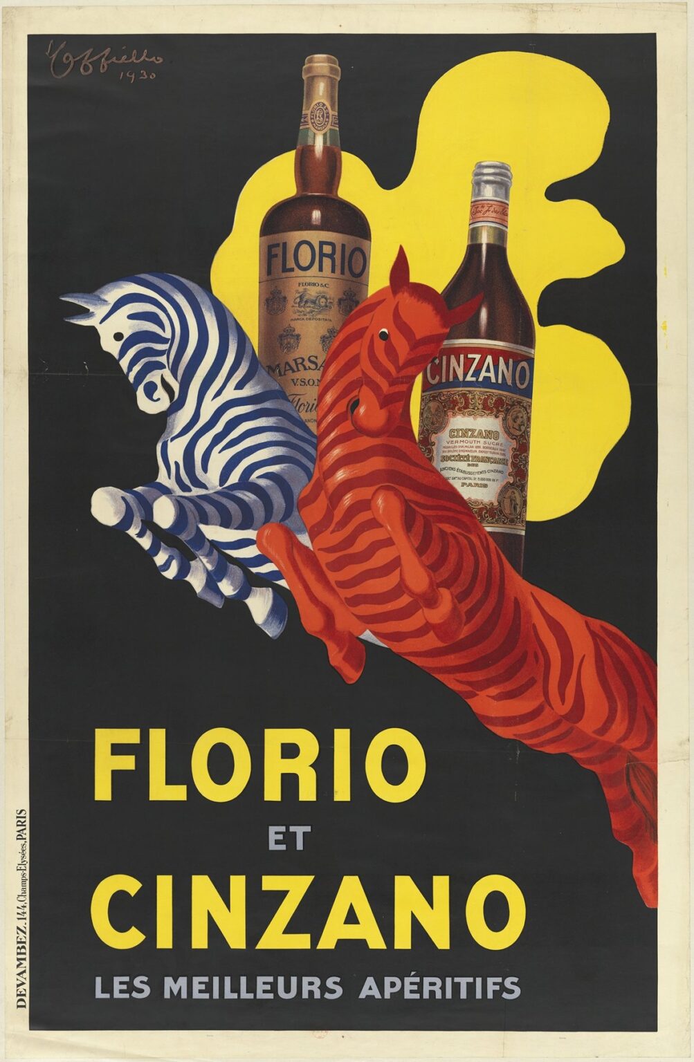
Composition and Central Motif: Dynamic Equine Allegory
The Florio et Cinzano poster’s most striking feature is its pair of leaping equines—a blue-and-white zebra-striped steed on the left and a red-and-orange striped horse on the right. These creatures soar diagonally across a midnight-black field, their bodies echoing the contours of the two bottles that loom behind them. The zebra echoes the snowy white highlights of Cinzano’s glass bottle, while the flaming orange horse recalls the amber glow of Florio Marsala. Positioned between and slightly behind the jumping beasts stand the two products: the tall, slender bottle of Cinzano Vermouth Sucré to the right, its ornate label aglow, and the squat, rounded bottle of Florio Marsala V.S.O.P. to the left, its foil cap catching light.
The horses’ forward momentum—noses lifted, hooves poised in mid-stride—conveys energy and flight, suggesting that each aperitif imparts a spirited lift to the consumer. Their stylized stripes unify them visually and conceptually, evoking the fusion of two distinct brands into a harmonious pairing. Behind them, a freeform yellow splash provides a backdrop that echoes the horses’ warmth and frames the bottles, further tying image and product together.
Color Palette and Emotional Impact
Cappiello’s expert handling of color in this poster ranks among his most sophisticated achievements. The onyx black background ensures maximum contrast, allowing every other hue to pop with jewel-like clarity. The cerulean blue and pure white stripes of the zebra figure convey freshness, coolness, and the crisp herbal notes of Cinzano. In contrast, the vermilion red and sunset orange stripes of the horse allude to the warm, honeyed sweetness and depth of aged Marsala. The luminous yellow behind the bottles and horses evokes Mediterranean sunshine and the golden light of a bar at sunset. The pale green typeface below—“FLORIO ET CINZANO Les Meilleurs Apéritifs”—provides a calm foil to the fiery hues above, linking both brands under one inviting call to taste.
Typography: Uniting Two Brands in Harmony
The poster’s text appears in just two lines at the bottom, set in a bold sans-serif typical of early Art Deco. “FLORIO” appears in uppercase yellow on the left, balanced by “CINZANO” in the same style on the right. Between them, the small word “ET” in pale gray underscores the partnership. Beneath, the phrase “Les Meilleurs Apéritifs” (“The Best Aperitifs”) appears in uppercase pale gray, serving as a concise slogan. By limiting text to brand names and a single declarative promise, Cappiello allowed the imagery to do the heavy lifting. The typography’s clean lines mirror the horses’ sleek forms, ensuring visual cohesion and preventing any distraction from the central motif.
Symbolism and Interplay of Elements
The equine allegory in Florio et Cinzano carries rich layers of meaning. Horses traditionally symbolize freedom, power, and nobility—qualities both brands wished to claim. The zebra’s exotic stripes hint at the global spice routes that brought aromatic herbs to Turin, while the orange horse’s warmth suggests the sunny vineyards of Sicily. The upward, leaping posture of both animals implies an aspirational journey, inviting the viewer to rise above quotidian life with a refined aperitif. By positioning the bottles as looming benefactors behind the horses, Cappiello suggests that each brand provides the vital energy enabling the leap. The yellow splash behind them—abstract and dynamic—could be read as sunlight, fire, or even the effervescence of spirits in a glass. This carefully choreographed interplay of symbols transforms what could be a static advertisement into a vibrant narrative of taste, tradition, and elevation.
Spatial Arrangement and Visual Flow
Cappiello’s design expertly choreographs the viewer’s eye in a sweeping diagonal from the lower left to the upper right. Beginning at the word “FLORIO”, the gaze moves across the zebra figure, up to the golden bottle of Florio Marsala, then to the yellow halo, down to the red horse, and finally to the Cinzano bottle and brand name. This fluid path reflects the dynamic dance of color and form, creating a sense of movement that feels cinematic. Meanwhile, the black background grants the composition ample breathing room, elevating each element as if suspended in space. The negative space around the horses underscores their shapes, allowing the viewer to appreciate the precise curvature of each stripe without visual clutter.
Technical Mastery: Lithography and Print Quality
The Florio et Cinzano poster was executed as a large-format color lithograph by Vercasson & Cie in Paris. Early 20th-century lithography offered the ideal medium for Cappiello’s flat fields of color and crisp outlines. Each hue—two blues, two reds, two yellows, green, gray, and black—required its own limestone stone and press run. Accurate stone registration was crucial to maintain the overlapping stripes on the horses and the precise contours of the yellow backdrop. The fine gradients in the Marsala bottle’s glass highlights and the intricate label details for Cinzano demonstrate the pressmen’s skill. The final prints, often over one meter tall, exhibited uniform ink coverage and vibrant saturation that resisted fading, ensuring the poster’s longevity on public walls and kiosks.
Cultural Reception and Market Impact
Released in 1930, the Florio et Cinzano poster quickly became ubiquitous in French cafés, hotel lobbies, and train stations. Patrons stopped to admire its modernist flair and astonished at its arresting simplicity. Sales records from both Florio Marsala and Cinzano Vermouth indicate a notable uptick in orders in regions where the poster was displayed, suggesting its effectiveness in reinforcing brand prestige. The design’s innovative pairing of two major aperitif brands in a single visual narrative also set a trend for cross-promotional campaigns in the liquor industry. Collectors of vintage posters have since lauded Florio et Cinzano as one of Cappiello’s crowning achievements, and originals trade in specialist auctions at premium prices.
Legacy and Influence on Graphic Design
Leonetto Cappiello’s “Florio et Cinzano” poster stands as a seminal work in the history of graphic design. Its fusion of minimalist composition, bold color schemes, and symbolic allegory influenced generations of poster artists and brand designers. The principle of pairing a single, evocative image with minimal text to convey complex brand values remains foundational in modern logo and label design. Art Deco enthusiasts point to Florio et Cinzano as an exemplar of early 20th-century style, where flat color, geometric type, and stylized motifs converge. The poster’s continued reproduction in design textbooks and retrospectives underscores its enduring pedagogical and aesthetic value.
Interpretive Themes: Tradition, Innovation, and Shared Celebration
At its heart, Florio et Cinzano celebrates three intertwined themes. Tradition emerges in the historic pedigrees of both brands—Sicilian Marsala and Piedmontese vermouth—and in Cappiello’s invocation of classical symbols (horses, sunbursts). Innovation appears in the poster’s modernist aesthetic, technological excellence, and cross-brand collaboration. Shared celebration resonates in the poster’s joyous energy, inviting viewers to partake in a ritual of refined tasting and social communion. By weaving these themes together, Cappiello created a design that transcended mere product promotion to affirm the cultural significance of the aperitif as an act of convivial sophistication.
Conclusion: A Masterpiece of Modern Advertising Art
Leonetto Cappiello’s 1930 “Florio et Cinzano, Les Meilleurs Apéritifs” remains a masterwork at the confluence of art, commerce, and social ritual. Through a dynamic composition of twin striped horses, dramatic color contrasts, and minimalist typography, he distilled the essence of two legendary aperitifs into a single resonant image. The poster’s technical brilliance—rooted in advanced lithographic production—and its symbolic depth combined to produce one of the most iconic advertisements of the Belle Époque’s twilight and the dawn of Art Deco. Over nine decades later, Florio et Cinzano continues to inspire designers, marketers, and collectors, reminding us that the most enduring messages arise from the harmonious marriage of visual clarity, emotional resonance, and cultural storytelling.