Image source: artvee.com
Introduction
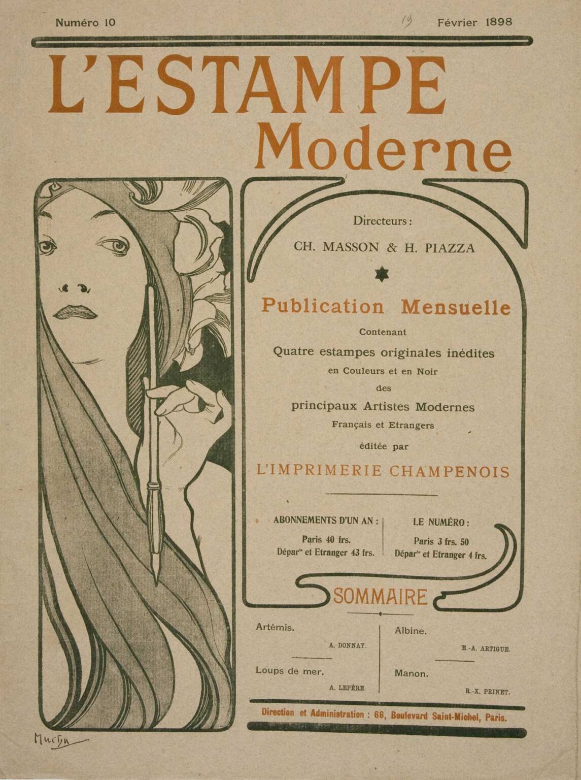
Alphonse Mucha’s “Femme à la Plume” (1898) is a compact manifesto of Art Nouveau thinking, compressed into the cover page of a modern print journal. Created for the February issue of L’Estampe Moderne—a luxurious monthly that commissioned original lithographs from leading artists—the design pairs a poised female figure with an elegant block of editorial copy and a frame of sinuously drawn rules. Mucha folds information, ornament, and allegory into one seamless surface: the woman becomes the personification of modern print culture, the quill a wand of authorship, and the braided lines that steer the eye around the page double as the magazine’s organizing grid. The result is not merely an attractive frontispiece; it is a visual argument for the dignity and desirability of the printed image at the end of the nineteenth century.
Historical Context: Paris, the Print Revival, and L’Estampe Moderne
In the 1890s, Paris teemed with posters, portfolios, and artist-led print societies. New presses and color lithography had democratized imagery, and the boulevard became a gallery. L’Estampe Moderne emerged in 1897 as a subscription publication devoted to the “modern print,” offering subscribers a set of original works every month, carefully printed by L’Imprimerie Champenois—the very firm that handled Mucha’s most celebrated posters. The periodical’s purpose was educational and commercial: cultivate taste, elevate the print to a collectible object, and connect buyers directly to artists. For the February 1898 issue (No. 10), Mucha designed this cover, using the magazine’s typographic program to declare its editors, pricing, and contents while encircling all that information with the very style that made the era’s print culture irresistible.
Why a Cover by Mucha Mattered
By 1898 Mucha was effectively a brand. His Sarah Bernhardt posters had transformed street lithography, and his seasonal panels sold widely as home decoration. To place his design at the head of L’Estampe Moderne was to align the journal with the hottest visual language in Paris while signaling that print itself—traditionally considered secondary—could reach the status of fine art. “Femme à la Plume” is therefore both advertisement and editorial stance: it claims that the most modern publication is one whose form is itself a work of art.
Composition: Two Fields, One Conversation
Mucha divides the page into two unequal rectangles separated by a sinuous border line that behaves like both a frame and a piece of calligraphy. At left, the femme occupies a tall, narrow panel, her face turned slightly toward the reader, a quill held upright beside her cheek. At right, a larger, arched panel collects the masthead details—directors (Masson and Piazza), subscription rates, printer’s name, and a short table of contents. The top headline, L’ESTAMPE Moderne, sits like a frieze above both panels, binding them into a single façade.
This architecture captures two necessary modes of the modern periodical: seduction and information. The woman is the warm invitation; the text is the contract. The lines that curve around and beneath the paragraphs are not mere decoration; they lead the reader through hierarchy—title, mission statement, price, address—without breaking the poster’s mood.
The Woman as Allegory of Print
Mucha’s women are not portraits so much as personifications. This figure is Print made human: composed, intelligent, and slightly aloof, with a headdress of stylized blossoms that reads as both laurel and typesetter’s rosette. Her quill—la plume—is the literal instrument of writers and critics, but as held here it also suggests the lithographer’s grease pencil and the illustrator’s pen. She is a conduit between hand and press, a reminder that every modern image still begins with a line drawn by a person.
Gesture and Gaze
Unlike the inward-looking muses of some of Mucha’s theater posters, the femme meets the reader’s glance directly. There is no flirtation; the expression is businesslike, serious, even a shade skeptical. That gaze makes the cover feel adult and editorial rather than merely decorative. It places the journal in conversation with its public, as if to say: this is not ephemeral street noise; this is a publication you will sit with.
Line: The True Subject of the Page
Everything in “Femme à la Plume” is a demonstration of line. The figure’s veil falls in long, ribboning arcs; the quill’s shaft is a simple, decisive stroke; the border rules swell and taper like a masterful signature. Mucha’s key line is elastic and musical, thickening to anchor a curve and thinning as it accelerates around a bend. Because the cover relies on flat color fields, those lines carry both structure and rhythm. The reader’s eye moves along them the way a hand might trace a sentence—an experience perfectly aligned with the mission of a print magazine.
The left panel in particular shows Mucha’s command of contour: the cheek, neck, and hand are reduced to essentials, and yet the figure breathes. He achieves volume not with shading but with judicious overlaps and delicate interior strokes that hint at fabric weight and hair texture.
Color: Editorial Calm with Strategic Warmth
The palette favors paper tones—cream, cool gray, and green-black—punctuated by warm accents of terracotta and lilac. The masthead’s burnt orange and the star-like bullet points tie the composition to the color of iron gall ink and aged leather bindings, a nod to bibliophiles. The restraint serves readability; text remains crisp against quiet grounds. It also communicates seriousness; this is not a carnival broadside but a cultured object. Yet Mucha still gives pleasure: the lilac infill behind the woman and the mellow ochre in her hair create a soft halo that feels modern and luxurious.
Typography that Belongs to the Image
One of the cover’s great triumphs is the way type and picture inhabit the same world. L’ESTAMPE is set in a monumental, hand-drawn roman with flared serifs, while Moderne glides beneath it in a more playful italic, implying motion and contemporaneity. In the right-hand panel, Mucha alternates small caps and upper-and-lowercase lines to establish hierarchy, then threads a calligraphic rule under the word SOMMAIRE that curls like a strand of hair. Even the colophon—Direction et Administration: 66, Boulevard Saint-Michel, Paris—is integrated elegantly within a horizontal rule. The letters do not sit on the page; they “live” in it, a core tenet of Art Nouveau.
The Editorial Panel: Information as Ornament
Look at the right panel as a design object. A stiff rectangle would have done the job, but Mucha rounds its upper corners into an arcade and then pulls a quasi-bracket around the heading Publication Mensuelle. The line is not just a frame—it is a path the eye can walk. The price table rests on a thin shelf of ink; the list of featured artists perches between two minimalist dot leaders. In sum, the pragmatic content receives the same sculptural attention as the figure, which is why the page reads as one organism, not two neighboring boxes.
Printing Intelligence and the Logic of Chromolithography
Mucha designed with the press in mind. The cover was printed by Imprimerie Champenois, which specialized in multi-stone color lithography. Each hue in the design sits in a distinct, separable shape; the unifying key line keeps registration clean. Areas of unprinted paper—especially in the light grounds—save ink and lend brightness. The stippled fill used in the masthead’s green-black background allows for even tone without banding, disguising minor inconsistencies that might occur during long runs. The design is not just beautiful; it is efficient, durable, and reproducible—ideal for a journal that mailed to subscribers and was handled frequently.
Relationship to Mucha’s Other Editorial Works
“Femme à la Plume” converses with Mucha’s posters for La Plume and the Salon des Cent, but it is noticeably more editorial. Where the Salon posters exhale stars and veils, this cover tightens its language: fewer colors, fewer metaphors, more text. It sits at the midpoint between advertisement and title page, proof that Mucha could modulate tone while retaining identity. The profile goddess of his 1896 La Plume zodiac reappears here as a modern professional—a woman who holds a tool, not a crown.
The Feminine Ideal Recast as Professionalism
Art Nouveau is often accused of reducing women to decoration. Mucha often pushes back. The woman here is an agent of culture, a bearer of the pen. Her face is not coy; her hand is steady. With the drooping lily-like petals that rise behind her head, she inherits botanical grace, yet the quill and the urgent verticality of her panel frame assert her role as worker and witness. She is the editor’s muse—yes—but also the craftsperson who makes the marks.
The Quill as Polyglot Symbol
The quill is literal (writing), metaphorical (judgment, voice), and technical (the lithographer’s greasy pencil). For L’Estampe Moderne, the symbol is perfectly chosen because the magazine brokered a meeting of writers, illustrators, printers, and readers. That the quill is drawn as a simple, crisp vertical is intentional: it is the page’s metronome, a counterweight to the curls of hair and the looping rules. The whole cover “breathes” around this single straight stroke.
The Economies of Negative Space
Mucha’s mastery of blankness is easy to overlook. The left panel’s large fields of open paper create an aura of quiet; the eye finds rest between the hair’s dark swirls and the quill’s thin silhouette. On the right, generous margins around the text prevent the information from feeling crowded. This measured use of white space communicates confidence and elevates the journal: luxury is often the permission to leave things out.
Reading Path and Viewer Experience
The cover invites a specific journey. The eye lands on L’ESTAMPE, drops to the woman’s glance, slides along the quill to the base of her panel, crosses the connecting rule into the right-hand arch, and then descends through the announcement of the monthly publication, the promise of “quatre estampes originales,” the price tables, and finally the Sommaire with its neat list of contributors. That reading path mirrors the act of buying: first the name, then the seduction, then the details that clinch the decision.
Influence and Afterlives
Mucha’s editorial covers influenced both magazine design and the packaging of prints for decades. The integrated headline, the calligraphic border, and the pairing of figure-with-information became a template for journals seeking a premium aura. Echoes appear in Jugendstil magazines in Germany and, much later, in mid-century book jackets that revived ornamental rules to move the reader’s eye. In contemporary branding, the cover’s logic—seductive image anchored by a clean grid—remains a reliable playbook for cultural institutions.
Comparison with Commercial Posters
Compared with the blockbuster posters that papered Parisian boulevards, “Femme à la Plume” is quieter and more typographic. Yet the DNA is the same: a central feminine presence; line that performs; a strictly curated palette; and, crucially, a border that behaves like a living thing rather than a mechanical frame. The difference is scale and intent. This image is designed not for a street glance but for the intimate moment when a subscriber opens a portfolio and meets the journal at arm’s length.
What the Cover Says About the Value of Prints
The right panel’s promise—“Quatre estampes originales inédites”—is bold. It tells the subscriber that each issue contains not reproductions but original works. Mucha’s design visually validates that claim: every curve announces the artist’s hand, every rule looks drawn rather than typeset. The cover itself behaves like an original print, training the reader to expect the same care and authorship from the contents.
Practical Lessons for Designers Today
This sheet still functions as a primer in how to design the front door to a complex publication. Give the image a lane of its own; give the information a clear hierarchy; use a few lines to knit everything together; keep the palette restrained; and let the letterforms belong to the same world as the illustration. Above all, cultivate a tone—serious but inviting—that reflects the product’s values. The design works because it respects the reader and the medium equally.
Conclusion
“Femme à la Plume” is not simply a beautiful cover; it is a total argument for modern print culture delivered through line, color, and calm assurance. Mucha fuses a symbol of authorship with a page of practical details, making the case that information and art need not be strangers. In a single glance we understand the promise of L’Estampe Moderne: original images, finely printed, guided by editors who believe the page can sing. More than a century later, the cover feels uncannily fresh because its priorities—clarity, grace, authorship—are still the ones that matter.