Image source: artvee.com
Introduction
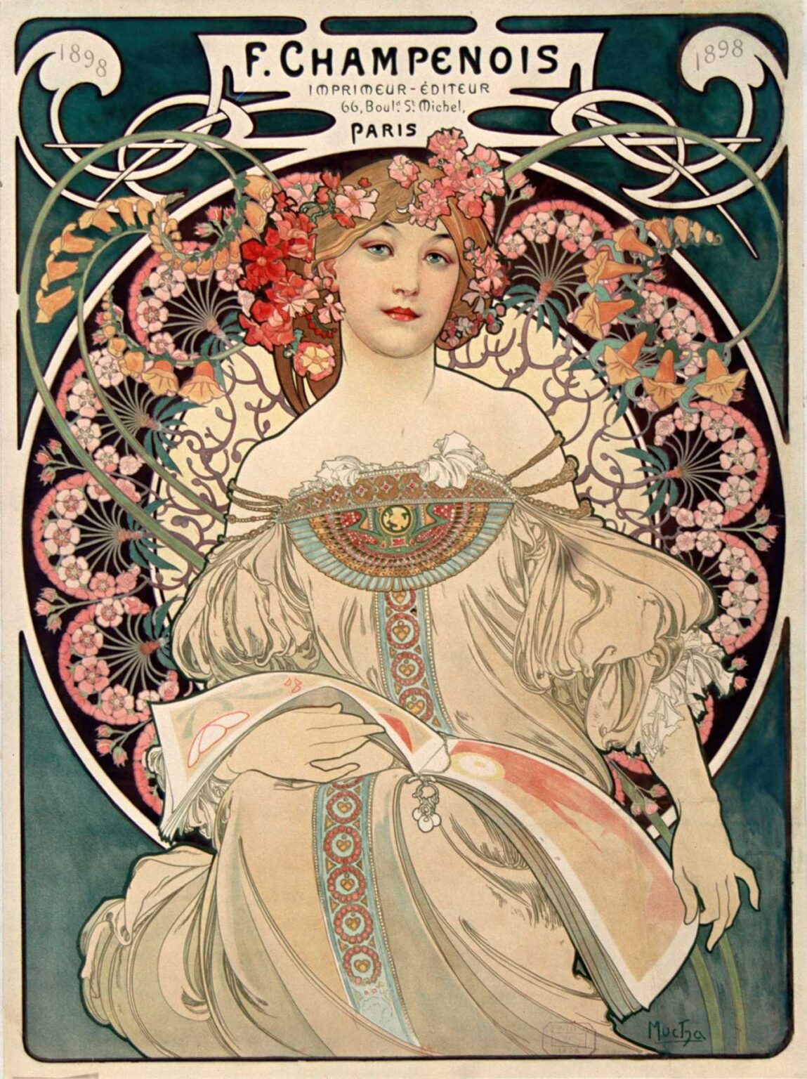
Alphonse Mucha’s 1898 lithograph F. Champenois Imprimeur-Éditeur serves as both an exquisite example of Art Nouveau design and a masterclass in the art of commercial poster-making. Commissioned by Ferdinand Champenois’s Parisian printing and publishing house, this poster transcends mere advertisement to become an object of aesthetic contemplation. Through its harmonious composition, sinuous linework, sophisticated color palette, and integrated typography, Mucha transforms the functional imperative of branding into a celebration of decorative beauty. Situated at the height of the Belle Époque, when Parisian boulevards were awash with colorful posters, Mucha’s design for Champenois both epitomizes and elevates the era’s visual culture.
Historical and Cultural Context
The late 19th century in Paris marked a golden age of printmaking and public display. Advances in chromolithography allowed for richly colored posters that could be produced in large runs and pasted on city walls, turning everyday thoroughfares into open-air galleries. Ferdinand Champenois, a prominent Parisian printer and publisher located at 66 Boulevard Saint-Michel, recognized the promotional power of the emerging poster medium. To distinguish his firm in a competitive market, he commissioned Mucha—fresh from his triumphs with Sarah Bernhardt posters—to create a signature image that would appear on invoices, catalog covers, and public notices. The resulting lithograph stands at the intersection of commercial necessity and artistic innovation, reflecting both the ambitions of a modern entrepreneur and the decorative ideals of the Art Nouveau movement.
Mucha’s Artistic Evolution up to 1898
By 1898, Alphonse Mucha had already secured his reputation as the preeminent poster artist of his generation. After arriving in Paris in 1887 and studying at the Académie Julian, he struggled for recognition until 1894, when actress Sarah Bernhardt’s commission for Gismonda catapulted him to fame. Mucha’s signature style—elongated, idealized figures; ornate halos of botanical motifs; and custom lettering—quickly became synonymous with the decorative revolution known as Art Nouveau. Over the next four years, Mucha experimented with lithographic techniques, refining his use of layered inks, metallic highlights, and nuanced color harmonies. The F. Champenois poster encapsulates this period of artistic maturity: it exhibits the confidence of an established master and introduces a more restrained, geometric approach to ornament, aligning More with the commercial commission’s demands.
Commission and Purpose
Ferdinand Champenois’s printing house specialized in art books, fine stationery, and high-quality lithographic prints. In seeking a unifying emblem for his brand, Champenois required a design that could function across multiple contexts: as a poster on building facades, as a header on invoices, and as a decorative motif in printed catalogs. Mucha’s task was to create an image that was instantly recognizable, flexible in scale, and resonant with the house’s commitment to craftsmanship. By featuring an allegorical female figure—an embodiment of print media’s grace and creativity—Mucha offered Champenois more than a logo: he provided a visual identity that communicated artistic refinement and commercial reliability.
Subject and Allegory
At the heart of the poster stands a stately young woman, her profile framed by a halo of stylized floral forms. Clad in a flowing gown and adorned with a wreath of morning glories and poppies, she holds a broad sheet of paper or catalog in her hand—an unmistakable reference to the printer’s product. Mucha’s choice of a female allegory echoes Renaissance personifications of Fama (Fame) and Clio (History), suggesting that the printed word carries enduring influence. The figure’s serene expression and poised gesture convey dignity and intellectual engagement, positioning print media as both beautiful and enlightening. Through this allegorical mode, Mucha elevates the mundane act of printing into an act of cultural creation.
Composition and Spatial Arrangement
Mucha structures the F. Champenois poster on a vertical axis, using a tripartite composition that balances figure, ornament, and typography. The central register features the female figure against a circular decorative panel. Above, a rectangular cartouche bears the printer’s name and address in prominent custom lettering; below, a broad ribbon-like band repeats the name or provides additional information. The circular background panel is filled with geometric abstractions reminiscent of mosaic or stained-glass tracery, offering a modern counterpoint to the organic curves of the wreath and gown. Vertical ornamental bars on either side frame the composition, giving it both structural coherence and an architectural presence. This layered approach—foreground figure, midground ornament, background pattern—creates depth and visual interest without overcrowding the design.
Use of Line and Decorative Motifs
Central to Mucha’s Art Nouveau vocabulary is the “whiplash” curve, a dynamic, sinuous line that animates both figure and ornament. In the F. Champenois poster, the floral wreath unfurls in looping arcs, while the folds of the woman’s gown echo the parallel curves. These undulating lines are counterbalanced by the more rigorous, grid-like geometry of the circular panel’s interior, where repeating quatrefoils and chevrons evoke architectural motifs. Mucha’s modulation of line weight—thicker outlines for primary forms, thinner strokes for secondary details—guides the viewer’s eye and reinforces the hierarchy of elements. The interplay of curved and straight lines not only unifies the composition but also symbolizes the union of nature’s spontaneity and human design.
Color Palette and Light Effects
Mucha’s palette for the F. Champenois poster is both rich and harmonious, featuring deep emerald greens, soft rose pinks, warm golds, and cream backgrounds. The wreath’s flowers—poppies and morning glories—are rendered in vibrant reds and mauves that contrast with the cool teal of the girdling stems. The figure’s flesh tone, achieved through delicate glazing, glows against the pale cream of the gown and the dark green of the border. Golden highlights on the catalog’s edge and the hair wreath catch the eye, suggesting the metallic inks used in print. Mucha’s layering of translucent lithographic inks creates gentle gradations that mimic the play of daylight on fabric and flower petals, imbuing the image with luminous depth and a subtle three-dimensionality.
Typography and Branding Integration
The name F. Champenois Imprimeur-Éditeur appears prominently in a rectangular header, set in a custom typeface that combines the solidity of serifs with the elegance of curved terminals. The letters are tightly kerned to form a unified block, echoing the visual density of the floral wreath below. Address details—“66, Boulevard St. Michel, Paris”—are placed beneath in a smaller, more restrained serif, ensuring legibility while deferring to the primary branding. Mucha frames the text with sinuous linework that mirrors the wreath’s tendrils, integrating typography into the overall decorative scheme. This seamless fusion of text and ornament exemplifies Mucha’s belief that lettering should participate in the poster’s aesthetic harmony rather than disrupt it.
Printing Technique and Collaborative Craftsmanship
Creating the F. Champenois poster involved a close collaboration between Mucha and the lithographic workshop of Champenois himself. Mucha’s original watercolors and pencil drawings were transferred onto limestone plates, each dedicated to a specific color or tone. Registration marks ensured precise alignment across multiple color passes—often seven to nine stones in total. Special attention was given to maintaining the fluidity of Mucha’s linework while achieving the crispness required for mass production. The choice of slightly textured, cream-toned wove paper enhanced the warmth of the color layers and added a tactile quality to the prints. Printers mixed inks by hand, carefully matching Mucha’s swatches to preserve the design’s integrity. The final proofs reveal subtle variations in color density, a testament to both the challenges and the artisanal care inherent in late-19th-century lithography.
Reception and Influence
When the F. Champenois poster debuted, it garnered admiration from the printing and artistic communities alike. Printers lauded its demonstration of what could be achieved through litography, while designers praised much for elevating commercial imagery to fine art. The poster adorned Champenois’s shopfront and appeared in trade publications, serving as both advertisement and portfolio piece. Over the ensuing decades, Mucha’s approach influenced generations of graphic artists who recognized the power of integrated composition, custom typography, and thematic allegory. The poster also helped establish the notion of the “printer’s mark” as a vital element of corporate identity, a concept that resonates in modern branding practices.
Place within Art Nouveau and Mucha’s Oeuvre
Within Mucha’s prolific output, the F. Champenois poster occupies a unique niche—less flamboyant than his theatre commissions yet more ornate than his purely decorative panels. It demonstrates how Mucha could adapt his style to different contexts, balancing maximalist and minimalist tendencies to suit a client’s needs. The restrained geometry of the circular background anticipates the more streamlined Art Nouveau variants that would emerge in the Edwardian and Jugendstil contexts. At the same time, the lush wreath and figure maintain the organic exuberance that defines Mucha’s most celebrated works. As such, the poster stands as a bridge between the movement’s decorative high point and its gradual evolution toward modernist simplification.
Legacy and Modern Relevance
More than a century after its creation, Mucha’s F. Champenois poster remains a touchstone for designers, historians, and collectors. Original lithographs are held in major museum collections, including the Musée d’Orsay and the Victoria & Albert, where they are exhibited as exemplars of turn-of-the-century graphic art. Contemporary branding and typography classes study the poster as a paragon of integrated design—where text, image, and ornament collaborate to convey both aesthetic pleasure and clear messaging. Digital artists and print studios continue to reference Mucha’s methods when creating corporate identities that seek an artisanal feel in an era of mass production. The F. Champenois poster endures as a demonstration that commercial art can achieve timeless beauty without sacrificing functional clarity.
Conclusion
Alphonse Mucha’s F. Champenois Imprimeur-Éditeur is far more than an advertisement for a Parisian printer; it is a manifesto of Art Nouveau’s ideals—elegant form, harmonious ornament, and the elevation of everyday life through beauty. Through masterful composition, sinuous linework, a refined color palette, and integrated typography, Mucha created an image that communicates both the practical identity of a business and the transcendent possibilities of graphic art. In doing so, he set a lasting standard for poster design and corporate branding. Over a century since its first appearance on Boulevard Saint-Michel, the poster continues to captivate viewers, reminding us that art and commerce can intertwine to produce works of enduring cultural significance.