Image source: artvee.com
The Banquet Menu That Became a Work of Art
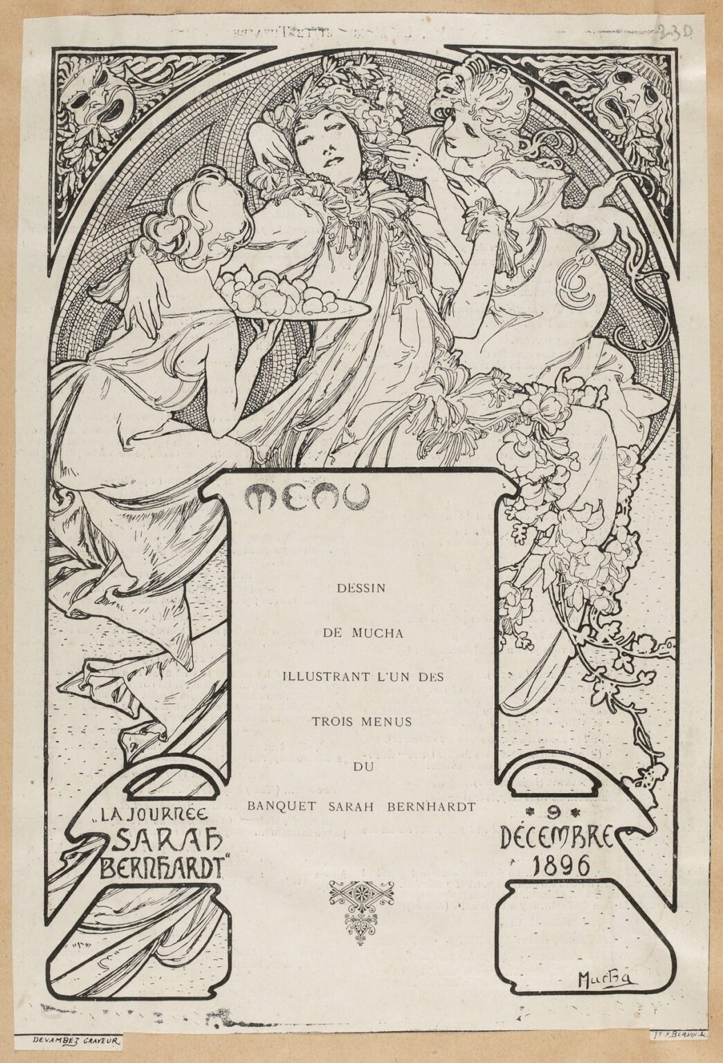
Alphonse Mucha’s “Drawing by Mucha illustrating one of the three menus of the Sarah Bernhardt banquet” (1896) turns a single sheet of dinner ephemera into a fully staged celebration of celebrity, theatre and Art Nouveau line. The composition is printed in black on a pale ground and framed by a rich, curving border. At the top, a circular medallion holds a reclining central figure in luxuriant costume, flanked by two attendants who lean in with offerings and adoration. Two theatrical masks stare from the corners, and a cascade of blossoms and drapery pours down the sides toward a large central cartouche reserved for the printed MENU. Small panels at the bottom announce “La Journée Sarah Bernhardt” and the date, 9 décembre 1896. Even before a single course is listed, the page feels ceremonial. It is less a utilitarian sheet than a portable stage, with Sarah Bernhardt cast as presiding deity of the evening.
A Partnership Sealed With Ornament and Applause
The menu comes from the peak of Mucha’s collaboration with Sarah Bernhardt, the most famous actress in Europe. Two years earlier his breakthrough poster for Gismonda made both names inseparable from the new Paris look. By 1896 their partnership extended beyond gigantic street posters to programs, invitations, souvenirs and, here, a banquet menu celebrating the star. That expansion matters, because it shows how Mucha understood branding long before the word existed. He gave Bernhardt a visual world that followed her from boulevard kiosks to the dinner table. This menu is proof that he could compress theatrical enchantment into intimate scale without losing authority.
An Image Built to Perform and to Serve
Mucha designs the page to do two jobs at once. It must frame food listings cleanly and it must project aura across the room. The rectangular sheet is divided so that image and text interlock. The upper medallion and side panels provide spectacle while the central field remains calm, ready to accept the typeset list of courses. The border does not merely decorate; it directs the eye from star to cartouche and back again, the visual equivalent of an emcee announcing dishes between toasts. A good menu makes dining feel like performance. Mucha, a master of stage posters, simply made that role explicit.
Composition: A Halo of Hospitality
The most striking device is the large circular frame behind the figures. Its interior is textured like mosaic, a pattern that implies ritual space and permanence. Inside, the central figure’s languid pose creates a diagonal that cuts the roundel into two unequal but balanced fields. The two attendants mirror each other in a soft V-shape, stabilizing the diagonal and suggesting choreographed service. The circle’s rim is heavy, ensuring that the image holds together even when glimpsed at a distance across candlelight. Mucha frequently used such halos to elevate his subjects. Here the effect is apotheosis by hospitality: the star is enthroned at a table whose offerings—fruits, flowers, and affection—flow toward her.
The Iconography of Abundance
Everything within the image speaks of plenty. One attendant presents a brimming platter; the other adjusts hair or wreath as if to perfect the star before a toast. Garlands and flowering boughs spill along the borders and into the lower corners. The theatrical masks peering from the top corners extend the theme. They are the ancestral symbols of comedy and tragedy, reminding diners that the evening belongs to the stage. By placing them outside the main halo Mucha keeps the mood celebratory while acknowledging the art form that made the banquet possible. Abundance, in this design, is not just food. It is public love, performed with style.
Line That Feels Like Music
Although printed in one color, the sheet vibrates with motion. Mucha’s line swells and thins as if conducted. Drapery billows in long whiplash curves, hair coils into rhythmic loops, and foliage thickens into clusters of short strokes that read as texture from afar and as drawing up close. In the halo, a mesh of tiny marks suggests mosaic or night sky and sets off the smooth sweep of neck and cheek. The linear tempo is what made Mucha’s graphic language so persuasive in the 1890s; it could sing even without color. On a dinner table, that liveliness would have made conversation feel staged and the evening feel choreographed.
The Central Cartouche and the Drama of Typography
The rounded rectangle at the center holds the word MENU in a custom alphabet that curves like vines. Below it, the remaining field is intentionally quiet. Mucha knew that the list of courses would vary, so he designed a panel that printers could typeset without fighting the art. At left, a small cartouche reads La Journée Sarah Bernhardt, and at right another panel carries the date. The composition thus binds content and context: what you will eat, whom you celebrate, when you gather. This integration of lettering and line is a Mucha hallmark. Even in black and white his pages feel illuminated.
The Three Women as Allegory
Whether the reclining figure is meant to be Bernhardt herself or the personified spirit of the banquet, she is clearly a sovereign. Her expression is deliciously ambiguous—eyes half-closed, mouth soft with pleasure, arms lifted not in fatigue but in ease. The attending women are not servants; they are graces, embodiments of nurture and charm. Mucha often divided feminine archetypes into trios that act as seasons, arts, or virtues. Here they become hospitality in three registers: nourishment, adornment and presence. Their interlocked gestures prevent the picture from becoming a static emblem; it breathes like a scene.
Theater in the Corners
The tiny faces nestled into the upper corners do more than nod to masks. Each appears caught mid-change, as if mask and living face are fusing. This ambiguity collapses stage and life, which is exactly the point of a banquet honoring an actress whose public role defined her private myth. The banquet is a theatre of friends, critics and admirers; the masks witness and frame the ceremony. Mucha often used corner panels as narrative hinges. Here they ensure that every inch of the sheet participates in theme.
Black-and-White as a Choice, Not a Compromise
Printing a menu in monochrome was economical, but in Mucha’s hands it becomes an aesthetic. The absence of color clarifies the drawing’s architecture, which relies on counterpoint between dense hatch and open paper. Because the design contains strong silhouettes, the image would have read well in dim light and under the amber warmth of Belle Époque dining rooms. Monochrome also links the piece to engravings and to the long tradition of book illustration, lending the ephemeral sheet a whiff of permanence. Guests would have felt that they were taking home not just a wine-stained list but a true keepsake.
How the Eye Travels
Mucha designs a precise viewing path. The gaze lands first on the languid, haloed figure, then slides left to the platter and down the attendant’s back into the central cartouche where the courses would be read. From there the eye drifts right to the second attendant and out to the flowering margin before looping back to the upper masks. The path repeats, just like a conversation returning to the guest of honor between courses. Even the empty spaces are active. The small blank panels at bottom corners behave like pauses in speech, places to breathe before another toast.
Echoes of the Street Posters, Scaled for the Table
This menu condenses the very devices that made Mucha’s boulevard posters famous. A large central halo or medallion elevates the subject. Graceful female figures drape in long lines that become the architecture of the page. Borders fuse Celtic interlace, Byzantine mosaic and botanical arabesque into a single frame. Lettering is hand-drawn to match the art. The difference here is intimacy. Where a poster demanded high contrast and loud color, the menu relies on the sophistication of line and the pleasure of close looking. It is the Mucha style whispered rather than shouted.
A Souvenir That Turned Dinner Into Myth
Menus are meant to be handled, annotated, and taken home. On the night of 9 December 1896, guests would have held this sheet, studied its details between courses, and perhaps folded it into a pocket afterward. Mucha’s design anticipates that tactile life. The lower corners, with their small plaques, provide natural places to hold the sheet without obscuring the image. The strong black frame helps the paper survive handling. Because the central area is plain, stains and pencil notes would not mar the drawing. The object is a memory machine, engineered for survival.
The Belle Époque and the Birth of the Branded Event
This menu belongs to a period when the event itself became a work of art. Parisian banquets for writers and actors were not just dinners. They were public performances of community, complete with custom print, music and speeches. Mucha’s collaboration with Bernhardt shows how a visual identity can carry across formats: posters lured the city to the theatre; programs guided spectators through the performance; menus captured the evening afterward. The modern festival, with its coherent look on every surface, has roots in moments like this.
Ornament as Narrative Economy
One delight of the drawing is how efficiently ornament carries meaning. Garlanded blossoms are not random prettiness; they say springtime of career and ripeness of fame. The mosaic halo is not just texture; it implies consecration. The long sweep of the central gown makes a path for the eye and also reads as curtain, linking dining to stagecraft. Even the subtle star tucked within the halo acknowledges stardom without printing the word. When an artist can make flourishes speak, the page becomes literature without paragraphs.
A Page That Balances Intimacy and Publicity
Because this was a private banquet, the menu needed to feel personal. Yet every guest was also a potential amplifier in the era’s social networks of salons and newspapers. Mucha manages both demands. The faces are tender, the touch of hand to shoulder is intimate, the drawing invites close inspection. At the same time, the frame, masks, halo and calligraphy read instantly as brand Bernhardt. Anyone glimpsing the card from across a room would know whom it celebrated. That duality—close charm and public clarity—is a central Mucha achievement.
Why the Design Still Feels Fresh
Designers today still mine this sheet for lessons. It shows how to integrate imagery with typography without crowding either. It demonstrates the power of a circular device to anchor a page. It proves that monochrome can be luxuriant when the line is alive. It collapses marketing and homage into a single gesture, showing respect for a subject while creating a collectible object. And it reveals a way to show hospitality in graphic form—a quality often missing in modern design.
The Humanity of the Star
Perhaps the most moving element is the central face. The expression is not triumphant; it is slightly dreamy, as if the actress is both present at the banquet and elsewhere in memory. Mucha was attentive to such states. He did not simply flatter; he suggested interior life. In a culture accustomed to grand public masks, this hint of vulnerability feels modern. The menu honors not only Bernhardt’s celebrity but also the person whose art earned the feast.
Conclusion: A Small Sheet, A Complete Stage
“Drawing by Mucha illustrating one of the three menus of the Sarah Bernhardt banquet” distills Belle Époque glamour into a page meant to be touched. The composition balances haloed spectacle with clear typography, turning the practical business of courses into an act of devotion. It connects poster, program and dinner table within a single visual language and captures the social invention of its age: that a night out can be branded, that a star can be honored through ornament, and that a dinner menu can rise to the level of art. More than a century later the sheet still plays like music—quiet, precise, and unforgettable.