Image source: artvee.com
Introduction
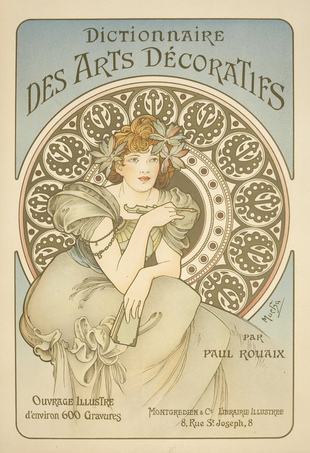
Alphonse Mucha’s Dictionnaire des Arts Décoratifs, created in 1902, stands as a crowning achievement at the intersection of fine art and applied design during the Art Nouveau era. Commissioned to advertise a lavishly illustrated reference work on decorative arts, Mucha’s lithographic poster transcends mere advertisement to become a masterwork in its own right. A serene female figure, poised with an open volume in hand, is framed by a halo of intricate circular motifs drawn from Byzantine and medieval art. Soft pastels—pale sages, muted rose, and gentle creams—pervade the composition, allowing line and form to emerge with sculptural clarity. Through sinuous contours, harmonious patterning, and seamless integration of text and image, Mucha transforms a promotional commission into an enduring emblem of decorative elegance.
Historical and Cultural Context
At the turn of the twentieth century, Paris was the beating heart of the Art Nouveau movement, which sought to dissolve boundaries between fine art and everyday objects. Entrusted with promoting Paul Rouaix’s Dictionnaire des Arts Décoratifs, published by Montgredien & Cie. Librairie Illustrée in 1902, Mucha created a poster that catered to design professionals, architects, craftsmen, and wealthy patrons of the decorative arts. The dictionary itself was an ambitious volume featuring some 600 engravings, intended as a comprehensive visual guide to historical and contemporary motifs, techniques, and materials. Mucha’s poster, plastered across boulevards and gallery walls, both reflected and fueled the era’s enthusiasm for aesthetic craftsmanship, symbolizing the democratization of high-style design knowledge.
Commission and Publication
Montgredien & Cie. recognized the need for a visually compelling campaign to launch Rouaix’s monumental dictionary. Mucha, by then an international celebrity for his theater and product posters, was the natural choice. The commission required a design that would convey both the scholarly gravitas of a reference work and the sensual allure of Art Nouveau aesthetics. Once printed by the Imprimerie Champenois in Paris, the poster appeared in September 1902, preceding the dictionary’s release. Its wide circulation in galleries, bookstores, and design studios ensured that the poster itself became a collector’s item, embedding Mucha’s vision of decorative splendour into the cultural consciousness even before readers turned the dictionary’s first page.
Composition and Spatial Design
Mucha arranges Dictionnaire des Arts Décoratifs within a tall, rectangular frame with softly rounded corners, embodying the vertical format typical of his poster work. The design divides into three principal zones: the upper curved banner bearing the title, the expansive central field featuring the allegorical figure, and the lower informational panel. A large circular medallion—reminiscent of a rose window—anchors the central zone, its repeated leaf and pinion motifs suggesting both Byzantine mosaics and Gothic tracery. The figure, seated before this mandala, leans forward with a slender rod in one hand and the dictionary’s volume in the other, her gaze directed toward the viewer’s right. Text blocks in the base region balance the composition, rendered in a custom Art Nouveau typeface whose curves echo the poster’s organic forms. Mucha’s spatial organization guides the eye from the title, through the central narrative, to the publication details, creating a visual journey that underscores the dictionary’s prestige.
Mastery of Line and Contour
Central to Mucha’s artistry is his fluid, calligraphic line, and nowhere is this more evident than in Dictionnaire des Arts Décoratifs. The contours of the figure’s drapery cascade in sweeping curves that undulate like waves, their thickness modulating to suggest weight and movement. Her hair, arranged in soft ringlets, reveals the same sculptural finesse, each strand articulated with expressive precision. Behind her, the circular motifs—comprising interlocking ovals and foliate forms—are delineated with crisp, rhythmic strokes that evoke both mechanical precision and natural growth. Even the typeface letters exhibit a hand-drawn vitality, their serifs and bowls resonating with the poster’s broader ornamental vocabulary. Through subtle variations in line weight and uninterrupted contour flow, Mucha achieves a harmonious unity of form that feels both spontaneous and meticulously crafted.
Color Palette and Lithographic Technique
Mucha’s color scheme for this poster is a study in refined restraint. A pale aquamarine gradient washes the upper banner, fading into a cream background that extends downward. The medallion’s motifs alternate between soft taupe and muted rose, while the figure’s gown and foliage accents adopt gentle greens and pinks. Highlights of deep umber define key outlines—hair curls, leaf veins, and type strokes—providing necessary contrast. Achieving such subtle hues and perfect registration demanded a complex multi-stone lithographic process. Mucha worked closely with the Champenois workshop to mix transparent inks, permitting underpainting to shimmer through and creating gradations without muddying lines. The final result is a luminous print whose color harmony feels as elegant as its linear composition.
Symbolism and Decorative Reference
Dictionnaire des Arts Décoratifs is steeped in references to the very motifs the dictionary catalogues. The circular halo mimics a rose window, signaling the dictionary’s encyclopedic survey of historical ornament—from Byzantine friezes to Gothic stained glass. The figure’s laurel wreath, comprised of stylized leaves, alludes to classical victory and artistic achievement. Her tools—a slender rod reminiscent of a painter’s brush or a ruler—denote the craftsman’s discipline, while the open book embodies knowledge’s unveiling. By embedding these symbols into the poster’s decorative fabric, Mucha creates a meta-narrative: his advertisement not only promotes a dictionary of decorative arts but itself exemplifies the dictionary’s subject matter come to life.
The Feminine Allegory
Mucha often used female figures as allegories, and here the young woman personifies “Design” or “Decorative Arts” itself—graceful, knowledgeable, and poised. Her serene countenance and direct gaze confer authority: she is not a passive muse but an active guide to the world of ornament. Mucha elongates her limbs and drapery to emphasize verticality, aligning her with the medallion’s axis. The subtle modelling of her face and hands retains naturalism, preventing the figure from sliding into mere formal abstraction. Through this balanced depiction, Mucha honors both the intellectual rigor and the aesthetic pleasures of decorative craft, aligning the feminine form with creative empowerment.
Integration of Text and Image
Typography in Dictionnaire des Arts Décoratifs reflects Mucha’s conviction that letters should be as artfully designed as images. The title’s capitals feature slight flares and irregularities—tiny inward curves on the stems, asymmetrical serifs—that mirror the foliate forms in the medallion. Line spacing and letter spacing are calibrated to flow in gentle arcs, echoing the circular motif beneath. In the base panel, smaller text—publisher, author, address, and edition details—is set in a complementary script that remains legible without disrupting the poster’s ornamental rhythm. Mucha’s integration ensures that text is not an afterthought but a coequal partner in the visual narrative, strengthening brand recognition while maintaining aesthetic coherence.
Ornamental Borders and Patterning
Beyond the medallion, the poster features several secondary decorative bands. A slender border of paired ovals and dots frames the entire design, reinforcing the poster’s vertical containment. Above and below the figure, horizontal panels of stylized leaf-scroll patterns provide transition zones between image and text. Mucha drew inspiration from mosaic pavements, medieval metalwork, and Japonisme—distilling these sources into a unified Art Nouveau syntax. The rhythmic repetition of shapes, combined with occasional asymmetries, creates a sense of both order and organic growth. Designers consulting Mucha’s poster could extract any of these motifs for adaptation into textile prints, stucco friezes, or marquetry inlays.
Cross-Cultural Influence and Synthesis
Mucha’s decorative vocabulary in this poster synthesizes influences from across time and geography. The circular medallion draws on Byzantine and Romanesque precedents; the leaf-scrolls echo Renaissance arabesques; the Japanese affinity for negative space informs the poster’s airy background fields. This cosmopolitan fusion reflects Paris’s status as an artistic crossroads in the Belle Époque. Yet rather than a mere collage of styles, Mucha achieves a seamless integration—each motif resonates with the others in proportion, line quality, and color harmony. The poster thus stands as both an emblem of global decorative heritage and a coherent new expression of modern aesthetic unity.
Technical Collaboration and Craftsmanship
The production of Dictionnaire des Arts Décoratifs exemplifies the collaborative craftsmanship behind Mucha’s color lithographs. He began with meticulously detailed gouache studies, then oversaw the transfer of linework to limestone plates by specialist draftsmen. Each color required a separate stone: one for aquamarine, one for taupe, one for rose, and one for umber outlines. Printers at Champenois used fine-grained limestone and high-quality inks to capture the subtleties of Mucha’s palette. Registration marks carved into the plate edges ensured pixel-perfect alignment. The final proofs underwent multiple revisions before approval, underscoring the exacting standards needed to produce a poster of such nuanced beauty.
Reception and Influence
Upon its release, Dictionnaire des Arts Décoratifs garnered acclaim from designers, architects, and collectors alike. It was praised for illustrating the advertised dictionary’s content by embodying decorative principles in visual form. The poster’s motifs were eagerly studied and adapted in contemporary interior design, influencing wallpaper patterns, furniture ornamentation, and metalwork. In academic contexts, Mucha’s poster became a case study in how advertisement could fuse art historical reference with modern innovation. Its legacy persists in design pedagogy, where it remains an exemplar of how to integrate text and image, historical allusion and contemporary flair.
Preservation and Modern Relevance
More than a century later, original impressions of Dictionnaire des Arts Décoratifs are treasured by museums and private collections. Conservation efforts focus on stabilizing the fragile paper substrate and neutralizing acidic degradation to preserve the poster’s delicate hues. High-resolution digital reproductions allow scholars and enthusiasts to study its rich details without risking the original. Contemporary designers continue to draw inspiration from its motifs—particularly the circular medallion and sinuous leaf-scroll patterns—in modern branding, textile design, and digital interfaces. Mucha’s work endures as a reminder that beauty and utility, history and modernity, can merge seamlessly in graphic art.
Conclusion
Alphonse Mucha’s Dictionnaire des Arts Décoratifs poster stands as a testament to the power of decorative art to inform and delight. Through its graceful composition, masterful linework, harmonious palette, and rich symbolism, Mucha elevates a promotional commission into a landmark of Art Nouveau design. The poster not only heralds the arrival of Paul Rouaix’s comprehensive decorative arts dictionary but itself becomes a chapter in the history of ornament. More than a century later, it continues to captivate and instruct designers, embodying the conviction that art and craft, knowledge and beauty, are inseparable.